

Suggestions for facade
8 years ago
Featured Answer
Sort by:Oldest
Comments (14)
 8 years ago
 8 years ago
Related Discussions
how to make it WOW?
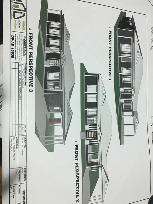
Comments (14)You must have quite a wide frontage to build this design so I would suggest the facades and garage door to have a striking contemporary colour to really stand out. I don't think it would look too busy at all because of the wide frontage you must have on your block of land. My only suggestion would be to work with your architect to change the facades a little more to differentiate the two. In my experience, the value of duplexes where the facades are differentiated to make it looks more like two homes increases. Also out of curiosity how many bedrooms has the architect included in the design?...See MoreFacade and exterior ideas. Open to suggestions
Comments (6)what an unusual looking house..would love to see the internal floor plans...my suggestions would be to keep the colours simple with Lexicon quarter for all painted walls (including the bricks?) black fascias and barge boards, dark grey gutters, black front door, white windows and try painting the striped blind and roof over the upstairs balcony in a deep grey, consider having wide steps across the front instead of sideways and lose the central garden bed and the untidy tall palm and consider new landscaping...See MoreSuggestions for split level facade for a less bulky look
Comments (7)I sort of agree with you , first time builder -- it does look not quite proportioned right IMO , but I wonder if that is because of the dropped down garage ? Personally , I think it may have been better to have the 'upper line' level above the garge , level with the top of that downstairs window wall to the left . And before you say that would add to the bulky look , you would have the garage door and opening taller -- currently , it looks a bit low and also a bit of a dogs leg as it is . I realise its probably a bit late for that now , so how about getting the brickie to do a line of probably '2 high' rows of bricks in a dark shade across about where the dotted line is on the picture -- it will make the upper floor look 'flat' , and break the line of our eyesight . Another option colourwise would be 2 or 3 rows of bricks in a colour similar to your render ( thats risky IMO ) , OR maybe get render added across that line -- that will then look like a designline that was intended all the time , and tie the two materials in together ? Just throwing out some thoughts...See MoreSuggest Facade Colours
Comments (1)What’s wrong with it as pictured?...See More 8 years ago
 PRO8 years ago
- 8 years ago
- 8 years ago
- 8 years ago
- 8 years ago
- PRO8 years ago
- PRO8 years agolast modified: 8 years ago
- 8 years ago
- 8 years ago
- 8 years ago

MB Design & Drafting