An Addition Creates More Living Space Out Front
A small addition transforms a cramped New Zealand bungalow into a modern light-filled home

It’s a familiar story. When the owners bought this 1940s brick bungalow in New Zealand, it was because they wanted something that better suited their personalities. Previously, they’d lived in what architect Simon Harrison calls a “standard developer house” north of their city. Tired of commuting, they wanted an individual house with a bit of character in a central suburb — somewhere they could display their collection of art and furniture.
This place fit the bill: brick, untouched and down a long driveway off an established, quiet side street full of old villas and bungalows. And it was within walking distance of work, cafes and parks. It was also badly in need of renovation.
This place fit the bill: brick, untouched and down a long driveway off an established, quiet side street full of old villas and bungalows. And it was within walking distance of work, cafes and parks. It was also badly in need of renovation.
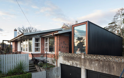
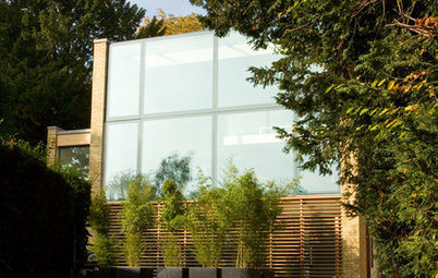
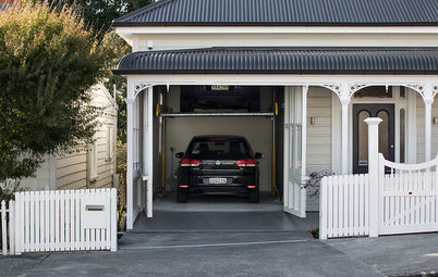
Now, approaching the house from the driveway, you encounter an asymmetrical glass-and-timber box that seems to float off the front of the solid brick facade. “Typically we’re designing houses that have the living spaces open onto the backyard to maximize outdoor living,” Harrison says. “That approach wasn’t an option here. We had to fit a double garage on the northern sunny side and then make the extension open out towards this.” In the Southern Hemisphere, of course, the north is the sunny side.
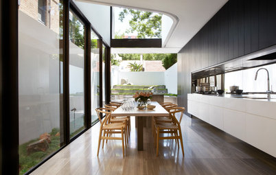
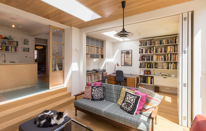
Now, a small study nook sits beside the entry — screened by cedar fins — and a sunken living area a few steps down from the rest of the house flows out to a small north-facing courtyard. It’s fundamentally and obviously a new construction, and yet it is still respectful of the original structure: The cedar mimics the color of the brick, and the pitch of the roof mimics that of the original but in the form of two contrasting monopitches.
Now, a small study nook sits beside the entry — screened by cedar fins — and a sunken living area a few steps down from the rest of the house flows out to a small north-facing courtyard. It’s fundamentally and obviously a new construction, and yet it is still respectful of the original structure: The cedar mimics the color of the brick, and the pitch of the roof mimics that of the original but in the form of two contrasting monopitches.
The entry sits at the junction between the existing house and the addition — a series of poured concrete steps leads up to a small wood deck, which forms the entry area. The charming ficus creeper has covered the front facade for many years, and was carefully protected during construction.
These days, Claudelands is a highly desirable suburb due to its proximity to the city and its mixture of old villas and bungalows on established streets — with tight heritage controls. This house was built a little later than others, in the 1940s, and it sits on a rear site down a long driveway, so the heritage controls didn’t apply. “We were free to design anything within the standard rules of the district plan,” Harrison says.
These days, Claudelands is a highly desirable suburb due to its proximity to the city and its mixture of old villas and bungalows on established streets — with tight heritage controls. This house was built a little later than others, in the 1940s, and it sits on a rear site down a long driveway, so the heritage controls didn’t apply. “We were free to design anything within the standard rules of the district plan,” Harrison says.
The clients had expressed an interest in the more intimate spaces of 1970s houses, rather than the wide-open spaces of more contemporary designs. As a result, the living spaces are now clearly separated between the kitchen-dining area in the original part of the house, and the new living area in the addition.
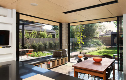
There are view shafts through and across the entry to unite the spaces, but the family has room to spread out through the kitchen, study nook and sunken living room.
There are view shafts through and across the entry to unite the spaces, but the family has room to spread out through the kitchen, study nook and sunken living room.
Each space is just as big as it needs to be, which Harrison says was the result of good discipline. “Working on this house has been a lesson in designing in a more compact way,” he says, and in fact MOAA has gone on to work on several more renovations in a similar style.
The dining room, previously part of the kitchen, is positioned to catch the sun in the morning and the middle of the day. The clients imported the tall vertical radiators throughout the house from the United Kingdom — there are few options on the New Zealand market.
The dining room, previously part of the kitchen, is positioned to catch the sun in the morning and the middle of the day. The clients imported the tall vertical radiators throughout the house from the United Kingdom — there are few options on the New Zealand market.
The kitchen sits at the heart of the home, in a space formerly occupied by a rabbit warren of hallways and small rooms that opened off each other. It’s small but highly functional, with floor-to-ceiling cupboards, plenty of counter space and an induction range. The cabinetry is birch plywood, with handles formed by partially routing out the doors.
The kitchen island has a white Formica countertop, used because it’s hard-wearing and relatively inexpensive. Despite the kitchen’s small size, the clients did manage to squeeze in a commercial espresso machine and coffee grinder.
The kitchen island has a white Formica countertop, used because it’s hard-wearing and relatively inexpensive. Despite the kitchen’s small size, the clients did manage to squeeze in a commercial espresso machine and coffee grinder.
The cupboard doors on the island are built from Melteca-laminated plywood featuring the same routered handle detail.
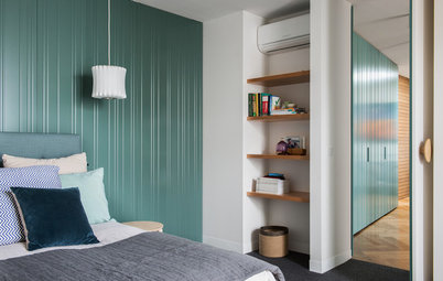
This study nook was a response to the clients’ desire for small, intimate, interconnected spaces. A daybed makes for an ideal spot to read, while timber shutters allow the space to be closed off from the main living room. The spaces in the extension are smaller and more intimate than the spaces in many contemporary homes. “This matches in with the scale of the spaces within the original house,” Harrison says.
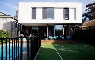
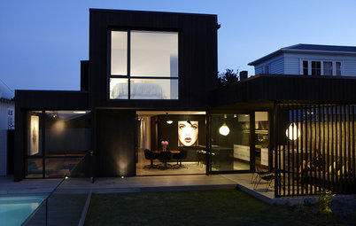
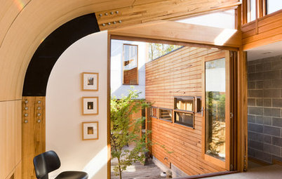
Harrison was determined that — while the new layout of the house flows to the north and the sun — the house should also connect to the backyard. A new glass door at the end of a long central corridor provides a glimpse out to the garden, even though it doesn’t get used much.
The architects worked with the existing 1940s vernacular style, retaining the wood floors but adding a curved wall around the master bedroom, which now houses an en suite shower. They also retained the house’s moldings and baseboards, though they took out quite a few walls.
The floors are a mixture of matai and rimu woods, carefully matched in alterations to the original part of the house and the study nook. The walls, ceilings, wooden windows and trim throughout the house are painted in Resene’s Half Albescent.
The laundry sits at the end of the corridor beside the back door and features a white Formica countertop, a white EcoGranit sink and cabinetry painted in Resene’s Canary Yellow. The room’s sliding doors are usually left open, but allow the space to be closed off when things get messy.
Here’s the curved shower in the master bedroom’s en suite bathroom — the small hexagonal tiles are also a nice touch.
The cabinetry in the main bathroom mimics that of the kitchen, with a subtle midcentury nod. The cabinetry here is painted plywood, while the countertop is white Formica.
The main bathroom and its fixtures stayed in the same place, which saved on plumbing costs, but received a much-needed makeover. That included this beautifully detailed American oak shelf set into a tiled wall above the bath.
The bath and the shower are tiled in H-75 Nube tiles from Tile Warehouse, laid in a running bond pattern, in keeping with the heritage of the house.
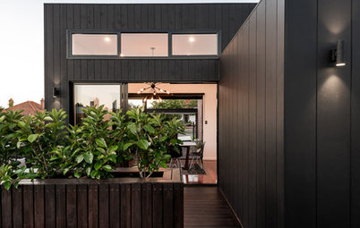
Eventually, the addition will flow out to a landscaped courtyard, with plantings to screen it from the driveway — a future project for the clients. The form of the extension might be radically different from the original house — a response to the family’s wish for it to be completely different — but it connects in delicate and subtle ways. The rooms are small and interconnected, rather than wide open, and the scale is similar in form to the original house.
More: The case for modern additions to older homes
More: The case for modern additions to older homes

Sponsored
Who lives here: A professional couple and their two children
Location: Claudelands, Hamilton, New Zealand
Size: 1,690 square feet (157 square meters); four bedrooms, two bathrooms
Designer: MOAA Architects
The existing three-bedroom house was small (about 1,185 square feet, or 110 square meters), with a rabbit warren of oddly shaped rooms and small spaces, including an almost unusable L-shaped bedroom. It also had no connection to the north-facing front yard or the south-facing back garden. The owners bought the property and then asked Harrison and the rest of the team at MOAA Architects to transform it into a family home with small, intimate spaces that would allow them to spread out but still have space for reading, cooking or studying.
MOAA’s approach was clever — and all the more so given budget constraints. They moved the bedrooms and bathrooms to the back of the house, opened up the front for kitchen and dining, and designed a small living extension around a north-facing courtyard.