Maison & Objet 2022: Trend Forecasters' Fave Colours & Must-Haves
Trend forecasters Elisabeth Leriche and François Bernard tell us about their 'What's New' exhibit at this year's fair

The latest edition of the Maison & Objet trade show in Paris, France, was held from 8 to 12 September 2022 and, once again, the ‘What’s New’ exhibition by trend forecasters Elizabeth Leriche and François Bernard proved particularly insightful. Leriche and Bernard unveiled this year’s new trends through inspiring displays of decor, furniture and materials spotted in the newest collections presented at the fair. This season, they highlight the themes ‘Colour Power’ and ‘Kaleidoscope’ alongside the overall theme of the fair, ‘Meta Sensible’.
‘Colour Power’ exhibition by Elizabeth Leriche for the ‘What’s New’ space at Maison & Objet 2022.
Another favourite combination associates geometric appliqué with undulatory curves in tones of electric blue, bordeaux or light blue. Furniture adopts generous and comfortable shapes, notably with rounded seats, lacquered sheet-metal table legs and coloured-glass tops. Coloured glass is very present on coffee tables and sofa ends, while metal holds a place of honour in an aesthetic inspired by the ’80s.
Inspired to work colour into your home? Find an interior designer near you, browse images of their work and read reviews from previous clients
oltreNFT by Saba; photo by Gaia Bonanomi.
What is your perspective on ‘Meta Sensible’, the new theme of the fair?
[Meta Sensible paints a picture of a physical world that is no longer in opposition with its digital counterpart. The two worlds are mutually influential, cross-fertilising and even merging to become a brand new media for creation, communication and distribution.]
This is a very interesting subject, which the brands should reflect on to enter in this new territory and collaborate with designers in order to work on the aesthetic of these fictional worlds. This new reality may still seem abstract, but the younger generations will very quickly appropriate it to try out different lives.
One of the sculptural furniture pieces from Mojow.
What are the other emerging trends for 2023?
Diffused colours are a must for this season. Their hues evoke daybreak and dawn; also a rainbow palette, with halos of pleasant effects.
It is worth noting the importance of colours for our emotions. In our interiors, we can easily repaint a wall to suit our mood, to refresh or revive a space, using cool or warm colours depending on the light. Light and colour cannot be dissociated.
Trend forecaster François Bernard.
François Bernard
What is the theme you have developed for Maison & Objet?
Such a mosaic of influences and crossroads, ‘Kaleidoscope’ presents the new ‘gifts’ [and home decor sector] for [the European] autumn 2022. This scenario responds to the need for variety, softness and empathy, colourful optimism and the products that can offer us these things.
The time is right for a variety of styles, just as communication in the digital era invites everyone to express themselves and make themselves heard. It is in multivalence that we find a response to the era, never in a unique message.
Riviera, a tableware collection from Costa Nova.
Which colours, furniture and materials reveal this new trend?
A palette of greens holds a place of honour more than ever, with particular emphasis on jade, tableware in decorative glass, and materials running from synthetic to lacquer. Like celadon, jade comprises a very broad spectrum: it is more or less grey- or blue-tinged, and more or less green. We also note the presence of orange tones: from brick to a lively and dynamic orange.
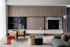
Finally, beiges and browns are still very present. Evoking the colours of the skin, they are very physical. We need these extensions of ourselves into our surroundings, placing the physical resonances of beige against the dematerialisation of the age.
Which colours, furniture and materials reveal this new trend?
A palette of greens holds a place of honour more than ever, with particular emphasis on jade, tableware in decorative glass, and materials running from synthetic to lacquer. Like celadon, jade comprises a very broad spectrum: it is more or less grey- or blue-tinged, and more or less green. We also note the presence of orange tones: from brick to a lively and dynamic orange.
Finally, beiges and browns are still very present. Evoking the colours of the skin, they are very physical. We need these extensions of ourselves into our surroundings, placing the physical resonances of beige against the dematerialisation of the age.
Apartment in Udine, Italy, designed by Cristina Celestino.
At the forefront of the scene, geometric design – witness to prewar modernism – sends us a message of that which is radical, of mechanism and rupture.
We also note an organic softness, curvy and sensual, an envoy of that which is slow, local and of humanism.
Browse more beautiful dining areas with pops of colour
What is your perspective on ‘Meta Sensible’, the new theme of the fair?
We construct our interiors like a second skin. It is neither a bubble nor a nest, it is an exo-body. Our home is a protective and creative projection of ourselves. Beige makes this exo-construction possible. It is comforting, mimetic, protective and regenerative.
Jade can also reinforce this theme. This indeterminate colour, which makes room for the sensory is at once translucent, transparent and opaque. Jade never has the same shade. It corresponds to our search for variety. That indescribable poetic value of that which exceeds us, carries us away, seduces us and makes us dream. Is this not also a good definition for ‘Meta’?
Du Roy stools by Maison Dada.
How is the world of the home going to evolve over the years to come?
We are tending towards a mode more than a fashion. We should reconsider yesterday, now and tomorrow most of all by being in the moment. We must juxtapose the notions of design and historicity, nature and technology. The idea of heritage will no longer be experienced as an isolated past, just as augmented reality will become a functional necessity. Nature and its textures, landscapes and technology will remain a constant source of wonder.
Your turn
Which colours would you like to see more of in architecture and interior design? Tell us in the Comments below, like this story, save the images and join the conversation.
More
Musing about your own home’s purpose? Here’s your next read: Should You Have a Mission Statement for Your Home or Renovation?
Elizabeth Leriche
Tell us about the theme you developed for Maison & Objet
‘Colour Power’ explores cheerfulness and audacity as counterbalances to this difficult period in time.
Which colours, furniture and materials reveal this new trend?
Colours express themselves in monochrome, colour blocking or ombré. In the exhibition space, we propose ways of putting them together in bold associations and ’70s bohemian-inspired pop, matching geometric patterns and stylised flowers. The palette marries green, purple and mauve, elevated by a touch of yellow ochre.