Color Psychology in Architectural Design
Color is more than a visual experience, it’s a psychological tool that influences how we perceive space, emotion, and function. In architectural design, color plays a vital role not only in aesthetics but also in shaping how people feel and interact within a space.
Understanding the psychology behind color enables designer and Architect in Los Angeles to craft environments that are not only beautiful but also functional, mood-enhancing, and purpose-driven.
The Emotional Impact of Color
Each color has the power to trigger specific emotional responses, influencing how we feel and behave in a given environment. For example:
- Blue is calming and promotes trust. It’s often used in offices, hospitals, and bedrooms to evoke serenity and focus.
- Red stimulates energy and excitement. While it can be overpowering in large amounts, it works well in restaurants or entertainment spaces where stimulation is welcome.
- Green symbolizes nature and balance. It has a restorative effect, making it ideal for healthcare settings and educational environments.
- Yellow is associated with optimism and energy but can cause anxiety if overused. It’s great for kitchens and creative workspaces in small doses.
- White conveys cleanliness and simplicity, often used in modern designs to create a sense of spaciousness.
- Black exudes sophistication and authority but can feel heavy or somber if not balanced with lighter tones.
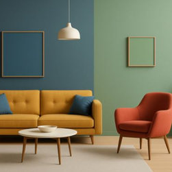
- Living rooms often benefit from warm tones like earthy browns, soft yellows, or terracotta to encourage social interaction and warmth.
- Bedrooms are typically suited to cooler hues—blues, soft greens, or muted lavenders that promote relaxation and better sleep.
- Kitchens can handle more vibrant colors. Yellow or orange accents may stimulate appetite and energy.
- Bathrooms often feature whites, light blues, or sea greens for a clean, refreshing atmosphere.
- Retail stores use color to drive sales. Warm, energetic colors like red and orange can create urgency and excitement, encouraging impulse purchases.
- Corporate offices tend to use blues and grays to promote focus, professionalism, and calm.
- Hospitals and healthcare facilities rely on greens and blues to reduce stress and promote healing.
- Educational institutions often incorporate a mix—cool tones for concentration, brighter hues in creative spaces to inspire innovation.
- In Western cultures, white symbolizes purity and peace, while in some Eastern cultures it’s associated with mourning.
- Red, which is seen as aggressive or alarming in some contexts, represents luck and prosperity in Chinese culture.
- Green, associated with growth and fertility in many regions, may be politically or religiously significant in others.
Understanding these associations helps architects design spaces that evoke the desired mood and functionality.
Color in Residential Architecture
In homes, the colors we choose can greatly affect how we feel and experience our daily routines. For example:
Personal preference still plays a role, but color psychology ensures the emotional and sensory impact aligns with the room’s intended use.
Commercial and Public Spaces
In commercial and public architecture, color decisions can influence behavior and brand perception:
Public transportation hubs, museums, hotels, and even correctional facilities all rely on strategic color usage to guide behavior, reduce stress, and enhance function.
Cultural and Contextual Considerations
Color meanings vary across cultures, so architects working internationally or in multicultural communities must account for these differences. For example:
Local context—geography, climate, and cultural traditions should also inform color choices. Bright colors may be more suitable for tropical climates, while muted palettes work well in colder, northern regions.
Natural Light and Material Interaction
Color perception isn’t static; it changes with lighting, texture, and materials. A color that looks warm and vibrant in daylight may feel dull under artificial lighting. That’s why architects test color in various lighting conditions before finalizing a design.
Materials also affect how color is perceived. A matte olive green wall will read differently from a glossy green tile. Combining color theory with material science helps achieve the intended visual and emotional impact.
Trends vs. Timelessness
Trendy colors come and go, but timeless palettes endure. While it’s tempting to follow current color trends, architectural design typically favors longevity. Subtle, neutral palettes with bold accent colors provide flexibility and long-term appeal.
Designers must balance creativity and innovation with durability and functionality. Choosing colors that reflect the building’s purpose and stand the test of time ensures both relevance and aesthetic value.
Sustainable and Psychological Design
With increased awareness of mental health and sustainability, color psychology has become central to wellness-focused architectural design. Biophilic design is a concept that connects occupants more closely to nature, relies heavily on earth tones and nature-inspired hues to evoke calm and improve well-being.
For instance, bringing in greens and browns mimics forest environments, while ocean-inspired blues and sandy neutrals recreate coastal tranquility. These color strategies can improve productivity, reduce stress, and even lower blood pressure, especially in workplaces and healthcare environments.
Final Thoughts
Color is a silent language in architectural design, one that communicates emotion, guides behavior, and enhances space. Whether designing a tranquil retreat, a high-energy café, or a welcoming hospital, the colors chosen can define the experience of everyone who walks through the door.
Designers and Architects in Los Angeles, CA who understand how color affects us can create spaces that look beautiful and feel right, making us feel comfortable, energized, inspired, or calm as needed.