Before and After: Gray and Marble in a Serene Master Suite
A designer helps a California couple create an efficient and stylish space where they can relax, rest and rejuvenate

In 2009, Trent and Kim Watkins moved into their two-level, Mediterranean-style home in Moraga, California. The house was built in the 1960s and the interiors were updated in 1991. For almost 10 years, the Watkins, who have two young children, lived with their existing upper-level master suite and its tan walls and decades-old finishes. But those years gave the couple plenty of time to reflect on what they wanted to do with the room.
When the time finally came to renovate, they hired designer Kelly Scanlon to create a more streamlined space with a serene gray-and-white color scheme, efficient storage and a polished look that better coordinates with the contemporary interiors that now feature in the rest of their updated family home.
When the time finally came to renovate, they hired designer Kelly Scanlon to create a more streamlined space with a serene gray-and-white color scheme, efficient storage and a polished look that better coordinates with the contemporary interiors that now feature in the rest of their updated family home.
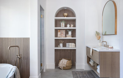
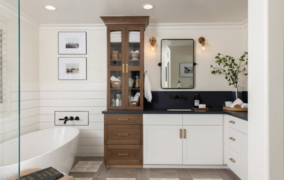
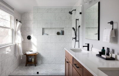
After: To create more user-friendly storage for the couple, Scanlon included tower cabinets for quick access to frequently used items such as hair products and makeup on each end of the new paint-grade-maple double vanity, which is painted a light blue-gray (Silver Lake by Benjamin Moore). The spacious vanity provides contrast to the walls painted a soft white with a touch of gray (Decorator’s White by Benjamin Moore).
Polished nickel sconces with white glass shades above the two new custom mirrors help illuminate the space. The updated insulated window between the mirrors offers a view of the mountains outside. The old bubble skylights were removed and replaced with modern linear versions, with shades controlled by a remote.
Custom cabinets: Caliber Cabinets; sconces: Whitman small sconce in polished nickel with white glass, Visual Comfort
The countertop is durable quartz that mimics the look of marble. “We wanted to keep it light, and something with a blue and gray in the veining that would connect it with the cabinets,” Scanlon says.
The attractive backsplash behind the vanity includes mosaic marble tiles with a shell finish and iridescent shimmer. “We were just trying to give them something visually interesting, but not compete with the view,” Scanlon says. “It’s a nice, quiet backsplash, with lines that disappear into this circle pattern.”
The attractive backsplash behind the vanity includes mosaic marble tiles with a shell finish and iridescent shimmer. “We were just trying to give them something visually interesting, but not compete with the view,” Scanlon says. “It’s a nice, quiet backsplash, with lines that disappear into this circle pattern.”
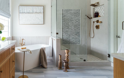
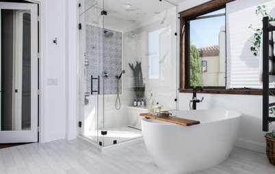
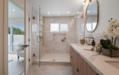
This doorway, with an updated wood and white laminate glass pocket door, connects the vanity area to the couple’s walk-in shower with frameless glass door.
The sliding door provides a bit of privacy while still allowing light to enter. “We had an existing door there before, but it was a solid one,” Trent says.
The sliding door provides a bit of privacy while still allowing light to enter. “We had an existing door there before, but it was a solid one,” Trent says.
Before: This look at the shower before the renovation shows the glass-block window that was inside it, which Trent and Kim dubbed their Miami Vice window because of the popularity of glass block during the 1980s. “We recommended to address it, to keep some light coming through, but also allow storage for shampoo and such,” Scanlon says.
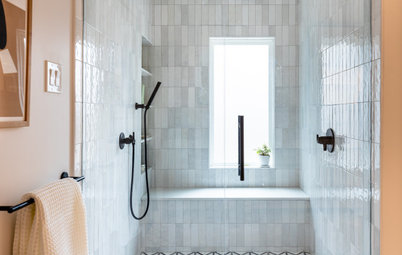
After: Scanlon removed the glass-block window, moved the new opening a few inches higher and installed a long and lean rectangular awning window that offers ventilation. An equal-size niche sits just below it. Both are cased out with the same quartz used for the vanity counter. “It’s clean, and it allows you to focus on the beauty of the materials,” Scanlon says.
The handmade ceramic tiles used on the shower walls have a subtle pattern in a traditional style for a refined look.
The handmade ceramic tiles used on the shower walls have a subtle pattern in a traditional style for a refined look.
Before: This photo taken from the shower area shows the old closet with sliding mirrored doors on the left side of the bathroom, looking toward the master bedroom. Kim “wanted a more efficient closet and those doors were super dated, but she still wanted a full mirror,” Scanlon says.
After: Scanlon created a hidden custom closet door with mirror inserts and outfitted the inside with organizational tools to meet the couple’s specific storage needs.
Framing work between the bathroom and bedroom shows where a new door now stands, separating the two spaces and providing some privacy. “Before we had the door, it was clearly two separate spaces, but there wasn’t a clear transition and funny molding around the ceiling that was confusing,” Trent says. “Adding the same door that we used for the transition to the shower space just defines the spaces better.”
This image also shows the textured porcelain tile floor with a subtle herringbone pattern that provides grip, and the smooth transition to the bedroom, which features wool loop pile carpet in a stone color.
Before: This look at the existing master bedroom shows the tan walls and a glimpse of the sliding glass door with plantation-style shutters, which Trent says felt heavy and made the space feel dark. The bedroom also included a wood sleigh bed and awkwardly placed cabinets that restricted the size of the bed to a queen.
Also note the ornate ceiling, which felt dated. “We appreciated there was some extra height in the room and didn’t want to lose it,” Scanlon says.
Also note the ornate ceiling, which felt dated. “We appreciated there was some extra height in the room and didn’t want to lose it,” Scanlon says.
After: Scanlon replaced the old cabinets with custom bedside cabinets that flank a new upholstered king bed with sustainable wood frame and nailhead trim.
Scanlon cleaned up the ceiling by removing the applied crown molding and pushing the soffit out to the side as much as possible.
Scanlon cleaned up the ceiling by removing the applied crown molding and pushing the soffit out to the side as much as possible.
Each bedside cabinet features a top cabinet for large items, a charging station hidden in a drawer, an open cubby for decorative items and a built-in tray that slides out to hold a book or glass of water.
Before: This photo shows the previous TV cabinet, which felt boxy and was designed for an old-school square TV.
After: A new combination of drawers and built-in closet with a rod at the top gives Trent a designated area for his clothing and accessories and offers a more streamlined design with space for a modern flat-screen TV. “I wanted him to feel like he had his own space,” Scanlon says. “Upon entering the room, he has a landing spot for all of his things, rather than just any space available.”
Now the couple have an inviting space where they can read, watch TV, relax and rejuvenate. “I’m just proud of how it turned out,” Scanlon says. “We took chances where the details mattered.”
More on Houzz
See more Before and Afters
Browse popular bathroom design ideas
Find a general contractor
Shop for bathroom vanities and more
Master Suite at a Glance
Who lives here: Trent and Kim Watkins and their two young children
Location: Moraga, California
Size: 625 square feet (58 square meters)
Designer: Kelly Scanlon Interior Design
General contractor: Imagine Construction
Before: The long, narrow bathroom in the existing master suite had tan walls and carpet on the floor. A mirrored-panel backsplash hung behind a neutral wood-look vanity with a hard-to-clean tile countertop. Although the vanity had several drawers, the bathroom was missing other types of usable storage. “When we bought the house, there were no towel bars anywhere in the home,” Trent says. “There were some hooks on the back of doors, but that was it.”
There was also a window above the vanity that felt lost in the middle of the backsplash and needed to be integrated into the design better, and there were aging bubble skylights that needed to be replaced.