Houzz Tour: A Shoebox Apartment Embraces the Plantation Style
This bachelor's pad defies its limited size by going big and bold with tropical patterns and hues

With only one requirement in his design brief, the owner of this bachelor pad entrusted designer Arjan Nijen Twilhaar of Aiden T with everything else.
“This was the first ever project where I had free rein to execute the design proposal from start to finish,” says Twilhaar. “The bachelor owner left it up to me to come up with a space plan and design aesthetic to implement. He was pretty much hands-off, not even selecting the wall colours or curtains and entrusted the entire design process to me. His only requirement was that the home should feature the artworks he has collected over the years.”
“This was the first ever project where I had free rein to execute the design proposal from start to finish,” says Twilhaar. “The bachelor owner left it up to me to come up with a space plan and design aesthetic to implement. He was pretty much hands-off, not even selecting the wall colours or curtains and entrusted the entire design process to me. His only requirement was that the home should feature the artworks he has collected over the years.”
Because this is a shoebox apartment, Twilhaar had to be creative with the layout. “The enfilade way of space planning is always my favourite approach for open-plan living. Rather than creating one large space, I feel it’s nice when the apartment slowly reveals itself through different areas and features,” he says. The enfilade layout opens up the space, but leaves areas for the eye to explore.
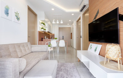
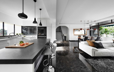
The apartment opens to the dining area from the entrance. A large portrait anchors the space.
The apartment opens to the dining area from the entrance. A large portrait anchors the space.
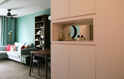
To free up floor space, Twilhaar built recesses in the wall to display the owner’s collection of travel souvenirs and books. These recesses are lined with mirrors, so they almost come across as windows and add depth and a sense of space,” he says.
The existing tiled floors were replaced with hardwood flooring laid out in a chevron pattern. As large expanses of wall were needed to properly display the homeowner’s large scale art, the existing aircon system was replaced with a ducted system.
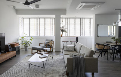
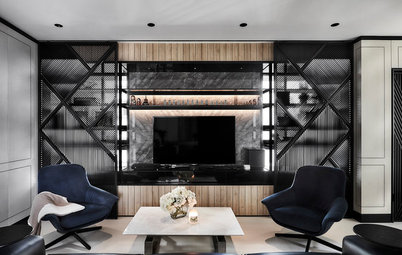
Further into the living space is the library/reading nook, which is demarcated by a cased opening. The reading nook also flows effortlessly into the balcony. “I placed a large bookshelf and added a wood-beamed ceiling. This is my nod to the cigar room vibe,” he says.
Flooring: FloorVision; furniture: Crate and Barrel; pendant lights: LC Lighting; recessed lights: Zentarra; curtains: V. Gos
To give the illusion of more space, a mirror was placed on the wall in the balcony, and a trellis was added on top of it. “I’ve had this idea for many years, but it was always axed during previous presentations. Once the trellis is covered with more plants, it will give you glimpses of reflection and give the illusion of more space,” Twilhaar says.
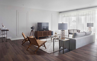
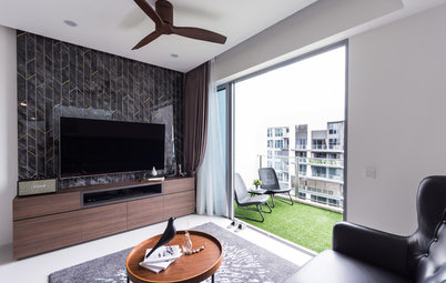
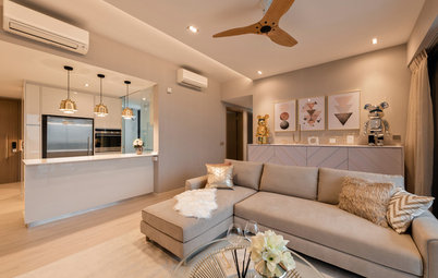
One bedroom was annexed for a nook to cater for the sofa.
This was slated to be a TV room, but the owner, who doesn’t really watch TV, decided not to have one. The room is now a cosy hangout, where he can have friends over for drinks and music.
Twilhaar intentionally kept the styling here simple to allow the quirky artwork to stand out. A tall fiddle leaf fig tree and leaf-print cushions add a tropical element to the neutral-toned space.
Next to the sitting area is the powder room. “We converted one bathroom into a powder room by taking out the shower function,” explains Twilhaar.
This space perhaps makes the boldest statement in the whole apartment, with its walls dressed in a custom tropical leaf print wallpaper, befitting the colourful and breezy Cuban-inspired design.
This space perhaps makes the boldest statement in the whole apartment, with its walls dressed in a custom tropical leaf print wallpaper, befitting the colourful and breezy Cuban-inspired design.
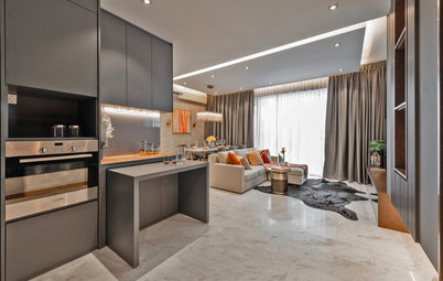
The deep green jewel tone is also seen in the compact kitchen, which got a complete colour makeover. “I saw this green marble many years ago, but no homeowner has been brave enough to use it before. It took three years before I could finally use this,” he beams. The choice of marble, complemented by the deep green cabinetry, sets the tone of this space.
And since the kitchen has a small footprint, the designer deemed it necessary to integrate a reflective detail to create a brightening effect. “A chevron mirror wall was installed here. I opted for an antique mirror finish in a brass colour as it has a nice patina and is pretty soft in colour,” he says.
Marble and tiles: Hafary
Marble and tiles: Hafary
The master bedroom is across the reading nook. As there was only room for a small bed, it was furnished with the essentials. The wallpaper’s geometric print creates a dynamic focal point, without overwhelming the space.
“The Bruce Lee-inspired piece above the bed was the first artwork that the owner bought when he was stationed in Hong Kong,” Twilhaar shares. “Most of the artwork were purchased at key points in his life, so they hold special meaning.”
“The Bruce Lee-inspired piece above the bed was the first artwork that the owner bought when he was stationed in Hong Kong,” Twilhaar shares. “Most of the artwork were purchased at key points in his life, so they hold special meaning.”
Wallpaper: Cole and Son
TELL US
What is your favourite feature in this home? Let us know in the Comments below. And don’t forget to save your favourite images, bookmark the story, and join in the conversation.
What is your favourite feature in this home? Let us know in the Comments below. And don’t forget to save your favourite images, bookmark the story, and join in the conversation.

Sponsored

Sponsored
Houzz at a Glance
Who lives here: A bachelor who works in the finance industry, and his dog
Location: Margate Road, East Coast
Size: 480 square feet (44.5 square metres)
Project duration: 4 months
Twilhaar’s design inspiration was Finca Vigía, Ernest Hemingway’s Plantation-style home in Cuba. “I approached it with a gentlemen’s club/cigar room setup in mind (hence the Cuban reference), but kept the furniture style to more mid-century modern,” he explains.