How to Make a Big Design Impact With Color
Interior designer Sabrina Alfin discusses ways to use bold hues, playful patterns and layered neutrals

As part of San Francisco Design Week in June, designer Sabrina Alfin of Sabrina Alfin Interiors sat down with Shannon Kaye of Kelly-Moore Paints for a virtual conversation about the impact of using color in the home. Alfin shared her expertise on how to incorporate a bold color, use color to complement a room’s style, layer in neutrals, play up colorful patterns and subtly add color to a kitchen.
When it comes to selecting colors for any room, Alfin said it’s important to first understand the vision and purpose of the space. “In general, using color is all about setting a mood. Do you want it to feel energetic? Do you want it to feel calming? It really depends on what the goal is for the space,” she said. As a designer, “the way you figure that out is by talking to your clients and understanding who they are, what they gravitate toward and how they want to live their lives.”
When it comes to selecting colors for any room, Alfin said it’s important to first understand the vision and purpose of the space. “In general, using color is all about setting a mood. Do you want it to feel energetic? Do you want it to feel calming? It really depends on what the goal is for the space,” she said. As a designer, “the way you figure that out is by talking to your clients and understanding who they are, what they gravitate toward and how they want to live their lives.”
Work With a Room’s Style
Adding color can be a great way to complement the style of a room, Alfin said. Her clients wanted this beach house in Pacific Grove, California, to feel like a vacation getaway from the moment they walked in the door.
“They wanted to feel as if they were leaving the rest of the world behind,” Alfin said. “So we surrounded them with watery blue on the walls and a sandy sisal rug on the floor.”
The house is intended to feel like an extension of its beachside location. “You probably hear many architects and designers use that type of language, but it’s actually quite true,” Alfin said. “Your setting is very often an indicator of the direction you’d like to go.”
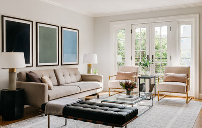
Create Layers With Neutrals
Alfin recommended layering neutrals in “a tone-on-tone manner that mixes in layers of similar colors in a way that there’s nothing that really screams out at you.”
For this New Rochelle, New York, living room, designer Tamu Green of Lux Pad Interiors used subtle patterns that add depth to the neutral color palette. A large club chair and ottoman are covered in an abstract-patterned fabric, and the cream-toned area rug has a relief pattern that gives it depth. The potted plant adds a touch of green.
“There are a lot of people who do neutral interiors who don’t layer in enough color, texture and visual interest, so it ends up looking bland,” Alfin said. To keep a neutral space from feeling boring, she likes to bring in pattern, texture, objects and art that keep it “from feeling a little too one-note.”
Play With Colorful Patterns
When it comes to coordinating fabrics, Alfin said, it’s all about scale. “Even though you might be mixing different colors and type of patterns, if the scale or size of the patterns work, it will pull it all together.”
Designer Susan Nelson used a variety of colors and patterns in this Washington, D.C., living room, which features a paisley armchair, a striped ottoman, geometric-print Roman shades and a variety of patterned throw pillows. Because the scales of the patterns are similar, the space feels cohesive and balanced.
Designer tip: When selecting patterns for a room, Alfin likes to start with the paint palette. She can take a paint swatch with her into a showroom while she chooses fabrics. “This way I have an idea of what I’m looking for and I don’t have to look at everything.”
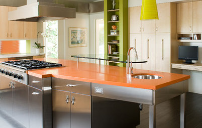
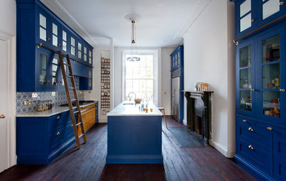
Add Color Subtly in the Kitchen
“I’m very much of the mind that kitchens should be every bit as colorful as the rest of the house,” Alfin said. The key to having homeowners feel comfortable with using color in a kitchen is making sure they love the selection. “Of course it’s a lot easier to paint a wall than it is to rip out tile, but if the clients love the color they won’t want to rip it out.”
Still, Alfin recommended using color in a more subtle manner in kitchens. “We like to use color in a subtle way, whether it’s through accent tiles, fabrics or lower cabinets,” she said.
This Pennsylvania kitchen remodel by Sharp and Grey Interiors showcases color used in a subtle but powerful way. While most of the kitchen features classic white materials, such as the marble countertops, perimeter cabinets and subway tile backsplash, the design team wove in shades of blue with a painted island base, accent tiles above the range and a rug.
Designer tip: When it comes to adding color to a kitchen or any other room, lighting is crucial. “There’s nothing worse than being in an enclosed space that only has artificial lighting,” Alfin said. “If the budget allows for it, we like to bring in natural light by adding skylights, clerestory windows and enlarging existing windows.”
More on Houzz
Read more about designing with color
See more coverage of design events
Browse millions of home photos for inspiration


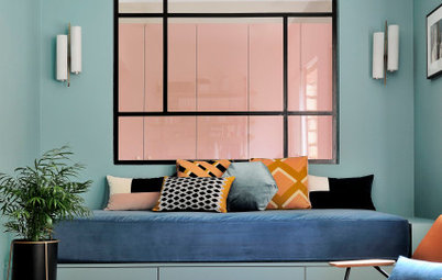
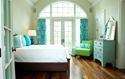

The wall color in this San Francisco bedroom was inspired by the existing artwork above the bed, Alfin said. “The couple wanted to use that piece in the bedroom, so I said, ‘Let’s take the watery teal in it and blow it out as much as possible.’ ”
The designer then used gray bedding, a wood headboard and print pillows to balance the space. “It has a sophistication without taking itself too seriously, which is very much the personality of these clients as well,” Alfin said.
She recommended finding the right balance when using a bold paint color in a room. “From an emotional point of view, you want to walk into a room and feel that it’s harmonious but definitely not boring,” Alfin said.