Kitchen of the Week: A Hardworking Room With 1925 Cottage Style
His newfound love of cooking and her love of their home’s period architecture meet in this charming Oregon renovation

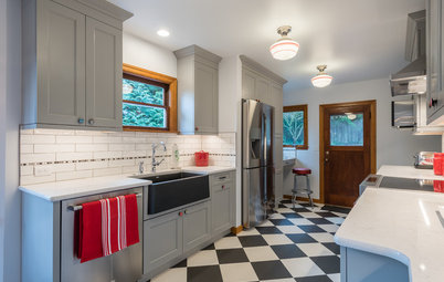
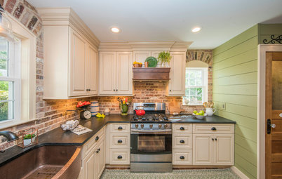
Problems: The kitchen in the historic home had undergone what Chelly dubbed a “big-box store special” years before the couple moved in. The cabinets had a Thermafoil finish that her toaster had melted; the floors were red vinyl-composite tiles that were popping up all over; storage was lacking and the placement of the bulky refrigerator made the room feel cramped.
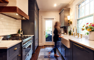
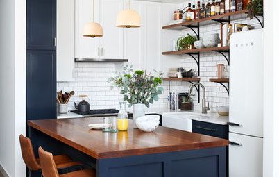
Cabinets: The couple had already painted the trim around the rest of the house in Mascarpone by Benjamin Moore and wanted to continue that look through the kitchen for a seamless, period-appropriate look. They painted the upper cabinets and walls in the same color. But Chelly wanted the lower cabinets to help the windows pop even more, so she chose a charcoal gray paint for them.
The designer opted for custom cabinets to utilize every inch of space and test out the cabinet company for future projects for her clients. (It passed with flying colors.) “By going with custom we only had to have 1½ inches between the drawers and doors because it’s all built as one continuous run. If we’d lined up off-the-shelf cabinets there would have been 3 inches between them,” she says. The flush-inset drawers, simple Shaker design and traditional polished nickel hardware befit the home’s style and age.
Tip: She had the cabinets painted on-site, which meant fewer touch-ups than if they were painted in the shop, transported and installed.
Sink: Previously, the couple had a large beautiful sink with two basins, but neither were big enough to be functional. “We switched to a single-bowl 24-inch sink that works so much better for us and frees up more counter space,” she says. By using wall-mounted faucets, they saved more precious inches. Under the sink is a pullout shelf that makes it easy to reach items stashed in the back.
Cabinets: Oak Grove Custom Cabinets; trim, wall and upper cabinet paint color: Mascarpone, and lower cabinet paint: Wrought Iron, both Benjamin Moore; sink: Riverby, Kohler; faucets: Rohl; cabinet hardware: Rejuvenation; dishwasher: Miele
Kitchen plan (before): Note here the lack of cabinets in the nook, the placement of the range (middle left) and fridge (middle bottom) and the placement of the back door and basement stairs (far left).
Kitchen plan (after): The bulky refrigerator had cluttered up this spot directly across from the sink. Chelly swapped the placement of the range with that of the fridge. “This small change made the kitchen feel so much bigger and more open,” she says.
Refrigerator: The fridge is now part of a cabinet wall where the range had been. Because its true cabinet depth is only 24 inches, the new refrigerator doesn’t impede on the room as much as the old one did, and the freestanding piece integrates well into cabinetry.
The cabinet to the left conceals a microwave, which they use infrequently. Beneath it she placed a pullout maple butcher-block board. “The maple board serves as a landing space beneath the microwave, which is important as things can be really hot when you pull them out,” she says.
Back hall: The tiny hall toward the back door and basement stairs is more utilitarian, with two metal racks for pots and pans. The couple could not spare the cabinet space for trash and recycling pullouts, so they wanted to go with something other than the usual ho-hum trash can. Chelly scored two chic Vipp bins from Design Within Reach right before they stopped selling them in the United States — one for trash and one for recycling.
Because they finished their basement, they were able to eliminate its door on the left and just keep the small back hallway open to the stairway. And though they’d scored this limited-edition poster from Willi’s Wine Bar in Paris in the 1990s, this renovation was the first time they’ve found the perfect spot for it. They had it specially framed to fit over an unattractive fuse box, and it gives the subtle signal that the wine cellar is thataway.
Refrigerator: 30-inch counter-depth bottom-freezer refrigerator, Liebherr
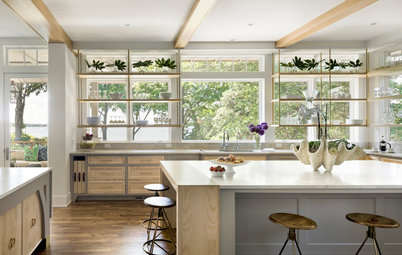
Range: Phil’s working kitchen style is shown off best in this photo. He opted for a professional-looking stainless finish on the range and hood, and Chelly found durable quartz that resembles concrete for the countertops. The cabinets on either side are narrow but highly efficient — one side holds spices, oils and vinegars, while the other has inserts with built-in buckets for more cooking utensils.
Counters: Sleek concrete with a honed finish, Caesarstone; range: BlueStar; hood: Vent-a-Hood; utensil rack: Amazon; cabinet inserts: Rev-a-Shelf
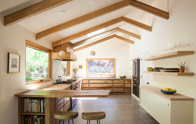
Drool-Worthy Design Features to Borrow From Restaurant Kitchens
Counters: Sleek concrete with a honed finish, Caesarstone; range: BlueStar; hood: Vent-a-Hood; utensil rack: Amazon; cabinet inserts: Rev-a-Shelf
Drool-Worthy Design Features to Borrow From Restaurant Kitchens
Because they are low on counter space here, the couple made the most of the range backsplash by adding a utensil rack.
Backsplash: While Phil wanted to go with the more durable quartz for the countertops in his working kitchen, both Phil and Chelly love the well-worn patina Carrara marble has in typical European cafes. So Chelly brought the Carrara in via 2-by-4-inch tile for the prominent backsplash. She chose a medium-gray grout that suits the home’s age and adds to the kitchen’s industrial feel.
Backsplash tile: Tribeca Classic 2-by-4 brick mosaic, Walker Zanger; grout: Delorean Gray, Polyblend
Find wall-mounted racks
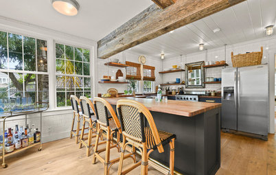
Eat-in nook: Before, the couple had a longer rectangular table in here that hogged space. By switching to this round table from Rejuvenation, Chelly was able to fit cabinets along either side. The table’s cast-iron base and marble top add period-appropriate character, which she contrasted by using modern Globus Chairs. “Rejuvenation was founded in Portland, and I even used to work in the same building as their offices. Using their products was appropriate not only for our home’s age but also for Portland,” she says.
A shelf supported by historic style-appropriate corbels adds architectural flair near the ceiling and gives the couple a place to display their favorite china and pottery.
By using custom cabinets, Chelly was able to specify that they be more shallow than standard cabinets, giving her room to add them on opposite sides of the nook. The cabinet countertops are food-grade walnut planks. They provide extra storage for items they don’t use every day, such as table linens, a tortilla warmer, ramekins and serving platters.
The floors: To the couple’s disappointment, the original fir floors that were hiding underneath the vinyl-composite tiles and layers of paint could not be salvaged, but Chelly found a beautiful sustainable wood to use from local company Viridian Wood. It is reclaimed from transpacific shipping crates that once carried steel railroad track. This wood has character that fits the home’s age and style.
Dining chairs: Globus Chair, Stua; dining table: Pioneer round dining table and light fixture: Rejuvenation
Browse round dining tables for four
Chelly and Phil can set up a buffet on one side of the nook, while this other side serves as a bar. They love wine and have a wine cellar in their finished basement, while liquor, glassware and other cocktail supplies all are housed here.
Though Phil is thrilled with his professional cook zone, Chelly is happiest surrounded by her favorite windows in the nook while he cooks for her. “People are always saying things like ‘Oh, you could remove this wall and make your kitchen so much bigger,’ but I love my cozy nook,” she says.
Takeaways:
More: Read other Kitchens of the Week
Though Phil is thrilled with his professional cook zone, Chelly is happiest surrounded by her favorite windows in the nook while he cooks for her. “People are always saying things like ‘Oh, you could remove this wall and make your kitchen so much bigger,’ but I love my cozy nook,” she says.
Takeaways:
- In a tight space, being able to customize cabinetry can help you gain valuable inches.
- Consider a smaller single-basin kitchen sink to gain counter space.
- The look of concrete and stainless steel lends a professional working kitchen look that can fit into historic architecture.
- Having cabinets painted on-site can save you from touch-ups.
- Don’t be afraid to add a few modern accents to a kitchen with vintage style.
- Have something framed to fit over an unsightly fuse box.
- Trash bins can be stylish.
More: Read other Kitchens of the Week

Sponsored
Kitchen at a Glance
Who lives here: Interior designer Chelly Wentworth of C Change Design and husband Phil Wentworth
Location: Portland, Oregon
Size: 159 square feet (15 square meters)
Backstory: When Chelly and Phil Wentworth moved into their 1925 Tudor-style cottage in Portland, Oregon, they planned to remodel the kitchen right away. Fifteen years later, they finally got around to it and the timing was just right. After years of working for other firms, Chelly was going out on her own as an interior designer, and she became her own first client. And after retiring a few years ago, Phil developed an avid interest in cooking, something that had previously been Chelly’s domain. “It’s great after 30 years of my doing most of the cooking for him to take it up, and he really took the initiative with this project,” she says.
Style: Chelly and Phil appreciated their home’s 1925 style and charm. Respecting its age and preserving its original style was a priority. The arch you see in this photo was existing, and they were able to preserve the original plaster walls rather than using drywall. Chelly’s favorite thing about the architecture was the original 1925 windows, even though they were painted shut and needed new ropes. She had them fully restored and painted black to highlight them. Phil wanted a real working kitchen, so durability and professional kitchen style were important influences on their design decisions.