Kitchen of the Week: Wood, White and Blue in an 1890s Kitchen
A designer preserves 19th-century architectural details while updating the room’s style and adding modern comforts

Balancing Old and New
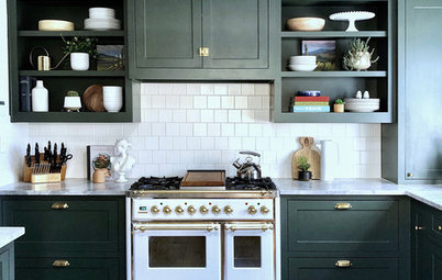
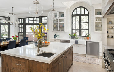
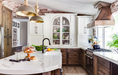
“This house had great bones,” Castro says. She deliberately refrained from putting upper cabinets in the corner at left to highlight the beautiful walnut door and its leaded glass. “This keeps a more open feeling that puts the attention on the door rather than cluttering the area up with more lines,” she says. She was careful about maintaining clean lines throughout the room to keep it visually pleasing. Notice the way the drawers and hardware line up along the peninsula.
The Shaker-style cabinets lend a more modern simplicity, but their subtle beaded detail nods to the ornate tendencies of the Victorian era. The cabinetry’s dark matte finish provides a sharp contrast to the white countertops, updating the look.
Millwork like the turned leg on the peninsula is traditional. Another detail to note is the crown molding connecting the upper cabinets and the ceiling. This was a place to add detail to the kitchen while keeping the top of the cabinets dust-free. Castro says the molding’s scale and profile is more transitional than, for example, dentil molding.
Placing the range and the microwave drawer on this side of the peninsula hides them from the dining area. An induction cooktop keeps the counter looking sleek.
Tip: Wherever possible, Castro used deep drawers instead of cabinet drawers for space-saving and ergonomic reasons. “You get 40 percent more storage space from fully extended drawers than from cabinets with doors,” she says.
Calm wall paint: Benjamin Moore; Aspen series cabinet hardware: Top Knobs
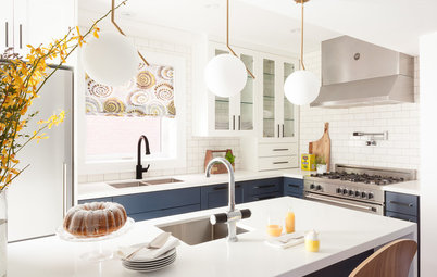
Other nods to the Victorian era are the white apron-front sink and the traditional bridge faucet. The walnut casement window over the faucet is one of the most significant original architectural details of the kitchen. The new walnut flooring fits in with the wood doors and trim, while its 4¾-inch-wide planks update the look.
The counters are a more modern material, Eternal Statuario engineered quartz by Silestone. Castro extended the new backsplash all the way to the ceiling. “Covering the entire wall unified everything on it and put the focus on the beautiful window,” she says. “A traditional backsplash that ended at the bottom of the cabinets would have created a distracting line.”
Brushed American walnut Natural Studio flooring: Kentwood Floors
Browse bridge faucets in the Houzz Shop
The backsplash is a classic marble stone cut into a relatively modern geometric pattern. “The fact that the pattern is complicated makes it work with Victorian style,” Castro says.
Find a marble mosaic tile for your backsplash on Houzz
Find a marble mosaic tile for your backsplash on Houzz
Casual-to-Formal Dining
“Though they were opening up the kitchen to the dining room, my clients still wanted to be able to entertain formally in here,” Castro says. They can extend the table for formal dinners, but they also can eat casually in the nook while perusing the Sunday paper.
“Though they were opening up the kitchen to the dining room, my clients still wanted to be able to entertain formally in here,” Castro says. They can extend the table for formal dinners, but they also can eat casually in the nook while perusing the Sunday paper.
The arched alcove is an original part of the dining room’s architecture, and Castro cleverly designed a banquette that fits into it. The streamlined style of the banquette and its fabric complement her clients’ existing midcentury modern Danish table and chairs.
Morris medium lantern: Visual Comfort
Morris medium lantern: Visual Comfort
The color of the banquette fabric ties in with the navy cabinetry across the room. Throw pillows add bright color and pattern.
Shop for throw pillows
Shop for throw pillows
Concentrated Storage
The old kitchen’s lack of storage had plagued the homeowners. To keep the main kitchen area uncluttered by too many upper cabinets, Castro carved space out of a small office off the kitchen. She lined the left wall with cabinetry outfitted for everything — there are knife blocks, spice racks, tray inserts and more behind these doors. This is also where food is stored.
The opposite side of the room still serves as command central.
Find a cabinetmaker for your project
Takeaways
More on Houzz
Read about other Kitchens of the Week
Find an architect
Shop for your kitchen
The old kitchen’s lack of storage had plagued the homeowners. To keep the main kitchen area uncluttered by too many upper cabinets, Castro carved space out of a small office off the kitchen. She lined the left wall with cabinetry outfitted for everything — there are knife blocks, spice racks, tray inserts and more behind these doors. This is also where food is stored.
The opposite side of the room still serves as command central.
Find a cabinetmaker for your project
Takeaways
- Determine which original architectural features are must-saves before starting a renovation.
- Remember that putting upper cabinets on all kitchen walls isn’t mandated. Let some spaces breathe and make up for it with smartly outfitted base cabinetry.
- Find updated ways to honor a historic home. Here the Shaker-style cabinetry is finished in a fresh dark color, and the backsplash is classic marble but composed in a modern pattern. The countertops are a traditional white, but their modern engineering makes them durable.
- Make a kitchen eat-in space more formal by thinking about the views from the table and adding an elegant light fixture.
- Do a careful inventory of everything that needs to be stored and then plan the cabinetry accordingly. Here the cabinets are outfitted for specific items like trays, spices and knives.
More on Houzz
Read about other Kitchens of the Week
Find an architect
Shop for your kitchen
Kitchen at a Glance
Who lives here: A couple of professional classical musicians
Location: Toronto
Size: About 250 square feet (23 square meters) plus a walk-in pantry
Designer: Frankie Castro of Square Footage
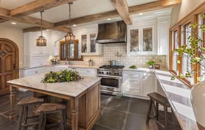
Many 120-year-old homes in north Toronto have lovely rooms full of beautiful details, with one glaring exception — the kitchen. During the Victorian era, kitchens were usually compact, spare and purely utilitarian, and they were often laid out with the assumption that one person would be doing all the cooking and prep work there before serving the food in a dining room. That was the case in this home, owned by two classical musicians whose children had grown up and moved into homes of their own.
They enlisted kitchen and bath designer Frankie Castro to remodel their kitchen. Their top priorities were honoring the home’s heritage and preserving the original architectural details while maximizing storage and creating a versatile eat-in space. The full renovation included taking out the wall between the kitchen and the dining room as well as adding pantry storage to an adjacent office.
This photo was taken from the dining space. The partial wall that meets the peninsula at left was part of the wall that came down. The section had to remain for structural purposes, so Castro designed around it. This worked out well since it provided a spot for a large countertop china cabinet.
Wyndham natural wood swivel counter stools: Arteriors Home
Find a local kitchen and bath designer on Houzz