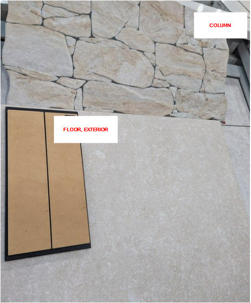
Render colours. How does it work with these cladding and pavers?
Biko Tee
10 months ago
Featured Answer
Sort by:Oldest
Comments (7)
Related Discussions
Need help deciding on render colour
Comments (28)I think this is the perfect tone next to the brick. If you see it near a light colour, in contrast it may appear that way to some, but seeing it complete has a different impression. I think it looks modern and sophisticated. I would continue to complete the porch and reserve an opinion until then. Paint as much of the rendered base also to get the full effect. Regardless it will be painted so it's worth doing, you will be repainting soon anyway. I don't agree lightening th ecolour, it will look wushu washy next to the boldness of the brick. Your rendered brick has so much feature, this grey will accent that. Paint the rest and live with it for your husband to see. Don't stop at that square. Once you've done that, only then reconsider it. Too many people stop when they start, because they're having a reaction to change, an adjustment has to be made visually, and different is not bad. Light is comfortable, but I can't count the many of period homes that professional specifiers apply this too. How many architecturally renovated homes do you see cream? One more colour I will suggest along these lines, but not better, just slightly lighter is murky water. And last case, dune. Get all three, I would bet on your husband liking dune, which proves my theory, but dont settle on the dullest colour. It won't do the facade favors. Rather it will look ho hum. Render flattens the facade, removes character, so I think it more important than before tonuse these tones to effect to compensate the loss of character. First look at it, I smiled, that's it, keep going. Hard to trust me not knowing me, but many have to success. I have been a dulux colour finalist and are recognized for my colour specifying. Please just see it out, then you can make an informed decision, one where you've had time to adjust to a change....See MoreDulux Exterior Render Colour - HELP NEEDED!!!
Comments (35)hahaha tribbletrouble...U kill me :)) No charge - every week they have a free consultant at my local dulux paint shop :) Question - Do you think Surfmist matches with Colorbond Dune ?...See MoreCan anyone help identify the render colour of this fence?
Comments (10)With a million variations through a million computer screens you will get a million suggestions and very confused while no closer to your answer. You have to do the work yourself and either get a colour match to a chip the min of a 50c piece or buy a Dulux or Taubmans fan deck and select a colour as close as you can. Alternately get a professional painter or decorator to use their fan deck or atlas to colour match for you and be prepared to pay them for their time....See MoreNew build full render front facade colours - help please!
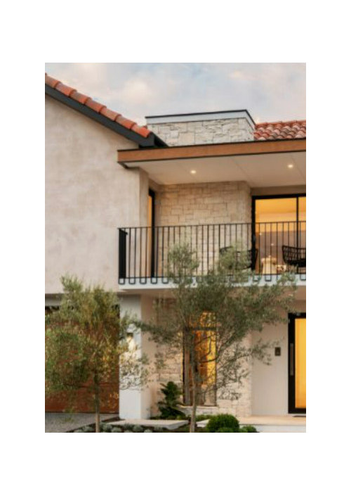
Comments (6)Imagine that -- a grey on grey house looking boring haha ! Without being too critical , it looks like a 1950's rendered house plonked on a block base that has been painted grey or charcoal . Just my opinion , but the upstairs looks too uniform , with all the windows the same . They don't really match that downstairs 'horizontal' window , but it will sort of work , assuming the window frames/trims all match ( same profile , colour , etc ) but if its not too late , I'd seriously consider making the middle of the 3 'front' upstairs windows quite a bit larger , maybe 100mm wider each side , maybe also 100mm shorter but keep all 3 windows top aligned ? Then I'd do the upstairs render in an off-white , something along the line of surfmist , as it has a bluish tinge , which will tie in with the grey , but it isn't grey . The garage door/front door combo in wood is always my favourite , and I know those pics are just designs , but add a more interesting front door -- definitely don't just carry the horizontal wood of the garage door through . Go with the same wood/stain , but have maybe 3 off-centre little square windows ( to sort of reference the other 'groups of 3 ) , or glass ( non-opening ) up one side , with a narrower door , as it looks quite wide . Downstairs colour you can go with the mid-grey and charcoal , although I'd love the 'column' done in a stacked stone -- a schist or similar -- even if it was only the bottom 800mm or so -- although the stone works best with lighter colours , so maybe you'd 'have to' do the coluns in your mid grey , the rest downstairs in the lighter grey , upstairs in the even lighter off-white -- combined with the stone , and the cedar or similar doors , its going to look at least $50k more , for $20k or less ( depending on how far along you have gotten obviously ) . Use colour , but also imaginative window placement etc , to add interest -- others may disagree , but I don't think that will make your place look too unusual or specialised ( harder to resell , because we all do at some stage ) , and will look cvlassier , more interesting . Of course , budgets and banks may not allow that , and/or you may screw your nose up , but thats my take ....See More
Biko Tee
10 months ago
bigreader
10 months agodreamer
10 months agoUser
10 months agoBiko Tee
9 months ago


Julie Herbert