Project Of The Week
Popular Houzz Series
Popular Houzz Series
Appears in
See also
Fun HouzzFrom The ProsHouzz Around The WorldProject Of The WeekStickybeak Of The WeekQuizzesCreatives At HomeAt Home With...Best Of The WeekRoom Of The WeekDesigner Profiles3 Things I Wish My Clients KnewHow Do I...Buyer's GuidesExpert EyeInnovation AlertSo Your Style Is...Spotted!Picture PerfectBefore & AfterBudget BreakdownHome TimeMade Local
A Sweet Balmain Cottage Sure to Capture Your Heart
With an extension underway, this cottage was ready for a new decorative scheme that would bring old and new together

In this Q&A series, we turn the spotlight on one thought-provoking renovation, redesign or new build. Here, interior designer Annie Bowen reveals how she brought colour, functionality and old-meets-new cohesion to a small Balmain cottage undergoing an extension for a young family.
The original kitchen.
What was this house like originally?
A single-storey, weatherboard worker’s cottage.
It had two bedrooms running off a long, narrow hallway. The rear of the house had been added to over the years, but was in essence a lean-to tacked on the back containing a kitchen, bathroom and laundry.
What wasn’t working for the client?
Everything! It was too small, completely unrenovated, had zero storage, a disjointed layout, and the kitchen and bathroom were well past their use-by date.
Need a hand with your renovation or decorative redesign? Find an interior designer near you on Houzz
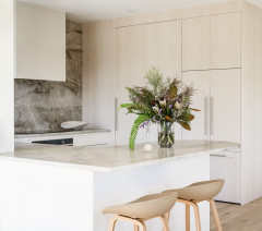
The new kitchen. Island painted in a custom blue/green: Resene; cabinetry in Modesty White: Haymes Paint; superwhite dolomite benchtops and splashback: CDK Stone; brushed-nickel tapware: Phoenix Tapware.
Tell us about the kitchen
The old kitchen in the original lean-to was completely dysfunctional. It was replaced with a contemporary entertainer’s kitchen in the new rear extension that connects to a small garden.
Although it’s a small cooking space, we maximised the length of the island to provide ample food preparation space and room for casual dining. The island’s generous size also meant we could squeeze in lots of storage – always so important in a small home.
Floor plan after works.
What did the renovation involve?
The existing cottage was gutted and the old lean-to replaced with a new extension housing an entertainer’s kitchen, a dining area and a powder room.
A new second level was added with three bedrooms and two bathrooms.
In the original front part of the house, we retained one of the two bedrooms and converted the second one into a new living room.
Rather than simply opening up the walls, we added curved arches (one leading to the hall and one to the dining area) to make the living room feel purposeful and to link it with the original design of the house. The arches mirror the shapes in the patterned ceilings in that part of the cottage.
What was your brief?
The client already had architectural plans done for the rear and upstairs extensions, but with such a compact home, there was quite a lot of finessing of the plans required to ensure each area was as practical and beautiful as it could be.
The client wanted a generous kitchen with a big island, a functional laundry and dedicated living and dining rooms.
They love colour and wanted a bit of ‘bling’ – hence the brushed-brass tapware. They wanted their home to be fun, youthful and comfortable.
The original living room, now the dining room.
What was your scope of works?
What was your scope of works?
- Floor planning and layout, and collaborating with the architect to ensure the spaces were functional.
- Exterior and interior colour palettes.
- Kitchen, bathrooms and laundry design.
- Joinery design.
- All colours, finishes, fixtures, fittings, furniture, rugs and styling.
- Lighting selection.
- A custom-designed dining table.
Did you also make any spatial or structural changes?
Yes. Originally there was a dining booth planned near the back doors, but this was just too tight. We converted this section into a laundry, hidden behind joinery doors, and moved the dining space into the end of the old house, with a window seat and a custom dining table.
We worked on the design of the powder room under the stairs and spent quite a bit of time configuring the small, main ensuite to ensure that it would be functional.
Voss engineered timber flooring: Woodcut; walls in the original part of the house painted in Smoky Silhouette: Haymes Paint; trims painted in Modesty White: Haymes Paint; Crescendo pendant above dining table: South Drawn (formerly Lumil).
What challenges did you face?
It’s a small house, even with the extension, so we had to maximise every possible opportunity to add storage.
We put the laundry into a cupboard near the back doors. It was the only space to fit it and still provide storage for brooms and linen.
What challenges did you face?
It’s a small house, even with the extension, so we had to maximise every possible opportunity to add storage.
We put the laundry into a cupboard near the back doors. It was the only space to fit it and still provide storage for brooms and linen.
Where did you focus your attention and budget?
We always start with a colour palette, especially with older homes like this where we have some beautiful architecture to play with.
We focused on the colour of the joinery and the detail in the kitchen island, including a beautiful natural stone for the benchtops and splashback.
We worked with the client to put the budget towards certain areas and pulled back on others. For example, they really invested in the beautiful stone and joinery in the kitchen, the finishes and furniture for the dining room and the lighting. We pulled back on the tapware to save money, going for a good quality mid-range brand.
Tell us about the arches in the new living room
It was really a way to link the old house with the new extension. The small living room used to be a bedroom; I didn’t want the opening to just be square as I think it would have been obvious the room was once a bedroom. By added the arches, we were able to connect the space to the hall and dining area, frame the furniture and reflect the curved pattern in the ceiling.
The curves also soften the view from the more angular lines in the modern kitchen as you look back to the old cottage.
An original bedroom, now the guest room/play room.
Did you restore any original features or highlight them in any way?
Yes, we repaired the beautiful patterned ceilings and cornices in the old cottage, and the timber fretwork in the hall was repaired and painted.
We used colour and contrast to highlight the heritage features – large architraves and skirtings and the patterned ceilings.
Brushed-brass tapware: Phoenix Tapware.
What was the budget?
Around AU$1.2 million.
Where did most of it go?
The renovation, extension and joinery.
What was the budget?
Around AU$1.2 million.
Where did most of it go?
The renovation, extension and joinery.
The main family bathroom. Bath: Cass Brothers.
Tell us about the design of the main bathroom
With two small children, the client really needed a bath. I don’t normally love a shower-over-bath set-up, but in this instance we didn’t have any other option.
It’s a compact bath but it fits perfectly in the space and the addition of feature tiles adds a bit of fun.
Superwhite dolomite vanity top: CDK Stone.
What are the main ingredients in the colour and materials palette?
In the old cottage, we used a soft grey on the walls (Smoky Silhouette from Haymes Paint), contrasted with crisp white trims (Modesty White from Haymes Paint). This allowed us to enhance the heritage features of the home.
We then carried the same white through to the walls of the contemporary extension and the white joinery.
The daughter’s bedroom. Walls painted in Pretty in Pink: Porter’s Paints.
In the bedrooms, we chose a textured grey carpet from Bremworth.
The kids’ rooms are compact, but we used custom joinery and pops of colour on the walls to add energy.
And in the kitchen we used a beautiful custom green colour for the island and Superwhite dolomite for the benchtops and splashback.
In the bedrooms, we chose a textured grey carpet from Bremworth.
The kids’ rooms are compact, but we used custom joinery and pops of colour on the walls to add energy.
And in the kitchen we used a beautiful custom green colour for the island and Superwhite dolomite for the benchtops and splashback.
The main bedroom.
What are the defining features of the house now?
What are the defining features of the house now?
- Restored heritage features
- A soft colour palette.
- A modern entertainer’s kitchen with natural stone benches.
- Maximised storage opportunities.
- Beautiful lighting.
The powder room. Sunbird wallpaper: These Walls; basin: Robert Gordon.
The client loves colour and pattern, so we added wallpaper to the powder room. The blue basin is handmade by the Australian family-run pottery firm Robert Gordon. We chose the blue as it worked with the colour palette. A little bit of unexpected colour is great in a guest powder room.
Your turn
Are you as charmed by this redesign as we are? Tell us in the Comments below. And don’t forget to save these images for your own renovation inspiration, like this story and join the conversation.
More
Like to see another heritage home makeover? Don’t miss this Sydney Houzz: From Empty Shell to a Luxe, Layered Delight
Who lives here: A couple with two young children
Location: Balmain, NSW
Number of bedrooms and bathrooms before works: Two bedrooms, one bathroom
Number of bedrooms and bathrooms after works: Four bedrooms, 2.5 bathrooms
Approximate size of house before works: 82.5 square metres
Approximate size of house after works: 137 square metres
Budget: Around AU$1.2 million
Interior design: Annie Bowen Design
Architect: Daniel Cowley
Builder: Signature Build