
Houzz Tours
London Houzz: How an Angular Design Solved a Clash With Council
Geometric volumes and a relocated staircase unlocked an improved layout and access to light in this Victorian home

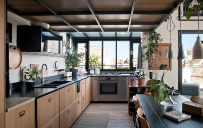
When Lizzie Fraher of Fraher & Findlay took on the design of this derelict UK house, she looked to its previously industrial location in London’s King’s Cross for inspiration. This was particularly the case for the striking new steel staircase, which now runs through the centre of the building, transforming the layout. “The house had no connection to the garden and very poor connection between all levels of the building,” says Fraher. Not anymore!
As part of a full renovation, the house got a new rear extension and a light-flooded double-height room, an attic conversion and an enhanced sense of connection between the spaces. Throughout, pale oiled ash joinery is punctuated by black metal detailing that references nearby St Pancras station. In terms of sustainability, the house was fully insulated internally, with upgraded glazing and an insulating, wildlife-friendly green roof on the new extension.
As part of a full renovation, the house got a new rear extension and a light-flooded double-height room, an attic conversion and an enhanced sense of connection between the spaces. Throughout, pale oiled ash joinery is punctuated by black metal detailing that references nearby St Pancras station. In terms of sustainability, the house was fully insulated internally, with upgraded glazing and an insulating, wildlife-friendly green roof on the new extension.
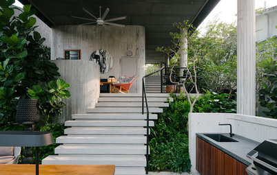
Externally, the shape of the new extension is echoed in the garden. “The angular design creates a hidden seating space and gives a bit of what’s called ‘complex geometry’,” says Fraher. “The more complex it is – ie, the more there is to look at – the more there is for the eye to take in and so the bigger it feels.”
The space also has a Corten steel water feature at the back.
The space also has a Corten steel water feature at the back.
The crumbling original two-storey outrigger structure was demolished and the top half rebuilt above the new extension. It has new glazing in a deliberately contemporary style. “We wanted it so that you could very easily read the extension as being a new part of the building,” says Fraher.
The renovation also included a mansard loft conversion (typically built at the rear of a property, with a flat roof), which is unusual for a heritage conservation area. “We got it,” says Fraher, “because we made a joint application with the neighbours,” arguing that the design would re-establish a consistent roofline across the back of the houses.
Renovating? Find reviewed architects in your area on Houzz and browse images of their previous projects
Inside the extension, the dramatic effect of the glazing becomes clearer. An extended skylight stretches up through the space and draws the outside in. The green upholstery of the bench seat enhances the effect.
The space is carefully designed to be purposeful, with everything bespoke. “Because nothing is challenging the space, it feels bigger,” says Fraher. Joinery in oiled ash adds warmth while keeping the aesthetic pale and airy.
The space is carefully designed to be purposeful, with everything bespoke. “Because nothing is challenging the space, it feels bigger,” says Fraher. Joinery in oiled ash adds warmth while keeping the aesthetic pale and airy.
The homeowner worked with a local antique and art dealer to add artwork and decorative pieces.
The clean-lined bespoke kitchen has oiled ash fronts with cut-out handles, while the benchtops, waterfall island and splashback are all marble. The marble runs along the wall of cabinetry, continuing the horizontal benchtop line across the room.
The floor is polished concrete, while brass pendants inject warmth.
The floor is polished concrete, while brass pendants inject warmth.
The continued benchtop also runs beneath a breakfast station. “Visually, it suggests something’s happening behind it,” says Fraher.
There’s more concealed storage in the base units…
…As well as within the kitchen island, which also contains the sink, an integrated dishwasher and a wine fridge.
Browse beautifully designed Australian kitchens with marble benchtops
Browse beautifully designed Australian kitchens with marble benchtops
You can see the upper wall of the house in this view. There are multiple skylights, but, as the sun hits the front of the building most of the day, this room remains cool.
“This is something to be mindful of,” says Fraher. “It’s one of the benefits of working with an architect, who’s trained to design buildings that sit well within their environments, assessing their orientation and surroundings, as well as their potential for solar gain and overheating. It’s also about harnessing that power [of the sun] to make the building as passive as possible.”
Also visible from this angle is the double height of the space. The next floor starts just behind the shelves on the left and the visible part here is a study.
The dark timber detail on this bespoke ash cabinet is American black walnut. The colour ties into black detailing around the rest of the house, referencing the formerly industrial local area. The walnut is hand-beaten and the dimples highlight the craftsmanship by referencing hand tools.
The interior of the cabinet is designed as a bar, with storage for a variety of glasses and bottles.
At the far end of the kitchen is the new staircase, with the area in front intended as a ‘snug’ or cosy sitting area. The tall cupboard was incorporated to store coats.
Next to that, the cavity beneath the stairs has been turned into pull-out storage.
On the other side of the staircase, at the front of the house, is another sitting area, with the potential to double as a study.
The room features more bespoke joinery to maximise the space. “We took an original tongue-and-groove – a very Victorian detail – but made it contemporary, particularly with the oak-lined recessed handles,” says Fraher.
The room features more bespoke joinery to maximise the space. “We took an original tongue-and-groove – a very Victorian detail – but made it contemporary, particularly with the oak-lined recessed handles,” says Fraher.
The cabinetry also contains a little reading nook under the stairs.
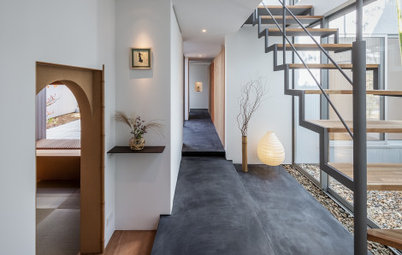
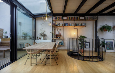
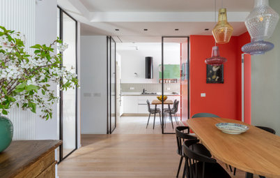
One of the most significant structural alterations to the internal layout was the relocation of the staircase, seen here on the ground floor – one level up from the kitchen.
Originally, as is traditional in a house of this era, the staircase hugged the hallway wall and ran from front to back. The result of the traditional orientation is that you get one big room at the front and a small room behind. Fraher’s new staircase design runs across the house and is bang in the middle of it, which creates more evenly sized rooms.
The powder-coated steel balustrade, stretching from floor to ceiling, references the area’s early Victorian industrial buildings and nearby St Pancras railway station. The design also allows light to flow through the structure.
The glass door on the left leads to a newly created lobby and the front door.
From the front door you can see the reorientated staircase, just visible on the left.
The connection with the rear garden starts here – right at the front door. “A direct view to the garden was important,” says Fraher. “We always try to do that.”
The connection with the rear garden starts here – right at the front door. “A direct view to the garden was important,” says Fraher. “We always try to do that.”
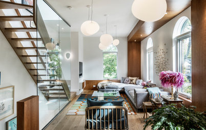
At the front of the ground floor is a living room, which is open-plan with the area on the other side of the staircase (see next photo).
There were no period features remaining in the property when Fraher came in to redesign it. As such, she opted to create a sleek new contemporary concrete fireplace in the location of the original one.
There were no period features remaining in the property when Fraher came in to redesign it. As such, she opted to create a sleek new contemporary concrete fireplace in the location of the original one.
On the other side of the staircase is a reading area and a secondary living room.
The dado and wall panelling across the spaces echo the original Victorian style, but, with a contemporary bead, are a deliberately modern take on the idea.
The low steps on the left lead up to the study, which looks out over the kitchen and dining room below.
The dado and wall panelling across the spaces echo the original Victorian style, but, with a contemporary bead, are a deliberately modern take on the idea.
The low steps on the left lead up to the study, which looks out over the kitchen and dining room below.
The first-floor study area is behind the new window at the back of the house. The immediate view out of it is of the extension’s green roof.
It also has a Juliet balcony overlooking the dining room below.
It also has a Juliet balcony overlooking the dining room below.
Fraher made good use of the period property’s original underground coal vaults, located beneath the front entrance. By lowering the floor slightly, it became a useable space, into which she designed a petite bathroom, as well as a small laundry area (not shown). The curved ceiling gives a hint of the room’s original shape.
Due to the staircase relocation, the bedrooms are now equal sizes, front and back. Because the space was previously arranged to provide one single bedroom and one very generously proportioned double bedroom, the result is two small doubles.
Fraher’s design cleverly maximises the space. This bedroom has an ensuite with a shower behind a sliding pocket door. On the other side, she fitted in a wardrobe.
Fraher’s design cleverly maximises the space. This bedroom has an ensuite with a shower behind a sliding pocket door. On the other side, she fitted in a wardrobe.
With sloping walls and sash windows, the new mansard attic conversion feels as though it’s always been part of the house. It contains the main bedroom, ensuite (the door to the left here) and a dressing area.
In the ensuite, the industrial references continue, with a powder-coated steel frame for the vanity unit. The basin, in Glacier White Corian, keeps the look clean and minimal, while a generous ash drawer warms things up.
A clever layout means the small bathroom accommodates a bath as well as a walk-in shower. The same Corian forms the bath top, panel and niche shelf.
An orange stool references the upholstery downstairs.
An orange stool references the upholstery downstairs.
A compact dressing area complete with a bench seat by the window finishes the bedroom. It’s the perfect spot for gazing out across the early Victorian and industrial buildings that inspired this home’s redesign.
Your turn
What’s your favourite detail in the contemporary update of this period house? Let us know in the Comments. And if you liked this story, give it a thumbs up and save the images. Join the conversation.
More
Travel from the UK to Australia with this charming Queensland Houzz: A Cosy, 90-Year-Old Coastal Cottage Is Reborn

Sponsored
Sponsored
House at a Glance
Who lives here: A man owns this home
Location: London, UK
Property: An early Victorian terrace in a heritage conservation area
Size: Three bedrooms and three bathrooms
Architect and interior designer: Lizzie Fraher of Fraher & Findlay
Garden design: Urban Roots Landscapes
Your first thought might not be that the unusual shape of Fraher’s rear-extension design was down to planning restrictions, because it looks so dramatic, but it was. “We wanted to extend in order to increase the kitchen space at this lower-ground floor level,” she says, “but planning [at the local council] made us fold back the design so it didn’t impose on the neighbours’ extension.”
The result is a strikingly angled addition with a huge, pivoting door. When viewed from the interior, the geometry leads the eye towards the garden beds beyond, boosting the sense of space inside, as well as the indoor-outdoor connection.