Project Of The Week
Architecture
Popular Houzz Series
Popular Houzz Series
Appears in
See also
Fun HouzzFrom The ProsHouzz Around The WorldProject Of The WeekStickybeak Of The WeekQuizzesCreatives At HomeAt Home With...Best Of The WeekRoom Of The WeekDesigner Profiles3 Things I Wish My Clients KnewHow Do I...Buyer's GuidesExpert EyeInnovation AlertSo Your Style Is...Spotted!Picture PerfectBefore & AfterBudget BreakdownHome TimeMade Local
Warmth, Light & Garden Views For a Dull, Inner-City Terrace
A characterless pre-sale renovation masked the potential of this Victorian terrace, until architects drew it out

In this Q&A series, we turn the spotlight on one thought-provoking renovation each week. Here, director Nick Travers and associate architect Bianca Baldi, both of Techne Architecture + Interior Design, reveal how they took a cramped and poorly renovated Victorian terrace and added more space, light and personality with a considered makeover and a new pavilion extension.
The rear before works
What was the house like originally?
Travers says:
A two-storey, Victorian-era home in good condition, with a rather cramped kitchen/living/dining extension to the rear.
What was the house like originally?
Travers says:
A two-storey, Victorian-era home in good condition, with a rather cramped kitchen/living/dining extension to the rear.
Living room before works
Itching to renovate? Find a local architect near you on Houzz to make it happen
Itching to renovate? Find a local architect near you on Houzz to make it happen
What was your scope of works?
Travers says:
A renovation and extension.
Travers says:
A renovation and extension.
What was your brief?
Travers says:
Initially, the client approached us to undertake a full interior refurbishment only. The house was in good condition and had recently been renovated, but it was very much a generic fit-out for sale.
The client particularly didn’t like the Carrara marble used extensively throughout. They wanted to personalise the house.
We also identified that the existing extension was too cramped, and could be significantly improved by being replaced with a new pavilion structure.
What were the client’s must-haves?
Travers says:
Travers says:
- A design that catered to their growing family.
- To showcase the home’s original heritage features.
The new ground-floor plan
What exactly did you do?
Travers says:
What exactly did you do?
Travers says:
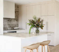
- Demolished the original extension and replaced it with a new pavilion structure housing a kitchen/family living area/dining.
- Incorporated a proper laundry to replace the previous European-style laundry.
- Created two separate living areas (the formal living in the original part of the house and a new family living area in the extension).
- Renovated the bathrooms.
- Preserved the home’s historical details within a design that feels smart and contemporary.
- Incorporated a bespoke liquor cabinet.
- Restored the original cornices, ceiling roses and five fireplaces.
The new first-floor plan
What look and feel did you want to create?
Travers says:
Contemporary but sympathetic to the Victorian era of the existing house.
We wanted the house to be light-filled, elegant and robust enough to handle family life. It needed to be a private retreat and have an architectural design that maximised the outlook over the landscaped garden.
Our client wanted tactility and warmth in the design, which is a hallmark of all our project work.
What was your thinking behind the colours and materials palette?
Travers says:
We used materiality that complemented the existing period features and aimed to achieve a seamless threshold between old and new.
Tranquillity was a key theme that we achieved with soft-toned finishes and textures, and fine black detailing through the fireplace design, curtain rails, steel windows and door frames.
The addition of V-groove panelling to the existing fireplace walls added a layer of texture that complemented the contemporary fireplace details, without taking away from the heritage feel.
What challenges did you face?
Baldi says:
We had lots of space-planning revisions, especially for the kitchen. We needed to fit the client’s existing Mark Tuckey eight-seater dining table in the new part of the space.
Baldi says:
We had lots of space-planning revisions, especially for the kitchen. We needed to fit the client’s existing Mark Tuckey eight-seater dining table in the new part of the space.
The new bespoke liquor cabinet features a pull-out leather drawer, lighting and doors that fold back into the joinery for a seamless look.
What are the defining features of the house now?
Travers says:
Travers says:
- The strong connection to garden.
- The steel-framed glazing and windows throughout the old and new spaces.
- Connection between the old and new parts of the house.
Where did most of the $500,000 budget go?
Travers says:
To the extension.
Travers says:
To the extension.
Tell us about the garden
Travers says:
The garden was well established with large trees, and the extension was designed around its visuals.
Tranquillity was the theme throughout the space and the garden was a major thread to that story. We linked the living and garden spaces together with full-height windows.
Travers says:
The garden was well established with large trees, and the extension was designed around its visuals.
Tranquillity was the theme throughout the space and the garden was a major thread to that story. We linked the living and garden spaces together with full-height windows.
How do the old and new parts of the house sit together?
Travers says:
By using a complementary colour and materials palette in both old and new parts, the two areas blend seamlessly together. The consistent balance between warm and cool tones assists with this.
Travers says:
By using a complementary colour and materials palette in both old and new parts, the two areas blend seamlessly together. The consistent balance between warm and cool tones assists with this.
The family living room in the new extension
Baldi says:
We had a lot of revisions on the exact pitch of the roof structure, working out shadowing and natural lighting coming into the space.
Originally, we had designed a louvred screen element to sit high up in the pitch to reduce the amount of sunlight. In the end, the screen louvres were not installed because the space had the right amount of light.
Did you do any work to the facade?
Travers says:
We specified a new front door and front fence. The tiles were existing.
Travers says:
We specified a new front door and front fence. The tiles were existing.
Interior materials palette
- White-oiled oak flooring.
- Artedomus Maximum Aster Mercury large-format porcelain panels to the kitchen bechtops.
- Volker Haug Big Kick pendant in the kitchen.
- Jardan Hudson sofa in the family room.
- Jardan Andy sofa in the formal living room.
- Living Edge Muuto Outline chairs.
- Living Edge Around coffee tables.
Exterior materials palette
- Artedomus Fiandre Core Shade Cloudy Structured porcelain pavers.
Your turn
What’s the one standout feature in this project for you? Tell us in the Comments below. And don’t forget to save these images, like this story and join the conversation.
More
Want to read about another heritage home makeover? Don’t miss this Before & After: A New Tune for a Pianist’s Art Deco Flat
What’s the one standout feature in this project for you? Tell us in the Comments below. And don’t forget to save these images, like this story and join the conversation.
More
Want to read about another heritage home makeover? Don’t miss this Before & After: A New Tune for a Pianist’s Art Deco Flat
Answers by Nick Travers, director, and Bianca Baldi, associate architect, both at Techne Architecture + Interior Design
Who lives here: A couple with two young children
Location: Carlton North, Victoria
Bedrooms and bathrooms before works: Three bedrooms, two bathrooms and a powder room
Bedrooms and bathrooms after works: Three bedrooms and three bathrooms
House size before works: Around 215 square metres
House size after works: Around 220 square metres
Budget: Around $500,000
Architecture and interior design: Techne Architecture + Interior Design
Builder: Figurehead
Landscape architecture: Eckersley Garden Architecture