
1923 Kitchen Remodel- After photos
Traditional Kitchen, Seattle
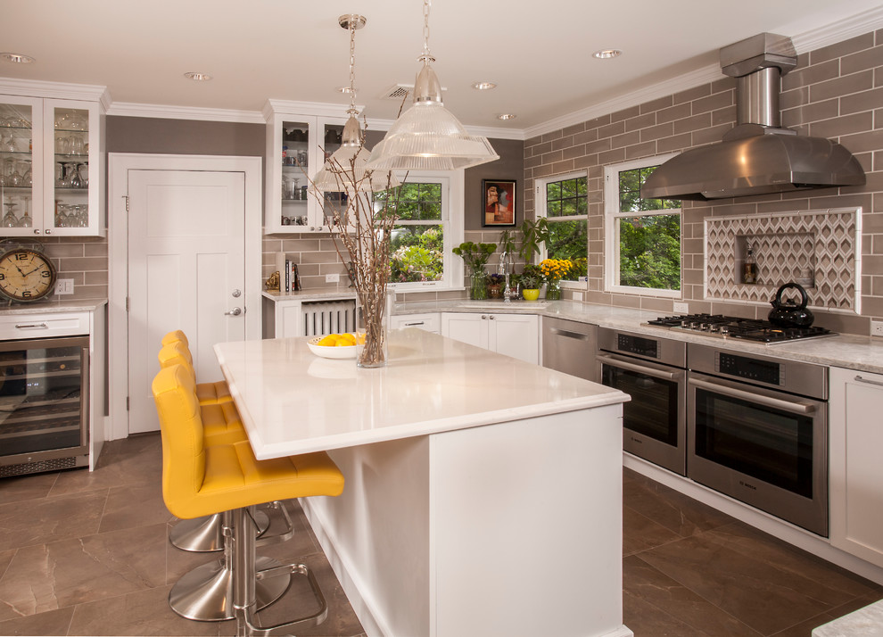
This is major kitchen remodel done on a tight budget!
1st thing I noticed in the original kitchen (please refer to before pictures) was that the ceiling height was lower than both the adjacent rooms, and of course the soffit cabinets made everything lower so I suggested we take the ceiling height up the match the other rooms. Through process of elimination I found the best place for the sink was in the corner because she would now have 2 windows for views of the neighborhood and a place to put the plants that once sat on the floor in the “breakfast nook”. Moving the gas cook top the exterior wall allowed for ease of installation and venting out also this was the best place to put it given the amount of windows. It is very important to me to design every kitchen with surface space on either side of the cook top so that you have enough room for baking racks, cookie sheets, etc.. to spread out. The solution to the double oven request was to put 2 of them under the counter instead of stacking them which would have taken up surface space. During the design meeting I asked how often to you close that door to the dining room? To which they replied “never, we always leave it open”. I knew then that door was a waste of space so I decided to toss that to make a bigger opening to make the kitchen more inviting as you enter from the dining room. Another thing I always talk about during kitchen designs is “landing zone”. You must have a surface to place things on once you enter the kitchen, be it groceries, keys, phone, wallet, etc.. But I find it functional and it keeps you from walking into a room with large things on either side of you. Again relating back to making sure the kitchen felt inviting. Definitely wanted make sure we had as much pullout kitchen accessories and deep drawers for ease of use because we did not have room for a lot of upper cabinets. I decided to take full advantage of those large open windows buy taking the tile to the ceiling and picture framing them with tile liners. The effect is that you see more light coming in because of the contrast of the darker tile. My solution to the clients request to get as much light in from the adjacent family room was to take out that kitchen desk and frame in a large opening. I needed to make sure that opening made a statement so instead of doing a standard door casing I added architectural details of molding around the doorway and highlighted by insetting the molding into the wall and painting the inset a different color. Once I was able to achieve bringing in the most light, I decided I could bring in a little drama by going with a dark wall color! It is okay to use dark wall colors as long as you have enough light so it still feels inviting. My solution to the radiator was to move it over to give us just enough room to squeeze in another cabinet for capturing as much storage as I could. I needed to make sure I had that “landing zone” so I wanted to place a counter top over the radiator, but how? I used a decorative post to give the kitchen a little something extra and to tie back in with the cabinets. Then I added a counter top above the wine refrigerator but both had to be the same height because they were across from each other. So what a great challenge this turned out be. Because of me needing to make the wine refrigerator counter top higher to match the other counter top, I was able to fit in a little drawer for wine accessories above the wine refrigerator. More storage! Yes!! Painting the radiator white to give it a fresh new look added a lot and was relatively simple in the grand scheme of things. Solution to pantry was to make it a cabinet pantry so that we didn’t have to work around the thickness of walls and a door. Island size was determined by NKBA standards of having enough room for traffic flow around the kitchen which allowed us 3 chairs. And if someone ever wanted to, they could use the counter above the radiator as a surface to work on. Of course we updated all the lighting, made sure we had under counter lighting, and they are all LED. Lastly porcelain floor tiles , ceramic backsplash and quartz counter tops were the material of choice for ease of maintenance and budget.
2 ovens below cooktop