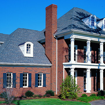
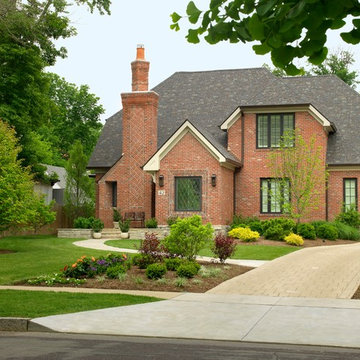
Search results for "Dark brick house" in Home Design Ideas
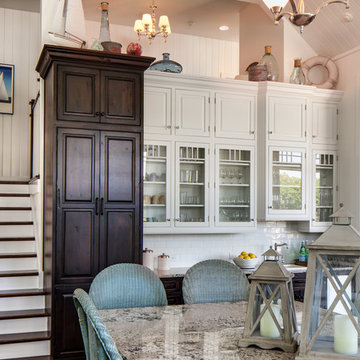
This beautiful lake house kitchen design was created by Kim D. Hoegger at Kim Hoegger Home in Rockwell, Texas mixing two-tones of Dura Supreme Cabinetry. Designer Kim Hoegger chose a rustic Knotty Alder wood species with a dark patina stain for the lower base cabinets and kitchen island and contrasted it with a Classic White painted finish for the wall cabinetry above.
This unique and eclectic design brings bright light and character to the home.
Request a FREE Dura Supreme Brochure Packet: http://www.durasupreme.com/request-brochure
Find a Dura Supreme Showroom near you today: http://www.durasupreme.com/dealer-locator
Learn more about Kim Hoegger Home at:
http://www.houzz.com/pro/kdhoegger/kim-d-hoegger
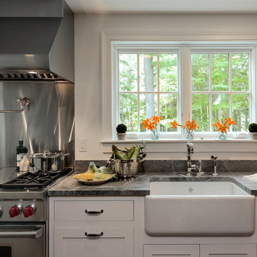
Rob Karosis
Photo of a country kitchen in New York with a farmhouse sink, shaker cabinets, white cabinets, granite benchtops, metallic splashback, metal splashback and stainless steel appliances.
Photo of a country kitchen in New York with a farmhouse sink, shaker cabinets, white cabinets, granite benchtops, metallic splashback, metal splashback and stainless steel appliances.
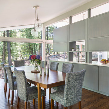
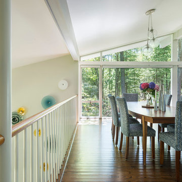
Mid-Century Remodel on Tabor Hill
This sensitively sited house was designed by Robert Coolidge, a renowned architect and grandson of President Calvin Coolidge. The house features a symmetrical gable roof and beautiful floor to ceiling glass facing due south, smartly oriented for passive solar heating. Situated on a steep lot, the house is primarily a single story that steps down to a family room. This lower level opens to a New England exterior. Our goals for this project were to maintain the integrity of the original design while creating more modern spaces. Our design team worked to envision what Coolidge himself might have designed if he'd had access to modern materials and fixtures.
With the aim of creating a signature space that ties together the living, dining, and kitchen areas, we designed a variation on the 1950's "floating kitchen." In this inviting assembly, the kitchen is located away from exterior walls, which allows views from the floor-to-ceiling glass to remain uninterrupted by cabinetry.
We updated rooms throughout the house; installing modern features that pay homage to the fine, sleek lines of the original design. Finally, we opened the family room to a terrace featuring a fire pit. Since a hallmark of our design is the diminishment of the hard line between interior and exterior, we were especially pleased for the opportunity to update this classic work.
Find the right local pro for your project
Our goal on this project was to create a live-able and open feeling space in a 690 square foot modern farmhouse. We planned for an open feeling space by installing tall windows and doors, utilizing pocket doors and building a vaulted ceiling. An efficient layout with hidden kitchen appliances and a concealed laundry space, built in tv and work desk, carefully selected furniture pieces and a bright and white colour palette combine to make this tiny house feel like a home. We achieved our goal of building a functionally beautiful space where we comfortably host a few friends and spend time together as a family.
John McManus
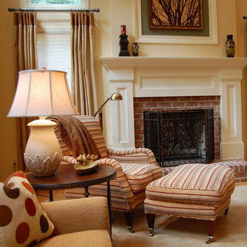
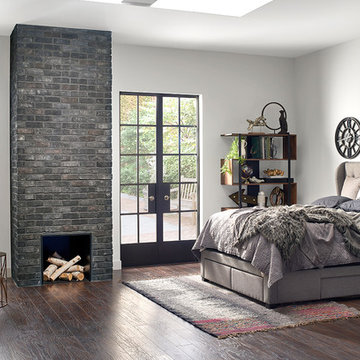
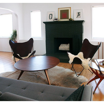
The Beginning: Soaring cathedral ceilings in a room flooded with light from arched windows and a view to the woods beyond.
hhm
The Concept: Refresh the dark, dated, brick fireplace; add much-needed architectural details for visual impact; create a cozy, welcoming style within this expanse of space.
Mid-Century Remodel on Tabor Hill
This sensitively sited house was designed by Robert Coolidge, a renowned architect and grandson of President Calvin Coolidge. The house features a symmetrical gable roof and beautiful floor to ceiling glass facing due south, smartly oriented for passive solar heating. Situated on a steep lot, the house is primarily a single story that steps down to a family room. This lower level opens to a New England exterior. Our goals for this project were to maintain the integrity of the original design while creating more modern spaces. Our design team worked to envision what Coolidge himself might have designed if he'd had access to modern materials and fixtures.
With the aim of creating a signature space that ties together the living, dining, and kitchen areas, we designed a variation on the 1950's "floating kitchen." In this inviting assembly, the kitchen is located away from exterior walls, which allows views from the floor-to-ceiling glass to remain uninterrupted by cabinetry.
We updated rooms throughout the house; installing modern features that pay homage to the fine, sleek lines of the original design. Finally, we opened the family room to a terrace featuring a fire pit. Since a hallmark of our design is the diminishment of the hard line between interior and exterior, we were especially pleased for the opportunity to update this classic work.
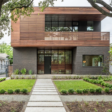
The Kipling house is a new addition to the Montrose neighborhood. Designed for a family of five, it allows for generous open family zones oriented to large glass walls facing the street and courtyard pool. The courtyard also creates a buffer between the master suite and the children's play and bedroom zones. The master suite echoes the first floor connection to the exterior, with large glass walls facing balconies to the courtyard and street. Fixed wood screens provide privacy on the first floor while a large sliding second floor panel allows the street balcony to exchange privacy control with the study. Material changes on the exterior articulate the zones of the house and negotiate structural loads.
Photo by Peter Molick
Reload the page to not see this specific ad anymore
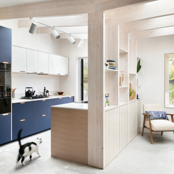
Amos Goldreich Architecture has completed an asymmetric brick extension that celebrates light and modern life for a young family in North London. The new layout gives the family distinct kitchen, dining and relaxation zones, and views to the large rear garden from numerous angles within the home.
The owners wanted to update the property in a way that would maximise the available space and reconnect different areas while leaving them clearly defined. Rather than building the common, open box extension, Amos Goldreich Architecture created distinctly separate yet connected spaces both externally and internally using an asymmetric form united by pale white bricks.
Previously the rear plan of the house was divided into a kitchen, dining room and conservatory. The kitchen and dining room were very dark; the kitchen was incredibly narrow and the late 90’s UPVC conservatory was thermally inefficient. Bringing in natural light and creating views into the garden where the clients’ children often spend time playing were both important elements of the brief. Amos Goldreich Architecture designed a large X by X metre box window in the centre of the sitting room that offers views from both the sitting area and dining table, meaning the clients can keep an eye on the children while working or relaxing.
Amos Goldreich Architecture enlivened and lightened the home by working with materials that encourage the diffusion of light throughout the spaces. Exposed timber rafters create a clever shelving screen, functioning both as open storage and a permeable room divider to maintain the connection between the sitting area and kitchen. A deep blue kitchen with plywood handle detailing creates balance and contrast against the light tones of the pale timber and white walls.
The new extension is clad in white bricks which help to bounce light around the new interiors, emphasise the freshness and newness, and create a clear, distinct separation from the existing part of the late Victorian semi-detached London home. Brick continues to make an impact in the patio area where Amos Goldreich Architecture chose to use Stone Grey brick pavers for their muted tones and durability. A sedum roof spans the entire extension giving a beautiful view from the first floor bedrooms. The sedum roof also acts to encourage biodiversity and collect rainwater.
Continues
Amos Goldreich, Director of Amos Goldreich Architecture says:
“The Framework House was a fantastic project to work on with our clients. We thought carefully about the space planning to ensure we met the brief for distinct zones, while also keeping a connection to the outdoors and others in the space.
“The materials of the project also had to marry with the new plan. We chose to keep the interiors fresh, calm, and clean so our clients could adapt their future interior design choices easily without the need to renovate the space again.”
Clients, Tom and Jennifer Allen say:
“I couldn’t have envisioned having a space like this. It has completely changed the way we live as a family for the better. We are more connected, yet also have our own spaces to work, eat, play, learn and relax.”
“The extension has had an impact on the entire house. When our son looks out of his window on the first floor, he sees a beautiful planted roof that merges with the garden.”
With an atmosphere that feels almost frozen in time, Williamsburg has captured a snapshot of Colonial America unlike anywhere else in the US. Inspired by the classic, 18th-century architecture of historic cities across the US, our Standard-tier Williamsburg brick features a warm red brick base with subtle charcoal accents for a traditional exterior cladding look modernized by Triangle Brick Company's revolutionary manufacturing processes. Interested in a more rustic and tumbled look? Check out our Portsmouth brick.
TundraBrick is a classically-shaped profile with all the surface character you could want. Slightly squared edges are chiseled and worn as if they’d braved the elements for decades. TundraBrick is roughly 2.5″ high and 7.875″ long.
Stone: TundraBrick - Ironside
Get a Sample of TundraBrick: https://shop.eldoradostone.com/products/tundrabrick-sample
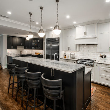
Our clients were living in a Northwood Hills home in Dallas that was built in 1968. Some updates had been done but none really to the main living areas in the front of the house. They love to entertain and do so frequently but the layout of their house wasn’t very functional. There was a galley kitchen, which was mostly shut off to the rest of the home. They were not using the formal living and dining room in front of your house, so they wanted to see how this space could be better utilized. They wanted to create a more open and updated kitchen space that fits their lifestyle. One idea was to turn part of this space into an office, utilizing the bay window with the view out of the front of the house. Storage was also a necessity, as they entertain often and need space for storing those items they use for entertaining. They would also like to incorporate a wet bar somewhere!
We demoed the brick and paneling from all of the existing walls and put up drywall. The openings on either side of the fireplace and through the entryway were widened and the kitchen was completely opened up. The fireplace surround is changed to a modern Emser Esplanade Trail tile, versus the chunky rock it was previously. The ceiling was raised and leveled out and the beams were removed throughout the entire area. Beautiful Olympus quartzite countertops were installed throughout the kitchen and butler’s pantry with white Chandler cabinets and Grace 4”x12” Bianco tile backsplash. A large two level island with bar seating for guests was built to create a little separation between the kitchen and dining room. Contrasting black Chandler cabinets were used for the island, as well as for the bar area, all with the same 6” Emtek Alexander pulls. A Blanco low divide metallic gray kitchen sink was placed in the center of the island with a Kohler Bellera kitchen faucet in vibrant stainless. To finish off the look three Iconic Classic Globe Small Pendants in Antiqued Nickel pendant lights were hung above the island. Black Supreme granite countertops with a cool leathered finish were installed in the wet bar, The backsplash is Choice Fawn gloss 4x12” tile, which created a little different look than in the kitchen. A hammered copper Hayden square sink was installed in the bar, giving it that cool bar feel with the black Chandler cabinets. Off the kitchen was a laundry room and powder bath that were also updated. They wanted to have a little fun with these spaces, so the clients chose a geometric black and white Bella Mori 9x9” porcelain tile. Coordinating black and white polka dot wallpaper was installed in the laundry room and a fun floral black and white wallpaper in the powder bath. A dark bronze Metal Mirror with a shelf was installed above the porcelain pedestal sink with simple floating black shelves for storage.
Their butlers pantry, the added storage space, and the overall functionality has made entertaining so much easier and keeps unwanted things out of sight, whether the guests are sitting at the island or at the wet bar! The clients absolutely love their new space and the way in which has transformed their lives and really love entertaining even more now!
This cottage style architecture was created by adding a 2nd floor and garage to this small rambler.
Photography: Sicora, Inc.
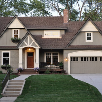
Photo of a traditional exterior in Minneapolis with wood siding and a gable roof.
Photo of a traditional exterior in Minneapolis with wood siding and a gable roof.
Reload the page to not see this specific ad anymore
The Stacked Brick Extension is a ground floor wrap around extension to a small Victorian terraced house in Stoke Newington.
The original house had an odd layout, with the main bathroom on the ground floor at the back of the kitchen and no bathroom on the first floor. The ceiling height was very low on the ground floor creating a very unwelcoming kitchen and there was no connection with the garden.
The extension creates a sociable open plan kitchen diner with sliding doors opening onto a new patio. We lowered the floor to create better ceiling height in the kitchen and opened up the pitched roof internally to create even more volume and define the dining space.
The extension is constructed from a pale yellow brick to complement the traditional yellow stock brick of the original house, but lend a more contemporary feel. The bricks are stack bonded to create a geometric pattern. The garden and patio are all constructed form the same brickwork which helps the spaces flow together and gives a greater sense of space and continuity in the small garden.
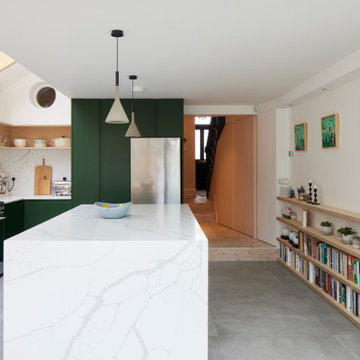
Internally a simple palette of materials includes exposed Ash rafters, Birch face plywood to form a dining room bench, dark green kitchen cabinets and grey floor tiles.
This newly constructed home is the first in its City be recognized as Green. While maintaining its impecable charm and cottage feeling, it is state of the art in Green technology. The appearance of the home blends with and enhances the older neighborhood, while integrating the best in construciton methods and residential technologies.
The home includes an outstanding insulation package; solar panels; geothermal ground source heat humps; ample natural light to reduce the use of artificial lighting; native plantings and vegetation; a variety of enjoyable outdoor spaces; regionally manufactured brick; underground storm water detention system; and an infill site.
The architecture of the house blends with the neighborhood. It is an exquisite cottage, with interior and exterior living spaces. Traditional in style, the home is comfortable yet elegant and serves the homeowner well.
Polly Eltes
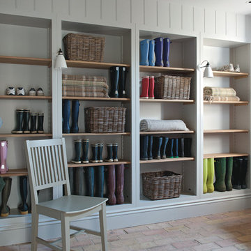
Photo of a large country mudroom in Gloucestershire with brick floors and white walls.
Photo of a large country mudroom in Gloucestershire with brick floors and white walls.
The brick and lannon paving materials were chosen to coordinate with the historic architecture of the home.
Westhauser Photography
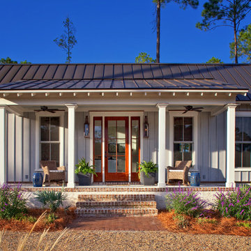
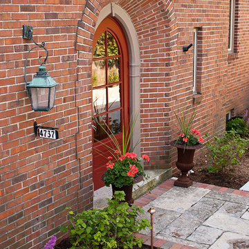
Design ideas for a mid-sized traditional front door in Milwaukee with a red front door and a single front door.
Design ideas for a mid-sized traditional front door in Milwaukee with a red front door and a single front door.
Dark Brick House - Photos & Ideas | Houzz
Reload the page to not see this specific ad anymore
A playful re-imagining of a Victorian terrace with a large rear extension.
The project started as a problem solving exercise – the owner of the house was very tall and he had never been able to have a shower in the pokey outrigger bathroom, there was simply not enough ceiling height. The lower ground floor kitchen also suffered from low ceilings and was dark and uninviting. There was very little connection to the garden, surrounded by trees, which felt like a lost opportunity. The whole house needed rethinking.
The solution we proposed was to extend into the generous garden at the rear and reconstruct the existing outrigger with an extra storey. We used the outrigger to relocate the staircase to the lower ground floor, moving it from the centre of the house into a double height space in the extension. This gave the house a very generous sense of height and space and allows light to flood into the kitchen and hall from high level windows. These provide glances of the surrounding tress as you descent to the dining room.
The extension allows the kitchen and dining room to push further into the garden, making the most of the views and light. A strip rooflight over the kitchen wall units brings light deep into the space and washes the kitchen with sunlight during the day. Behind the kitchen, where there was no access to natural light, we tucked a utility room and shower room, with a second sitting room at the front of the house. The extension has a green sedum roof to ensure it feels like part of the garden when seen from the upper floors of the house. We used a pale white and yellow brick to complement the colour of the London stock brickwork, but maintain a contemporary aesthetic. Oak windows and sliding door add a warmth to the extension and tie in with the materials we used internally.
Internally there is a palette of bold colours to define the living spaces, including an entirely yellow corridor the client has named ‘The Yolky Way’ leading from the kitchen to the front reception room, complete with hidden yellow doors. These are offset against more natural materials such as the oak batten cladding, which define the dining space and also line the back wall of the kitchen concealing the fridge door and larder units. A bespoke terrazzo counter unites the colours of the floor, oak cladding and cupboard doors and the tiled floor leads seamlessly to the outside patio, leading the eye back into the garden.
A new bathroom with a generous ceiling height was placed in the reconstructed outrigger, with triple aspect windows, including a picture window at the end of the bath framing views of the trees in the garden.
Upstairs we kept the traditional Victorian layout, refurbished the windows and shutters, reinstating cornice and ceiling roses to the principal rooms. At every point in the project the ergonomics of the house were considered, tall doors, very high kitchen worktops and always maximising ceiling heights, ensuring the house was more suited to its tall owner.
It started with vision. Then arrived fresh sight, seeing what was absent, seeing what was possible. Followed quickly by desire and creativity and know-how and communication and collaboration.
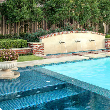
When the Ramsowers first called Exterior Worlds, all they had in mind was an outdoor fountain. About working with the Ramsowers, Jeff Halper, owner of Exterior Worlds says, “The Ramsowers had great vision. While they didn’t know exactly what they wanted, they did push us to create something special for them. I get inspired by my clients who are engaged and focused on design like they were. When you get that kind of inspiration and dialogue, you end up with a project like this one.”
For Exterior Worlds, our design process addressed two main features of the original space—the blank surface of the yard surrounded by looming architecture and plain fencing. With the yard, we dug out the center of it to create a one-foot drop in elevation in which to build a sunken pool. At one end, we installed a spa, lining it with a contrasting darker blue glass tile. Pedestals topped with urns anchor the pool and provide a place for spot color. Jets of water emerge from these pedestals. This moving water becomes a shield to block out urban noises and makes the scene lively. (And the children think it’s great fun to play in them.) On the side of the pool, another fountain, an illuminated basin built of limestone, brick and stainless steel, feeds the pool through three slots.
The pool is counterbalanced by a large plot of grass. What is inventive about this grassy area is its sub-structure. Before putting down the grass, we installed a French drain using grid pavers that pulls water away, an action that keeps the soil from compacting and the grass from suffocating. The entire sunken area is finished off with a border of ground cover that transitions the eye to the limestone walkway and the retaining wall, where we used the same reclaimed bricks found in architectural features of the house.
In the outer border along the fence line, we planted small trees that give the space scale and also hide some unsightly utility infrastructure. Boxwood and limestone gravel were embroidered into a parterre design to underscore the formal shape of the pool. Additionally, we planted a rose garden around the illuminated basin and a color garden for seasonal color at the far end of the yard across from the covered terrace.
To address the issue of the house’s prominence, we added a pergola to the main wing of the house. The pergola is made of solid aluminum, chosen for its durability, and painted black. The Ramsowers had used reclaimed ornamental iron around their front yard and so we replicated its pattern in the pergola’s design. “In making this design choice and also by using the reclaimed brick in the pool area, we wanted to honor the architecture of the house,” says Halper.
We continued the ornamental pattern by building an aluminum arbor and pool security fence along the covered terrace. The arbor’s supports gently curve out and away from the house. It, plus the pergola, extends the structural aspect of the house into the landscape. At the same time, it softens the hard edges of the house and unifies it with the yard. The softening effect is further enhanced by the wisteria vine that will eventually cover both the arbor and the pergola. From a practical standpoint, the pergola and arbor provide shade, especially when the vine becomes mature, a definite plus for the west-facing main house.
This newly-created space is an updated vision for a traditional garden that combines classic lines with the modern sensibility of innovative materials. The family is able to sit in the house or on the covered terrace and look out over the landscaping. To enjoy its pleasing form and practical function. To appreciate its cool, soothing palette, the blues of the water flowing into the greens of the garden with a judicious use of color. And accept its invitation to step out, step down, jump in, enjoy.
4