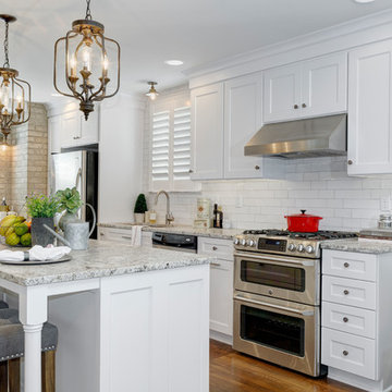
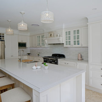
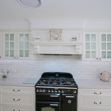
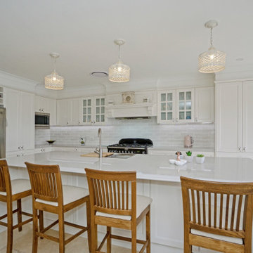
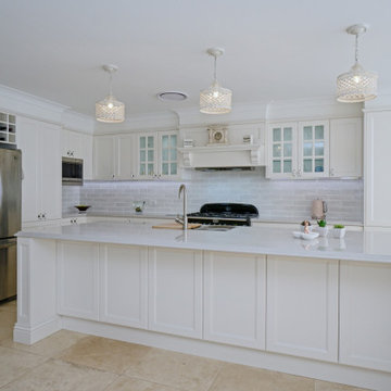
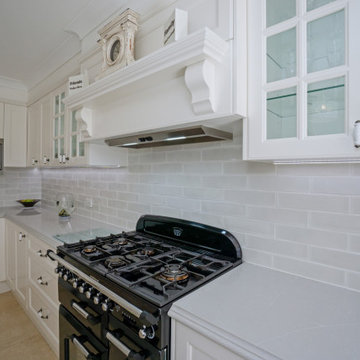
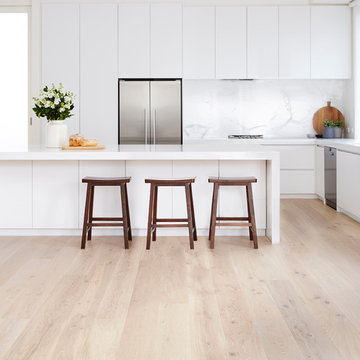
Search results for "French provincial kitchen" in Home Design Ideas
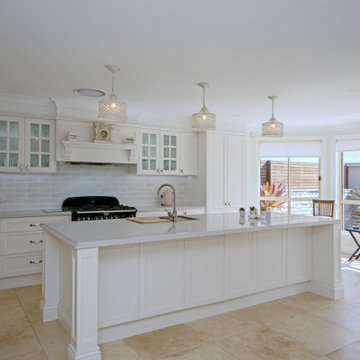
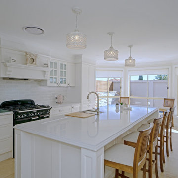
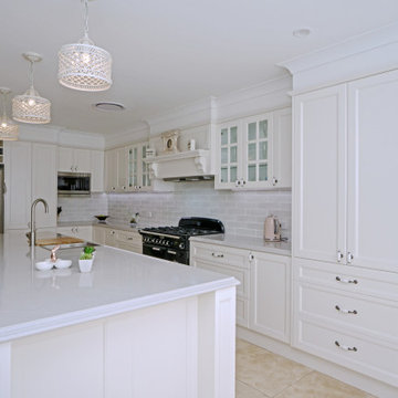
The original layout of the home had a wall cutting this kitchen in half. It was placed where the current range is and had a door way between connecting the kitchen and dining room.
The original breakfast room was removed and the corner corner squared off a the site of the new sink. The removal of the wall dividing the kitchen and dining areas allowed the kitchen to expand and accommodate the open concept floor plan. The result is an amazingly comfortable & beautiful space in which to cook & entertain.
Find the right local pro for your project
Reload the page to not see this specific ad anymore
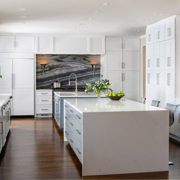
-In this kitchen renovation, new double islands & ceiling-high cabinetry quadruples the previous counter & storage space
-9’ island with seating includes three workstations
-Seating island offers under counter electronics charging ports & three shelves of storage per workstation in cabinets directly in front of stools
-Behind stools, lower cabinetry provides one drawer & two pull-out shelves per workstation
-7’ prep island services 48” paneled refrigerator & 48” gas range & includes 2nd sink, 2nd dishwasher & 2nd trash/recycling station
-Wine/beverage chiller located opposite island sink
-Both sink spigots are touch-less & are fed by whole-house water filtration system
-Independent non-leaching water faucet delivers purified, double-pass reverse osmosis drinking water
-Exhaust fan for gas range is hidden inside bridge of upper cabinets
-New built-in window seat in bay window increases seating for informal dining while reducing floor space needed for table and chairs
-New configuration allows unobstructed windows & French doors to flood space with natural light & enhances views into the back yard
-Gray-blue coloration of cabinet bases helps anchor the middle of the room and provides welcome contrast in scheme
Lind & Cummings
This is an example of a transitional kitchen in London with shaker cabinets, grey cabinets, white splashback, subway tile splashback and light hardwood floors.
This is an example of a transitional kitchen in London with shaker cabinets, grey cabinets, white splashback, subway tile splashback and light hardwood floors.
Reload the page to not see this specific ad anymore
Water, water everywhere, but not a drop to drink. Although this kitchen had ample cabinets and countertops, none of it was functional. Tall appliances divided what would have been a functional run of counters. The cooktop was placed at the end of a narrow island. The walk-in pantry jutted into the kitchen reducing the walkspace of the only functional countertop to 36”. There was not enough room to work and still have a walking area behind. Dark corners and cabinets with poor storage rounded out the existing kitchen.
Removing the walk in pantry opened the kitchen and made the adjoining utility room more functional. The space created by removing the pantry became a functional wall of appliances featuring:
• 30” Viking Freezer
• 36” Viking Refrigerator
• 30” Wolf Microwave
• 30” Wolf warming drawer
To minimize a three foot ceiling height change, a custom Uberboten was built to create a horizontal band keeping the focus downward. The Uberboten houses recessed cans and three decorative light fixtures to illuminate the worksurface and seating area.
The Island is functional from all four sides:
• Elevation F: functions as an eating bar for two and as a buffet counter for large parties. Countertop: Ceasarstone Blue Ridge
• Elevation G: 30” deep coffee bar with beverage refrigerator. Custom storage for flavored syrups and coffee accoutrements. Access to the water with the pull out Elkay faucet makes filling the espresso machine a cinch! Countertop: Ceasarstone Canyon Red
• Elevation H: holds the Franke sink, and a cabinet with popup mixer hardware. Countertop: 4” thick endgrain butcherblock maple countertop
• Elevation I: 42” tall and 30” deep cabinets hold a second Wolf oven and a built-in Franke scale Countertop: Ceasarstone in Blue Ridge
The Range Elevation (Elevation B) has 27” deep countertops, the trash compactor, recycling, a 48” Wolf range. Opposing counter surfaces flank of the range:
• Left: Ceasarstone in Canyon Red
• Right: Stainless Steel.
• Backsplash: Copper
What originally was a dysfunctional desk that collected EVERYTHING, now is an attractive, functional 21” deep pantry that stores linen, food, serving pieces and more. The cabinet doors were made from a Zebra-wood-look-alike melamine, the gain runs both horizontally and vertically for a custom design. The end cabinet is a 12” deep message center with cork-board backing and a small work space. Storage below houses phone books and the Lumitron Graphic Eye that controls the light fixtures.
Design Details:
• An Icebox computer to the left of the main sink
• Undercabinet lighting: Xenon
• Plug strip eliminate unsightly outlets in the backsplash
• Cabinets: natural maple accented with espresso stained alder.
Design ideas for a mid-sized contemporary l-shaped eat-in kitchen in Toronto with granite benchtops, an undermount sink, shaker cabinets, green cabinets, white splashback, porcelain splashback, stainless steel appliances, light hardwood floors and no island.
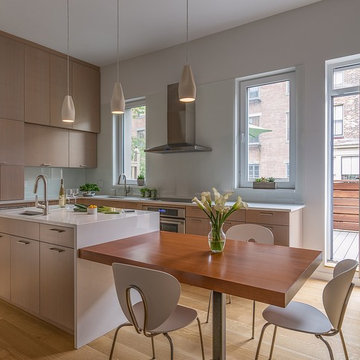
This Seattle remodel of a Greenlake house involved lifting the original Sears Roebuck home 12 feet in the air and building a new basement and 1st floor, remodeling much of the original third floor. The kitchen features an eat-in nook and cabinetry that makes the most of a small space. This home was featured in the Eco Guild's Green Building Slam, Eco Guild's sponsored remodel tour, and has received tremendous attention for its conservative, sustainable approach. Constructed by Blue Sound Construction, Inc, Designed by Make Design, photographed by Aaron Leitz Photography.
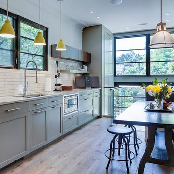
This renovated brick rowhome in Boston’s South End offers a modern aesthetic within a historic structure, creative use of space, exceptional thermal comfort, a reduced carbon footprint, and a passive stream of income.
DESIGN PRIORITIES. The goals for the project were clear - design the primary unit to accommodate the family’s modern lifestyle, rework the layout to create a desirable rental unit, improve thermal comfort and introduce a modern aesthetic. We designed the street-level entry as a shared entrance for both the primary and rental unit. The family uses it as their everyday entrance - we planned for bike storage and an open mudroom with bench and shoe storage to facilitate the change from shoes to slippers or bare feet as they enter their home. On the main level, we expanded the kitchen into the dining room to create an eat-in space with generous counter space and storage, as well as a comfortable connection to the living space. The second floor serves as master suite for the couple - a bedroom with a walk-in-closet and ensuite bathroom, and an adjacent study, with refinished original pumpkin pine floors. The upper floor, aside from a guest bedroom, is the child's domain with interconnected spaces for sleeping, work and play. In the play space, which can be separated from the work space with new translucent sliding doors, we incorporated recreational features inspired by adventurous and competitive television shows, at their son’s request.
MODERN MEETS TRADITIONAL. We left the historic front facade of the building largely unchanged - the security bars were removed from the windows and the single pane windows were replaced with higher performing historic replicas. We designed the interior and rear facade with a vision of warm modernism, weaving in the notable period features. Each element was either restored or reinterpreted to blend with the modern aesthetic. The detailed ceiling in the living space, for example, has a new matte monochromatic finish, and the wood stairs are covered in a dark grey floor paint, whereas the mahogany doors were simply refinished. New wide plank wood flooring with a neutral finish, floor-to-ceiling casework, and bold splashes of color in wall paint and tile, and oversized high-performance windows (on the rear facade) round out the modern aesthetic.
RENTAL INCOME. The existing rowhome was zoned for a 2-family dwelling but included an undesirable, single-floor studio apartment at the garden level with low ceiling heights and questionable emergency egress. In order to increase the quality and quantity of space in the rental unit, we reimagined it as a two-floor, 1 or 2 bedroom, 2 bathroom apartment with a modern aesthetic, increased ceiling height on the lowest level and provided an in-unit washer/dryer. The apartment was listed with Jackie O'Connor Real Estate and rented immediately, providing the owners with a source of passive income.
ENCLOSURE WITH BENEFITS. The homeowners sought a minimal carbon footprint, enabled by their urban location and lifestyle decisions, paired with the benefits of a high-performance home. The extent of the renovation allowed us to implement a deep energy retrofit (DER) to address air tightness, insulation, and high-performance windows. The historic front facade is insulated from the interior, while the rear facade is insulated on the exterior. Together with these building enclosure improvements, we designed an HVAC system comprised of continuous fresh air ventilation, and an efficient, all-electric heating and cooling system to decouple the house from natural gas. This strategy provides optimal thermal comfort and indoor air quality, improved acoustic isolation from street noise and neighbors, as well as a further reduced carbon footprint. We also took measures to prepare the roof for future solar panels, for when the South End neighborhood’s aging electrical infrastructure is upgraded to allow them.
URBAN LIVING. The desirable neighborhood location allows the both the homeowners and tenant to walk, bike, and use public transportation to access the city, while each charging their respective plug-in electric cars behind the building to travel greater distances.
OVERALL. The understated rowhouse is now ready for another century of urban living, offering the owners comfort and convenience as they live life as an expression of their values.
Photography: Eric Roth Photo
French Provincial Kitchen - Photos & Ideas | Houzz
Reload the page to not see this specific ad anymore
Photography by Stacy Bass. www.stacybassphotography.com
Photo of a mid-sized beach style single-wall eat-in kitchen in New York with shaker cabinets, white cabinets, white splashback, subway tile splashback, stainless steel appliances, medium hardwood floors, with island, an undermount sink, quartz benchtops and brown floor.
Photo of a mid-sized beach style single-wall eat-in kitchen in New York with shaker cabinets, white cabinets, white splashback, subway tile splashback, stainless steel appliances, medium hardwood floors, with island, an undermount sink, quartz benchtops and brown floor.
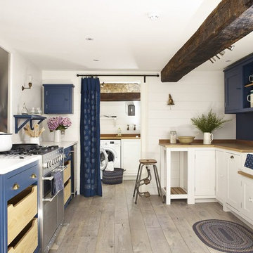
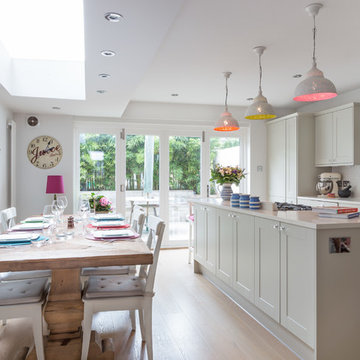
Design ideas for a beach style u-shaped separate kitchen in Wiltshire with a farmhouse sink, blue cabinets, wood benchtops, metallic splashback, stainless steel appliances, medium hardwood floors, no island and beige floor.
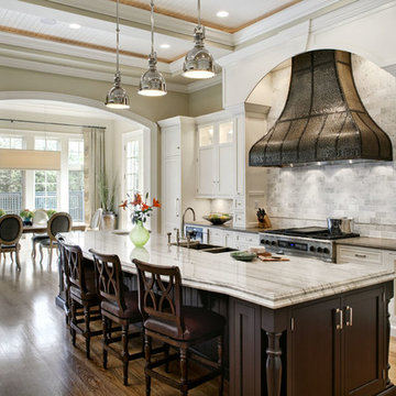
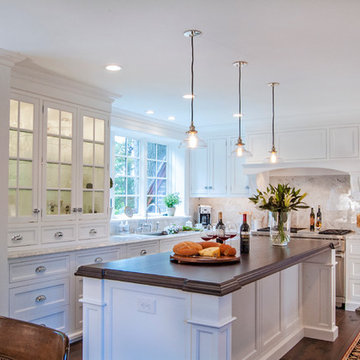
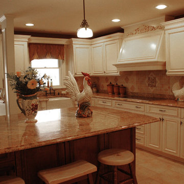
The beautiful hand-hammered custom pewter hood, framed in painted woodwork and in-set cabinetry and the spacious, fourteen foot ceilings are the focal points of this kitchen.
Co-designer: Janie Petkus of Janie Petkus Interiors, Hinsdale IL.
60