Search results for "Second floor addition" in Home Design Ideas
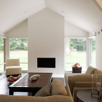
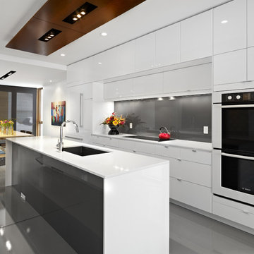
This contemporary renovation makes no concession towards differentiating the old from the new. Rather than razing the entire residence an effort was made to conserve what elements could be worked with and added space where an expanded program required it. Clad with cedar, the addition contains a master suite on the first floor and two children’s rooms and playroom on the second floor. A small vegetated roof is located adjacent to the stairwell and is visible from the upper landing. Interiors throughout the house, both in new construction and in the existing renovation, were handled with great care to ensure an experience that is cohesive. Partition walls that once differentiated living, dining, and kitchen spaces, were removed and ceiling vaults expressed. A new kitchen island both defines and complements this singular space.
The parti is a modern addition to a suburban midcentury ranch house. Hence, the name “Modern with Ranch.”
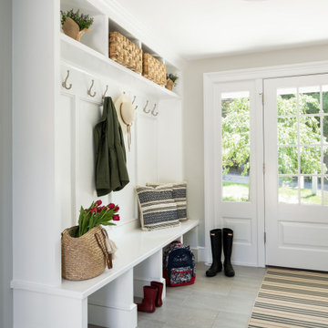
As seen in this photo, the front to back view offers homeowners and guests alike a direct view and access to the deck off the back of the house. In addition to holding access to the garage, this space holds two closets. One, the homeowners are using as a coat closest and the other, a pantry closet. You also see a custom built in unit with a bench and storage. There is also access to a powder room, a bathroom that was relocated from middle of the 1st floor layout. Relocating the bathroom allowed us to open up the floor plan, offering a view directly into and out of the playroom and dining room.

A simple one-story white clapboard 1920s cottage bungalow sat on a narrow straight street with many older homes, all of which meeting the street with a similar dignified approach. This house was the smallest of them all, built in 1922 as a weekend cottage, near the old East Falls Church rail station which provided direct access to Washington D.C. Its diminutive scale, low-pitched roof with the ridge parallel to the street, and lack of superfluous decoration characterized this cottage bungalow. Though the owners fell in love with the charm of the original house, their growing family presented an architectural dilemma: how do you significantly expand a charming little 1920’s Craftsman style house that you love without totally losing the integrity that made it so perfect?
The answer began to formulate after a review of the houses in the turn-of-the-century neighborhood; every older house was two stories tall, each built in a different style, each beautifully proportioned, each much larger than this cottage bungalow. Most of the neighborhood houses had been significantly renovated or expanded. Growing this one-story house would certainly not adversely affect the architectural character of the neighborhood. Given that, the house needed to maintain a diminutive scale in order to appear friendly and avoid a dominating presence.
The simplistic, crisp, honest materials and details of the little house, all painted white, would be saved and incorporated into a new house. Across the front of the house, the three public spaces would be saved, connected along an axis anchored on the left by the living room fireplace, with the dining room and the sitting room to the right. These three rooms are punctuated by thirteen windows, which for this house age and style, really suggests a more modern aesthetic.
Hoachlander Davis Photography.
Find the right local pro for your project
This 1950s ranch was transformed with a second floor addition. New materials were introduced but picked up on the colors of the existing first floor brickwork. Hardi fiber cement siding and trim gave detail to the new second floor addition. Gables and shed dormers create an interesting roof scape and keep the scale of the final design in proportion.
Photo by Giles of Las Vegas Video and Photos, Inc.
Photo by Paul Burk
This is an example of a traditional exterior in DC Metro with wood siding.
This is an example of a traditional exterior in DC Metro with wood siding.
Photos by StudioCeja.com
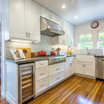
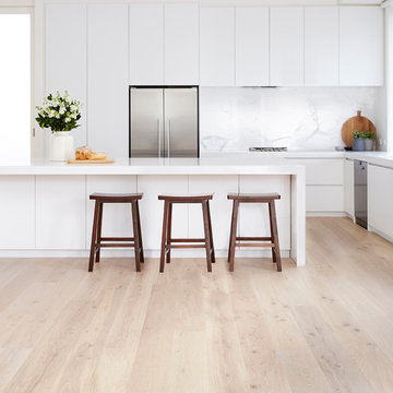
Design ideas for a mid-sized traditional u-shaped eat-in kitchen in Los Angeles with a farmhouse sink, shaker cabinets, white cabinets, quartz benchtops, stainless steel appliances, bamboo floors, white splashback, porcelain splashback and a peninsula.
Design ideas for a mid-sized traditional u-shaped eat-in kitchen in Los Angeles with a farmhouse sink, shaker cabinets, white cabinets, quartz benchtops, stainless steel appliances, bamboo floors, white splashback, porcelain splashback and a peninsula.
This remodel consisted of a whole house transformation. We took this 3 bedroom dated home and turned it into a 5 bedroom award winning showpiece, all without an addition. By reworking the awkward floor plan and lowering the living room floor to be level with the rest of the house we were able to create additional space within the existing footprint of the home. What was once the small lack-luster master suite, is now 2 kids bedrooms that share a jack and jill bath. The master suite was relocated to the first floor, and the kitchen that was located right at the front door, is now located in the back of the home with great access to the patio overlooking the golf course.
View more about this project and our company at our website: www.davefox.com
Reload the page to not see this specific ad anymore
Originally built in 1889 a short walk from the old East Falls Church rail station, the vaguely reminiscent gothic Victorian was a landmark in a neighborhood of late 19th century wood frame homes. The two story house had been changed many times over its 116 year life with most of the changes diminishing the style and integrity of the original home. Beginning during the mid-twentieth century, few of the changes could be seen as improvements. The wonderfully dominate front tower was obscured by a bathroom shed roof addition. The exterior skin was covered with asbestos siding, requiring the removal of any wood detailing projecting from its surface. Poorly designed diminutive additions were added to the rear creating small, awkward, low ceiling spaces that became irrelevant to the modern user. The house was in serious need of a significant renovation and restoration.
A young family purchased the house and immediately realized the inadequacies; sub-par spaces, kitchen, bathrooms and systems. The program for this project was closely linked to aesthetics, function and budget. The program called for significantly enlarging the house with a major new rear addition taking the place of the former small additions. Critically important to the program was to not only protect the integrity of the original house, but to restore and expand the house in such a way that the addition would be seamless. The completed house had to fulfill all of the requirements of a modern house with significant living spaces, including reconfigured foyer, living room and dining room on the first floor and three modified bedrooms on the second floor. On the rear of the house a new addition created a new kitchen, family room, mud room, powder room and back stair hall. This new stair hall connected the new and existing first floor to a new basement recreation room below and a new master bedroom suite with laundry and second bathroom on the second floor.
The entire exterior of the house was stripped to the original sheathing. New wood windows, wood lap siding, wall trim including roof eave and rake trim were installed. Each of the details on the exterior of the house matched the original details. This fact was confirmed by researching the house and studying turn-of-the-century photographs. The second floor addition was removed, facilitating the restoration of the four sided mansard roof tower.
The final design for the house is strong but not overpowering. As a renovated house, the finished product fits the neighborhood, restoring its standing as a landmark, satisfying the owner’s needs for house and home.
Hoachlander Davis Photography
LG House (Edmonton
Design :: thirdstone inc. [^]
Photography :: Merle Prosofsky
This is an example of a contemporary galley eat-in kitchen in Edmonton with a single-bowl sink, flat-panel cabinets, white cabinets, grey splashback, glass sheet splashback, panelled appliances and white benchtop.
This is an example of a contemporary galley eat-in kitchen in Edmonton with a single-bowl sink, flat-panel cabinets, white cabinets, grey splashback, glass sheet splashback, panelled appliances and white benchtop.
The existing house was in need of some upgrades, formerly with a smaller second floor space within a dormer. The existing second floor was removed and an additional floor level added on top of the existing so as to not disturb the existing first floor, and increase structural stability. The homeowners preferences for style were prairie, so the addition is a hybrid of prairie and bungalo features to best accentuate the features and proportions of the existing home.
This contemporary renovation makes no concession towards differentiating the old from the new. Rather than razing the entire residence an effort was made to conserve what elements could be worked with and added space where an expanded program required it. Clad with cedar, the addition contains a master suite on the first floor and two children’s rooms and playroom on the second floor. A small vegetated roof is located adjacent to the stairwell and is visible from the upper landing. Interiors throughout the house, both in new construction and in the existing renovation, were handled with great care to ensure an experience that is cohesive. Partition walls that once differentiated living, dining, and kitchen spaces, were removed and ceiling vaults expressed. A new kitchen island both defines and complements this singular space.
The parti is a modern addition to a suburban midcentury ranch house. Hence, the name “Modern with Ranch.”
Complete interior renovation of a 1980s split level house in the Virginia suburbs. Main level includes reading room, dining, kitchen, living and master bedroom suite. New front elevation at entry, new rear deck and complete re-cladding of the house. Interior: The prototypical layout of the split level home tends to separate the entrance, and any other associated space, from the rest of the living spaces one half level up. In this home the lower level "living" room off the entry was physically isolated from the dining, kitchen and family rooms above, and was only connected visually by a railing at dining room level. The owner desired a stronger integration of the lower and upper levels, in addition to an open flow between the major spaces on the upper level where they spend most of their time. ExteriorThe exterior entry of the house was a fragmented composition of disparate elements. The rear of the home was blocked off from views due to small windows, and had a difficult to use multi leveled deck. The owners requested an updated treatment of the entry, a more uniform exterior cladding, and an integration between the interior and exterior spaces. SOLUTIONS The overriding strategy was to create a spatial sequence allowing a seamless flow from the front of the house through the living spaces and to the exterior, in addition to unifying the upper and lower spaces. This was accomplished by creating a "reading room" at the entry level that responds to the front garden with a series of interior contours that are both steps as well as seating zones, while the orthogonal layout of the main level and deck reflects the pragmatic daily activities of cooking, eating and relaxing. The stairs between levels were moved so that the visitor could enter the new reading room, experiencing it as a place, before moving up to the main level. The upper level dining room floor was "pushed" out into the reading room space, thus creating a balcony over and into the space below. At the entry, the second floor landing was opened up to create a double height space, with enlarged windows. The rear wall of the house was opened up with continuous glass windows and doors to maximize the views and light. A new simplified single level deck replaced the old one.
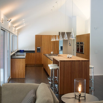
This contemporary renovation makes no concession towards differentiating the old from the new. Rather than razing the entire residence an effort was made to conserve what elements could be worked with and added space where an expanded program required it. Clad with cedar, the addition contains a master suite on the first floor and two children’s rooms and playroom on the second floor. A small vegetated roof is located adjacent to the stairwell and is visible from the upper landing. Interiors throughout the house, both in new construction and in the existing renovation, were handled with great care to ensure an experience that is cohesive. Partition walls that once differentiated living, dining, and kitchen spaces, were removed and ceiling vaults expressed. A new kitchen island both defines and complements this singular space.
The parti is a modern addition to a suburban midcentury ranch house. Hence, the name “Modern with Ranch.”
Reload the page to not see this specific ad anymore
When my client had to move from her company office to work at home, she set up in the dining room. Despite her best efforts, this was not the long-term solution she was looking for. My client realized she needed a dedicated space not on the main floor of the home. On one hand, having your office space right next to the kitchen is handy. On the other hand, it made separating work and home life was not that easy.
The house was a ranch. In essence, the basement would run entire length of the home. As we came down the steps, we entered a time capsule. The house was built in the 1950’s. The walls were covered with original knotty pine paneling. There was a wood burning fireplace and considering this was a basement, high ceilings. In addition, there was everything her family could not store at their own homes. As we wound though the space, I though “wow this has potential”, Eventually, after walking through the laundry room we came to a small nicely lit room. This would be the office.
My client looked at me and asked what I thought. Undoubtedly, I said, this can be a great workspace, but do you really want to walk through this basement and laundry to get here? Without reservation, my client said where do we start?
Once the design was in place, we started the renovation. The knotty pine paneling had to go. Specifically, to add some insulation and control the dampness and humidity. The laundry room wall was relocated to create a hallway to the office.
At the far end of the room, we designated a workout zone. Weights, mats, exercise bike and television are at the ready for morning or afternoon workouts. The space can be concealed by a folding screen for party time. Doors to an old closet under the stairs were relocated to the workout area for hidden storage. Now we had nice wall for a beautiful console and mirror for storage and serving during parties.
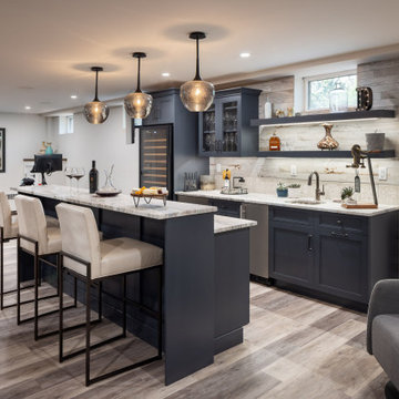
In order to add architectural details, we covered the old ugly support columns with simple recessed millwork panels. This detail created a visual division between the bar area and the seating area in front of the fireplace. The old red brick on the fireplace surround was replaced with stack stone. A mantle was made from reclaimed wood. Additional reclaimed wood floating shelves left and right of the fireplace provides decorative display while maintaining a rustic element balancing the copper end table and leather swivel rocker.
We found an amazing rug which tied all of the colors together further defining the gathering space. Russet and burnt orange became the accent color unifying each space. With a bit of whimsy, a rather unusual light fixture which looks like roots from a tree growing through the ceiling is a conversation piece.
The office space is quite and removed from the main part of the basement. There is a desk large enough for multiple screens, a small bookcase holding office supplies and a comfortable chair for conference calls. Because working from home requires many online meetings, we added a shiplap wall painted in Hale Navy to contrast with the orange fabric on the chair. We finished the décor with a painting from my client’s father. This is the background online visitors will see.
The last and best part of the renovation is the beautiful bar. My client is an avid collector of wine. She already had the EuroCave refrigerator, so I incorporated it into the design. The cabinets are painted Temptation Grey from Benjamin Moore. The counter tops are my favorite hard working quartzite Brown Fantasy. The backsplash is a combination of rustic wood and old tin ceiling like porcelain tiles. Together with the textures of the reclaimed wood and hide poofs balanced against the smooth finish of the cabinets, we created a comfortable luxury for relaxing.
There is ample storage for bottles, cans, glasses, and anything else you can think of for a great party. In addition to the wine storage, we incorporated a beverage refrigerator, an ice maker, and a sink. Floating shelves with integrated lighting illuminate the back bar. The raised height of the front bar provides the perfect wine tasting and paring spot. I especially love the pendant lights which look like wine glasses.
Finally, I selected carpet for the stairs and office. It is perfect for noise reduction. Meanwhile for the overall flooring, I specifically selected a high-performance vinyl plank floor. We often use this product as it is perfect to install on a concrete floor. It is soft to walk on, easy to clean and does not reduce the overall height of the space.
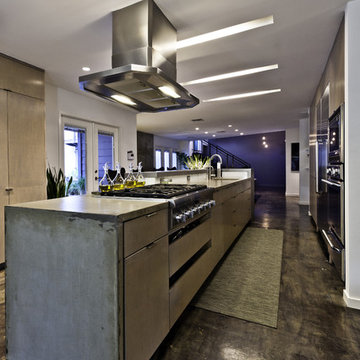
Completed in 2010 this 1950's Ranch transformed into a modern family home with 6 bedrooms and 4 1/2 baths. Concrete floors and counters and gray stained cabinetry are warmed by rich bold colors. Public spaces were opened to each other and the entire second level is a master suite. Photo by: Dennis DeSilva
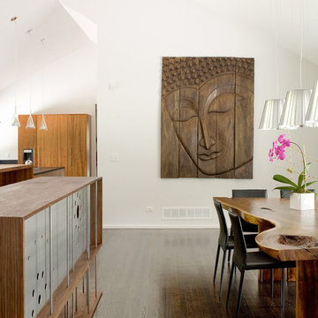
This contemporary renovation makes no concession towards differentiating the old from the new. Rather than razing the entire residence an effort was made to conserve what elements could be worked with and added space where an expanded program required it. Clad with cedar, the addition contains a master suite on the first floor and two children’s rooms and playroom on the second floor. A small vegetated roof is located adjacent to the stairwell and is visible from the upper landing. Interiors throughout the house, both in new construction and in the existing renovation, were handled with great care to ensure an experience that is cohesive. Partition walls that once differentiated living, dining, and kitchen spaces, were removed and ceiling vaults expressed. A new kitchen island both defines and complements this singular space.
The parti is a modern addition to a suburban midcentury ranch house. Hence, the name “Modern with Ranch.”
This brownstone, located in Harlem, consists of five stories which had been duplexed to create a two story rental unit and a 3 story home for the owners. The owner hired us to do a modern renovation of their home and rear garden. The garden was under utilized, barely visible from the interior and could only be accessed via a small steel stair at the rear of the second floor. We enlarged the owner’s home to include the rear third of the floor below which had walk out access to the garden. The additional square footage became a new family room connected to the living room and kitchen on the floor above via a double height space and a new sculptural stair. The rear facade was completely restructured to allow us to install a wall to wall two story window and door system within the new double height space creating a connection not only between the two floors but with the outside. The garden itself was terraced into two levels, the bottom level of which is directly accessed from the new family room space, the upper level accessed via a few stone clad steps. The upper level of the garden features a playful interplay of stone pavers with wood decking adjacent to a large seating area and a new planting bed. Wet bar cabinetry at the family room level is mirrored by an outside cabinetry/grill configuration as another way to visually tie inside to out. The second floor features the dining room, kitchen and living room in a large open space. Wall to wall builtins from the front to the rear transition from storage to dining display to kitchen; ending at an open shelf display with a fireplace feature in the base. The third floor serves as the children’s floor with two bedrooms and two ensuite baths. The fourth floor is a master suite with a large bedroom and a large bathroom bridged by a walnut clad hall that conceals a closet system and features a built in desk. The master bath consists of a tiled partition wall dividing the space to create a large walkthrough shower for two on one side and showcasing a free standing tub on the other. The house is full of custom modern details such as the recessed, lit handrail at the house’s main stair, floor to ceiling glass partitions separating the halls from the stairs and a whimsical builtin bench in the entry.
Second Floor Addition - Photos & Ideas | Houzz
Reload the page to not see this specific ad anymore
Forget just one room with a view—Lochley has almost an entire house dedicated to capturing nature’s best views and vistas. Make the most of a waterside or lakefront lot in this economical yet elegant floor plan, which was tailored to fit a narrow lot and has more than 1,600 square feet of main floor living space as well as almost as much on its upper and lower levels. A dovecote over the garage, multiple peaks and interesting roof lines greet guests at the street side, where a pergola over the front door provides a warm welcome and fitting intro to the interesting design. Other exterior features include trusses and transoms over multiple windows, siding, shutters and stone accents throughout the home’s three stories. The water side includes a lower-level walkout, a lower patio, an upper enclosed porch and walls of windows, all designed to take full advantage of the sun-filled site. The floor plan is all about relaxation – the kitchen includes an oversized island designed for gathering family and friends, a u-shaped butler’s pantry with a convenient second sink, while the nearby great room has built-ins and a central natural fireplace. Distinctive details include decorative wood beams in the living and kitchen areas, a dining area with sloped ceiling and decorative trusses and built-in window seat, and another window seat with built-in storage in the den, perfect for relaxing or using as a home office. A first-floor laundry and space for future elevator make it as convenient as attractive. Upstairs, an additional 1,200 square feet of living space include a master bedroom suite with a sloped 13-foot ceiling with decorative trusses and a corner natural fireplace, a master bath with two sinks and a large walk-in closet with built-in bench near the window. Also included is are two additional bedrooms and access to a third-floor loft, which could functions as a third bedroom if needed. Two more bedrooms with walk-in closets and a bath are found in the 1,300-square foot lower level, which also includes a secondary kitchen with bar, a fitness room overlooking the lake, a recreation/family room with built-in TV and a wine bar perfect for toasting the beautiful view beyond.
Adding a second floor to a house is a great opportunity to make it look interesting and better. This is often missed, as many second story additions appear like a hump on top of an existing old home.
Not here: the remodeled home looks like it always needed to look - eye catching, pleasing and inviting.
Mega Builders (www.megabuilders.com)
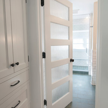
Photo by Jody Dole
This was a fast-track design-build project which began design in July and ended construction before Christmas. The scope included additions and first and second floor renovations. The house is an early 1900’s gambrel style with painted wood shingle siding and mission style detailing. On the first and second floor we removed previously constructed awkward additions and extended the gambrel style roof to make room for a large kitchen on the first floor and a master bathroom and bedroom on the second floor. We also added two new dormers to match the existing dormers to bring light into the master shower and new bedroom. We refinished the wood floors, repainted all of the walls and trim, added new vintage style light fixtures, and created a new half and kid’s bath. We also added new millwork features to continue the existing level of detail and texture within the house. A wrap-around covered porch with a corner trellis was also added, which provides a perfect opportunity to enjoy the back-yard. A wonderful project!
8