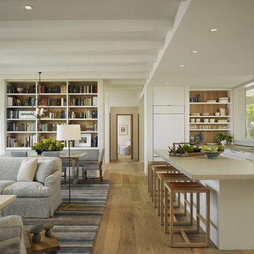
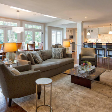
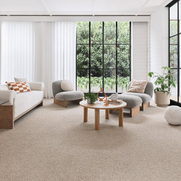
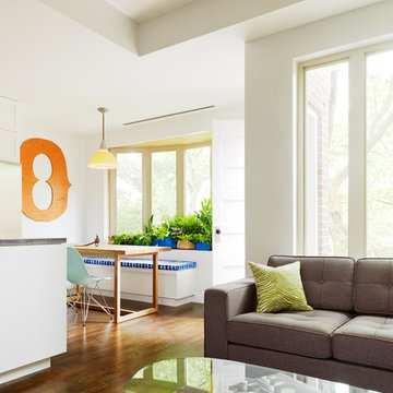
Search results for "Small open plan kitchen and living room" in Home Design Ideas
Open concept great room (kitchen, living room, dining room). Kitchen and dining room are located to the left of the living room in this picture.
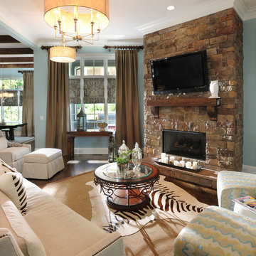
Traditional living room in Nashville with blue walls, a stone fireplace surround and a wall-mounted tv.
Traditional living room in Nashville with blue walls, a stone fireplace surround and a wall-mounted tv.
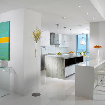
Modern - Contemporary Interior Designs By J Design Group in Miami, Florida.
Aventura Magazine selected one of our contemporary interior design projects and they said:
Shortly after Jennifer Corredor’s interior design clients bought a four-bedroom, three bath home last year, the couple suffered through a period of buyer’s remorse.
While they loved the Bay Harbor Islands location and the 4,000-square-foot, one-story home’s potential for beauty and ample entertaining space, they felt the living and dining areas were too restricted and looked very small. They feared they had bought the wrong house. “My clients thought the brown wall separating these spaces from the kitchen created a somber mood and darkness, and they were unhappy after they had bought the house,” says Corredor of the J. Design Group in Coral Gables. “So we decided to renovate and tear down the wall to make a galley kitchen.” Mathy Garcia Chesnick, a sales director with Cervera Real Estate, and husband Andrew Chesnick, an executive for the new Porsche Design Tower residential project in Sunny Isles, liked the idea of incorporating the kitchen area into the living and dining spaces. Since they have two young children, the couple felt those areas were too narrow for easy, open living. At first, Corredor was afraid a structural beam could get in the way and impede the restoration process. But after doing research, she learned that problem did not exist, and there was nothing to hinder the project from moving forward. So she collapsed the wall to create one large kitchen, living and dining space. Then she changed the flooring, using 36x36-inch light slabs of gold Bianco marble, replacing the wood that had been there before. This process also enlarged the look of the space, giving it lightness, brightness and zoom. “By eliminating the wall and adding the marble we amplified the new and expanded public area,” says Corredor, who is known for optimizing space in creative ways. “And I used sheer white window treatments which further opened things up creating an airy, balmy space. The transformation is astonishing! It looks like a different place.” Part of that transformation included stripping the “awful” brown kitchen cabinets and replacing them with clean-lined, white ones from Italy. She also added a functional island and mint chocolate granite countertops. At one end of the kitchen space, Corredor designed dark wood shelving where Mathy displays her collection of cookbooks. “Mathy cooks a great deal, and they entertain on a regular basis,” says Corredor. “The island we created is where she likes to serve the kids breakfast and have family members gather. And when they have a dinner party, everyone can mill in and out of the kitchen-galley, dining and living areas while able to see everything going on around them. It looks and functions so much better.” Corredor extended the Bianco marble flooring to other open areas of the house, nearly everywhere except for the bedrooms. She also changed the powder room, which is annexed to the kitchen. She applied white linear glass on the walls and added a new white square sink by Hastings. Clean and fresh, the room is reminiscent of a little jewel box. I n the living room, Corredor designed a showpiece wall unit of exotic cherry wood with an aqua center to bring back some warmth that modernizing naturally strips away. The designer also changed the room’s lighting, introducing a new system that eschews a switch. Instead, it works by remote and also dims to create various moods for different social engagements. “The lighting is wonderful and enhances everything else we have done in these open spaces,” says Corredor. T he dining room overlooks the pool and yard, with large, floorto- ceiling window brings the outdoors inside. A chandelier above the dining table is another expression of openness, like the lens of a person’s eyeglasses. “We wanted this unusual piece because its sort of translucence takes you outside without ever moving from the room,” explains Corredor. “The family members love seeing the yard and pool from the living and dining space. It’s also great for entertaining friends and business associates. They can get a real feel for the subtropical elegance of Miami.” N earby, the front door was originally brown so she repainted it a sleek lacquered white. This bright consistency helps maintain a constant eye flow from one section of the open areas to another. Everything is visible in the new extended space and creates a bright and inviting atmosphere. “It was important to modernize and update the house without totally changing the character,” says Corredor. “We organized everything well and it turned out beautifully, just as we envisioned it.” While nothing on the home’s exterior was changed, Corredor worked her magic in the master bedroom by adding panels with a wavelike motif to again bring elements of the outside in. The room is austere and clean lined, elegant, peaceful and not cluttered with unnecessary furnishings. In the master bath, Corredor removed the existing cabinets and made another large cherry wood cabinet, this time with double sinks for husband and wife. She also added frosted green glass to give a spa-like aura to the spacious room. T hroughout the house are splashy canvases from Mathy’s personal art collection. She likes to add color to the decor through the art while the backdrops remain a soothing white. The end result is a divine, refined interior, light, bright and open. “The owners are thrilled, and we were able to complete the renovation in a few months,” says Corredor. “Everything turned out how it should be.”
J Design Group
Call us.
305-444-4611
Miami modern,
Contemporary Interior Designers,
Modern Interior Designers,
Coco Plum Interior Designers,
Sunny Isles Interior Designers,
Pinecrest Interior Designers,
J Design Group interiors,
South Florida designers,
Best Miami Designers,
Miami interiors,
Miami décor,
Miami Beach Designers,
Best Miami Interior Designers,
Miami Beach Interiors,
Luxurious Design in Miami,
Top designers,
Deco Miami,
Luxury interiors,
Miami Beach Luxury Interiors,
Miami Interior Design,
Miami Interior Design Firms,
Beach front,
Top Interior Designers,
top décor,
Top Miami Decorators,
Miami luxury condos,
modern interiors,
Modern,
Pent house design,
white interiors,
Top Miami Interior Decorators,
Top Miami Interior Designers,
Modern Designers in Miami,
J Design Group
Call us.
305-444-4611
www.JDesignGroup.com
A captivating transformation in the coveted neighborhood of University Park, Dallas
The heart of this home lies in the kitchen, where we embarked on a design endeavor that would leave anyone speechless. By opening up the main kitchen wall, we created a magnificent window system that floods the space with natural light and offers a breathtaking view of the picturesque surroundings. Suspended from the ceiling, a steel-framed marble vent hood floats a few inches from the window, showcasing a mesmerizing Lilac Marble. The same marble is skillfully applied to the backsplash and island, featuring a bold combination of color and pattern that exudes elegance.
Adding to the kitchen's allure is the Italian range, which not only serves as a showstopper but offers robust culinary features for even the savviest of cooks. However, the true masterpiece of the kitchen lies in the honed reeded marble-faced island. Each marble strip was meticulously cut and crafted by artisans to achieve a half-rounded profile, resulting in an island that is nothing short of breathtaking. This intricate process took several months, but the end result speaks for itself.
To complement the grandeur of the kitchen, we designed a combination of stain-grade and paint-grade cabinets in a thin raised panel door style. This choice adds an elegant yet simple look to the overall design. Inside each cabinet and drawer, custom interiors were meticulously designed to provide maximum functionality and organization for the day-to-day cooking activities. A vintage Turkish runner dating back to the 1960s, evokes a sense of history and character.
The breakfast nook boasts a stunning, vivid, and colorful artwork created by one of Dallas' top artist, Kyle Steed, who is revered for his mastery of his craft. Some of our favorite art pieces from the inspiring Haylee Yale grace the coffee station and media console, adding the perfect moment to pause and loose yourself in the story of her art.
The project extends beyond the kitchen into the living room, where the family's changing needs and growing children demanded a new design approach. Accommodating their new lifestyle, we incorporated a large sectional for family bonding moments while watching TV. The living room now boasts bolder colors, striking artwork a coffered accent wall, and cayenne velvet curtains that create an inviting atmosphere. Completing the room is a custom 22' x 15' rug, adding warmth and comfort to the space. A hidden coat closet door integrated into the feature wall adds an element of surprise and functionality.
This project is not just about aesthetics; it's about pushing the boundaries of design and showcasing the possibilities. By curating an out-of-the-box approach, we bring texture and depth to the space, employing different materials and original applications. The layered design achieved through repeated use of the same material in various forms, shapes, and locations demonstrates that unexpected elements can create breathtaking results.
The reason behind this redesign and remodel was the homeowners' desire to have a kitchen that not only provided functionality but also served as a beautiful backdrop to their cherished family moments. The previous kitchen lacked the "wow" factor they desired, prompting them to seek our expertise in creating a space that would be a source of joy and inspiration.
Inspired by well-curated European vignettes, sculptural elements, clean lines, and a natural color scheme with pops of color, this design reflects an elegant organic modern style. Mixing metals, contrasting textures, and utilizing clean lines were key elements in achieving the desired aesthetic. The living room introduces bolder moments and a carefully chosen color scheme that adds character and personality.
The client's must-haves were clear: they wanted a show stopping centerpiece for their home, enhanced natural light in the kitchen, and a design that reflected their family's dynamic. With the transformation of the range wall into a wall of windows, we fulfilled their desire for abundant natural light and breathtaking views of the surrounding landscape.
Our favorite rooms and design elements are numerous, but the kitchen remains a standout feature. The painstaking process of hand-cutting and crafting each reeded panel in the island to match the marble's veining resulted in a labor of love that emanates warmth and hospitality to all who enter.
In conclusion, this tastefully lux project in University Park, Dallas is an extraordinary example of a full gut remodel that has surpassed all expectations. The meticulous attention to detail, the masterful use of materials, and the seamless blend of functionality and aesthetics create an unforgettable space. It serves as a testament to the power of design and the transformative impact it can have on a home and its inhabitants.
Project by Texas' Urbanology Designs. Their North Richland Hills-based interior design studio serves Dallas, Highland Park, University Park, Fort Worth, and upscale clients nationwide.
Find the right local pro for your project
We completed a luxury apartment in Primrose Hill. This is the second apartment within the same building to be designed by the practice, commissioned by a new client who viewed the initial scheme and immediately briefed the practice to conduct a similar high-end refurbishment.
The brief was to fully maximise the potential of the 60-square metre, two-bedroom flat, improving usable space, and optimising natural light.
We significantly reconfigured the apartment’s spatial lay-out – the relocated kitchen, now open-plan, is seamlessly integrated within the living area, while a window between the kitchen and the entrance hallway creates new visual connections and a more coherent sense of progression from one space to the next.
The previously rather constrained single bedroom has been enlarged, with additional windows introducing much needed natural light. The reconfigured space also includes a new bathroom.
The apartment is finely detailed, with bespoke joinery and ingenious storage solutions such as a walk-in wardrobe in the master bedroom and a floating sideboard in the living room.
Elsewhere, potential space has been imaginatively deployed – a former wall cabinet now accommodates the guest WC.
The choice of colour palette and materials is deliberately light in tone, further enhancing the apartment’s spatial volumes, while colourful furniture and accessories provide focus and variation.
Photographer: Rory Gardiner
Hedrich Blessing Photographers
Floor from DuChateau
Mid-sized transitional open concept living room in Chicago with light hardwood floors.
Mid-sized transitional open concept living room in Chicago with light hardwood floors.
Open plan dining, kitchen and family room. Marvin French Doors and Transoms. Photography by Pete Weigley
Traditional open concept living room in New York with grey walls, medium hardwood floors, a corner fireplace, a wood fireplace surround and a built-in media wall.
Traditional open concept living room in New York with grey walls, medium hardwood floors, a corner fireplace, a wood fireplace surround and a built-in media wall.
This property was purchased by a lovely empty nester couple that was looking for a home that offered primarily one level living. This late 1950’s rambler was outdated with sight line issues and included a claustrophobic kitchen that was separated from the main dining room. One of the challenges we encountered was figuring out a way to create an open floor plan with good sight lines while removing the structural obstacles including a supporting wall and a stand alone island that was too large for the size of the kitchen. In addition, we needed to add cabinets which would allow the kitchen to remain functional, open. We had a fairly small kitchen footprint and 8 ft. ceilings, which meant we had to be very strategic with our takeaways and additions to room.
To remove the load bearing wall and open up the kitchen to the dining room, we cut the roof trusses and installed a beam flush with the ceiling. The two structural posts were designed into the cabinet façade to appear as a design element as opposed to a structural element. We designed short upper cabinets with glass against the 8 ft. ceiling to achieve the sight lines and open feeling the homeowners desired. New custom built cabinets were installed and finished with a custom oil rubbed glaze. A glass tiled backsplash, granite countertops, and Brazilian Cherry flooring upgraded this dated space into the modern upscale look the designer envisioned. We also removed the center island and added a smaller “floating” island on wheels that made the kitchen space more open and functional.
Once the partition walls came down, the owners saw the designer's vision as a spacious, flowing floor plan centered on an elegant kitchen with a quaint lounging area flanked by a functional family room, living room, and dining room. By creating a functional design within the original exterior walls this allowed our client the ability to add detailed finishes and upgrade materials and still within their original budget.
Reload the page to not see this specific ad anymore
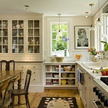
This kitchen was formerly a dark paneled, cluttered, divided space with little natural light. By eliminating partitions and creating a more functional, open floorplan, as well as adding modern windows with traditional detailing, providing lovingly detailed built-ins for the clients extensive collection of beautiful dishes, and lightening up the color palette we were able to create a rather miraculous transformation. The wide plank salvaged pine floors, the antique french dining table, as well as the Galbraith & Paul drum pendant and the salvaged antique glass monopoint track pendants all help to provide a warmth to the crisp detailing.
Renovation/Addition. Rob Karosis Photography
Conceived as a remodel and addition, the final design iteration for this home is uniquely multifaceted. Structural considerations required a more extensive tear down, however the clients wanted the entire remodel design kept intact, essentially recreating much of the existing home. The overall floor plan design centers on maximizing the views, while extensive glazing is carefully placed to frame and enhance them. The residence opens up to the outdoor living and views from multiple spaces and visually connects interior spaces in the inner court. The client, who also specializes in residential interiors, had a vision of ‘transitional’ style for the home, marrying clean and contemporary elements with touches of antique charm. Energy efficient materials along with reclaimed architectural wood details were seamlessly integrated, adding sustainable design elements to this transitional design. The architect and client collaboration strived to achieve modern, clean spaces playfully interjecting rustic elements throughout the home.
Greenbelt Homes
Glynis Wood Interiors
Photography by Bryant Hill
Ocean front, Luxury home in Miami Beach
Projects by J Design Group, Your friendly Interior designers firm in Miami, FL. at your service.
AVENTURA MAGAZINE selected our client’s luxury 5000 Sf ocean front apartment in Miami Beach, to publish it in their issue and they Said:
Story by Linda Marx, Photography by Daniel Newcomb
Light & Bright
New York snowbirds redesigned their Miami Beach apartment to take advantage of the tropical lifestyle.
New York snowbirds redesigned their Miami Beach apartment to take advantage of the tropical lifestyle.
WHEN INTERIOR DESIGNER JENNIFER CORREDOR was asked to recreate a four-bedroom, six-bath condominium at The Bath Club in Miami Beach, she seized the opportunity to open the rooms and better utilize the vast ocean views.
In five months last year, the designer transformed a dark and closed 5,000-square-foot unit located on a high floor into a series of sweeping waterfront spaces and updated the well located apartment into a light and airy retreat for a sports-loving family of five.
“They come down from New York every other weekend and wanted to make their waterfront home a series of grand open spaces,” says Jennifer Corrredor, of the J. Design Group in Miami, a firm specializing in modern and contemporary interiors. “Since many of the rooms face the ocean, it made sense to open and lighten up the home, taking advantage of the awesome views of the sea and the bay.”
The designer used 40 x 40 all white tile throughout the apartment as a clean base. This way, her sophisticated use of color would stand out and bring the outdoors in.
The close-knit family members—two parents and three boys in college—like to do things together. But there were situations to overcome in the process of modernizing and opening the space. When Jennifer Corredor was briefed on their desires, nothing seemed too daunting. The confident designer was ready to delve in. For example, she fixed an area at the front door
that was curved. “The wood was concave so I straightened it out,” she explains of a request from the clients. “It was an obstacle that I overcame as part of what I do in a redesign. I don’t consider it a difficult challenge. Improving what I see is part of the process.”
She also tackled the kitchen with gusto by demolishing a wall. The kitchen had formerly been enclosed, which was a waste of space and poor use of available waterfront ambience. To create a grand space linking the kitchen to the living room and dining room area, something had to go. Once the wall was yesterday’s news, she relocated the refrigerator and freezer (two separate appliances) to the other side of the room. This change was a natural functionality in the new open space. “By tearing out the wall, the family has a better view of the kitchen from the living and dining rooms,” says Jennifer Corredor, who also made it easier to walk in and out of one area and into the other. “The views of the larger public space and the surrounding water are breathtaking.
Opening it up changed everything.”
They clients can now see the kitchen from the living and dining areas, and at the same time, dwell in an airy and open space instead of feeling stuck in a dark enclosed series of rooms. In fact, the high-top bar stools that Jennifer Corredor selected for the kitchen can be twirled around to use for watching TV in the living room.
In keeping with the theme of moving seamlessly from one room to the other, Corredor designed a subtle wall of glass in the living room along with lots of comfortable seating. This way, all family members feel at ease while relaxing, talking, or watching sporting events on the large flat screen television. “For this room, I wanted more open space, light and a supreme airy feeling,” she says. “With the glass design making a statement, it quickly became the star of the show.”…….
….. To add texture and depth, Jennifer Corredor custom created wood doors here, and in other areas of the home. They provide a nice contrast to the open Florida tropical feel. “I added character to the openness by using exotic cherry wood,” she says. “I repeated this throughout the home and it works well.”
Known for capturing the client’s vision while adding her own innovative twists, Jennifer Corredor lightened the family room, giving it a contemporary and modern edge with colorful art and matching throw pillows on the sofas. She added a large beige leather ottoman as the center coffee table in the room. This round piece was punctuated with a bold-toned flowering plant atop. It effortlessly matches the pillows and colors of the contemporary canvas.
Jennifer Corredor also gutted all of the bathrooms, resulting in a major redesign of the master. She jettisoned the whirlpool and created the dazzling illusion of a floating tub. From an area where there were two toilets, she eliminated one to make a grand rectangular shower, which became an overall showpiece. The master bath went from being just a functional water closet to a sophisticated spa-like space. “The client said I was ‘delicious’ after seeing the change,” laughed Jennifer Corredor, who emphasized that her clients love their part-time life in South Florida more each time they come down. Even when the husband has to work from their Miami Beach digs, he is surrounded by tropical beauty. For instance, there are times when the master bedroom must double as the husband’s home office.
The room had to be large enough to accommodate a working space for this purpose. So Jennifer Corredor placed an appropriate table near the window and across from the king-size bed. “No blocking of the amazing water view was necessary,” she says. “I kept an open space with a lot of white so It functions well and the work space fits right in.” She repeated the bold modern art in the room as well as in the guest bedroom, which also has a workspace for the sons when they are home from school and need to study.
The designer is still happy and glowing with the results of her toil in this apartment. She gets a “spiritual feeling” when she walks inside. “It is so peaceful and serene, with subtle hints of explosive statements,” she says. “The entire space is open, yet anchored by the warmth of the exotic woods.” The client wrote Jennifer Corredor a letter at the end of the project congratulating her on a
job well done. She revealed that owning a Miami Beach home was her husband’s dream 30 years ago. “Now we have a quality perfect yet practical home,” she wrote to the designer. “You solved the challenges, and the end
result far exceeds our expectations. We love it.”
Thanks for your interest in our Contemporary Interior Design projects and if you have any question please do not hesitate to ask us.
http://www.JDesignGroup.com
305.444.4611
Modern Interior designer Miami. Contemporary
Miami
Miami Interior Designers
Miami Interior Designer
Interior Designers Miami
Interior Designer Miami
Modern Interior Designers
Modern Interior Designer
Modern interior decorators
Modern interior decorator
Contemporary Interior Designers
Contemporary Interior Designer
Interior design decorators
Interior design decorator
Interior Decoration and Design
Black Interior Designers
Black Interior Designer
Interior designer
Interior designers
Interior design decorators
Interior design decorator
Home interior designers
Home interior designer
Interior design companies
Interior decorators
Interior decorator
Decorators
Decorator
Miami Decorators
Miami Decorator
Decorators Miami
Decorator Miami
Interior Design Firm
Interior Design Firms
Interior Designer Firm
Interior Designer Firms
Interior design
Interior designs
home decorators
Interior decorating Miami
Best Interior Designers.
225 Malaga Ave.
Coral Gable, FL 33134
http://www.JDesignGroup.com
305.444.4611
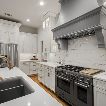
Our clients came to us wanting to maximize the space they had. They were not planning on moving anytime soon, as they loved their neighborhood. They wanted to renovate the front of their house, which included the front atrium, living room, kitchen, and powder bath. They hated their kitchen because it was completely closed off, had low ceilings, was dark and outdated, not to mention the floors were different in each of these rooms! The pantry was in the breakfast area and the kitchen table became a junk catcher, being the first thing you see when coming in from the garage/laundry room. In their living room, they wanted the spaces on either side of the fireplace to be symmetrical, whether that be bookshelves, a wet bar or closed off. Both parents are working professionals with no time and/or desire to design, create and figure this out on their own. They needed help figuring out how to reconfigure their current space in order to maximize what they already had, as they could not see an obvious solution. They could not envision how it would look so the fact that our designers were able to show them their new kitchen in 3D was pertinent.
We removed the pass-through windows that surrounded the atrium and front dining room, as well as the entire kitchen wall, completely opening up those two rooms. We removed a hall that used to lead between the kitchen and the living room since it was a complete waste of space! The ceilings were raised to 10’ in the kitchen and we were able to leave the skylight, letting in that natural light they wanted. We were able to give them a much larger pantry with tons of shelving and increase the size of their laundry room by utilizing the space of their old breakfast nook.
We relocated the door to the garage into their new elongated laundry room, built a wet bar across from their new larger pantry (with a pocket door) and the flow and functionality of these new spaces is just perfect! All new Waypoint cabinets were installed one two main kitchen surrounding walls painted Linen. Calacatta Bianco Polished Porcelain Tile 4x12 was used for the backsplash. A large eat-at island was installed, painted Stone, where the family can now gather for homework, meals, and mingling. The soft champagne bronze hardware and accent lighting really give this white and gray kitchen a soft classic look.
In the living room, we removed the built-in bookshelves to the left of the fireplace and closed off the wet-bar on the other side, giving them more space in their master suite. White Oak wood flooring, stained Putney, was installed throughout the entire new space, giving it the continuity they were looking for.
In the guest bathroom, Carrara white herringbone marble mosaic 12x12 tile was used on the shower floor and niche, while basic marble Bianco polished 12x24 porcelain tile was used on the walls. Luxart polished chrome traditional hardware gives this timeless bathroom the perfect shine.
Our clients are so happy with the new functionality and look of their space. It has definitely changed their lives in a way they could have never imagined!
Martha O'Hara Interiors, Interior Design | Susan Gilmore, Photography
Photo of a traditional living room in Minneapolis with grey walls.
Photo of a traditional living room in Minneapolis with grey walls.
Open plan living room and kitchen.
© Joe Fletcher Photography.
This is an example of a contemporary living room in New York with white walls and dark hardwood floors.
This is an example of a contemporary living room in New York with white walls and dark hardwood floors.
Reload the page to not see this specific ad anymore
To dwell and establish connections with a place is a basic human necessity often combined, amongst other things, with light and is performed in association with the elements that generate it, be they natural or artificial. And in the renovation of this purpose-built first floor flat in a quiet residential street in Kennington, the use of light in its varied forms is adopted to modulate the space and create a brand new dwelling, adapted to modern living standards.
From the intentionally darkened entrance lobby at the lower ground floor – as seen in Mackintosh’s Hill House – one is led to a brighter upper level where the insertion of wide pivot doors creates a flexible open plan centred around an unfinished plaster box-like pod. Kitchen and living room are connected and use a stair balustrade that doubles as a bench seat; this allows the landing to become an extension of the kitchen/dining area - rather than being merely circulation space – with a new external view towards the landscaped terrace at the rear.
The attic space is converted: a modernist black box, clad in natural slate tiles and with a wide sliding window, is inserted in the rear roof slope to accommodate a bedroom and a bathroom.
A new relationship can eventually be established with all new and existing exterior openings, now visible from the former landing space: traditional timber sash windows are re-introduced to replace unsightly UPVC frames, and skylights are put in to direct one’s view outwards and upwards.
photo: Gianluca Maver
Photographer: Tom Crane
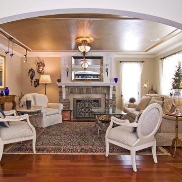
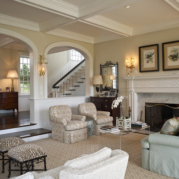
Design ideas for a large traditional formal open concept living room in Philadelphia with beige walls, no tv, carpet, a standard fireplace and a stone fireplace surround.
Design ideas for a large traditional formal open concept living room in Philadelphia with beige walls, no tv, carpet, a standard fireplace and a stone fireplace surround.
Complete interior renovation of a 1980s split level house in the Virginia suburbs. Main level includes reading room, dining, kitchen, living and master bedroom suite. New front elevation at entry, new rear deck and complete re-cladding of the house. Interior: The prototypical layout of the split level home tends to separate the entrance, and any other associated space, from the rest of the living spaces one half level up. In this home the lower level "living" room off the entry was physically isolated from the dining, kitchen and family rooms above, and was only connected visually by a railing at dining room level. The owner desired a stronger integration of the lower and upper levels, in addition to an open flow between the major spaces on the upper level where they spend most of their time. ExteriorThe exterior entry of the house was a fragmented composition of disparate elements. The rear of the home was blocked off from views due to small windows, and had a difficult to use multi leveled deck. The owners requested an updated treatment of the entry, a more uniform exterior cladding, and an integration between the interior and exterior spaces. SOLUTIONS The overriding strategy was to create a spatial sequence allowing a seamless flow from the front of the house through the living spaces and to the exterior, in addition to unifying the upper and lower spaces. This was accomplished by creating a "reading room" at the entry level that responds to the front garden with a series of interior contours that are both steps as well as seating zones, while the orthogonal layout of the main level and deck reflects the pragmatic daily activities of cooking, eating and relaxing. The stairs between levels were moved so that the visitor could enter the new reading room, experiencing it as a place, before moving up to the main level. The upper level dining room floor was "pushed" out into the reading room space, thus creating a balcony over and into the space below. At the entry, the second floor landing was opened up to create a double height space, with enlarged windows. The rear wall of the house was opened up with continuous glass windows and doors to maximize the views and light. A new simplified single level deck replaced the old one.
The decision to remodel your kitchen isn't one to take lightly. But, if you really don't enjoy spending time there, it may be time for a change. That was the situation facing the owners of this remodeled kitchen, says interior designer Vernon Applegate.
"The old kitchen was dismal," he says. "It was small, cramped and outdated, with low ceilings and a style that reminded me of the early ‘80s."
It was also some way from what the owners – a young couple – wanted. They were looking for a contemporary open-plan kitchen and family room where they could entertain guests and, in the future, keep an eye on their children. Two sinks, dishwashers and refrigerators were on their wish list, along with storage space for appliances and other equipment.
Applegate's first task was to open up and increase the space by demolishing some walls and raising the height of the ceiling.
"The house sits on a steep ravine. The original architect's plans for the house were missing, so we needed to be sure which walls were structural and which were decorative," he says.
With the walls removed and the ceiling height increased by 18 inches, the new kitchen is now three times the size of the original galley kitchen.
The main work area runs along the back of the kitchen, with an island providing additional workspace and a place for guests to linger.
A color palette of dark blues and reds was chosen for the walls and backsplashes. Black was used for the kitchen island top and back.
"Blue provides a sense of intimacy, and creates a contrast with the bright living and dining areas, which have lots of natural light coming through their large windows," he says. "Blue also works as a restful backdrop for anyone watching the large screen television in the kitchen."
A mottled red backsplash adds to the intimate tone and makes the walls seem to pop out, especially around the range hood, says Applegate. From the family room, the black of the kitchen island provides a visual break between the two spaces.
"I wanted to avoid people's eyes going straight to the cabinetry, so I extended the black countertop down to the back of the island to form a negative space and divide the two areas," he says.
"The kitchen is now the axis of the whole public space in the house. From there you can see the dining room, living room and family room, as well as views of the hills and the water beyond."
Cabinets : Custom rift sawn white oak, cerused dyed glaze
Countertops : Absolute black granite, polished
Flooring : Oak/driftwood grey from Gammapar
Bar stools : Techno with arms, walnut color
Lighting : Policelli
Backsplash : Red dragon marble
Sink : Stainless undermountby Blanco
Faucets : Grohe
Hot water system : InSinkErator
Oven : Jade
Cooktop : Independent Hoods, custom
Microwave : GE Monogram
Refrigerator : Jade
Dishwasher : Miele, Touchtronic anniversary Limited Edition
Small Open Plan Kitchen And Living Room - Photos & Ideas | Houzz
Reload the page to not see this specific ad anymore
Cooking for Two
Location: Plymouth, MN, United States
When this couple’s last child graduated from college they began the process of looking for a new home. After a lengthy search they decided to stay with the neighborhood they loved, saving money by remodeling rather than starting over.
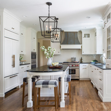
The top priorities on their wish list were adding character to their 1990’s era home with a classic white kitchen and a larger island while keeping within the existing footprint. With the intention of honing their cooking skills, they were also considering better appliances and two ovens.
Challenges and Solutions
Design a larger island with seating for at least two. The existing island was small and the area behind the seating was less than recommended clearances.
To solve this challenge, the seating area of the island was extended out into the open area of the kitchen. This created a larger island with seating for three, extra storage and a bookshelf across from the range.
The original kitchen had a range with microwave above, so adding another oven was a challenge with limited wall space.
Because the adjoining dining room is used infrequently, the homeowner was open to placing the second oven and microwave in the walkway. This made room for the small buffet between the built in refrigerator and ovens, creating one of her favorite areas.
The client requested a white painted kitchen but wanted to make sure it had warmth and character. To achieve this the following elements were chosen:
1) Cabinets painted with Benjamin Moore Capitol White, a luminous and warm shade of white.
2) The Range hood was painted with warm metallic shades to reflect the bronze of the Ashley Norton hardware.
3) Black Aqua Grantique granite was chosen for countertops because it looks like soapstone and adds contrast.
4) Walker Zanger Café tile in Latte was chosen for it’s handmade look with uneven edges.
5) The to-the-counter-cabinet with glass door shows off serving dishes and lends sophisticated charm.
The result is a welcoming classic kitchen, where this couple enjoys cooking more often and sharpening their skills with gourmet appliances.
Liz Schupanitz Designs
Photographed by: Andrea Rugg Photography
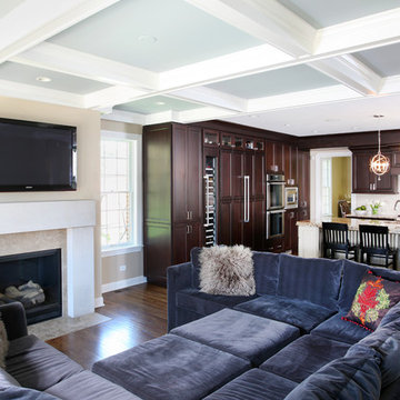
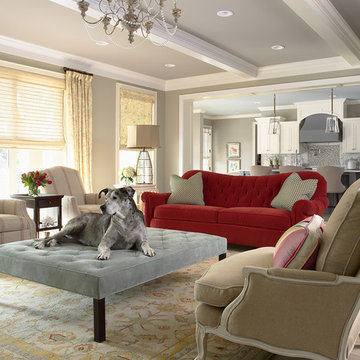
This open family room is part of a larger addition to this Oak Park home, which also included a new kitchen and a second floor master suite. This project was designed and executed by award winning Normandy Designer Stephanie Bryant. The coferred ceilings and limestone fireplace surround add visual interest and elegance to this living room space. The soft blue color of the ceiling enhances the visual interest even further.
In this combination living room/ family room, form vs function is at it's best.. Formal enough to host a cocktail party, and comfortable enough to host a football game. The wrap around sectional accommodates 5-6 people and the oversized ottoman has room enough for everyone to put their feet up! The high back, stylized wing chair offers comfort and a lamp for reading. Decorative accessories are placed in the custom built bookcases freeing table top space for drinks, books, etc. Magazines and current reading are neatly placed in the rattan tray for easy access. The overall neutral color palette is punctuated by soft shades of blue around the room.
LORRAINE G VALE
photo by Michael Costa
2