
Small Kitchen with Tile Benchtops Design Ideas
Refine by:
Budget
Sort by:Popular Today
1 - 20 of 199 photos
Item 1 of 3
 Projet Wabi-sabi
Projet Guynemer
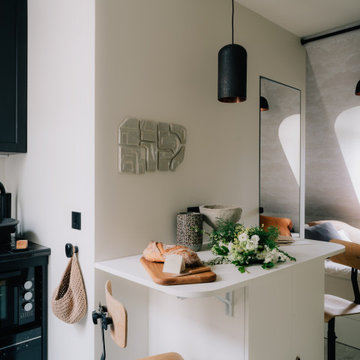
Une chambre de service que nous avons transformée en tiny house sur les toits de Paris, face au jardin du Luxembourg, notre nouveau bébé minimaliste mais multi fonctions, rien ne manque !
La cuisine avec ses zelliges et sa vasque en marbre noir, comprend un frigo, une plaque, un four, un lave vaisselle et de grands placards de rangement.
L’îlot cache la buanderie avec un lave linge séchant. Les deux tablettes rabattables permettent de profiter d’un côté dînatoire et d’un côté bureau, ou de dîner à deux et aux chandelles ;-)
Derrière se cache une salle de bain avec sa porte miroir secrète qui permet de renvoyer la lumière, de démultiplier la sensation d’espace et les perspectives. Une grande douche à l’italienne, un meuble avec sa vasque en marbre noir elle aussi, des wc suspendus, un sèche serviette sculpture, comme une grande ! La verrière reprend le dessin de la fenêtre de toit en face, qui donne sur les toits de Paris. On peut admirer la Tour Eiffel en faisant sa toilette si on en a envie! Et quand on est à plusieurs, un store bambou permet de redonner son intimité à la pièce sans empêcher la lumière naturelle de passer.
De l’autre côté de la pièce, très lumineuse car traversante avec une fenêtre coté cuisine et une fenêtre côté séjour / chambre, se déploie un ensemble de très belles menuiseries, qui composent une alcôve délicieuse, façon vanlife ultra luxe : sur une estrade, un grand lit deux places au matelas de qualité hôtelière, qui fait aussi canapé quand on reçoit : à gauche et à droite, deux tablettes peuvent même se déployer pour faire table basse, poser des verres, l’apéro ou un ordinateur (il y a des prises RJ45 partout où nécessaire). Quand elles sont refermées, ces tablettes font office de portes aux niches des deux grands placards sur mesure. Le premier contient le ballon d’eau chaude extra plat et ultra silencieux, une penderie, des étagères. De l’autre côté, une grande bibliothèque avec plusieurs tiroirs en partie basse. Elle se prolonge sur tout le mur jusqu’à l’entrée pour cacher le radiateur avec un placard ajouré dessiné par @projet_wabi_sabi , d’autres grandes étagères, deux autres grands placards dont l’un renferme la box, le compteur électrique et des prises pour le petit électroménager. En dessous, encore des grands tiroirs pour ranger plein de trucs. Et si on n’a pas tout casé avec tout ça, il reste un grand tiroir sous l’estrade et même une trappe secrète sous le matelas, façon coffre fort !
Les couleurs : un très joli beige doux et lumineux, du noir mat profond, le fauve du cuir et du cuivre, le caramel clair du bois et de l’osier. En guest star : une œuvre murale en céramique de l’artiste marseillaise Laurence Mallaret.
Photos @juanjerez pour @juanjerezstudio
 Tiles Paradise UK
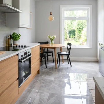
The right kitchen tiles can make a compact kitchen feel noticeably larger than it actually is. Size, finish, and layout each shape how open a room reads, and getting that combination right turns a cramped cooking area into one that feels calm and uncluttered. The decisions below — from light reflectance to grout colour to tile format — are the ones that quietly determine how spacious a small kitchen looks and how well it holds up to daily use.
Light Reflectance In Wall Tiles
How a surface handles light has a direct effect on perceived space. Glossy finishes bounce daylight across the room and brighten the corners that compact kitchens tend to leave dark, which is why brilliant white kitchen tiles lift ambient brightness so quickly. Matte finishes do the opposite — they absorb light and can make a tight space feel slightly more enclosed.
Reflective wall tiles amplify whatever natural light is already available, often without the need for extra fixtures. Cream tones add warmth while keeping luminosity high, and high-gloss surfaces push brightness even further. A luminous room almost always reads as larger than a dark, light-absorbing one, so designers frequently lean on reflective finishes to stretch a small footprint.
Grout Colour And Floor Continuity
Visible grout lines create a grid that stops the eye and draws attention to tight dimensions. Matching grout colour to the tile surface removes those interruptions, and the seamless effect works especially well with natural beige tones. Narrow joints help too, which is why rectified, precision-cut edges suit small spaces — they allow ultra-thin grout lines and a more continuous surface.
High-contrast grout introduces visual busyness that compact rooms can't afford. Colour-matched epoxy keeps joints clean and durable while preserving that unbroken plane. The result is a near-monolithic floor that the eye reads as a single expanse rather than a patchwork of small units.
Large-Format Tiles In Compact Spaces
It runs counter to intuition, but oversized formats often perform best in the smallest rooms. Fewer joints mean less visual clutter, and a 60x120cm tile laid horizontally stretches the perceived width of a tight galley layout. Large slabs reduce the intersections that chop up kitchen floor tiles, drawing the eye outward toward the edges of the room.
Replacing small square tiles with larger porcelain slabs also modernises the overall feel and creates a calmer, more continuous base. For most compact kitchens, that uninterrupted surface area does more for the sense of space than a busier small-format floor ever would.
Layout And Orientation
Pattern direction changes how a wall reads. Vertical stacking draws the eye upward and lifts perceived ceiling height, useful in rooms that feel boxed in. Horizontal stacking does the reverse, visually widening narrow walls — a run of deep blue kitchen tiles laid horizontally adds depth without closing the space in.
Classic brick-bond and metro layouts offer timeless appeal but need careful orientation to suit the room. Herringbone introduces movement and draws attention away from a limited floor area, though the zigzag demands proportional planning so it doesn't overwhelm a small space.
Colour And Pattern Strategy
Busy patterns can swamp a small room if they're used everywhere. A single feature zone solves this: confining patterned kitchen tiles to one backsplash area adds character without tipping into visual chaos. Elsewhere, a monochrome palette keeps the room unified, and tone-on-tone schemes — subtle grey kitchen tiles, for instance — create a sophisticated backdrop for modern appliances.
Deliberate contrast can still define zones intelligently. Pairing black kitchen tiles on base units with lighter walls above grounds the room and creates a gentle gradient, which tends to flatter a compact layout more than a single flat colour throughout.
Porcelain Vs Ceramic Durability
Material density drives longevity in a high-traffic cooking zone. Porcelain kitchen tiles are vitrified, giving them superior water resistance and structural integrity, and they stand up to decades of heavy daily use. Ceramic kitchen tiles are lighter, which makes them well suited to walls and splashbacks where reduced weight helps installation and allows more intricate detailing.
Maintenance differs between the two clay-based materials. Non-porous porcelain is the safer choice for busy households and floors that see spills and moisture, where absolute water resistance matters most.
Polished Onyx-Effect Tiles For Splashbacks
Polished surfaces replicate the luxury of natural stone without the upkeep stone demands, and an onyx-effect finish brings a high-end look to a modern kitchen. The reflective glaze bounces task lighting across prep areas attractively.
The trade-off is that glossy finishes show watermarks more readily than matte ones, so they reward regular wiping. Set against that, strong heat resistance makes them a sensible option for stove-adjacent areas where the surface takes direct warmth.
Wood-Effect Porcelain For Open-Plan Kitchens
Wood-effect porcelain pairs timber aesthetics with the thermal conductivity needed for underfloor heating — it retains and radiates warmth far more effectively than real timber. Plank formats also elongate a room when laid parallel to the longest wall.
Many of these tiles convincingly mimic Scandinavian oak or richer walnut tones, delivering durability, warmth underfoot, and a visual stretch all at once. For open-plan layouts with heating beneath the floor, it's one of the more practical premium choices available.
Backsplash Decisions
A splashback is prime real estate for a design statement, and reflective surfaces add depth right at eye level. Veined options like marble-effect tiles bring organic movement to otherwise rigid cabinetry, and matching the splashback to countertop materials creates a cohesive, considered finish.
Grout maintenance matters most behind hobs and sinks, where stain-resistant epoxy keeps surfaces hygienic and easy to clean over the long term.
High-performance splashbacks generally share three properties:
- High thermal shock resistance against direct stove heat
- Zero porosity, to repel cooking oils and heavy moisture
- Clean integration with the surrounding wall tiles
 Ren Studio
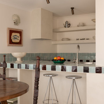
This seaside retreat in Cottesloe, WA has been reimagined by Emma & @whitestudioandco into a European-inspired haven with vintage Parisian treasures. The kitchen is a showstopper with Ren Studio doors in @dulux Antique White USA paired with handmade Moroccan tiles from @perinitiles. Coastal vibes, timeless design, and European elegance all in one dreamy getaway.
 VALENTINA AUTIERO architecture interiors design
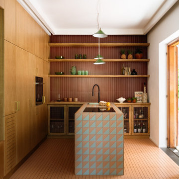
Design ideas for a small eclectic l-shaped open plan kitchen in Naples with an undermount sink, beaded inset cabinets, light wood cabinets, tile benchtops, red splashback, black appliances, ceramic floors, with island, pink floor and multi-coloured benchtop.
 Atelier Dito
Aurélien Aumond
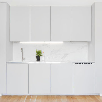
Small contemporary single-wall open plan kitchen in Lyon with a single-bowl sink, beaded inset cabinets, grey cabinets, tile benchtops, white splashback and light hardwood floors.
Small contemporary single-wall open plan kitchen in Lyon with a single-bowl sink, beaded inset cabinets, grey cabinets, tile benchtops, white splashback and light hardwood floors.
 As de Carreaux
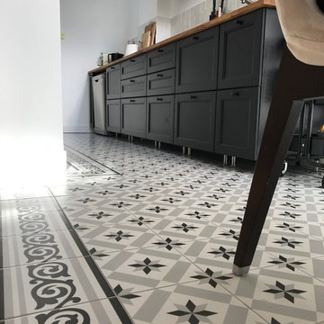
Offrant à la fois un aspect traditionnel et sophistiqué, les carreaux à motifs étoilés s'accordent parfaitement avec les meubles noirs de la pièce.
Design ideas for a small midcentury single-wall separate kitchen in Montpellier with tile benchtops, cement tiles, an undermount sink, beaded inset cabinets, black cabinets, grey splashback, porcelain splashback, stainless steel appliances, no island, multi-coloured floor and brown benchtop.
Design ideas for a small midcentury single-wall separate kitchen in Montpellier with tile benchtops, cement tiles, an undermount sink, beaded inset cabinets, black cabinets, grey splashback, porcelain splashback, stainless steel appliances, no island, multi-coloured floor and brown benchtop.
 SLAM architects
Dettagli Sartoriali: Ergonomia e Matericità in Cucina
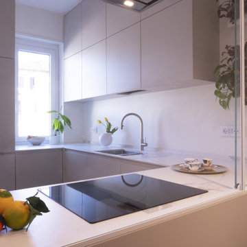
In questo scatto ravvicinato, la cucina del progetto MI B36 rivela la sua anima tecnologica e raffinata. La scelta del top in gres effetto marmo bianco con venature grigie avvolge l'intera superficie di lavoro, risalendo anche sullo schienale (backsplash) per creare un effetto monolitico ed elegante, facile da pulire e di grande impatto estetico.
La configurazione è studiata per chi ama cucinare senza isolarsi: il piano a induzione è posizionato sulla penisola, permettendo di interagire con la zona living oltre la vetrata. La palette cromatica punta su tonalità neutre e desaturate, che catturano la luce naturale proveniente dalla finestra adiacente. L'assenza di maniglie (apertura a gola o push-pull) sottolinea il rigore minimale dell'intervento, mentre il tocco di verde delle piante da interno appese crea un contrasto organico con le linee squadrate della falegnameria.
In evidenza in questa foto:
Continuità visiva: Il top che prosegue verticalmente come paraschizzi.
Zona cottura integrata: Piano a induzione a filo per una pulizia formale assoluta.
Luce e Colore: Il riflesso del laccato opaco che amplia la percezione dello spazio di lavoro.
 Northern Beaches Kitchens and Bathrooms
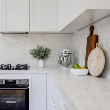
This is an example of a small beach style u-shaped kitchen pantry in Sydney with a drop-in sink, shaker cabinets, grey cabinets, tile benchtops, multi-coloured splashback, porcelain splashback, stainless steel appliances, light hardwood floors, a peninsula, beige floor and multi-coloured benchtop.
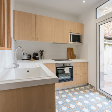
 Les Compagnons des Investisseurs
Small l-shaped eat-in kitchen in Paris with a single-bowl sink, light wood cabinets, tile benchtops, white splashback, ceramic splashback, stainless steel appliances, ceramic floors, no island, blue floor and white benchtop.
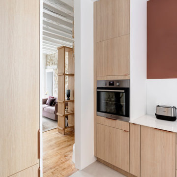
 Studio LF
La cuisine rénovée est ouverte sur le salon, pour permettre un apport de lumière traversant dans l'appartement. On a intégré le réfrigérateur et le congélateur dans une colonne. Le sol existant a été recouvert d'un carrelage Marazzi beige.
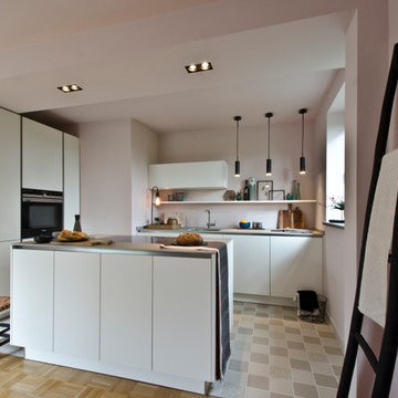
 Anne Stallkamp Innenarchitektur
This is an example of a small modern galley open plan kitchen in Hanover with white cabinets, tile benchtops, pink splashback, cement tiles, with island, an undermount sink and flat-panel cabinets.
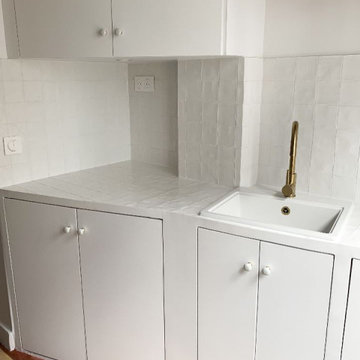
 Marie-Sophie Donnedieu - Architecture d'intérieur
Small midcentury kitchen in Paris with an undermount sink, white cabinets, tile benchtops, white splashback, ceramic splashback, cement tiles, red floor and white benchtop.
 laurence prevedello
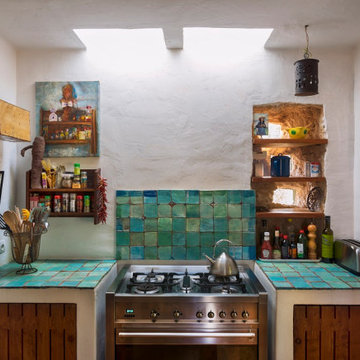
Inspiration for a small country open plan kitchen in Other with medium wood cabinets, tile benchtops, white splashback, stainless steel appliances and turquoise benchtop.
 Iori Arredamenti
Restyling cucina
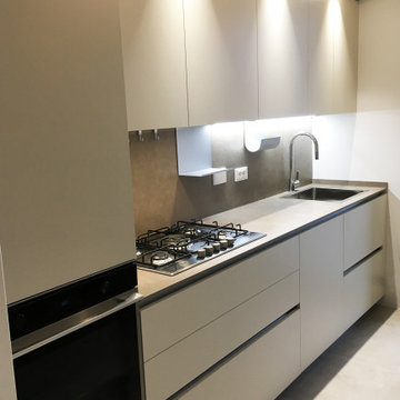
Photo of a small modern single-wall separate kitchen in Other with flat-panel cabinets, beige cabinets, tile benchtops, brown splashback, porcelain splashback, stainless steel appliances and brown benchtop.
Photo of a small modern single-wall separate kitchen in Other with flat-panel cabinets, beige cabinets, tile benchtops, brown splashback, porcelain splashback, stainless steel appliances and brown benchtop.
 Northern Beaches Kitchens and Bathrooms
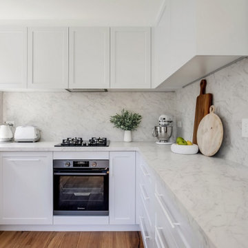
Inspiration for a small beach style u-shaped kitchen pantry in Sydney with a drop-in sink, shaker cabinets, grey cabinets, tile benchtops, multi-coloured splashback, porcelain splashback, stainless steel appliances, light hardwood floors, a peninsula, beige floor and multi-coloured benchtop.
 Juliana Gilbert
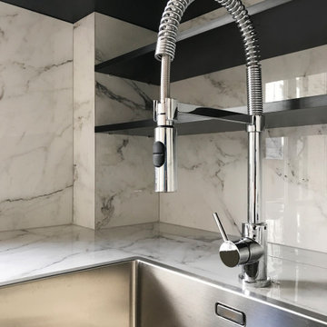
This is an example of a small contemporary single-wall kitchen in Paris with an undermount sink, beaded inset cabinets, white cabinets, tile benchtops, grey splashback, ceramic splashback, black appliances and light hardwood floors.
 Tamarindo srl
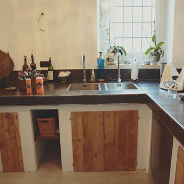
Cucina realizzata con pannelli portanti e poi rivestita con piastrelle di grande formato e profili acciaio inox
Photo of a small country l-shaped open plan kitchen in Turin with white cabinets, tile benchtops, stainless steel appliances, porcelain floors, no island, grey floor and black benchtop.
Photo of a small country l-shaped open plan kitchen in Turin with white cabinets, tile benchtops, stainless steel appliances, porcelain floors, no island, grey floor and black benchtop.
 Atelier Dito
Aurélien Aumond
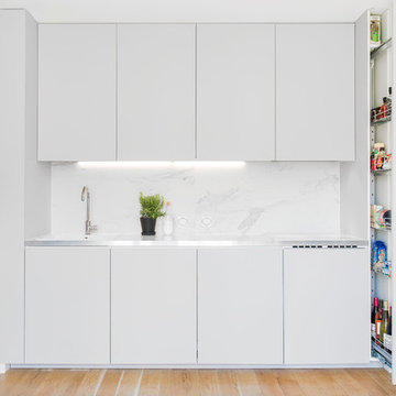
This is an example of a small contemporary single-wall open plan kitchen in Lyon with a single-bowl sink, beaded inset cabinets, grey cabinets, tile benchtops, white splashback and light hardwood floors.
This is an example of a small contemporary single-wall open plan kitchen in Lyon with a single-bowl sink, beaded inset cabinets, grey cabinets, tile benchtops, white splashback and light hardwood floors.
 Ferrari Design 3.6.0
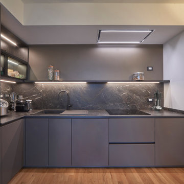
Dopo molti anni in una casa dove si sono stratificati molti ricordi, i proprietari hanno scelto di voltare pagina e iniziare un nuovo capitolo.
Le finiture e gli arredi del nuovo appartamento sono stati impostati cercando un look contemporaneo, ma mancava quel legame affettivo che rende un luogo “casa”.
Si è fatta una selezione accurata di oggetti e ricordi, integrandoli nel nuovo spazio con equilibrio e misura.
Il risultato è una casa razionale ma calda, dove tutto convive in armonia: il nuovo e il vissuto, la funzionalità e l’emozione.
Un progetto che parla di evoluzione, ma anche di continuità.
È così che il nuovo inizia a somigliare, giorno dopo giorno, a chi lo abita.
 Projet Wabi-sabi
Projet Guynemer
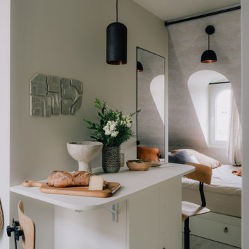
Une chambre de service que nous avons transformée en tiny house sur les toits de Paris, face au jardin du Luxembourg, notre nouveau bébé minimaliste mais multi fonctions, rien ne manque !
La cuisine avec ses zelliges et sa vasque en marbre noir, comprend un frigo, une plaque, un four, un lave vaisselle et de grands placards de rangement.
L’îlot cache la buanderie avec un lave linge séchant. Les deux tablettes rabattables permettent de profiter d’un côté dînatoire et d’un côté bureau, ou de dîner à deux et aux chandelles ;-)
Derrière se cache une salle de bain avec sa porte miroir secrète qui permet de renvoyer la lumière, de démultiplier la sensation d’espace et les perspectives. Une grande douche à l’italienne, un meuble avec sa vasque en marbre noir elle aussi, des wc suspendus, un sèche serviette sculpture, comme une grande ! La verrière reprend le dessin de la fenêtre de toit en face, qui donne sur les toits de Paris. On peut admirer la Tour Eiffel en faisant sa toilette si on en a envie! Et quand on est à plusieurs, un store bambou permet de redonner son intimité à la pièce sans empêcher la lumière naturelle de passer.
De l’autre côté de la pièce, très lumineuse car traversante avec une fenêtre coté cuisine et une fenêtre côté séjour / chambre, se déploie un ensemble de très belles menuiseries, qui composent une alcôve délicieuse, façon vanlife ultra luxe : sur une estrade, un grand lit deux places au matelas de qualité hôtelière, qui fait aussi canapé quand on reçoit : à gauche et à droite, deux tablettes peuvent même se déployer pour faire table basse, poser des verres, l’apéro ou un ordinateur (il y a des prises RJ45 partout où nécessaire). Quand elles sont refermées, ces tablettes font office de portes aux niches des deux grands placards sur mesure. Le premier contient le ballon d’eau chaude extra plat et ultra silencieux, une penderie, des étagères. De l’autre côté, une grande bibliothèque avec plusieurs tiroirs en partie basse. Elle se prolonge sur tout le mur jusqu’à l’entrée pour cacher le radiateur avec un placard ajouré dessiné par @projet_wabi_sabi , d’autres grandes étagères, deux autres grands placards dont l’un renferme la box, le compteur électrique et des prises pour le petit électroménager. En dessous, encore des grands tiroirs pour ranger plein de trucs. Et si on n’a pas tout casé avec tout ça, il reste un grand tiroir sous l’estrade et même une trappe secrète sous le matelas, façon coffre fort !
Les couleurs : un très joli beige doux et lumineux, du noir mat profond, le fauve du cuir et du cuivre, le caramel clair du bois et de l’osier. En guest star : une œuvre murale en céramique de l’artiste marseillaise Laurence Mallaret.
Photos @juanjerez pour @juanjerezstudio
1