
Houzz Tours
Devon Houzz: A Crumbling Old Cottage Gets a Fresh New Update
An inspiring blend of old and new architecture transforms a derelict cottage into a modern home with elegant proportions

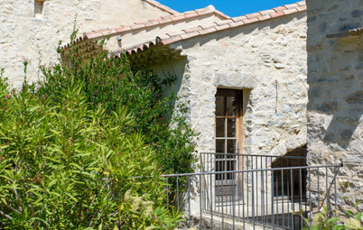
Buying a dilapidated cottage in the middle of Dartmoor National Park at auction might at first seem like a high-risk move, but the new owners of this rundown property in Devon, UK, could see past the state of the house to all its potential – and they were up for the challenge.
Sheryn could see the house itself was a combination of two different parts and that, at some point in its history, the older part at the back of the building had been improved with a newer Georgian extension at the front. “The first thing we did was analyse what we had and try to understand its merits and weaknesses,” he says.
They decided to knock down what didn’t work and sympathetically restore the better elements of the existing house, enhancing it with a new extension at the back. As the house wasn’t heritage listed, planning went through without a hitch.
Ready to renovate? Find reviewed architects in your area on Houzz and browse their previous projects
The elegant Georgian facade was one of the building’s finest features, so the team based the concept for the extension around it.
“It was important that the Georgian elevation took pride of place within the plot,” says Sheryn. “We knew we didn’t want to compete with that, so any extension would have to be set back and not interfere with the proportions of the existing building.”
To ensure the front of the extension was in harmony with its older counterpart, they mirrored the three windows on the first floor, used slate-coloured zinc on the roof, and clad it in Siberian-larch timber.
A big discussion the team had was around the advantages of retaining the render compared to exposing the old stone. “When you have an old building like this, if it’s rendered, it’s generally for a purpose,” says Sheryn. “The Georgians would either expose good cut-stone or build out of poorer stone and render over it, so our initial reaction was that it needed to be lime-rendered.”
However, the owners were taken with the idea of a stone look, so they stripped it back and were pleasantly surprised by what they found. Not only was the stonework in great condition, there was also some pretty brickwork around all the windows.
“It really works,” says Sheryn. “The fact it’s exposed adds an extra layer of detail and interest.”
“It really works,” says Sheryn. “The fact it’s exposed adds an extra layer of detail and interest.”
A portion of the old house was eventually demolished. “We realised the older part at the back didn’t really work,” says Sheryn. “It was damp and dark, and the floor-to-ceiling height was poor. It had much thicker stone walls and it was quite simplistic in its construction – and clearly not fit for purpose.”
This ‘before’ shot of the original kitchen – now demolished – gives a good flavour of what a sorry state the interiors were in.
The room and this part of the house have now been replaced by a modern extension.
Sheryn and the team designed the silhouette of the new extension to echo the outline of the older building, so although there’s a stark contrast between the two parts, there’s still a sense of unity.
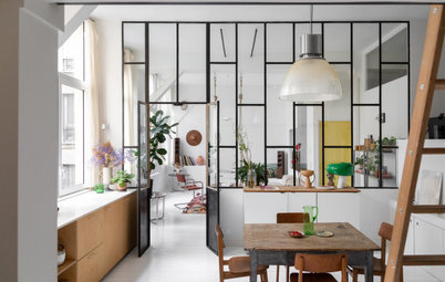
As the Georgian front door opened up straight into the sitting room – not ideal when coming in after a muddy, country walk – the team relocated the main entrance.
They chose the glazed link between the old house and new extension as the most practical point of entry, partly because it’s near where the cars are parked, but also because it’s next to the laundry. “Being on Dartmoor, they need a ‘decontamination zone’ where they could drop all their walking paraphernalia,” says Sheryn.
Inside the glazed link, where the raw stone of the historical part of the house is still exposed, Sheryn created a hallway. “It’s a multi-functional space that also has a front-to-back view,” he says. “And I like the fact it doesn’t blur the transition between old and new, but creates a very distinct separation. I think it creates a little more drama and a sense of arrival.”
Ground-floor plan.
After the renovation, this is how the ground floor looks. You can see clearly how the new extension is intentionally set back from the main house, allowing the historical Georgian part to take prominence, and how the breezeway-like glazed link joins the two portions together.
After the renovation, this is how the ground floor looks. You can see clearly how the new extension is intentionally set back from the main house, allowing the historical Georgian part to take prominence, and how the breezeway-like glazed link joins the two portions together.
The effect is repeated up on the first-floor landing, which is directly above the hallway, where Sheryn had the idea of creating a double-height space. This means when you enter the building, you look all the way up to the ceiling of the first floor.
Browse more traditionally styled entrances to inspire your own
Browse more traditionally styled entrances to inspire your own
First-floor plan.
The proposed floor plan of the first floor shows how, upstairs, the house now benefits from a wealth of extra space and functionality with the addition of the new extension.
The proposed floor plan of the first floor shows how, upstairs, the house now benefits from a wealth of extra space and functionality with the addition of the new extension.
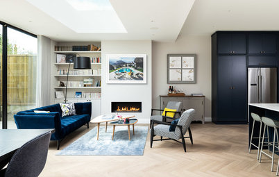
Back downstairs, off the hallway in the older half of the building there’s a comfortable living room.
“It’s quite a traditionally dressed room,” says Sheryn, “but the proportions are lovely, so it works well. It’s a very homely space without being too grand.”
“We kept the original fireplace,” says Sheryn. “A lot of the original features were past repair, but everything we could salvage, we did.”
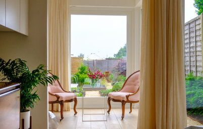
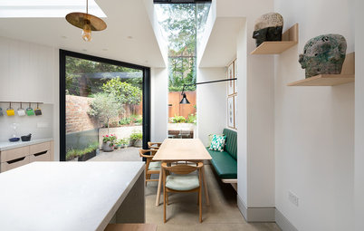
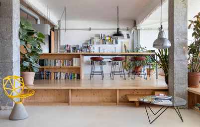
In the new extension, the team created a spacious, contemporary open-plan eat-in kitchen from Ikea, which overlooks the garden at the front of the house. Sliding doors mean the room can be opened up to the outdoor terrace.
The expansive modern space may seem at odds with the older parts of the property, but when all the areas are brought together, the combination elevates the home to a whole new level.
“People like an old cottage for its historic charm, but there are also restrictions with what you have – bad ceiling heights and a lack of natural light,” says Sheryn. “So if you can add something that’s light and transparent that connects well to the outside spaces, you can have a bit of everything.”
“People like an old cottage for its historic charm, but there are also restrictions with what you have – bad ceiling heights and a lack of natural light,” says Sheryn. “So if you can add something that’s light and transparent that connects well to the outside spaces, you can have a bit of everything.”
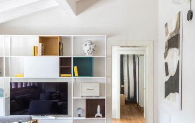
“We wanted a flexible, multi-functional living space, as it works in so many ways,” he says.
The clients sourced furniture from markets and antiques shops to create a fresh yet characterful Scandi vibe as well as turning to larger chain stores. Here, the trio of mirrors are from Ikea, while the porcelain floor tiles are from a local stone supplier.
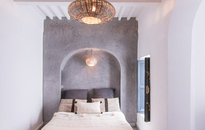
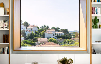
Upstairs in the old part of the house, there are two bedrooms with a main bathroom between them. The team was able to restore and reinstate some of the original timber trusses, which add character to the rooms. Where Sheryn needed to add new wooden elements, they used French oak.
The shared bathroom has a generous freestanding tub…
…And a beautiful view across the treetops.
In the extension on the first floor, Sheryn was able to add three spacious new bedrooms…
…And two new bathrooms, so the owners now have plenty of room for friends and family to come and stay.
For Sheryn, one of his favourite parts of the finished design is the glazed link between the historical half of the building and the contemporary part. “It’s a lovely space – and a very efficient use of the floor plan,” he says.
But what sets it apart for the architect is the way the building sits in harmony with its natural setting. “That’s been really successful – the way the landscape works so well with the house,” he says. “Quite often, you’ll get projects where the external spaces haven’t been developed with the same rigour and attention as the architecture, but here there’s such a wonderful backdrop.”
Sheryn thinks the owners feel the same way. “Overall, their favourite element is the tranquillity,” he says. “This really is a very special place.”
Your turn
What do you like best about the rebirth of this crumbling old building? Let us know in the Comments, like this story, save the images for inspiration and join the renovation conversation.
More
Want to see another stunning home restoration? Check out this
Tenerife Houzz: Restoring Period Features in a Childhood Home

House at a Glance
Who lives here: A couple entering retirement
Location: Devon, UK
Property: An early 17th-century cottage with a modern rear addition
Size: Five bedrooms and three bathrooms
Architect: Eilir Sheryn of van Ellen + Sheryn
Landscaping: Alice Blount Garden Design
Part of the appeal was that, although it had fallen into disrepair, the house is located in four acres of beautiful forest, which came with the lot. “It has one of those really wonderful approaches – you come through a gated entrance and wind through this landscaped woodland for about 100 yards [approximately 91 metres] and then you see the house at the end of the drive,” says architect Eilir Sheryn of van Ellen + Sheryn. “It’s a classic country-house approach.”