Houzz Tours

Houzz Tour: A Terrace That Boldly Goes Where None Has Gone Before
Heritage and council restrictions led to some clever design solutions in this envelope-pushing terrace

Renovating a terrace house in a suburb where heritage restrictions take precedence over modernisation is fraught with issues; many of these are thrown up unexpectedly. However, this reconfigured three-storey home in Paddington, Sydney, shows us that sometimes setbacks are a blessing in disguise.
“The brief was relatively simple,” says Koolloos. “It consisted of creating a contemporary home to suit the needs of a young, growing family.” Here you can see the layout of the ground level.
From the entrance, the home is configured so that once inside and past a bedroom, you come across a small living area adjacent to stairs. This new staircase runs perpendicular to its predecessor. Given most terrace homes are restricted by their width, the intent was to make each level feel as wide as possible, so in turning the stair 90 degrees, MCK was able to save on the space needed to circulate around a staircase.
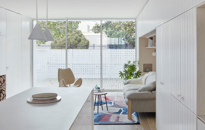
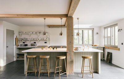
Beyond the stairs is an open-plan kitchen and dining area (this photo looks back towards the stairs). “The intent in regards to the joinery was to create a neutral palette, with sources of warmth provided in the floor and western wall, both being timber.”
Walls painted in Wash & Wear ‘Lexicon’ at half strength; Dulux
Walls painted in Wash & Wear ‘Lexicon’ at half strength; Dulux
The joinery in the centre of the plan was given a black stain to create the illusion that it could be a piece of furniture simply dropped into the home. The reality is that it conceals the kitchen functions, plus the structural walls required to hold the house up.
Beyond the kitchen and dining area is a second living area that connects directly to the deck and backyard.
The home’s rear form was the result of the council’s many design refusals – and Koolloos’ subsequent thinking outside the square. “The council wouldn’t allow a rear glass facade, so I came up with something completely new in order to flood the internal living areas with light,” Koolloos says. “It now features a two-storey-high Corten steel privacy screen, above which is a glass void that floods the internal living area and a mezzanine [office] (not pictured) with light.”
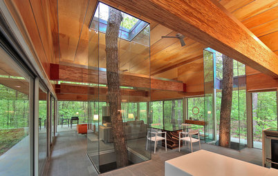
This photo shows the living room with the void.
This photo shows the living room with the void.
The mezzanine level houses another bedroom and the second of the home’s three-and-a-half bathrooms. The garage studio also sits on this level.
Here you can see the Corten screen on the external wall.
“Our brief included reconfiguring the primary internal living area so it connected to the backyard, which serves as an extension to the living space,” Koolloos says. “On the tight sites found in Paddington, being able to visually connect to as much of the site’s footprint as possible is a huge benefit.”
The backyard was also made more practical; it was previously a sequence of small paved areas separated by changes in ground levels, whereas the new layout attempts to utilise the site’s width better and open the space up more.
The backyard was also made more practical; it was previously a sequence of small paved areas separated by changes in ground levels, whereas the new layout attempts to utilise the site’s width better and open the space up more.
Beyond the lawn area is a swimming pool, which abuts a new garage with studio above.
The garage represented one of the greatest challenges the architects faced. “The function of a garage is humble; however, this particular garage required the most complex of requirements beyond its footprint,” Koolloos says.
“Local council had strict rules about garages being either double with no form above or single garages with a studio above.” The design solution visually focuses on the council’s objectives, but caters to the homeowners’ needs through clever technological and structural approaches.
What appears to be a single garage door with side fencing on the left is in fact fully automated to allow the fencing and garage door to slide back, revealing a double garage. Additionally, the floor is automated, so when one car is removed there is space for a third car and storage.
The garage presents itself to the laneway with the intention to fit into one of Australia’s most renowned heritage areas, yet has a level of flexibility to ensure it has great practicality.
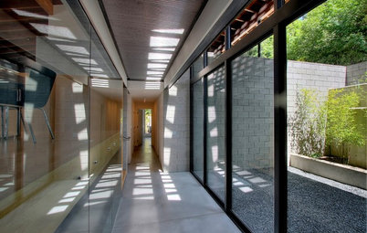
Back inside, the home has many envelope-pushing aspects. One is the ‘skinny void’. Situated on the western boundary, it’s nothing but a surplus of space that was reverted from being external to internal. It’s a simple gesture, however, it has transformed the entire home as now all of the rooms are able to open up to and connect to this thin but tall zone. The brick wall on the right-hand side is the original brick wall of the house, albeit with its service pipes and adornments removed.
On the left-hand side is a new wall that abuts the neighbour’s house. It’s effectively a concrete block wall used as a means of structural support and then clad with vertical timber planks. This space was then given glazed ends and a glazed roof so that it did not compete with the original terrace home with a solid versus transparent approach.
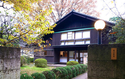
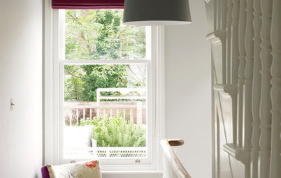
The right-hand-side wall was then punched through to give the staircase, bedrooms and bathrooms access to natural light. “The void brings light into what would otherwise be the darkest space in the home,” Koolloos says. The first photo in this story shows the void from the outside. The home with its white facade is pictured on the right and the neighbour’s home adjacent with exposed brickwork is on the left.
On the left-hand side is a new wall that abuts the neighbour’s house. It’s effectively a concrete block wall used as a means of structural support and then clad with vertical timber planks. This space was then given glazed ends and a glazed roof so that it did not compete with the original terrace home with a solid versus transparent approach.
The right-hand-side wall was then punched through to give the staircase, bedrooms and bathrooms access to natural light. “The void brings light into what would otherwise be the darkest space in the home,” Koolloos says. The first photo in this story shows the void from the outside. The home with its white facade is pictured on the right and the neighbour’s home adjacent with exposed brickwork is on the left.
The floor is engineered-oak with a limed finish.
The top level of the house holds the couple’s master suite.
This top-floor bedroom had access to the best viewing corner from the house on the north-west side, so the architects wrapped that corner in glazing. MCK adopted a black frame, which has the effect of allowing the eye to travel past the frame to something beyond. This results in interior spaces feeling larger. “A white frame would catch the eye and feel more like the edge of that space,” Koolloos says. “The owners’ wanted to break the glazing down into smaller panes, which we agreed to, given the conservation zone.” Smaller windows are also a distinct characteristic of many of the original buildings in Paddington.
An ensuite penetrates through the original brick wall, with the bath suspended within the void. “In doing this we have created a bath with a view, yet with remarkable privacy due to its height on the top floor,” says Koolloos.
The marble is Calacatta ‘Stratico’ book-matched in profile and mitred where possible to create the illusion the bathroom has been carved from a solid block of stone.
The marble is Calacatta ‘Stratico’ book-matched in profile and mitred where possible to create the illusion the bathroom has been carved from a solid block of stone.
There was a lot of back-and-forth with the council during the planning stage but the house, with all its clever inclusions, is the result of a collaborative outcome between what the clients were seeking, what the council wanted and what could arguably appease the neighbours. “After eighteen months of building, we have our version of a contemporary terrace that we find functions and feels like no other we have visited,” says Williams.

Houzz at a Glance
Who lives here: Juicy Designs’ creative director Tom Williams and his wife Belinda
Location: Paddington, NSW
Land size: 192 square metres; 5 bedrooms, 3.5 bathrooms, and an above-garage studio
Architect: MCK Architects
Year completed: 2017
The couple bought the terrace on the right several years ago, when it was in a state of disrepair. The original owner had been living there for more than 40 years, and had slowly moved into an increasingly smaller part of the house, leaving the remainder unoccupied.
“Finally, nestled in the top floor with only a small kitchenette and bathroom, the owner had essentially rendered the house un-functional,” says Tom Williams. “This, I think, was to our advantage as no-one saw the potential and nothing of any historical value was left.”
The terrace had what appeared to be a poorly planned 1970s makeover, during which its historical features had been removed; the home also did not make the most of the site. In particular, the north-facing aspect and the connection to the backyard on the north side weren’t utilised.
Williams, however, did see the potential of the home and worked closely with Steve Koolloos from MCK Architects, to maximise what was possible to do with 192
square metres of land.