
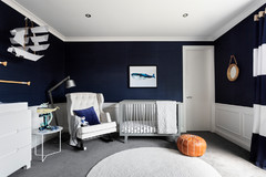
Room of the Week: A Colourful Scandi-Style Nursery
Bargain buys paired with select investment pieces, united by a love of colour, make for a cheery nursery

In a Q&A format, we talk to the designers – and examine the creative thinking – behind some of Houzz’s most loveable rooms.
Brief
We wanted to create something unique and special for our baby boy; a relaxing nursery to calm him, with room for him to play when he’s older. It was important for the look of the space to complement the contemporary coastal vibe in the rest of our house.
We wanted to create something unique and special for our baby boy; a relaxing nursery to calm him, with room for him to play when he’s older. It was important for the look of the space to complement the contemporary coastal vibe in the rest of our house.
Starting point
The cactus print by Home & Abode. I loved this print for its clean fresh colours and its out-of- the-box vibe. Cactuses are an unusual choice for a nursery, making the space unique, and the crisp colours provided the perfect cues to layer complementing decor and textiles.
The cactus print by Home & Abode. I loved this print for its clean fresh colours and its out-of- the-box vibe. Cactuses are an unusual choice for a nursery, making the space unique, and the crisp colours provided the perfect cues to layer complementing decor and textiles.
Key Design Aspects
Colour palette: I’m a huge fan of bright crisp colours set against white.
Materials palette: I fell in love with the cactus print for its clean lines and point of difference. The wallpaper had always been a favourite so I jumped at the chance to pair it with the print.
Key pieces of furniture/fittings:
The Ferm Living Grid wallpaper is from Designstuff, the cactus artwork from Home & Abode. The Kensington armchair was bought from Barnaby Lane, the Clarence drawers from Retrojan. The shelf came from Leo & Bella and the cot from Target.
Thinking behind the arrangement of furniture/fixtures
After starting with the print and the wallpaper it was all about continuing with the colour scheme and adding pops of yellow. The rug, cushions and toys all helped layer colour throughout the space. The chest of drawers delivered clean lines and a minimalist vibe to the space, while the cot has a raw edge that we were after too.
After starting with the print and the wallpaper it was all about continuing with the colour scheme and adding pops of yellow. The rug, cushions and toys all helped layer colour throughout the space. The chest of drawers delivered clean lines and a minimalist vibe to the space, while the cot has a raw edge that we were after too.
Our miniature sausage dog Alfie Beagley loves this space.
Challenges worked around
The room is a small square shape and one wall is built-in robes. This layout presented challenges in achieving balance; giving everything room to shine while ensuring there were enough practical elements in the room such as clothes storage. Placing the cot under the window on the middle of the wall really helped to achieve this layout balance
The room is a small square shape and one wall is built-in robes. This layout presented challenges in achieving balance; giving everything room to shine while ensuring there were enough practical elements in the room such as clothes storage. Placing the cot under the window on the middle of the wall really helped to achieve this layout balance
Why do you think this room works?
The colour platte is consistent and fresh. Clean crisp blue and green with pops of yellow create a unisex, happy space, perfect for little ones.
The colour platte is consistent and fresh. Clean crisp blue and green with pops of yellow create a unisex, happy space, perfect for little ones.
The style of furniture is all in keeping with a Scandi vibe and the toys and decor choices are all beautifully designed, delivering a boutique quality to the space. I love the feeling of this room – there’s so much happiness in just one small space. It has become a play space for all three children and we already have plenty of happy memories here.
Tell us
What do you love about this room? Tell us in the Comments section below. And don’t forget to like, share or bookmark this story. Join the conversation.
More
See more Room of the Week spaces on Houzz
Tell us
What do you love about this room? Tell us in the Comments section below. And don’t forget to like, share or bookmark this story. Join the conversation.
More
See more Room of the Week spaces on Houzz
Answers and styling by Tess Beagley of Minted Interiors
Who lives here: Tess Beagley of Minted Interiors, her husband Yves, and three children
Location: Geraldton, WA
Room size: 3 x 3 metres