Houzz Tours

UK Houzz Tour: A Converted Vicarage Answers a Family's Prayers
This former vicarage in the UK was updated, and the space cleverly made to feel just right for adults and kids alike

Can you design a home that’s both stylish and kid-friendly? That was the intention of the family who took on the task of overhauling this former vicarage, which was in a state of disrepair. The couple hired Cherie Lee of Cherie Lee Interiors to create a home that catered for the kids, but kept the feeling of a grown-up space. The result is a property that combines practicality, smart design and fun elements.
The couple had seen a chandelier they loved in one of Lee’s previous projects, but it was out of their price range. Lee helped them source an alternative from an American website and it has a wide shape to fit in the space.
Throughout the ground floor, reclaimed engineered boards in a mid-tone with grey hues were used for flooring. They’re smart, but also a robust, child-friendly choice.
Chandelier: Lumens
Throughout the ground floor, reclaimed engineered boards in a mid-tone with grey hues were used for flooring. They’re smart, but also a robust, child-friendly choice.
Chandelier: Lumens
A pink blossom tree is positioned close to the French doors, and the rest of the garden’s planting has a similar cool palette. Lee and her clients decided to pull the colours from the garden into the living room. “We chose pale, restful colours,” Lee says, “and we could go light as it’s an adult room.”
Lee continued the theme of bringing in nature with this patterned wallpaper. “It has a lovely earthy feel,” she says.
‘Cracked Earth’ wallpaper: Zoffany
‘Cracked Earth’ wallpaper: Zoffany
The kids’ play space is practical, comfortable and has plenty of room for fun. The colour scheme uses the classic child shades of blue and pink, but Lee has gone for stylish hues to give it a grown-up edge.
“It’s the first room you walk by when you enter the house,” Lee says, “so it needed to be both playful and attractive. There is loads of storage to keep everything tidy.”
Walls painted in ‘Hague Blue’: Farrow & Ball
“It’s the first room you walk by when you enter the house,” Lee says, “so it needed to be both playful and attractive. There is loads of storage to keep everything tidy.”
Walls painted in ‘Hague Blue’: Farrow & Ball
False panelling hides a wall of copious storage. Touch-catch doors open out to reveal enough space for all the children’s toys, as well as their game consoles.
Although the hallway is large, the family didn’t want to overfill it with furniture. “They’ve got a dog, a cat and two children, so didn’t want to risk bumping into furniture,” Lee says. “We kept it sleek and accented it with attractive accessories.”
The original Victorian door is a design statement in itself. “We restored the glass and painted the door in a dark colour to make the glass pop,” the designer says. Lee also painted the stairs and banisters, and laid a statement carpet runner complete with brass stair rods.
The original Victorian door is a design statement in itself. “We restored the glass and painted the door in a dark colour to make the glass pop,” the designer says. Lee also painted the stairs and banisters, and laid a statement carpet runner complete with brass stair rods.
A Crittall-style mirror above the console in the hall reflects the light and replicates the Crittall doors used in many of the rooms.
Mirror: LuxDeco
Mirror: LuxDeco
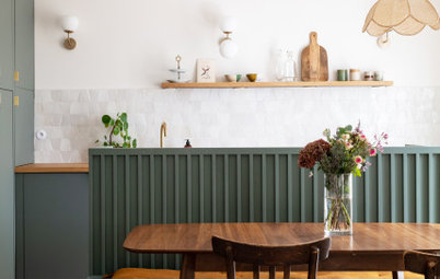
The kitchen has an industrial-style feel. “The couple had seen this kitchen at a design exhibition and loved it,” Lee says. “They bought it on the spot, so we used it as our starting point.”
The bold kitchen has a stone finish with copper tones, and below the island is laser-cut steel to enhance the industrial look. Lee chose a polished plaster finish for the chimney breast in the dining area to pick up on the copper in the cabinetry, and installed a hole-in-the-wall gas fire, which is a convenient and modern option.
“The kitchen is dark and atmospheric,” Lee says, “but to offset it slightly we went for a lighter flooring.” The dark cabinetry is ideal for hiding the kids’ messy fingerprints.
Handleless tall units hide plenty of storage, including a pantry, and small appliance station. Everything is kept out of sight to keep the focus on the beautiful cabinet surfaces.
Lee chose a rustic dining table to add warmth to the room, while statement lighting brings in a striking element.
The space was originally a series of garden storage rooms, which Lee’s team knocked through to create the large open space. They retained the exposed brick, which adds character to the kitchen.
Lee had the bench seating upholstered in one of her favourite fabrics, which has a soft cream and black geometrical pattern.
Bench upholstered in ‘Escher’:Designers Guild
Bench upholstered in ‘Escher’:Designers Guild
In the main bedroom, the couple kept their existing bed, which they found really comfortable. Lee used the oatmeal bedhead as the starting point for the room’s colour scheme.
“There were windows on two walls, so the bed was hard to position,” she says. “We tried a few options, but this was the preferred spot for us and the clients.”
Lee installed curtains either side of the window to make it appear a similar width to the bed. She also put semi-sheers over the window to prevent glare. Pendant lights on either side act as reading lights, with controls by the doors and the bed.
Lee’s team also restored the skirting boards and architraves.
Pocket doors lead through to an ensuite bathroom and dressing area. The pocket doors are actually painted in the same colour as the wall. “When they’re closed it makes the room feel really cosy,” Lee says.
The stud column in front of the corner shower has been covered with mother-of-pearl mosaic tiles to add a shimmery element to the space.
“We didn’t want to tile the shower walls, but they had to be waterproof,” Lee adds. “So we chose a back-painted glass, which we painted the same colour as the rest of the walls.”
A freestanding bath sits in front of a stud wall too. The half wall was covered in mirrored cladding. The bath tap is fitted into the cladding, and the sink is located behind the wall.
For their son’s bedroom, the couple wanted a room that would grow with him as he became a teenager. Lee chose classic blues and greys, and added orange accents. The wallpaper behind the bed resembles driftwood panelling.
Timber wallpaper: Andrew Martin
Timber wallpaper: Andrew Martin
Their son’s desk unit was custom-made from scaffold planks and reflects the driftwood wallpaper used behind the bed. It gives the room an industrial feel and provides plenty of space for storage.
A freestanding wardrobe was colour-matched to the walls.
A freestanding wardrobe was colour-matched to the walls.
The couple’s young daughter was really keen on animals when her room was created. “We chose the curtain fabric because elephants were her current favourite,” Lee says.
The colour scheme is pink, but Lee chose a subtle, elegant shade that would be suitable for a teen too. Feminine elements, such as the fluffy lamp, combine with quirky finds such as the cartoon drawing.
Lamp: Vitra
The colour scheme is pink, but Lee chose a subtle, elegant shade that would be suitable for a teen too. Feminine elements, such as the fluffy lamp, combine with quirky finds such as the cartoon drawing.
Lamp: Vitra
This bathroom was designed as a wet room and has a slate herringbone-style floor and a waterproof resin on the walls. “You apply it like polished plaster and it gives a nice continuous finish with interesting textures,” Lee says.
A teak vanity unit adds a natural element to the room and complements the copper hardware.
“The patterns in the room are quite geometric,” Lee says, “so we played around with shape and added a round mirror.”
A teak vanity unit adds a natural element to the room and complements the copper hardware.
“The patterns in the room are quite geometric,” Lee says, “so we played around with shape and added a round mirror.”
The large shower area sits under the sloped ceiling and a step made with the same resin material as the walls helps to retain water. Lee made use of the dead space under the eaves by building a ledge, which acts as a seat, as well as a spot for putting towels and toiletries.
Who lives here: A husband and wife, their 12-year-old son and 6-year-old daughter, as well as their pet cat and poodle.
Location: Southeast England, UK
Property: A former Victorian vicarage
Year built: The early 1900s
Size: 5 bedrooms, 5 bathrooms and downstairs powder room
Designer Cherie Lee of Cherie Lee Interiors
Photos by Sarah Hogan
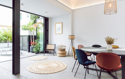
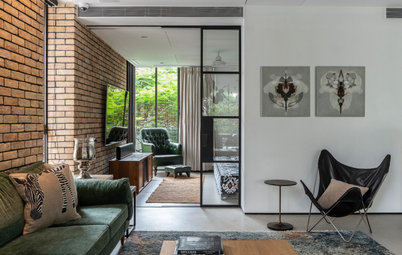
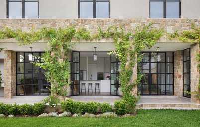
The main structural work in this former vicarage involved the removal of internal walls, one of which divided this airy living space leading out to the garden and the reception room in front of it. “The house had a lot of separate reception rooms, so we opened up these two to add something different,” Lee says. “We installed the Crittall doors to follow the shape of the French doors at the back.”
The two spaces have different functions: the one in the foreground is used mainly for listening to music and reading, and the one at the back is where the couple relax in front of the television at night.