Search results for "Exterior house paint colour" in Home Design Ideas
Color placement is corrected. Black sash adds a period and elegant appearance. House colors should be simple and elegant.
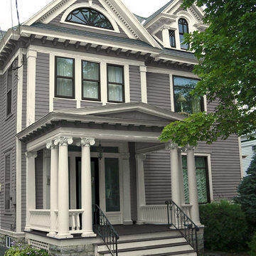
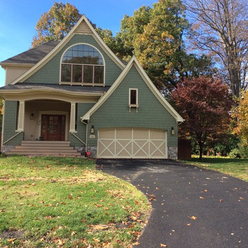
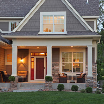
Inspiration for a large traditional three-storey grey exterior in New York with wood siding and a hip roof.
Inspiration for a large traditional three-storey grey exterior in New York with wood siding and a hip roof.
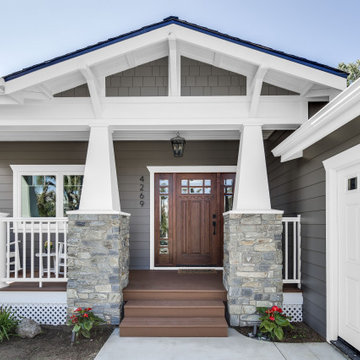
The goal for this Point Loma home was to transform it from the adorable beach bungalow it already was by expanding its footprint and giving it distinctive Craftsman characteristics while achieving a comfortable, modern aesthetic inside that perfectly caters to the active young family who lives here. By extending and reconfiguring the front portion of the home, we were able to not only add significant square footage, but create much needed usable space for a home office and comfortable family living room that flows directly into a large, open plan kitchen and dining area. A custom built-in entertainment center accented with shiplap is the focal point for the living room and the light color of the walls are perfect with the natural light that floods the space, courtesy of strategically placed windows and skylights. The kitchen was redone to feel modern and accommodate the homeowners busy lifestyle and love of entertaining. Beautiful white kitchen cabinetry sets the stage for a large island that packs a pop of color in a gorgeous teal hue. A Sub-Zero classic side by side refrigerator and Jenn-Air cooktop, steam oven, and wall oven provide the power in this kitchen while a white subway tile backsplash in a sophisticated herringbone pattern, gold pulls and stunning pendant lighting add the perfect design details. Another great addition to this project is the use of space to create separate wine and coffee bars on either side of the doorway. A large wine refrigerator is offset by beautiful natural wood floating shelves to store wine glasses and house a healthy Bourbon collection. The coffee bar is the perfect first top in the morning with a coffee maker and floating shelves to store coffee and cups. Luxury Vinyl Plank (LVP) flooring was selected for use throughout the home, offering the warm feel of hardwood, with the benefits of being waterproof and nearly indestructible - two key factors with young kids!
For the exterior of the home, it was important to capture classic Craftsman elements including the post and rock detail, wood siding, eves, and trimming around windows and doors. We think the porch is one of the cutest in San Diego and the custom wood door truly ties the look and feel of this beautiful home together.
Built porch on front of brick home and painted brick.
Roof Shingles: SG Timb HD Wehterwood ENG SG Roy SOV Weatherwood Gray
Door Color: SW Custom Red
Shutter Color: SW6258 Tricorn Black
Trim Color: SW7004 Snowbound
Brick Color: Benjamin Moore Sandy Hook Gray
Find the right local pro for your project
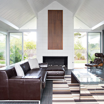
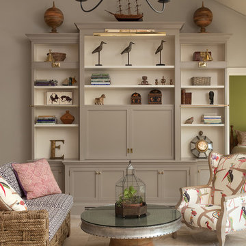
Design ideas for a midcentury formal open concept living room in San Francisco with grey walls.
Complete interior renovation of a 1980s split level house in the Virginia suburbs. Main level includes reading room, dining, kitchen, living and master bedroom suite. New front elevation at entry, new rear deck and complete re-cladding of the house. Interior: The prototypical layout of the split level home tends to separate the entrance, and any other associated space, from the rest of the living spaces one half level up. In this home the lower level "living" room off the entry was physically isolated from the dining, kitchen and family rooms above, and was only connected visually by a railing at dining room level. The owner desired a stronger integration of the lower and upper levels, in addition to an open flow between the major spaces on the upper level where they spend most of their time. ExteriorThe exterior entry of the house was a fragmented composition of disparate elements. The rear of the home was blocked off from views due to small windows, and had a difficult to use multi leveled deck. The owners requested an updated treatment of the entry, a more uniform exterior cladding, and an integration between the interior and exterior spaces. SOLUTIONS The overriding strategy was to create a spatial sequence allowing a seamless flow from the front of the house through the living spaces and to the exterior, in addition to unifying the upper and lower spaces. This was accomplished by creating a "reading room" at the entry level that responds to the front garden with a series of interior contours that are both steps as well as seating zones, while the orthogonal layout of the main level and deck reflects the pragmatic daily activities of cooking, eating and relaxing. The stairs between levels were moved so that the visitor could enter the new reading room, experiencing it as a place, before moving up to the main level. The upper level dining room floor was "pushed" out into the reading room space, thus creating a balcony over and into the space below. At the entry, the second floor landing was opened up to create a double height space, with enlarged windows. The rear wall of the house was opened up with continuous glass windows and doors to maximize the views and light. A new simplified single level deck replaced the old one.
Valencia 1180: Elevation “E”, open Model for Viewing at the Murano at Miromar Lakes Beach & Country Club Homes in Estero, Florida.
Visit www.ArthurRutenbergHomes.com to view other Models.
3 BEDROOMS / 3.5 Baths / Den / Bonus room 3,687 square feet
Plan Features:
Living Area: 3687
Total Area: 5143
Bedrooms: 3
Bathrooms: 3
Stories: 1
Den: Standard
Bonus Room: Standard
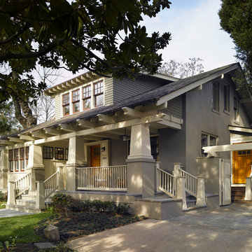
The Cleveland Park neighborhood of Washington, D.C boasts some of the most beautiful and well maintained bungalows of the late 19th century. Residential streets are distinguished by the most significant craftsman icon, the front porch.
Porter Street Bungalow was different. The stucco walls on the right and left side elevations were the first indication of an original bungalow form. Yet the swooping roof, so characteristic of the period, was terminated at the front by a first floor enclosure that had almost no penetrations and presented an unwelcoming face. Original timber beams buried within the enclosed mass provided the
only fenestration where they nudged through. The house,
known affectionately as ‘the bunker’, was in serious need of
a significant renovation and restoration.
A young couple purchased the house over 10 years ago as
a first home. As their family grew and professional lives
matured the inadequacies of the small rooms and out of date systems had to be addressed. The program called to significantly enlarge the house with a major new rear addition. The completed house had to fulfill all of the requirements of a modern house: a reconfigured larger living room, new shared kitchen and breakfast room and large family room on the first floor and three modified bedrooms and master suite on the second floor.
Front photo by Hoachlander Davis Photography.
All other photos by Prakash Patel.
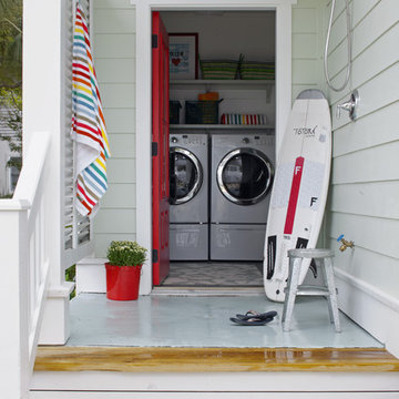
This backyard patio keeps the beach at the stairway with an outdoor shower and direct access to the laundry room.
Exterior Paint Color: SW Dewy 6469
Exterior Trim Color: SW Extra White 7006
This house was graphically renovated. New paint colors, new carriage house garage door, new properly mounted wood shutters. Please understand that shutters must be mounted properly. 99% you see are wrong. The only problem here is that the windows are white and plastic.
The image was created graphically so the homeowner can see the result and be sure what they want. They can give this to their builder to be sure they GET what they want.
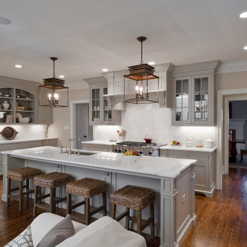
Jennifer and Dan have lived in their Deer Park Illinois home for 15 years, slowly making minor fixes like painting and decorating; but they had a new plan for their kitchen the entire time. An awkwardly placed garage door, and an island cooktop with a terrible downdraft made a full-scale kitchen remodel an absolute must. Jennifer had many ideas in mind and wanted to work with a company that could provide high-end work, while partnering with a designer that would tailor the kitchen to her ideas.
She was intrigued by the phrase “Common Sense Remodeling” in Advance Design’s feature she discovered while perusing an issue of the community’s Quintessential Barrington Magazine. Doing further research on the company’s website, as she looked through project profiles and read about Advance Design’s “Common Sense Remodeling” philosophy, she promptly scheduled an appointment to see if the people and ideas she read about were truly who they said they were. The more she read, the more she knew that the “Common Sense” approach to remodeling they described was exactly the type of company she was looking for.
The partnership was sealed after an initial consultation with Owner Todd Jurs and Project Designer Michelle Lecinski. They displayed a combination of friendliness, professionalism and respect that was unmatched by any of the other companies Jennifer talked to. She knew that with Advance Design, she would be able to retain the vision that she had in mind with high-quality craftsmanship.
“I reached out to Advance Design because of the ‘Common Sense Remodeling’ tagline,” Jennifer said. “That’s what lingered for me”. “Advance Design was the most respectful- of the house and of my design ideas, and the most professional of the handful of companies that looked at my project”.
Soon after the meeting Jennifer began working with Michelle on the project design. They quickly developed chemistry. Jennifer loved how Michelle researched and located every detail that Jennifer wanted for the kitchen. Between the two of them, every concept and idea was worked through and perfected. “Jennifer had definite ideas about what she wanted the new kitchen to look like, she just didn’t know how to bring it all together. We worked together really well to make her ideas into the practical reality necessary for a well-functioning kitchen, with the look and feel that she had envisioned”, says Michelle.
“Michelle was wonderful in using the CAD system she would show me new drawings every time we changed the layout while working through the design,” Jennifer said. “She was a really wonderful partner in execution, she made sure everything happened quickly and easily.”
The finished design drew out elements of Jennifer’s style and personality. The pair call the look “sophisticated farmhouse” to describe the kitchen renovation to family and friends. The result was a beautifully crafted, authentic-feeling space that satisfied Jennifer’s dreams 15 years in the making. The whole project consisted of a kitchen remodel, mudroom upgrade with powder room, and garage entry relocation. “The projects I personally like the best, are the ones that put the client’s dreams on display,” Project Designer Michelle said. “And this is one of those projects.”
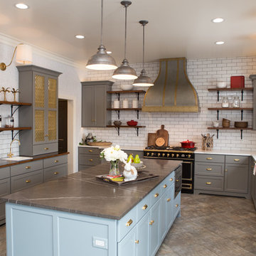
The main focal point of the kitchen is custom zinc and brass ventilation hood with a vintage sheen, which was hand made to order by a small company in Indiana named Vogler Metalworking. “It’s like sculpture, a true work of art”, says Jennifer. Your eye is immediately drawn towards this elegant yet practical hood that eliminated the home’s downdraft problem and added a striking conversation piece at the same time. The carpenters had to use special gloves when transporting and installing it, so they didn’t smudge it with fingerprints. The beautiful hood centers proudly over the stunning black enamel and brass LaCornue Range. “I had a friend who had a LaCornue range and after learning how easy it was to cook perfect meals, I was convinced I wanted to have one”, says Jennifer. This unique, breathtaking combination anchors the entire kitchen and is apparent immediately as you walk into the great room the surrounds the space.
DuraSupreme Crestwood cabinets with a Kendall Panel add function and sophistication. A custom gray paint color paired with a storm blue was developed so that the new kitchen looked like it belonged to the existing space. Unlacquered brass faucets and hardware were important to Jennifer because she wanted the living finishes to age over time. Remarkable brass diamond mesh cabinet door inserts imported from the UK continue to add this one-of-a-kind kitchen renovation; giving it a “you won’t see this everywhere” quality. The use of old railcar flooring for the coffee bar countertop and reclaimed oak for the open shelving gives an authenticity to the space uncommon in kitchens today.
Jennifer and Michelle fell in love with the Limestone Grey Stone while they were investigating unique island countertop ideas. They liked the fact that the limestone as a living finish will age and change over time. Calcutta Miel Quartz countertops made for an excellent pairing around the perimeter, as it’s durable and perfect for cooking preparations. A textured white subway tile backsplash that runs to the ceiling keeps your eye moving towards the open shelving, and to the main focal point of the stunning range hood combination.
“The kitchen functions beautifully, and it’s gorgeous,” beams Jennifer as she gestures with both hands while smiling ear to ear. “The most important thing was I wanted a kitchen that had a wonderful flow, cooked beautiful meals and was a great gathering place for family and friends, and this space does that perfectly! Beauty wise, it turned out exactly how I had envisioned. I felt the function part was the hardest part, and that was nailed”!
Relocating the garage entry to the new mudroom was a huge priority and has finally separated the family’s arriving home functions from their kitchen. Now coats and shoes and bags have their own area for dropping once members arrive home. Matching gray DuraSupreme cabinetry helped create gorgeous, purposeful lockers for the family. A reclaimed vintage sink and custom wall paper were added to the tiny powder room to beautify the once previously only functional space. Advance Design was even able to create a custom space for their dog to sleep while the family is away.
“It was unbelievable that a project of this size was completed in such a short time, and I think that’s because of the large amount of planning and preparation that went into it,” Jennifer marveled, “When we started, we were ready, and everything was prepared”.
When it came to execution, Project Manager Justin Davis and his crew were quick, accessible, and organized. Projects like this kitchen are typically completed in as little as 8-10 weeks. Jennifer’s kitchen however despite the relocation of some challenging HVAC in a soffit and moving of an exterior door was completed remarkably fast in part because the team was working with an existing tile floor that ran throughout the first floor that the client really loved.
“You get to know these people really well because they’re living in your house while you’re living in your house. They were so fast and really good, it didn’t take as long as even planned” reported Jennifer. “I would text Justin and he always responded almost immediately. I got to know all the guys who were working in our house and they were all wonderful people”.
Details in a customized kitchen like this one require skill and care from the people who install it. “All the guys on the job were skilled at what the did. I wanted small details like little feet to look like furniture, that is where their carpentry skill came in to make these all perfect”, said Jennifer. “The tile guys were wonderful. They even let me determine how I wanted the texture with the grout to appear for a salt and pepper look; now that is a very skilled trade person making it custom”.
In Jennifer’s interview, she continued to reference Advance Design’s “Common Sense Remodeling”, so I took a minute to ask her exactly what that phrase meant to her and how it played out in her experience with her project and the Advance Design team. Here is what she said: “I was intrigued about Common Sense Remodeling and in my head that there would be clear costs and prices, great communication between the design team, the execution team and me”, said Jennifer. They did deliver on that, it was so clear about the cost breakdown, what I could expect from everyone who came to my house, and everything that we had ordered. That to me is the Common Sense”!
It’s great to see a client take literally our assertion that a well-planned remodeling project is simply “Common Sense”! She anticipated each step of the way would be clear, concise, and predictable, all the while protecting the outcome due to the careful upfront planning. “Advance Design delivered on their ‘Common Sense Remodeling’ promise,” Jennifer said. “From the design team, to the execution team - everything was straight forward like I imagined. The project turned out exactly how I envisioned, I enjoyed this process and absolutely would recommend Advance Design Studio to anyone.”
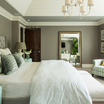
A great way to brighten up a bedroom is with painted nightstands. In this case, we wanted to maintain a calming environment with neutral wall colors and bedding. To add a bit of cheer to the space, we upholstered two lounge chairs and painted both nightstands similar shaded of aqua. Martha O'Hara Interiors, Interior Design | L. Cramer Builders + Remodelers, Builder | Troy Thies, Photography | Shannon Gale, Photo Styling
Please Note: All “related,” “similar,” and “sponsored” products tagged or listed by Houzz are not actual products pictured. They have not been approved by Martha O’Hara Interiors nor any of the professionals credited. For information about our work, please contact design@oharainteriors.com.
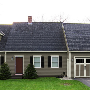
This house is adjacent to the first house, and was under construction when I began working with the clients. They had already selected red window frames, and the siding was unfinished, needing to be painted. Sherwin Williams colors were requested by the builder. They wanted it to work with the neighboring house, but have its own character, and to use a darker green in combination with other colors. The light trim is Sherwin Williams, Netsuke, the tan is Basket Beige. The color on the risers on the steps is slightly deeper. Basket Beige is used for the garage door, the indentation on the front columns, the accent in the front peak of the roof, the siding on the front porch, and the back of the house. It also is used for the fascia board above the two columns under the front curving roofline. The fascia and columns are outlined in Netsuke, which is also used for the details on the garage door, and the trim around the red windows. The Hardie shingle is in green, as is the siding on the side of the garage. Linda H. Bassert, Masterworks Window Fashions & Design, LLC
Best of House Design and Service 2014.
--Photo by Paul Dyer
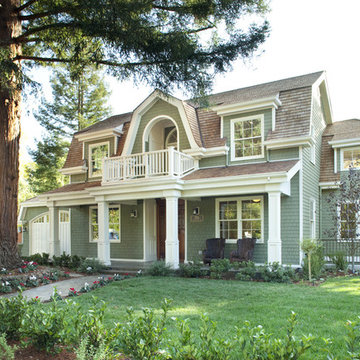
Inspiration for a mid-sized traditional two-storey exterior in San Francisco with wood siding and a gambrel roof.
Inspiration for a mid-sized traditional two-storey exterior in San Francisco with wood siding and a gambrel roof.
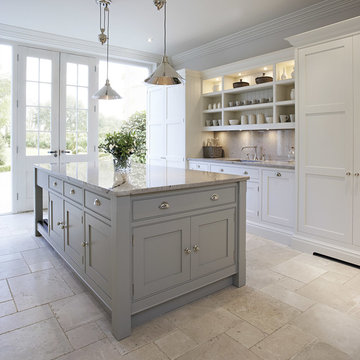
Kitchen cabinet paint color is Valspar paint Montpelier Ashlar Gray. Pendant lights from Pottery Barn.
For more info, call us at 844.770.ROBY or visit us online at www.AndrewRoby.com.
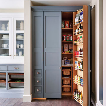
Sloane Square No.92 External Wall Cabinet.
Archway House No.106 External Base Cabinets.
Leadenhall No.118 Larder Exterior.
Kitchen by Smallbone of Devizes.
Smallbone’s Beaconsfield showroom.
This bright and light shaker style kitchen is painted in bespoke Tom Howley paint colour; Chicory, the light Ivory Spice granite worktops and Mazzano Tumbled marble flooring create a heightened sense of space.
This is an elegant, finely-appointed room with aged, hand-hewn beams, dormered clerestory windows, and radiant-heated limestone floors. But the real power of the space derives less from these handsome details and more from the wide opening centered on the pool.
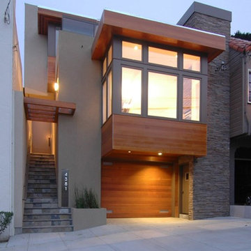
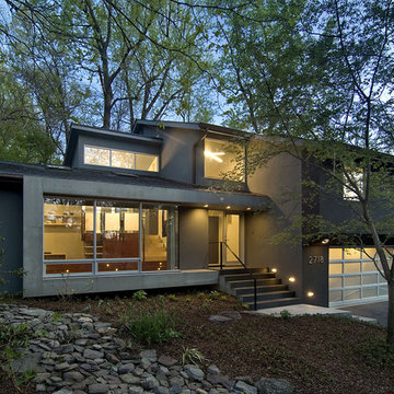
Mid-Century Modernism inspired our design for this new house in Noe Valley. The exterior is distinguished by cubic massing, well proportioned forms and use of contrasting but harmonious natural materials. These include clear cedar, stone, aluminum, colored stucco, glass railings, slate and painted wood. At the rear yard, stepped terraces provide scenic views of downtown and the Bay Bridge. Large sunken courts allow generous natural light to reach the below grade guest bedroom and office behind the first floor garage. The upper floors bedrooms and baths are flooded with natural light from carefully arranged windows that open the house to panoramic views. A mostly open plan with 10 foot ceilings and an open stairwell combine with metal railings, dropped ceilings, fin walls, a stone fireplace, stone counters and teak floors to create a unified interior.
Exterior House Paint Colour - Photos & Ideas | Houzz
Design ideas for a mid-sized traditional two-storey grey exterior in Minneapolis with stone veneer and a gable roof.
3