Houzz Logo Print
hzdeleted_21808948

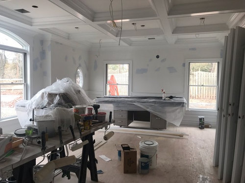
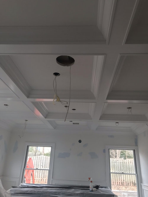
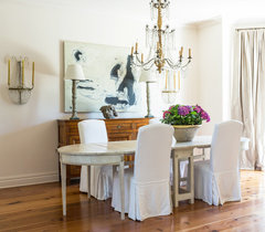
Major help with paint colors!!!

User
5 years ago
Hello everyone,

I need some help with color ideas for this library at our new house. It is right when you walk into the house & the main color of our house is “stonnington gray” by benjamin moore so i would like the colors to all blend nicely throughout the house. My husband wants a dark color. Im not crazy about “dark” so trying to find a nice happy medium. Also, considering painting the insides of the coffered ceiling, maybe 2 different shades between walls & ceiling? Help please!

Comments (51)

  • K R
    5 years ago
    IMO, painting the insides of coffered ceilings dates in right back to the early 2000’s. Coffered ceilings are beautiful and grand but should be WHITE, or some shade of white. But it should be all the same on the ceilings.
  • K R
    5 years ago
    Does this room have a door? If so, you could do some sort of dark, maybe navy in here. It looks like you have a lot of natural light.
  • Related Discussions

    Need help for my exterior paint colour and exterior design

    Q

    Comments (14)
    Hi, I like the overall concept of the darkish grey, it suits the home. I am a colour consultant and have been working with the Dulux range for 17 years and you are on the right track with the Guild Grey. The Dulux Signature will give you a dark blue house. Another option if Simone Weil which is just a bit lighter than the Guild Grey, if you find that one too dark. Sample pots and A4 brush outs onto white cardboard are the best way to decide, because computer programs give an overall impression of the "look" but are not accurate with colour choices, you can't beat the human eye. All the best, it's going to look great.
    ...See More

    Help needed for exterior update : render and/or paint, what color?

    Q

    Comments (16)
    The grey on the western wall looks dark and purplish on my monitor. It may come over as too imposing and monolithic on the southern face. If you're sticking with the grey palette then a warmer tone would suit the sandstone better. Does Dulux have a colour palette recommendation that includes your Berkshire White plus a grey? Check online or in store pamphlets. But, for such a big, expensive, and impactful paint job I would actually be tempted to get a colour consultant. You're not just repainting a loungeroom wall if it doesn't work!
    ...See More

    Major renovation - Exterior colour choices

    Q

    Comments (9)
    I considered Dieskau, Stepney and Timeless Grey with our render. The Dieskau throws a slight pink and the Stepney is a little beige. It may be worthwhile getting sample pots and painting a few areas around your home to see what it looks like in various light. Alternatively paint a large piece of cardboard in each colour and move it around the house. We decided on Timeless Grey. I think Surfmist is too light. Good luck! It's a very difficult decision. Took us months :)
    ...See More

    Help! Need to paint render, but what color?

    Q

    Comments (12)
    Go grey as advised above, don't paint window frames if they are metal but leave alone, plant sasanqua camelias along the side boundaries (they can be hedged) to screen out neighbours & add greenery plus colour, landscape the front. Don't do white stones as they look dirty after a while and are blinding in the sun. I'd get rid of the stones altogether. If you are a gardener, put in box hedging and some standard roses (yes, I know done to death but they are charming), or draw up something on paper first - play with shapes. A garden makes a house look good.
    ...See More
  • User
    Original Author
    5 years ago
    @karen - the room does not have a door. Its the first room on the left hand side when you walk in from the front door.
  • User
    Original Author
    5 years ago
    @holly the beams & trim is all painted its final color & it is a white!
  • Holly Stockley
    5 years ago

    Ah, yes, but WHICH white? They are not all created equal!

    As a slightly more functional suggestion, what would you both think of Hamilton Blue? Also a Benjamin Moore color, and also from their historical collection. It might work well since Stonington Grey has a bit of a blue undertone. But it's a fairly masculine color without disrupting the rest of our color scheme too much.

  • User
    Original Author
    5 years ago
    @holly - i love that color. That is right along the lines of the type of color i was thinking. Do you think we should leave the ceiling alone? Also - as far as the built ins on the wall, the back side should also be painted correct?
  • Holly Stockley
    5 years ago

    I would keep the inside of the coffers white. The cases, maybe blue?

    Though before I committed, I would get a sample and paint a foam board to move around. Make sure that color looks good in our space. Do one for the grey, as well, and make sure they work well together.

  • User
    Original Author
    5 years ago
    Will definitely pick up a sample. Thanks so much! Any other suggestions?
  • User
    Original Author
    5 years ago
    @karen thanks for the ceiling info! I didnt know that was outdated. Learn new things on here every day !
  • User
    Original Author
    5 years ago
    Was also looking at the color oxford gray by benjamin moore. Picked up a pint and painted on the walls - its the middle shade here. Not sure if its too dark for a room that has no door and is pretty open in the foyer area...
  • Holly Stockley
    5 years ago

    I like C2's Tempest, but I don't see anything in BM that's quite the same. Maybe BM Caldwell Green?

    Again, it's not really "dark" but it does make a definite statement. Get it up next to your grey and see if they work.

  • emmarene9
    5 years ago

    What is the dark color your husband would like? Has he given you any names? The room has so many windows and is large. I think it can handle a darker color. Have you purchased furniture for this room? Any rugs?

  • User
    Original Author
    5 years ago
    ^ he hasnt given me any names, just says a dark color would be nice lol! The room does have a lot of light, but it is also open to the whole house. We have not bought furniture. The house is new construction
  • K R
    5 years ago
    I like that blue! It’s not too dark, and yes, keep the ceilings white!
  • Yayagal
    5 years ago

    Do the blue. Most men love blue.

  • User
    Original Author
    5 years ago
    I did pick up hamilton blue & i think its a little TOO dark for my taste, although the color is very pretty.
  • ccwatters
    5 years ago
    last modified: 5 years ago

    By dark, maybe he wants something with a little more masculine appeal? All of these would be that, but still beautiful...and not necessarily dark!

    BM Ashley Gray HC 87. It's a beautiful medium neutral that should pair nicely with Stonington, which has a lot of blue in it.

    For more color, like green, look at BM Creekside Green 2141-40

    BM Silver Fox 2108-50 is soft and neutral, lighter than Ashley.

    BM Thunder AF-65 another soft neutral if Silver Fox is something you like but the tone off in your lighting

    BM Chelsea Gray would be stunning against all that white trim and a gorgeous backdrop for artwork...but it's dark.

    I realize these aren't blue, but I feel like Stonington has enough blue beneath as far as grays go, that you need to either do a dark navy or forego a lighter blue (but that is only my own personal preference/opinion)

  • PRO
    Lori A. Sawaya
    5 years ago

    Sherwin-Williams Samovar Silver. Can't really see what it looks like online - you need to get a chip. Would work with a lot of other colors.


    For the back of the book cases, you could do something fun. Like paint it orange. Upholster inserts in a pretty patterned fabric. Large-scale print floral wallpaper (removable). All kinds of clever things you can do with the back wall of a book case.


    Stonington Gray isn't inherently "blue". If it looks bluish, it's because of the light. Stongington Gray can look "just gray" or even greenish.


    Which is why all the color suggestions for a navy, blue-green, green-blue are good. Ideally, you should wait until Stonington goes up before choosing a color for this room. But you can't always do that with new construction.

  • decoenthusiaste
    5 years ago

    What fabrics and textiles will go in this room? Those need to be the main consideration in selecting wall color.

  • sprtphntc7a
    5 years ago
    last modified: 5 years ago

    i can attest to BM Chelsea Gray., although on the dark side, it is a FAB color!!! with all those windows, that room can definitely handle a color on the dark side.

    as stated above, it is a "gorgeous backdrop for art"

    we painted our DD's room Chelsea Gray, she sinced moved and wanted to use it in her bedroom.

    i am now going to use it in the main bathroom. can't see enough about that color!!!

    keep ceiling all one color! we used BM lacey pearl for the ceiling with the chelsea gray walls....

  • User
    Original Author
    5 years ago
    Different question - in regards to paint colors, how many colors is too many ? My whole downstairs (foyer through kitchen, down hallways) is painted stonington gray hc-170 BM. We ended up choosing a nice darker blue - BM oxford gray for the library (listed above) and am now working on the dining room which is directly across from the library (foyer in between the 2 rooms). Can i choose a different color for this room now?
  • PRO
    Center Stage Design
    5 years ago

    If all the rooms open to each other, too many diffeent colors can be distracting. If you have beautiful details in the molding and architecture let tththethem be the star.

    Have you thought about hiring a color consultant? They can help give you a cohesive plan the entire home Doing a design board can be really helpful to see how all your colors, finishes, fabric work together.

  • User
    Original Author
    5 years ago

    is that similar to a designer? I have not thought about it because i know that a designer is sadly out of my price range ;(


  • houssaon
    5 years ago

    Love that Hamilton Blue. Remember you have a lot white and windows in that room. How about Old Blue Jeans, which is slightly lighter? Or Oxford Gray (2128-40)?


    Here is another rich blue - November Skies. Love the ceiling treatment.

    Love Blue? · More Info


  • Brenan Zinni
    5 years ago

    You should definitely consider keeping the color very light in order to make the room feel spacious and open. Preferably you would want to keep it white or light shades to accomplish this.

  • User
    Original Author
    5 years ago
    I dont love the blues, but wanted something a little different that is why i went with it for library. Am i now limited to blues for the dining room as well?
  • User
    Original Author
    5 years ago
    Is there a general rule of how many shades can be used on first floor interior? (Rooms that are open and can be seen from standing in one room to the next)
  • ccwatters
    5 years ago

    You don't have to stick with blues and there's not a rule, but you want to pick colors that transition well from room to room (that doesn't mean match, but complement)

    Because Stonington is a a gray, you could go in a lot of different directions, but you don't have to be limited to fully painted walls....you could consider wallpaper (a commitment but a beautiful staement) or wainscot, etc

    You can do a wall color to make the statement, or you could go with a white that lets the furniture be the color


    Some examples.....


  • User
    Original Author
    5 years ago
    Color we went with!
  • emmarene9
    5 years ago

    How do you like it? It is fairly dark. Did you paint the back of the shelves?

    I like it!

    User thanked emmarene9
  • User
    Original Author
    5 years ago

    i love it! This photo was taken as it was getting dark out, with all the natural light during the day it looks stunning. i did not paint the back of the shelves. still deciding what to do with that area. We did also paint one of the squares to see how it would look. Torn on how to move forward.

  • User
    Original Author
    5 years ago
    Not a great photo (it was dark at this point)
  • ccwatters
    5 years ago
    last modified: 5 years ago

    The color is beautiful, looks stunning against all your trim and ceiling detail. Just my opinion but I much prefer your ceiling white (like above photo in original question)

    User thanked ccwatters
  • User
    Original Author
    5 years ago
    I know i am so torn. Do you think leaving the bookshelf white will be okay? There will be things on it anyways. Or should we paint that the same blue
  • ccwatters
    5 years ago
    last modified: 5 years ago

    I would leave all bookshelves white...I thought that from the first pic you posted in your question since they are a beautiful component of your room. The glossier finish white of your bookshelves/ base trim/ceiling trim show off their own detail as well as show off - and frame - your wall paint color and beautiful coffered ceiling .

    User thanked ccwatters
  • PRO
    Center Stage Design
    5 years ago

    I would leave the ceiling white. It's classic and you'll never tire of it!

    User thanked Center Stage Design
  • PRO
    Center Stage Design
    5 years ago

    In regard to your earlier qx about color consultants. TheThese are professionals who specialize in helping choose the right colors for your hard finishes such as flooring counters tile as well as Furnishings. The cost is surprisingly reasonable ranging from $250 for 1-2 rooms to $800 for an entire house. Since statistics show that almost 50% of paint purchases are made after a color mistake, it can save you a world of headaches! TThTheThey can help you recognize why certain colors don't work in your space and why. You can do a search in Houzz to locate a pro in your area. Many designers include it as a service.

    User thanked Center Stage Design
  • K R
    5 years ago
    I would leave them white for sure.
  • User
    Original Author
    5 years ago
    Hi guys! So we finished the library with oxford gray & my house is painted stonington gray.:: now we are looking for the dining room& thinking revere pewter. Will there be too many colors? See photos: first photo shows 3 colors. 2nd photo shows the foyer - dining room on one side & library on the next. Help!
  • User
    Original Author
    5 years ago
    2nd question - these rooms have this arch design (was already built with the house)... should they be the color of foyer or color of the room?
  • ccwatters
    5 years ago

    Revere Pewter is a safe choice, each room can always have its own color.

    Keep arches the foyer color - the oxford blue in the arches, wall, and ceiling makes the room look like there's entirely too much going on

  • User
    Original Author
    5 years ago
    @ccwatters thank you, thats what i thought about the arches as well, wanted a second opinion.
  • User
    Original Author
    5 years ago
    Would revere pewter best compliment these other 2 shades? Im horrible at colors & want these rooms to blend nicely
  • ccwatters
    5 years ago
    last modified: 5 years ago

    Revere Pewter and Stonington look nice together. on your swatches...and people have used RP for a long time as a color that works nicely with many colors.....but on your actual walls in your actual house, you need to see that for yourself. Get a sample and paint a posterboard , and then move it around, step back, look at it at different times of day.


    I have it here in my house, in a small office (former DR) in the SE corner of the house with 8 ft ceilings and only one window on the back (E) wall.

    It looks very different on the entire-first-floor walls of my cottage we built 7 years ago that has 9 ft ceilings and is completely open/completely surrounded by windows/natural light.

    It will have its own look in your space, but like I said before it looks like a safe color that would work with Stonington and is an easy color to furnish...but your floors may or may not like it so do that sample.


  • emmarene9
    5 years ago

    I would make a very large sample. RP looks greenish to some people in certain light.

  • ccwatters
    5 years ago
    last modified: 5 years ago

    Just another thought in looking at the strong/heavy look of your den with those painted ceilings .... your DR across the foyer could handle a stronger color that would balance the foyer/den/dining area if you wanted to consider something like:


    The gray (this may be Rockport Gray...or Chelsea Gray was one of the originals I suggested) would work well in contrast with your light floors too.

    I also think a substantial light fixture/chandelier like the photo above would help the painted ceiling in den feel less weighty. Just my two cents....


    Either way, buy some posterboards ;)

  • User
    Original Author
    5 years ago
    I like that gray color a lot. Ill check it out, thanks! The library/office is my hubbys room and he wanted it dark blue and wanted it to be loud, so mission accomplished lol. Im more into the subtle colors so im just trying to tie everything together now.
  • ccwatters
    5 years ago

    Library/office is a great color! Subtle color in dining room is fine too if you want to go that route! The grays are only one more suggestion taking your request to 'complement' the other 2 shades/2rooms. Houzz is a great resource...I look to it often when I am indecisive about things.....but this is yours/your husband's house - a beautiful one too - so you should always ultimately do what pleases you/feels right to both of you :)

  • User
    Original Author
    5 years ago
    @ccwatters , thank you for all of your help. It is much appreciated
Sponsored
More Discussions