
Stickybeak of the Week: A Cool Glass Kitchen in a Cosy English Cottage
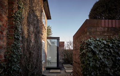
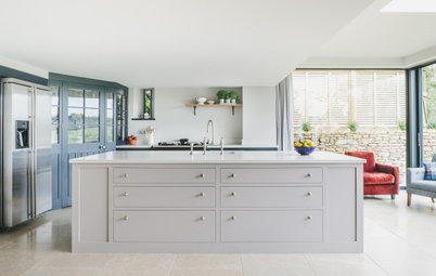
A snowy-white contemporary kitchen sits inside this glass-walled extension, juxtaposed against a storybook-style English cottage

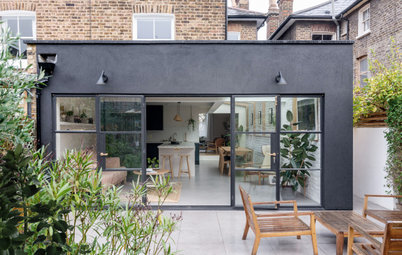
Sometimes with period properties, the best way to extend isn’t to copy what’s already there, but to do something completely different. And this was certainly the way kitchen designer Alex Saint of bulthaup by Kitchen Architecture was thinking when he approached this quintessential thatched cottage in Knutsford, England.
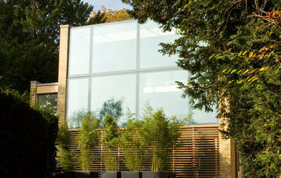
Rather than attempt a traditional brick addition, he decided – along with the homeowners and the local planning authorities – to go for a contemporary glass structure that wouldn’t interfere with the layout of the existing property. “We went for a very pure and simple addition to the cottage,” Saint says. The result is subtle, timeless and wonderfully bright.
Rather than attempt a traditional brick addition, he decided – along with the homeowners and the local planning authorities – to go for a contemporary glass structure that wouldn’t interfere with the layout of the existing property. “We went for a very pure and simple addition to the cottage,” Saint says. The result is subtle, timeless and wonderfully bright.
After considering some more traditional plans, the couple and their designer settled on this strikingly contemporary glass addition. “It doesn’t interfere with the original property too much,” Saint says, “and we didn’t have to alter the cottage a great deal to install it.”
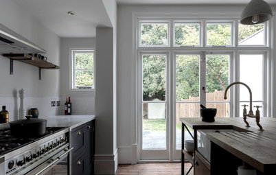
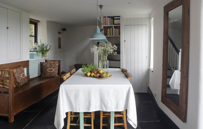
The only structural change was opening up the outside wall that leads into the new addition. The old kitchen had been positioned just to the left, where there is now a generous entrance hall.
The only structural change was opening up the outside wall that leads into the new addition. The old kitchen had been positioned just to the left, where there is now a generous entrance hall.
With the structure built almost entirely of glass, there were numerous considerations for installing the kitchen units and appliances. “For example, we didn’t have anything to attach the tall units onto,” Saint says.
A low-level wall runs around two of the three sides of the addition, so the backs of the base units could be fixed to that. “It just meant that we had to be really careful about how we planned the layout of the kitchen, so that in the end we didn’t need to fix anything high up,” Saint says. “Everything had to be literally millimetre-perfect.”
A low-level wall runs around two of the three sides of the addition, so the backs of the base units could be fixed to that. “It just meant that we had to be really careful about how we planned the layout of the kitchen, so that in the end we didn’t need to fix anything high up,” Saint says. “Everything had to be literally millimetre-perfect.”
Using glass for the structure also meant there were a few heat and ventilation challenges. Double glazing ensures the temperature doesn’t fluctuate too much in the winter, but the sliding doors – chosen to not impede access to the patio – need to be left open on sunny summer days to let the breeze through. The oak for the breakfast bar had to be treated with a UV finish to protect it from the sun too.
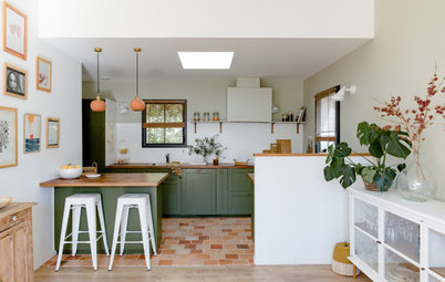
Saint created a modern-classic kitchen design, with sleek white cabinets and benchtops. The cabinet colour is a very soft matt white, almost borderline grey, the designer says. “We didn’t want it to be a stark finish, but something a little more understated. It’s easy to clean and doesn’t streak like glossy surfaces,” he adds, “which is great, as there is so much natural light in the room, which will show up any marks.”
A microwave, fan oven and warming drawer are to the left of the sink area. Beyond is a clever storage unit, which contains a pullout shelf. The toaster, teakettle and other appliances can be kept in here, plugged in, and drawn out when necessary. The sink is integrated into the laminate benchtop. It’s finished off with a tap with a pullout nozzle and a boiling-water dispenser.
Oven, stove and microwave: Gaggenau; tapware: KWC; boiling-water dispenser: Quooker
Oven, stove and microwave: Gaggenau; tapware: KWC; boiling-water dispenser: Quooker
The layout was based on the family’s wish for a sociable space. “The cook will always have nice views, either out of the window above the sink or facing the raised breakfast bar area and the garden beyond,” Saint says. “When guests are around, they’ll feel inclined to sit at the bar, which will also keep them safely out of the working zone.”
To the right of the sink area is a raised dishwasher, so the homeowners don’t have to bend down to stack the dishes. The cabinet above opens via a push latch, as does the drawer beneath. Next to the dishwasher is a full-height fridge. Its door makes it look as if it’s divided in two, but this is purely aesthetic; the line follows the edge of the benchtop.
To the right of the sink area is a raised dishwasher, so the homeowners don’t have to bend down to stack the dishes. The cabinet above opens via a push latch, as does the drawer beneath. Next to the dishwasher is a full-height fridge. Its door makes it look as if it’s divided in two, but this is purely aesthetic; the line follows the edge of the benchtop.
The texture of the oak breakfast bar contrasts that of the white kitchen furniture. “It creates a nice artisan feel,” Saint says. The wood is bolted to the cabinets, and the benchtop was shaped around it.
Cabinets under the breakfast bar provide additional storage and have push-latch doors, which keeps the look of this side of the kitchen more simple. Handles are reserved for the more functional areas. “If you have too many handles, sometimes you can’t see the wood for the trees,” Saint says. “A nice balance of both styles tends to look more considered.”
Bar stools: Carl Hansen
Bar stools: Carl Hansen
Both the cabinets and benchtops are laminate; the benchtop is about 8.5 millimetres thick and the same colour as the cabinets. “Having one material and one colour gives the space a homogenous look,” Saint says. “We wanted it to appear as one piece of material, one piece of furniture.”
Directly under the range are two power sockets, so that kitchen appliances can be used on the island. Lighting was kept as minimalist as possible and is fitted on a track system, so it can be moved and added to easily. The flagstone flooring was sourced by the homeowners and matches the patio exactly, to create a flow between inside and out. Tiny uplights are integrated into the floor to create further visual interest at night.
CH25 lounge chair: Carl Hansen

Sponsored
Who lives here: A couple with grown-up children who visit
Location: Knutsford, Cheshire, England
Size: Approximately 15 square metres
Designer: Alex Saint of bulthaup by Kitchen Architecture
This home is a classic Grade II-listed thatched cottage in Knutsford, Cheshire, and there was a series of discussions with the planning authorities to get the design for the new kitchen addition just right.