Architecture
7 Home Extensions That Make Their Own Mark
Respecting history and tradition is all well and good, but extending in a different architectural language is often the wiser thing to do

The problem with traditional extensions is this: Victorian homes didn’t have floor-to-ceiling glass, and families in the 1930s weren’t particularly fond of eating – let alone cooking – outside. The original occupants of Arts and Crafts bungalows didn’t seek to live in light-filled homes with decent access to a swimming pool, and back in the 1970s, large-screen televisions were barely thought of. More fundamentally: houses built in previous decades frequently ignore views, light and gardens. In short, older architectural styles don’t suit the modern way of life.
And yet so often, it’s assumed that the kindest thing you can do to your old house when extending is add on in the same style, despite how awkward the results can be. Buildings today are completely different – adding a bit of fretwork to a fundamentally modern construction with indoor-outdoor flow doesn’t make it any more ‘authentic’. As these wonderful houses show, sometimes the best course of action is to respect what’s already there, while at the same time trying to make your own mark with a contemporary extension.
And yet so often, it’s assumed that the kindest thing you can do to your old house when extending is add on in the same style, despite how awkward the results can be. Buildings today are completely different – adding a bit of fretwork to a fundamentally modern construction with indoor-outdoor flow doesn’t make it any more ‘authentic’. As these wonderful houses show, sometimes the best course of action is to respect what’s already there, while at the same time trying to make your own mark with a contemporary extension.
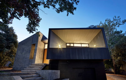
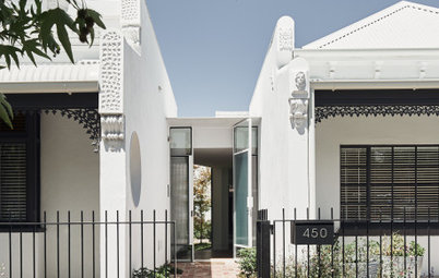
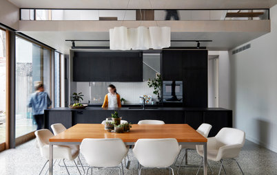
The extension is effectively two boxes on top of each other – the top box is pushed slightly towards the garden, creating a verandah-like space underneath, while downstairs is open and glassy, opening up to the lawn. Upstairs there is a library, with spectacular views out over the Waitakere Ranges to the west and the Waitemata Harbour to the north. The glazed link in between is white-painted GIB, which acts as a sort of bridge between old and new.
“There was that idea of peeling it back and seeing the bones,” says Clarke of the exposed floor joists in the extension, which contrast beautifully with the white-painted scotias and mouldings in the original. The addition is a few steps down from the original house, so the kitchen and dining area flows seamlessly out to the deck and a rolling green lawn.
2. Another book in the shelf
In Nelson, meanwhile, Jeremy Smith of Irving Smith Architects added just 12 square metres to his 1961 brick house, designed by Alec Bowman for a retired couple who only needed one bedroom and two studies. Smith has three children, so they needed more space. “We really liked the house,” he says. “Effectively what we did was add on at each end, like a bookcase.”
In Nelson, meanwhile, Jeremy Smith of Irving Smith Architects added just 12 square metres to his 1961 brick house, designed by Alec Bowman for a retired couple who only needed one bedroom and two studies. Smith has three children, so they needed more space. “We really liked the house,” he says. “Effectively what we did was add on at each end, like a bookcase.”
Smith added a long, skinny room at one end of the house and a new outside area at the other, as well as squeezing 600 millimetres in along the back wall by taking it out to the eaves. But where the original house is brick, the addition is clad in black corrugate and the additions are clearly legible, though still in scale with the original. And, as Smith notes, there are shades of black in the brick that is picked out by the new cladding.
The house had stayed virtually unchanged since it was built, with a lot of native rimu timber used throughout. “And we didn’t want to add to the rimu. It didn’t seem like a sensible thing to do,” he says. Instead, the additions are detailed in such a way that they relate to the original structure – in the kitchen, the cabinetry has slightly recessed fronts, in homage to how a 1960s kitchen might be.
The architect also rearranged the inside of the house to make it more functional – most notably in the bedrooms, where the two former studies became bedrooms with huge sliding doors running out into the hallway. “They’ve claimed the hallway as part of their space, just because it’s so little,” Smith says.
3. Dancing the brick fantastic
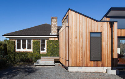
Simon Harrison of MOAA Architects radically transformed this small brick 1940s bungalow in Hamilton by adding a playful timber-clad box containing a study and small living area out the front. The extension is very obviously a new building – a key stipulation of the client – but connects to the original house in the most subtle of ways. The western red cedar fits nicely with the tones of the original Huntly brick, while the angle of the monopitch roofs is taken from the angle of the original roofline.
Simon Harrison of MOAA Architects radically transformed this small brick 1940s bungalow in Hamilton by adding a playful timber-clad box containing a study and small living area out the front. The extension is very obviously a new building – a key stipulation of the client – but connects to the original house in the most subtle of ways. The western red cedar fits nicely with the tones of the original Huntly brick, while the angle of the monopitch roofs is taken from the angle of the original roofline.
In the entry, contractors carefully preserved the ficus creeper on the brick facade. White-painted windows were retained in the original building – in the extension, they’re black aluminium. The new addition is signalled here with the use of concrete steps leading to a vitex deck.
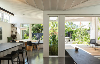
Unlike many of the projects seen here, the kitchen and dining area are contained in the original structure – Harrison completely reorganised the original interior of the house, which had been broken into a series of corridors and rooms that opened off each other. The redesign also gave the house a greater sense of distinction between private and public spaces, with four bedrooms and two bathrooms at the rear.
The clients asked for a series of interconnected spaces rather than a slavishly open-plan space, so the family could have spaces for cooking, reading and studying without interrupting each other. As a result, the rooms are intimate and inter-connected – here, the view is seen through matai shutters from the study into the new living area, which capitalises on views to the west over Hamilton in a way the previous house never did.
“The interior spaces are smaller than we have previously designed,” says Harrison. “But they work really well – this was partly due to working within the existing house, and limiting the size of the extension.”
“The interior spaces are smaller than we have previously designed,” says Harrison. “But they work really well – this was partly due to working within the existing house, and limiting the size of the extension.”
4. Building up and out
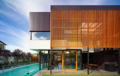
In Auckland, Pete Ritche and Bronwyn Kerr of Kerr Ritchie Architects designed an addition for old friends on a small site in the inner-city suburb of Grey Lynn. Initially brought in to design a second-storey addition to the 100-year-old house, they convinced the clients that their money would be better spent reworking the rear of the building, which was a collection of old lean-tos progressively dropping in ceiling height.
The result is a roof that extends up and out from the original house, clad in dark-stained vertical weatherboards. “We started working with the existing roof,” says Ritchie. “We wanted to create a difference between what’s usual in these houses, where it gets tighter and tighter – we wanted it to feel generous.”
Though the extension is sympathetic to the original house in its use of timber joinery and shiplap vertical cladding inside, it is most definitely a new building. “We weren’t trying to disguise that this was a new part of the house. We wanted it to have its own identity,” says the architect. Large windows were a key part of that – here, a window seat cleverly sits at the same level as the back lawn.
The clients had already upgraded their kitchen – after moving from Wellington they needed to make the house habitable. At the intersection between old and new, Kerr and Ritchie designed a floor-to-ceiling storage unit housing books, toys and collectibles. “We came to the conclusion that creating a better public space was more valuable than a nice private space,” says Ritchie.
5. The villa is reborn
With this house, Gerrad Hall led a meticulous restoration of a much-altered Herne Bay villa (pre-WWI weatherboard house) in a heritage zone, which meant convincing council planners of the merits of his design. “It had a series of regressing lean-tos off the back and then an old laundry,” says Hall. “A very classic and shambolic villa. In essence we kept the main roof and tore off all the lean-tos.”
With this house, Gerrad Hall led a meticulous restoration of a much-altered Herne Bay villa (pre-WWI weatherboard house) in a heritage zone, which meant convincing council planners of the merits of his design. “It had a series of regressing lean-tos off the back and then an old laundry,” says Hall. “A very classic and shambolic villa. In essence we kept the main roof and tore off all the lean-tos.”
At the rear, Hall built a double-height addition housing a living room, running out to a large flat lawn and a swimming pool. “I wanted to add a sense of permanence and have a base to the back of the house that was concrete and tied into the ground, unlike what villas are: popped on the earth.” Hall then wrapped the top storey in a slatted timber screen, which subtly references the white-painted timber of the original villa.
“Shifting the living area down to that lawn area made sense,” says Hall, who specified a restrained palette of concrete, dark timber and steel in the addition. This new section includes a second, sunken living area and a more casual family area, as well as a covered portico in a single-storey addition that wraps around the lawn. The stairs at the right of this image lead down from bedrooms in the original house.
Traditionally, you could stand at the front door of a villa and see right down the hall and out the back door to the garden – something Hall restored by placing a large square window on the second level of the addition. Detailing in the original house is traditional – white-painted timber, original polished floors along with traditional skirting and architraves. Council planners, surprisingly, were supportive of the distinction between old and new.
6. Another state of affairs
Dorrington Atcheson architects reworked another state house in Westmere – weatherboard this time – by adding a small north-facing extension running out to a new courtyard. The addition is deliberately modern, built from band-sawn plywood stained black, with black aluminium joinery. The addition connects to the original house via a glassy stairway.
Dorrington Atcheson architects reworked another state house in Westmere – weatherboard this time – by adding a small north-facing extension running out to a new courtyard. The addition is deliberately modern, built from band-sawn plywood stained black, with black aluminium joinery. The addition connects to the original house via a glassy stairway.
The original house now contains bedrooms, a big family bathroom and a second living area for the children, while across the courtyard the original garage has been repurposed as a studio and music room. As a result, the new living areas are small but efficient, since the family can now spread out around the whole house. A plywood divider sits between the kitchen and the casual living room at left.
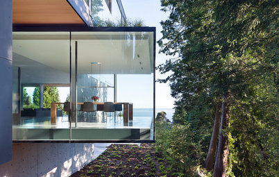
7. Ground force
Previously, this villa in Mt Eden had little connection to its back garden. Megan Edwards designed a small, thoughtful lean-to with a double-height void, connecting the house to the garden via a ground-floor library and living room. A new deck and stairs with a built-in concrete planter box connects the existing kitchen-dining area to the garden as well.
Previously, this villa in Mt Eden had little connection to its back garden. Megan Edwards designed a small, thoughtful lean-to with a double-height void, connecting the house to the garden via a ground-floor library and living room. A new deck and stairs with a built-in concrete planter box connects the existing kitchen-dining area to the garden as well.
The existing house is a white-painted wooden villa: Edwards introduced a material palette of wood, concrete and ply in the extension, adding a distinctly mid-century aesthetic that makes it feel like it’s been part of the house for decades.
Edwards slipped a small workstation in under the floor of the kitchen – here, you can clearly see the level change between the old house and the new ground-level living room. Built-in seating around the new fireplace adds a cosy touch.
TELL US
What do you think of these traditional/contemporary additions? Share your thoughts in the Comments below.
MORE
Houzz Tour: Terrace Reaches New Heights With Second-Storey Extension
10 Questions to Ask Yourself Before You Plan an Extension
Houzz Tour: The Modern Extension That Broke Down Barriers

Sponsored
Sponsored
When the owner of this former state house (government-subsidised home) in Westmere approached Paul Clarke of Studio 2 Architects, it was with a brief to create quite a different sort of building out the back of the house. Clarke set out to respect the original house, restoring its white-painted timber windows and plaster cladding.
Behind it, he built a two-storey extension that contrasts beautifully with the original. “We inverted the house,” says Clarke. “The old part is timber joinery and it’s painted white. We stripped that away in the new, and stained the new building black.”