
How to Pick the Right Paint Colours for Your Federation House
Roof colour, wall materials and emerging trends all come into play for Federation paint schemes that work

Federation homes are popular for good reason – who can resist those timeless asymmetrical designs and character-rich original features? But when it comes to keeping them in tiptop shape, this usually means painting. Even if it’s a brick house, the timber fretwork on gables, verandahs and windows need regular repainting, and if it’s a weatherboard, the task is that much bigger. The question is, should you stick with the tried-and-true heritage colours and respect the home’s past or bring it into the now with a more modern colour scheme? We find out what’s hot, what’s not, and how to get the best results out of your next painting job.
What traditional colour schemes work for Federation houses?
Houses of historical significance, or even whole areas, can be protected by a heritage overlay, so check with your local council if you’re not sure about your house. As well as restricting what changes you can make to the facade and structure of the house, there may also be limits on what you can do with paint.
Tip: Most paint companies have a heritage range of colours that have been approved for use on homes with heritage overlays, as well as a variety of suggested schemes for Federation homes.
What are my options if I live in a heritage-listed area?
Some councils are beginning to relax their rules around paint colours, especially in areas where new homes are going up around older ones. If you are restricted by a heritage overlay, however, it may be still be possible to work within the mandated palette to deliver a more contemporary look. “If they are not wanting to go down the path of classic red and green, they can often use a mix of neutrals,” says Dulux colour planning and communication manager Andrea Lucena-Orr.
If your house is red brick or has terracotta roof tiling, such as the house above, Lucena-Orr warns that it’s important to take care with your choice of neutrals. Dulux ‘Regency White’, for example, has a beige undertone, so won’t look yellow against the brick or roof tile, whereas if you choose an ivory (which has more of a yellow base), the red brick or tile will bring out more of the yellow.
Tip: Use the gutter and fascia colours to separate a terracotta roof from the main house. “Then you don’t have to be too restricted with the colour on the main house because you have that separation; it takes you two steps away from the orange,” Lucena-Orr says.
Trim: Dulux ‘Vivid White’; Walls: Dulux ‘Hog Bristle’
What modern colours work for a Federation home?
If you don’t have a heritage overlay restricting your colour choices, why not choose something bright and cheery? “White always looks beautiful against yellow,” Lucena-Orr says.
One factor to consider if you like the idea of yellow but haven’t yet taken the plunge, however, is its impact on your neighbours. “If you’re right on top of your neighbours, yellow can sometimes annoy them because it’s highly reflective,” Lucena-Orr warns.
She adds that a warm, soft yellow with a red undertone pairs well against a traditional white such as Dulux ‘Lime White’ and makes the yellow pop.
Unsure how to bring your Federation home into the 21st century? Find an interior designer on Houzz to help
For Federation homes, Taubmans colour creative director Shaynna Blaze advises playing off the romantic and nostalgic feel of the exterior with a gentle palette that highlights the unique trims and roof lines.
“The use of blue as an accent colour, contrasted against white and soft greys is a great way to create this exterior mood,” she says. “Whenever you’re painting the exterior of your home it’s always important to complement the style of your house and highlight any unique architectural features.”
Walls: Taubmans Endure Exterior ‘January Dawn’; trim: Taubmans ‘Grey Moth’; door and stairs: Taubmans ‘Elegant Evening’
Many Federation houses feature red brick on the front and less expensive brown bricks on the sides. According to Haymes Paint regional colour stylist Erin Hearns, Federation bricks often have blue and grey tones or flecks in them, so she suggests picking colours out of the brick for the fretwork. “That’s why the charcoals work really well,” she says.
Stone colours are also likely to work, but lean more towards red than yellow-toned hues for the trim if you want a more traditional look.
Browse beautiful Federation homes on Houzz
Stone colours are also likely to work, but lean more towards red than yellow-toned hues for the trim if you want a more traditional look.
Browse beautiful Federation homes on Houzz
How do I match my roof colour with my wall colour?
“Start with the roof colour first before choosing the wall or trims,” Hearns advises. Roof tile colours, such as terracotta and brown, are easiest to match, while green is the trickiest. Tones of grey and stone work well with the tiled roofs, Hearns adds, while creams are more traditional, but always lovely.
“Start with the roof colour first before choosing the wall or trims,” Hearns advises. Roof tile colours, such as terracotta and brown, are easiest to match, while green is the trickiest. Tones of grey and stone work well with the tiled roofs, Hearns adds, while creams are more traditional, but always lovely.
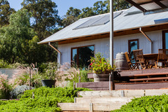
Taupes and warm greys work well with a red roof, stone colours work nicely with a green roof, but with a grey roof, the world is your oyster. The walls on this weatherboard are painted with Haymes ‘Balance’ and the windows with Haymes ‘Marble Mist’. The roof is in ‘Woodland Grey’ from Colorbond.
Hearns recommends sticking to just two or three paint colours to prevent a weatherboard from looking too busy. “Contemporary looks are about keeping it simple,” she says.
Painting tip: Cement tile roofs should be high-pressure cleaned and cleared of any loose particles before painting. And the experts at Taubmans advise cleaning and sanding Colorbond and galvanised iron roofs before giving them a coat of paint.
A light grey roof is even easier to match colours. If you are using light colours, however, be prepared to wash down the walls regularly with sugar soap and water to keep them looking fresh and bright. Pollution, dirt and cobwebs are much more obvious on lighter tones so take this into account when choosing colours.
Painting tip: Eaves tend to attract and show up the dirt so avoid painting them white. Whatever the shade of your house, choose a lighter colour in the same family for the eaves or go for a quarter strength. If your house is white, go for a grey-white or off-white on the eaves.
Painting tip: Eaves tend to attract and show up the dirt so avoid painting them white. Whatever the shade of your house, choose a lighter colour in the same family for the eaves or go for a quarter strength. If your house is white, go for a grey-white or off-white on the eaves.
How do I choose the right white for my Federation home?
The white-on-white look is classic and crisp. Choose one shade of white for the whole house or build in slight variation with two tones of white – one for the walls, the other for the trim – and one brighter than the other.
The white-on-white look is classic and crisp. Choose one shade of white for the whole house or build in slight variation with two tones of white – one for the walls, the other for the trim – and one brighter than the other.
Hearns warns the shade of white you love in the hardware or paint store is likely to look dramatically different when you step outside with paint chip (or tins of paint) in hand. “Consider going a couple of shades darker because they do lighten a lot in the natural light,” she recommends.
Hearns also advises checking how samples look in sunlight and shade, in front and at the back of your house. “White will look brighter on a sunny day, and greyer on a cloudy day,” she says.
Once you narrow down your choice to one or two whites, get a sample pot of each and paint a 1m x 1m patch of each on the front and back of the house. “Make sure you do two coats with the sample pot, especially if you’re painting over a darker colour,” Hearns adds.
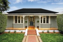
As seen here, the Federation Queen Anne style, prominent from 1890 to 1915, features Tudor-style fretwork rather than the more elaborate wrought-iron styles popular in the Victorian-style houses of the mid to late 19th century.
What features should I highlight?
Because traditional homes often have so many more features than modern homes, Lucena-Orr suggests thinking about how best to bring them out. “It’s a balance between making them stand out elegantly and beautifully without picking out every detail and making them too overt,” she explains.
The detailed fretwork of the early Federation period can be seen not only in gables and windows, but is also echoed on gateways.
The sunrise motif on front gables signified the dawning of a new century; highlighting these in a contrasting colour can make them more of a feature.
Should I repaint my Federation house myself?
If you’re thinking about repainting your house yourself, and it hasn’t been done in a while, keep in mind that any old oil enamel paint is likely to be brittle and cracked. Taubmans advises sanding, scraping and stripping back any peeling or flaking paint and removing as much dirt and dust as possible with sugar soap or other form of detergent.
Timber trim, doors and any shiny surfaces will likely have to be sanded and cleaned, too, before a new coat of paint goes on. The prep work often takes longer than the painting, but it’s worth your while if you don’t want to be doing the job all over again in just a few years.
The Edwardian-style Federation homes, common from 1900-1915, were less ornamental than Queen Annes and often featured roof shingles and decorative leadlight in the windows and the glass in the doors. This trend began with Australia’s Federation on 1 January, 1901, when the British colonies of Australia became known as states under the Commonwealth of Australia. Many motifs in glass and plaster are of Australian flora and fauna as a mark of national pride.
If you’re thinking about grey for your house, Haymes is forecasting warm greys such as ‘Refuge’ and ‘Minimalist’ (one of Hearns’s favourites) as being on trend, as well as the cooler grey ‘Pale Mushroom’.
If you’re thinking about grey for your house, Haymes is forecasting warm greys such as ‘Refuge’ and ‘Minimalist’ (one of Hearns’s favourites) as being on trend, as well as the cooler grey ‘Pale Mushroom’.
What colours suit Federation-era front doors?
It seems most people lean towards conservative choices when it comes to painting their house. “Usually they’ve seen something they like and want something similar,” says Hearns.
But the front door is a different story. “A highlighted front door can add a pop of colour or personality,” she adds. A glossy black front door works beautifully with a white-on-white colour scheme, as well as with grey or taupe.
Walls: Haymes ‘Koala Grey’; windows: Haymes ‘Fossil’; door: Haymes ‘Intrigue’
According to Hearns, homeowners are moving away from reds and oranges for the front door towards yellow and even teal. “A Greek island blue looks really funky, too,” she says. Usually you’d match the architraves on the windows and front door and paint just the door itself a bright hue.
Blaze says a more classic and subtle exterior scheme works best on Federation homes. As this house shows, neutral colours such as Taubmans ‘Burma Buff’ work well contrasted against crisp whites, such as Taubmans ‘Cotton Ball’.
Blaze agrees that although most Australians choose a timeless exterior colour scheme, more homeowners are wanting to keep up with colour trends by embracing bold splashes of colour in their exterior schemes without having to repaint their entire house. Painting the front door creates a focal point and gives the home a strong street presence. “This small addition of colour will add personality to your home and can easily be repainted in seasonal trend colours,” she says.
Door: Taubmans ‘Poinciana Red’; walls: Taubmans Endure ‘Burma Buff’
Grey is the perfect backdrop for a bright front door, says Lucena-Orr, because it’s such a neutral base and “pretty much goes with everything”. Strong reds, deep charcoals, royal blue, teal green, and even hot pink, as seen here, all work well as front door colours, she says.
Door: Dulux Aquanamel ‘Scarlet Ribbons’
Door: Dulux Aquanamel ‘Scarlet Ribbons’
Door: Dulux ‘Teal Trip’; trim and walls: Dulux ‘White On White’
Painting tip: Dulux advises using a brush over a roller so you have greater control with intricate details. Remember to paint the top and bottom edges of the door to protect against rot and swelling. Removing the door from its hinges will achieve the best results but is not essential.
Painting tip: Dulux advises using a brush over a roller so you have greater control with intricate details. Remember to paint the top and bottom edges of the door to protect against rot and swelling. Removing the door from its hinges will achieve the best results but is not essential.
Door: Dulux ‘Symphony Red’; door frame: Dulux ‘Leadman’
Your turn
What’s your favourite Federation colour scheme? And for the front door? Share your ideas in the comment section.
More
Do you need more advice for renovating your Federation home? Read Tile Guide: Choose the Right Styles for a Federation Home
Your turn
What’s your favourite Federation colour scheme? And for the front door? Share your ideas in the comment section.
More
Do you need more advice for renovating your Federation home? Read Tile Guide: Choose the Right Styles for a Federation Home
Federation-style houses emerged in Australia in the late-19th century and remained popular into the early 20th century – the ornate detailing a clear sign of the prosperity of the times. These solidly built homes are as sought after now as they were then for their charm and character, and sense of history.
While traditional, rich, deep creams with reds and greens go well with both brick and weatherboard Federation houses, contemporary schemes are more suited to weatherboards. The homeowners of this house have stuck with tried-and-true heritage colours, such as ‘Indian Red’, ‘Brunswick Green’ and cream – a combination that works beautifully with the red tiled roofing and bricks. This colour scheme is eternally on trend for this style of house so, if you love your house for its history, there’s no reason to depart from these colours.
Painting tip: Paint downpipes in a colour that blends in rather than stands out as an architectural highlight.