Project Of The Week
Renovating
A Neglected Victorian Villa Reborn as a Sustainable Family Home
A sensitive upgrade to a Victorian villa sees it transformed into a contemporary, environmentally friendly family home

In this Q&A series, we turn the spotlight on one thought-provoking renovation or redesign each week. Here, architect Claire McGuire, architect at RBA Architects + Conservation Consultants, shares the journey of restoring, reconfiguring and extending this home in Victoria. What was once a tired four-bedroom, two-bathroom villa is now a four-bedroom, three-bathroom family home fit for contemporary living.
Gained
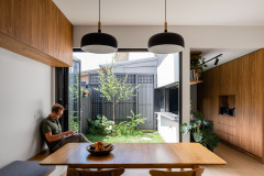
- A new extension housing an informal entry foyer and bag-drop area, a kitchen, butler’s pantry, dining room, living room, powder room, laundry and study.
- A more contemporary layout that still honours the original heritage character of the building.
- A design that incorporates environmentally sustainable design principles.
- A new ensuite and a second sitting room located in the original part of the house.
- A pool house with a bathroom and entertaining facilities that can also be used to accommodate future independent living.
The floor plan after works
What was the house like originally?
It’s one of a pair of late-Victorian Italianate villas that had been neglected and unsympathetically altered over a long period. Structurally, it was still quite intact and retained many of its original features, including its plan, facades, slate roof, verandah and decorative features.
Ready to take the plunge? Find a local architect on Houzz who can help you create your dream home
What wasn’t working about the original house?
This original extension was dated and did not provide adequate space for modern living. There was insufficient storage, no communal living space and no connection to the garden.
This original extension was dated and did not provide adequate space for modern living. There was insufficient storage, no communal living space and no connection to the garden.
What was your brief?
A renovation that included conservation works to the original house and the facade, and a contemporary addition that would create a light-filled home with flexible spaces for a young family.
A renovation that included conservation works to the original house and the facade, and a contemporary addition that would create a light-filled home with flexible spaces for a young family.
What were the client’s must-haves?
- A mix of private and communal spaces.
- Environmentally sustainable design principles to be employed.
- The existing qualities of spaciousness and natural light in the front part of the house were to be incorporated into the rest of the design.
- A swimming pool and pool house.
American oak cladding on some of the walls and ceiling adds warmth and depth in the new addition
What exactly did you do?
What exactly did you do?
- Removed a small rear addition that was not part of the original building.
- Added a new extension housing an open-plan kitchen/living space and a study nook.
- Undertook renovation and conservation work in the original part of the house and facade.
- Relocated the master suite.
- Turned an existing bedroom into a new ensuite.
- Included new rear landscaping.
- Incorporated a new pool house.
In this project, old techniques have been employed in a contemporary context, such as the polished plaster to the fireplace wall, which adds texture and interest to the room
What problems or constraints did this project address?
What problems or constraints did this project address?
- The home was not child-friendly.
- It had a poor connection to the garden.
- The spaces lacked flexibility.
How does the new work address these issues?
- The home is now child-friendly, with safe spaces for the children to play with unobstructed supervision.
- There is a direct connection to the garden, achieved through large windows, clerestory or roof windows, operable glass louvres and large sliding doors.
- The new spaces are flexible.
- Spacious and communal open-plan living areas can be closed off when required by sliding timber-panelled doors.
- The pool house offers space for private functions and can double as a guest house or accommodation for a teenager or ageing parent.
- A new study allows the owners to work from home.
How important was it to conserve the historical character of the house?
While the original house had not been recognised for statutory protection, it was immediately obvious to us that it retained significant heritage qualities. This recognition formed the initial basis for the design direction, with the whole-hearted support of the owners.
While the original house had not been recognised for statutory protection, it was immediately obvious to us that it retained significant heritage qualities. This recognition formed the initial basis for the design direction, with the whole-hearted support of the owners.
How does the new addition sit beside the original part of the house?
The architectural style of the contemporary addition contrasts with the existing house.
The junction, which is highlighted by a ribbon of glazed roof, accentuates the character of the existing house and is the point where the visitor is introduced to the new addition.
At this junction, along the entire width of the existing house, the original handmade bricks have been retained and celebrated, with the dancing light highlighting varying textures and colours throughout the day.
The black timber cupboard doors conceal an entertainer’s bar and storage
Why do you think this home works so well?
This late Victorian home has been successfully transformed into a flexible, spacious and light-filled contemporary family residence. The design successfully integrates the existing house and the new additions through a harmonious balance of texture, light and space.
Key features
- This house is a great example of how to successfully transform a heritage dwelling into a contemporary and sustainable home.
- The flexible layout incorporates a discrete study for working from home and a pool house that can accommodate future independent living.
- Upcyling is the best sustainable practice. Here, extending the life of the existing house while adapting it to suit modern needs is good sustainable practice.
- The design incorporates other ecologically sustainable development principles. These include the use of masonry and thermal mass for passive design, north-facing highlight windows, high-performance glazing and insulation, glazed louvres for natural ventilation, water tanks, solar panels as well as good solar access and shading.
Interior materials palette
Paint colours
Your turn
Are you as impressed as we are with this thoughtful redesign? Tell us in the Comments, like this story, save the images and join the conversation.
More
Seeking inspiration for your own renovation? Don’t miss A Masterful Balance of Colour and Light in a Knockdown-Rebuild
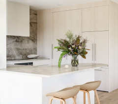
- Market Timbers American Oak panelling – a mix of both solid and veneer.
- Edge Architectural double-glazed windows with powder-coated aluminium frames to the new addition.
- Marble kitchen splashback.
- Brushed stainless steel kitchen benchtop.
- Exposed-aggregate concrete floor to the new addition with in-floor hydronic heating.
Paint colours
- Dulux Natural White, Ghosting, Ghosting Half, Unforgettable and Powered Rock used in different spaces throughout the house.
Your turn
Are you as impressed as we are with this thoughtful redesign? Tell us in the Comments, like this story, save the images and join the conversation.
More
Seeking inspiration for your own renovation? Don’t miss A Masterful Balance of Colour and Light in a Knockdown-Rebuild
Answers by Claire McGuire, architect at RBA Architects + Conservation Consultants
Who lives here: A couple with three young children
Location: Windsor, Victoria
Size of the house originally: 155 square metres
Size of the house after works: 335 square metres
Architect: RBA Architects + Conservation Consultants
Builder: VDB Building Contractors
Interior designer: Sanders & King