Stickybeak of the Week: A Timber Extension for a Mid-Century Home
It's all about the wood in this project, which was influenced by both American and Japanese architecture
Plenty of extensions improve light and space, but this structure, added to a home that had been hastily constructed on a former bomb site in the 1950s, raises standards too. “[The original home] was built at a time when there wasn’t a lot of money around, so we wanted to create something that had a bit more of a generous feel to it, both materially and spatially,” explains architect Tim O’Callaghan who designed the extension.
The extension, which has added 18 square metres to the house, consists of a grid-like design made of Douglas fir. The kitchen units are located on one side, with an island unit opposite. “We looked at lots of different configurations and worked through lots of ideas, but this was the best one,” O’Callaghan says. “It’s still quite a small space, so we wanted to keep it simple. We just wanted to make it as efficient as it could be.”
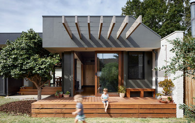
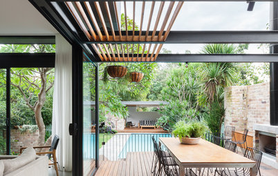
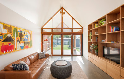
The extension’s timber ‘portal’ frames lead out into the garden, blurring the division between the inside and outside spaces. “It all needed to connect so the garden felt more like an extra room.”
Poured concrete flooring was chosen to continue the tactile material theme. Tracked spotlights attached to the extension’s timber frame provide task lighting, and pendants are used to define the dining area. “There are also LED strips above the storage in the kitchen, so you get a wash of light across the ceiling at night,” O’Callaghan says. In the daytime, generous skylights keep things bright.
The new structure creates the sense of a ‘closet wing’ or side return, echoing the original Victorian property that would have stood on this plot. The garden now mirrors the layout of the house. The architects’ sister company nimtim Landscapes laid pavers and planted barberries (berberis), hebe and Turkish sage with colour and texture in mind – the architects’ dog Corbi clearly approves.
There’s a small utility room behind the bespoke shelving unit. “It meant the run of kitchen units could be much more compact, because everything like the washing machine was tucked away,” O’Callaghan says.
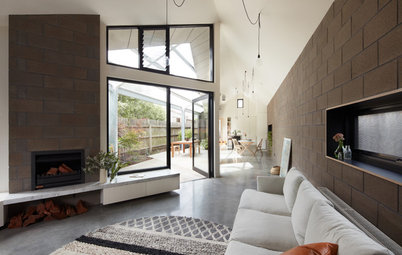
The bricks used in the extension were chosen for their colour (which contrasts with the light timber framing) and size (two-and-a-half times the normal length of a brick). It’s all part of O’Callaghan’s policy of using materials with character.
“The longer bricks guide the eye through the length of the house to the garden and add to the sense of space,” he says of the wall, which carries on out into the garden. “It’s something they did in Case Study Houses – having a solid element like exposed brick that goes from inside to outside.”
“The longer bricks guide the eye through the length of the house to the garden and add to the sense of space,” he says of the wall, which carries on out into the garden. “It’s something they did in Case Study Houses – having a solid element like exposed brick that goes from inside to outside.”
“Exposed timber was part of the idea of having high-quality materials that you could touch and feel,” O’Callaghan says. “We were originally going to stain them quite dark so it would look like a tropical timber, but once we were on site and saw the Douglas fir in situ we really liked it – it has a kind of pinky hue. When we suggested to the client that we leave it, she agreed.”
The building contractor customised standard unit carcasses with off-the-shelf treated ply doors and used the same material to make the shelving. The handles were also bespoke. “They’re a really cheap solution – a steel angle that you can buy from any metal merchant chopped down and put into the leading edge of the kitchen door,” O’Callaghan says. Textured tiles add interest. “They’re a bit wavy and all slightly different.”
The old galley kitchen didn’t have space for a table, but the new kitchen has plenty of room for one. The three pendant lights frame it beautifully.
The table was designed by nimtim Architects and made from offcuts of treated ply from the kitchen units.
The frame leading out into the garden was designed with flexibility in mind. “It’s not covered over at the moment, but it potentially could be in the future, depending on how the client decides to use it,” O’Callaghan says. “We also thought she could have plants growing over it for a pergola-type arrangement.”
Tell us
What do you love about this space? Tell us why in the Comments! And don’t forget to save your favourite images, bookmark the story, and join in the conversation below.
Tell us
What do you love about this space? Tell us why in the Comments! And don’t forget to save your favourite images, bookmark the story, and join in the conversation below.


Who lives here: A professional woman
Location: Peckham, south London, UK
Property: A 1950s terrace
Extension size: An additional 18 square metre
Architect: Tim O’Callaghan of nimtim Architects
Main contractor TW Space Conversion
Photos by Elyse Kennedy
Situated on a street of Victorian houses, this compact 1950s terrace had been something of the poor relation. “It’s smaller and had been made with low-quality materials that didn’t have any feel or texture,” O’Callaghan says. The back of the house had been split into a dining room and narrow galley kitchen, and there was no real connection to the garden.
To seek inspiration for the kitchen extension, O’Callaghan looked to the traditional Japanese style of connecting inside and outside spaces, as well as the iconic mid-century US architecture of Case Study Houses, which championed the use of quality, tactile materials. “Both have a much more considered relationship between the inside and outside. It’s not so distinct, there are kinds of layers to it. That kind of architecture inspired us.”