Stickybeak: Making More Room in a Mid-Century Marvel
Paying homage to the mid-century roots of the house, this timber-lined addition is like a pavilion among the trees
Camberwell is a well-established suburb in Melbourne’s east with tree-lined streets, leafy parks and an array of period houses. This addition to a mid-century home draws on elements of the much-loved architectural style to create a pavilion amongst the trees. Designed by AM Architecture, the addition – which includes an open-plan living, dining and kitchen area, and a master bedroom and bathroom – provides more communal space for the family, improves the zoning of the house, and fosters a better indoor-outdoor connection.
To meet the client’s brief for more functional space and better zoning, Mellios left the original dwelling largely intact and focused on a creating a separate addition, which takes advantage of the L-shaped block and overlooks the fence to the neighbouring park.
The addition incorporates an open-plan kitchen, living and dining area, with an adjoining master bedroom and ensuite that cantilever over the swimming pool. “It’s more a way of maximising pool area rather than architectural acrobatics, but the result is a fairly heroic gesture,” says Mellios.
The design and craftsmanship of the addition pay homage to the mid-century roots of the house, emphasising its horizontal form, natural materials, honesty in construction and meticulous attention to detail.
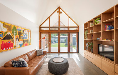
Its conceptual design emerged from the idea of a pavilion with timber posts forming its boundary and supporting the timber-lined ceiling – or canopy – overhead. “Being inside, the feeling is like standing on top of the fence, in total connection with the park, and with a lofty ceiling to embrace the leafy aspect,” says Mellios.
Its conceptual design emerged from the idea of a pavilion with timber posts forming its boundary and supporting the timber-lined ceiling – or canopy – overhead. “Being inside, the feeling is like standing on top of the fence, in total connection with the park, and with a lofty ceiling to embrace the leafy aspect,” says Mellios.
The timber posts around the perimeter of the space create rhythm and depth, and draw attention to and accentuate its heights. They also mediate the expansive glass surfaces, and each has a clasp for the suspended ceramic lights.
The fireplace reinforces the dramatic verticality of the space, and the eucalyptus tree in the courtyard outside.
Pendant lights: Mance; fireplace: Oblica
The fireplace reinforces the dramatic verticality of the space, and the eucalyptus tree in the courtyard outside.
Pendant lights: Mance; fireplace: Oblica
Australian native timbers for the ceiling, posts, flooring and joinery connect the addition with its immediate natural environment. And at each end of the space, the clinker-brick walls reference the external clinker-brick planes of the original architecture. “They bookend the new interior, suggesting that the living areas are an external space,” says Mellios. The recycled clinker bricks also capture the heat of the northern sunlight to provide thermal mass to the interior.
The vast swathes of glazing maximise the benefits of natural light and winter sun throughout the day, with living areas oriented for northeast-to-northwest light. High-performance glazing with low-e coating enhances insulation and energy efficiency.
Above the kitchen and spanning the length of the living area, southwest-facing clerestory windows allow late-afternoon sunlight to enter. “They are baffled with white blades to screen the harsh summer sun, but reflect its wonderful colour deep into the space,” says Mellios.
Waka Dining Table and Yo Dining Chairs: Tide Design
Waka Dining Table and Yo Dining Chairs: Tide Design
In keeping with the mid-century heritage of the original house, furniture is contemporary but with references to the smooth, organic and contoured lines typical of mid-century design.
Polygon Armchair: Mezai
Polygon Armchair: Mezai
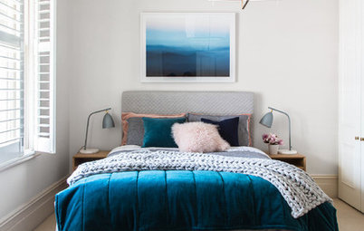
The entrance to the master bedroom ‘pod’ door is through a concealed door in the kitchen joinery. The space feels as lofty as the adjoining living area, and the native timber and clinker-brick palette continues.
Taking advantage of morning light, the bedroom is angled to face eastward, which also fosters a greater sense of privacy.
Taking advantage of morning light, the bedroom is angled to face eastward, which also fosters a greater sense of privacy.
A timber partition separates the bedroom and ensuite, maintaining the openness of the room. “This allows the space to flow around the pod, and avoids compartmentalising the spaces in order to maximise the views to the park beyond,” says Mellios.
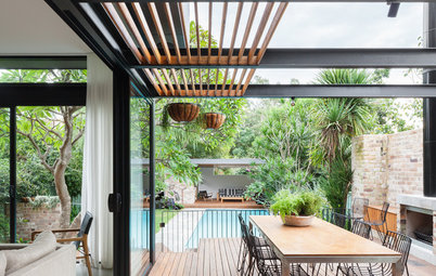
Respecting not only the original architecture but also the renovations, an oversized fascia emphasises the horizontality of the addition, and the deep northern eaves regulate sun penetration. An external venetian blind (“It enlarges the ubiquitous 1950s venetian,” says Mellios.) spans the length of the northeastern and northwestern facades, providing an additional layer of sun protection when needed.
External blinds: Reflex Shading Systems
External blinds: Reflex Shading Systems
The outdoor deck is two steps lower than the living room and its surface is closely aligned with the top of the paling fence, allowing the family to overlook the neighbouring park. The deck also separates the pool area and lawn to the northeast from the children’s lawn to the northwest, which connects to the kids’ living room and sleeping wing.
“The addition has achieved a simplicity of form and idea, but with enormous spatial impact, which has since become a central interest of our practice,” says Mellios.
Tell us
What do you love about this home? Tell us in the Comments below. And don’t forget to like the story, save your favourite images and join the conversation.
More
Want more inspiring design? Take a look at last week’s Stickybeak: How ‘No’ Paved the Way to a Better Revamp

Renovation at a Glance
Who lives here: A family of five, including three children under nine years of age
Location: Camberwell, Victoria
Size: 143 square metres; open-plan living, dining and kitchen area; master suite
Architecture and design: AM Architecture
With a passion for mid-century architecture, the clients purchased the house that was originally designed and built in 1959 by Geoffrey Trewenack of mid-century architecture firm Borland & Trewenack. Over the years, modifications to the original design saw external features removed, window areas reduced, a large fascia added, pebble-crete panels covered over and the first floor raised on external clinker-brick planes.
“Regardless of how we felt about these changes they gave rise to the new character of the house,” says Andrew Mellios, director of AM Architecture. “So while the original architecture had morphed into a slightly different form, we decided to work with the resultant building, and the oversized fascia and clinker-brick planes became the design language of the new addition.”