Search results for "Roof materials australia" in Home Design Ideas
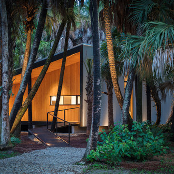
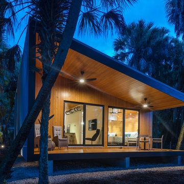
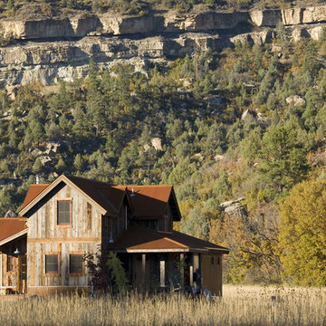
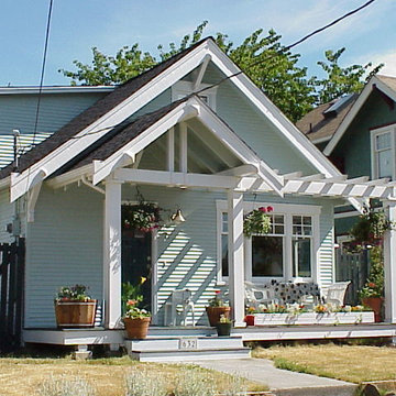
I built this on my property for my aging father who has some health issues. Handicap accessibility was a factor in design. His dream has always been to try retire to a cabin in the woods. This is what he got.
It is a 1 bedroom, 1 bath with a great room. It is 600 sqft of AC space. The footprint is 40' x 26' overall.
The site was the former home of our pig pen. I only had to take 1 tree to make this work and I planted 3 in its place. The axis is set from root ball to root ball. The rear center is aligned with mean sunset and is visible across a wetland.
The goal was to make the home feel like it was floating in the palms. The geometry had to simple and I didn't want it feeling heavy on the land so I cantilevered the structure beyond exposed foundation walls. My barn is nearby and it features old 1950's "S" corrugated metal panel walls. I used the same panel profile for my siding. I ran it vertical to math the barn, but also to balance the length of the structure and stretch the high point into the canopy, visually. The wood is all Southern Yellow Pine. This material came from clearing at the Babcock Ranch Development site. I ran it through the structure, end to end and horizontally, to create a seamless feel and to stretch the space. It worked. It feels MUCH bigger than it is.
I milled the material to specific sizes in specific areas to create precise alignments. Floor starters align with base. Wall tops adjoin ceiling starters to create the illusion of a seamless board. All light fixtures, HVAC supports, cabinets, switches, outlets, are set specifically to wood joints. The front and rear porch wood has three different milling profiles so the hypotenuse on the ceilings, align with the walls, and yield an aligned deck board below. Yes, I over did it. It is spectacular in its detailing. That's the benefit of small spaces.
Concrete counters and IKEA cabinets round out the conversation.
For those who could not live in a tiny house, I offer the Tiny-ish House.
Photos by Ryan Gamma
Staging by iStage Homes
Design assistance by Jimmy Thornton
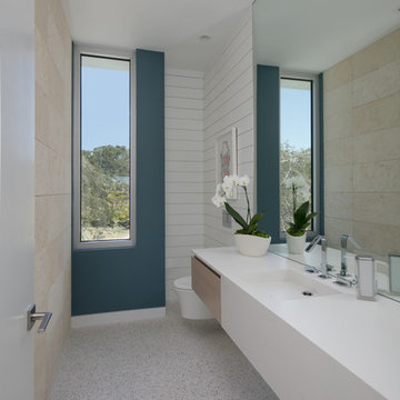
BeachHaus is built on a previously developed site on Siesta Key. It sits directly on the bay but has Gulf views from the upper floor and roof deck.
The client loved the old Florida cracker beach houses that are harder and harder to find these days. They loved the exposed roof joists, ship lap ceilings, light colored surfaces and inviting and durable materials.
Given the risk of hurricanes, building those homes in these areas is not only disingenuous it is impossible. Instead, we focused on building the new era of beach houses; fully elevated to comfy with FEMA requirements, exposed concrete beams, long eaves to shade windows, coralina stone cladding, ship lap ceilings, and white oak and terrazzo flooring.
The home is Net Zero Energy with a HERS index of -25 making it one of the most energy efficient homes in the US. It is also certified NGBS Emerald.
Photos by Ryan Gamma Photography
Find the right local pro for your project
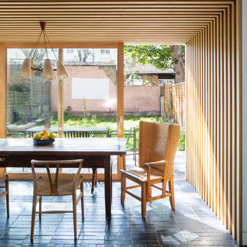
A playful re-imagining of a Victorian terrace with a large rear extension.
The project started as a problem solving exercise – the owner of the house was very tall and he had never been able to have a shower in the pokey outrigger bathroom, there was simply not enough ceiling height. The lower ground floor kitchen also suffered from low ceilings and was dark and uninviting. There was very little connection to the garden, surrounded by trees, which felt like a lost opportunity. The whole house needed rethinking.
The solution we proposed was to extend into the generous garden at the rear and reconstruct the existing outrigger with an extra storey. We used the outrigger to relocate the staircase to the lower ground floor, moving it from the centre of the house into a double height space in the extension. This gave the house a very generous sense of height and space and allows light to flood into the kitchen and hall from high level windows. These provide glances of the surrounding tress as you descent to the dining room.
The extension allows the kitchen and dining room to push further into the garden, making the most of the views and light. A strip rooflight over the kitchen wall units brings light deep into the space and washes the kitchen with sunlight during the day. Behind the kitchen, where there was no access to natural light, we tucked a utility room and shower room, with a second sitting room at the front of the house. The extension has a green sedum roof to ensure it feels like part of the garden when seen from the upper floors of the house. We used a pale white and yellow brick to complement the colour of the London stock brickwork, but maintain a contemporary aesthetic. Oak windows and sliding door add a warmth to the extension and tie in with the materials we used internally.
Internally there is a palette of bold colours to define the living spaces, including an entirely yellow corridor the client has named ‘The Yolky Way’ leading from the kitchen to the front reception room, complete with hidden yellow doors. These are offset against more natural materials such as the oak batten cladding, which define the dining space and also line the back wall of the kitchen concealing the fridge door and larder units. A bespoke terrazzo counter unites the colours of the floor, oak cladding and cupboard doors and the tiled floor leads seamlessly to the outside patio, leading the eye back into the garden.
A new bathroom with a generous ceiling height was placed in the reconstructed outrigger, with triple aspect windows, including a picture window at the end of the bath framing views of the trees in the garden.
Upstairs we kept the traditional Victorian layout, refurbished the windows and shutters, reinstating cornice and ceiling roses to the principal rooms. At every point in the project the ergonomics of the house were considered, tall doors, very high kitchen worktops and always maximising ceiling heights, ensuring the house was more suited to its tall owner.
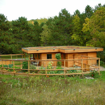
Green roof in full sun is harder than in the shade.
Sterilized shale is used here over slightly sloped rubber membrane with sedum plants plugged into shale and then watered with drip irrigation for first two summers depending on rain amount. Garden fence holds back deer, rabbits and ground hogs. Roof scuppers provide water to the butterfly garden. Raised beds mean less bending over and better weed control.
tkd
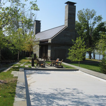
The family purchased the 1950s ranch on Mullet Lake because their daughter dreamed of being married on its shores. The home would be used for the wedding venue and then as a wedding gift to the young couple. We were originally hired in August 2014 to help with a simple renovation of the home that was to be completed well in advance of the August 2015 wedding date. However, thorough investigation revealed significant issues with the original foundation, floor framing and other critical elements of the home’s structure that made that impossible. Based on this information, the family decided to tear down and build again. So now we were tasked with designing a new home that would embody their daughter’s vision of a storybook home – a vision inspired by another one of our projects that she had toured. To capture this aesthetic, traditional cottage materials such as stone and cedar shakes are accentuated by more materials such as reclaimed barn wood siding and corrugated CORTEN steel accent roofs. Inside, interior finishes include hand-hewn timber accents that frame openings and highlight features like the entrance reading nook. Natural materials shine against white walls and simply furnished rooms. While the house has nods to vintage style throughout, the open-plan kitchen and living area allows for both contemporary living and entertaining. We were able to capture their daughter’s vision and the home was completed on time for her big day.
- Jacqueline Southby Photography
Reload the page to not see this specific ad anymore
The original Meadow Project design/build completed in October 2005
Photo of a country exterior in Albuquerque with wood siding.
Photo of a country exterior in Albuquerque with wood siding.

Not evident from the street, the parti for this new home is a sweeping arc of glass which forms an expansive panorama of a wooded river valley beyond in the rear. The lot is located in an established and planned neighborhood, which is adjacent to a heavily forested metropark.
The house is comprised of two levels; the primary living areas are located on the main level including the master bedroom suite. Additional living and entertaining areas are located below with access to the lower level outdoor living spaces. The large floor-to-ceiling curtain of glass and open floor plan allow all main living spaces access to views and light while affording privacy where required, primarily along the sides of the property.
Kitchen and eating areas include a large floating island which allows for meal preparation while entertaining, and the many large retracting glass doors allow for easy flow to the outdoor spaces.
The exterior materials were chosen for durability and minimal maintenance, including ultra- compact porcelain, stone, synthetic stucco, cement siding, stained fir roof underhangs and exterior ceilings. Lighting is downplayed with special fixtures where important areas are highlighted. The fireplace wall has a hidden door to the master suite veneered in concrete panels. The kitchen is sleek with hidden appliances behind full-height (responsibly harvested) rosewood veneer panels.
Interiors include a soft muted palette with minimalist fixtures and details. Careful attention was given to the variable ceiling heights throughout, for example in the foyer and dining room. The foyer area is raised and expressed as the large porcelain clad element of the entrance, and becomes a defining part of the composition of the façade from the street.
Twin Peaks House is a vibrant extension to a grand Edwardian homestead in Kensington.
Originally built in 1913 for a wealthy family of butchers, when the surrounding landscape was pasture from horizon to horizon, the homestead endured as its acreage was carved up and subdivided into smaller terrace allotments. Our clients discovered the property decades ago during long walks around their neighbourhood, promising themselves that they would buy it should the opportunity ever arise.
Many years later the opportunity did arise, and our clients made the leap. Not long after, they commissioned us to update the home for their family of five. They asked us to replace the pokey rear end of the house, shabbily renovated in the 1980s, with a generous extension that matched the scale of the original home and its voluminous garden.
Our design intervention extends the massing of the original gable-roofed house towards the back garden, accommodating kids’ bedrooms, living areas downstairs and main bedroom suite tucked away upstairs gabled volume to the east earns the project its name, duplicating the main roof pitch at a smaller scale and housing dining, kitchen, laundry and informal entry. This arrangement of rooms supports our clients’ busy lifestyles with zones of communal and individual living, places to be together and places to be alone.
The living area pivots around the kitchen island, positioned carefully to entice our clients' energetic teenaged boys with the aroma of cooking. A sculpted deck runs the length of the garden elevation, facing swimming pool, borrowed landscape and the sun. A first-floor hideout attached to the main bedroom floats above, vertical screening providing prospect and refuge. Neither quite indoors nor out, these spaces act as threshold between both, protected from the rain and flexibly dimensioned for either entertaining or retreat.
Galvanised steel continuously wraps the exterior of the extension, distilling the decorative heritage of the original’s walls, roofs and gables into two cohesive volumes. The masculinity in this form-making is balanced by a light-filled, feminine interior. Its material palette of pale timbers and pastel shades are set against a textured white backdrop, with 2400mm high datum adding a human scale to the raked ceilings. Celebrating the tension between these design moves is a dramatic, top-lit 7m high void that slices through the centre of the house. Another type of threshold, the void bridges the old and the new, the private and the public, the formal and the informal. It acts as a clear spatial marker for each of these transitions and a living relic of the home’s long history.
2016 MBIA Gold Award Winner: From whence an old one-story house once stood now stands this 5,000+ SF marvel that Finecraft built in the heart of Bethesda, MD.
Thomson & Cooke Architects
Susie Soleimani Photography
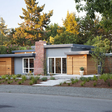
Photo ©2012 Mariko Reed
Photo of a midcentury one-storey exterior in San Francisco.
Photo of a midcentury one-storey exterior in San Francisco.
Scott Amundson
This is an example of an expansive country three-storey brown house exterior in Minneapolis with mixed siding, a gable roof and a mixed roof.
This is an example of an expansive country three-storey brown house exterior in Minneapolis with mixed siding, a gable roof and a mixed roof.

Reload the page to not see this specific ad anymore
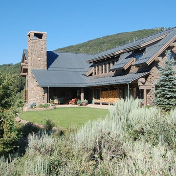
This custom residence exploits its southern exposure with a daylight basement that opens out to unencumbered mountain views. Interior finishes such as inlaid wood ceilings, Oklahoma sandstone masonry, and log wrapped steel columns, carry the ubiquitous natural tones of the site into the interior with a refined touch. Designed by Ward+Blake Architects in Jackson, Wyoming.
Photo Credit: Douglas Kahn
A palette of completely natural materials was used on this log cabin. “We wanted all materials to blend into the environment,” according to project architect Mike Burgoyne at Yunker Associates, Minneapolis. “The RHEINZINK fell so naturally into that approach. The patina process begins quickly and the material dulls down to look like it’s been there for a long time.”
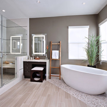
Inspired by the Japanese "roten-buro" (outdoor bath), this master bath uses natural materials and textures to create the feeling of bathing out in nature. Designer: Fumiko Faiman. Photographer: Jeri Koegel.
This is a little project we did for a friend a few years ago. Our client approached us after the south face of her house had deteriorated to the point that severe rot and mold had invaded the structure. She also wanted to give the front of her house a facelift and create some more curb appeal. On little projects like these, budget often dictates our design solution and our approach is to maximize value on behalf of our clients. We don't trying to win design awards with these small projects nor are we trying to get published. Our goal is to simply and elegantly solve the problem we are presented with at a price point that our client can afford.
There are several ideas we incorporated into this design solution. Foremost was to solve the water infiltration into the building envelope. The structure faces due south and takes a beating from all of the winter storms we get here in the Pacific Northwest. In the summer, harsh sun warps and cracks most siding materials. This solution entailed stripping the entire south facing facade down to the studs, tearing out all of the rotted lumber and reframing this wall to accept new windows. This wall was then insulated, sheathed, covered with a high performance building paper and then sided with a cementitious siding material.We added a cover at the front door to both protect the house and to announce the entry.
The element of time plays a large role in our designs and in this case we wanted to highlight the transition from the outer environment to protected interior of the home. Finally, with the addition of the minimal arbor we created a public space on the front of the house that allows for gathering, gives the house more visual interest and provides a public zone between the house and the street. This zone is literally a way for our client, who runs a business on the upper level of her home, to get out of her house and interact with the world. In short, this was a contextual solution that blends in well with its neighbors and promotes community through a classic front porch design. Our client spends a lot of time here in the summers chatting with neighbors, enjoying a glass of wine and watching the setting sun.
There are several ideas we incorporated into this desgn solution. Foremost was to solve the water infiltration into the building enevelope. The structure faces due south and takes a beating from all of the winter storms we get here in the Pacific Northwest. In the summer, harsh sun warps and cracks most siding materials. This solution entailed stripping the entire south facing facade down to the studs, tearing out all of the rotted lumber and refaming this wall to accept new windows. This wall was then insulated, sheathed, covered with a high performance building paper and then sided with a cementitious siding material.We added a cover at the front door to both protect the house and to announce the entry.
The element of time plays a large role in our designs and in this case we wanted to highlight the transiton from the outer environment to protected interior of the home. Finally, with the addition of the minimal arbor we created a public space on the front of the house that allows for gathering, gives the house more visual interest and provides a public zone between the house and the street. This zone is a literally way for out client, who runs a business on the upper level of her home, to get our her house and interact with the world. In short, this was a contextual solution that blends in well with its neighbors and promotes community through a classic front porch design. Our client spends a lot of time here in the summers chatting with neighbors, enjoying a glass of wine and watching the setting sun.
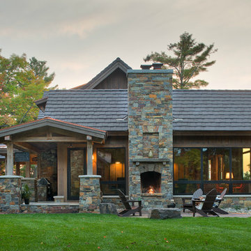
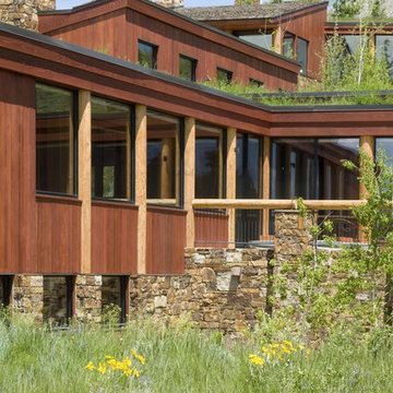
Roof Materials Australia - Photos & Ideas | Houzz
Reload the page to not see this specific ad anymore
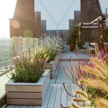
This is a larger roof terrace designed by Templeman Harrsion. The design is a mix of planted beds, decked informal and formal seating areas and a lounging area.
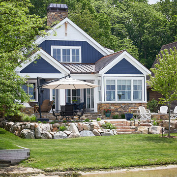
This cozy lake cottage skillfully incorporates a number of features that would normally be restricted to a larger home design. A glance of the exterior reveals a simple story and a half gable running the length of the home, enveloping the majority of the interior spaces. To the rear, a pair of gables with copper roofing flanks a covered dining area and screened porch. Inside, a linear foyer reveals a generous staircase with cascading landing.
Further back, a centrally placed kitchen is connected to all of the other main level entertaining spaces through expansive cased openings. A private study serves as the perfect buffer between the homes master suite and living room. Despite its small footprint, the master suite manages to incorporate several closets, built-ins, and adjacent master bath complete with a soaker tub flanked by separate enclosures for a shower and water closet.
Upstairs, a generous double vanity bathroom is shared by a bunkroom, exercise space, and private bedroom. The bunkroom is configured to provide sleeping accommodations for up to 4 people. The rear-facing exercise has great views of the lake through a set of windows that overlook the copper roof of the screened porch below.
40