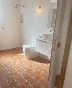
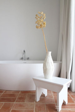
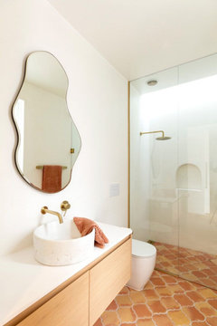
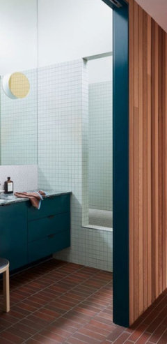
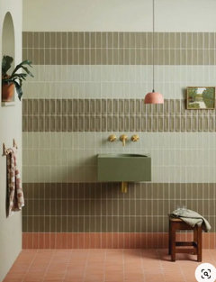
Earthy Bathroom Colours: Terracotta Inspiration
3 months ago
Featured Answer
Sort by:Oldest
Comments (6)
Related Discussions
Help me choose subway splashback tiles!?
Comments (25)No to the grey - your wall seems to have a green tinge in them, so I would say either green/grey or a warm white tile with darker grout. If you choose the right grey/green, it is a classic look so shouldn't date. If you are a bit scared to choose colours, why don't you get a couple of warm white sample tiles and put where the splash back will go. You will soon see if it looks too stark....(maybe another idea, but possibly not a good one - why don't you see if you can put a few pages from a blank sketchbook in the whole area where the splash back will go (not super white white, but a warm white). That could also possibly highlight how stark (or not), the white may look. I can see what design tank is saying, as your cupboards appear to be more cream than white in the photos and if this is the case, then I agree the white will most likely look too stark. My cupboards in kitchen were white (but a warm white not a cool white). The stone bench tops also have the little speckles of stone in them..I can't remember the colour Ocean foam/Osprey.......but even with those colours and them not being cool whites, I thought the white tiles looked too stark against them. I therefore went for a glass splash back and ever since I then went to think of designs for my bathroom renovation, I constantly regret going with the glass in the kitchen and modernising the house too much..........definitely don't do glass if you are wanting to keep a classic charm to the house. In a long winded way, I think yes, I also think you should just stick with the grey/green. It will make a statement. Not the right shade...but another example....it may be hard getting the colour of the tile exactly right given that the walls are already painted and the tiles need to match....See MoreGlass splashbacks - yay or nay?
Comments (85)It must depend what you cook. I don't do fried, spitty type dishes and the grout around the largish tiles in my now 10 year old kitchen is as good as new. I rubbed car wax into the freshly laid grout lines, same as I did in the bathroom. It also depends on how much light bounces around your kitchen, glass being so reflective shows up smears with light on it. Just above the kettle in the first photo is a good example. Each to their own, I'm a non-glass girl whenever I can get away with it....See MoreReally really really need help!
Comments (27)Aside from how you want your kitchen to function, you need to consider what depths and hues can do for a space. Basically if you have high ceilings, darker cabinetry for your overheads can really draw the eye upward and highlight the feature but if your ceilings are standard it can feel heavy and encroach the negative space. Lighter overheads will reflect the light so the negative space will feel larger. Dark colours are also used to create depth in a room, to draw it back further visually. In my opinion darker lowers would work if you like the two tone look, it will break up the light flooring. Keep in mind you don't have to use colours that are contrasting, try pulling samples together that are a few shades deeper in harmonious hues, much like your picture provided. When it comes to the splash back you can opt for a texture in similar colour family to create interest without adding too many colours. Perhaps a penny round, hexagon, hand made subway or the same stone you choose for the benches. Don't stress about paint colours right now as there are thousands that you can choose to complement your kitchen. Hope this helps!...See MoreAny paint colour suggestions?
Comments (22)You can borrow wallpaper books from suppliers and compare some you like by holding the samples up to your walls. Be sure to test how well they complement each other at different times of the day under different light conditions. I know it's hard to know for absolute certain how a particular wallpaper pattern will look on a large scale, but it's a place to start. And the people at the decorator stores will be happy to advise you....See More 3 months ago
 3 months agolast modified: 3 months ago
- 3 months agolast modified: 3 months ago


Ruth Benjamin-Thomas