POLL: Which 2016 Colour Palette from Dulux is your favourite?
signarture
8 years ago
last modified: 8 years ago


Bio Fragility

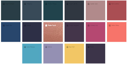
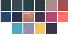
Infinite Worlds

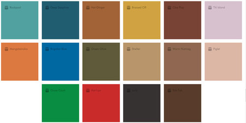
Retro Mix

Future Past
Featured Answer
Sort by:Oldest
Comments (13)

User
8 years agoUser
8 years agoRelated Discussions
Splashback Colour
Comments (20)A cheaper alternative to glass is the metaline range from Laminex, and maybe something to consider Laminex launched this product to compete with glass splash-backs. Your cabinetmaker can install it, and it can be cut on site as required to fit around power points etc. The range of colours are obviously limited compared to a paint finish but there are some lovely metallic's in the range - I'e added a photo of our sample folder to give you some ideas. In regards to the colour itself, you could stay with a neutral, but I would go for a splash of colour! as the rest of the kitchen is neutral, choose something that you just love, and will work with your planned decor, and go for it! I would think about putting something on the back of the island bench as well, timber is being used beautifully these days, so depending on your floor tiles it could add a lovely warm touch to your area....See MoreChanging the face of Interior Design - we need your feedback!
Comments (14)A great concept, I've often considered doing so myself. Whats great about your bodo boards, and the schemes put together on this poll, is that they are quite adaptive with a neutral foundation. They can be easilyapplied to everyone. I love an emphasis on tone and texture, and in place of colour, visual interest is really added by accents, architecture and artwork. The australian bush scheme is very textural, although I think the palette could explore some of the more chromatic tones in our bush, some organic notes of green and taupes, but perhaps with vibrant yellows or deep indigos for example introduced. as for the romantic industrial, lovely, but it is only so because of the rose pink. A feminine take on industrial would to me be softened with humanised accents. Please explain, industry is mechanical, and romance or femininity is softness, so perhaps signage featuring lettering, or bespoke handicrafts which show the connection between industry, and loved spaces created out of collecting. Almost a way of feathering our nest. waterfont is cool, calm and yes collected. Literally. I love coastal schemes, but they can become a little predictable when they are literal interpretations of sea and sand. Coastal can easily be adapted to a relaxed style and I feel many colours can be applied to demonstrate this costal palette. . The key is in muting the scheme and enhancing the textures from nature. Tha grand! Oh the grand. I love it. Who doesn't really. Its very now, but the drama and edge is lost in applying same old collaborations. The geometric tile, chevron, hexagonal or penny rounds are gorgeous, and befitting the current style, but more so appropriate in specific architectural styles, not everyone an have a warehouse or loft, or grand 1920s residence, although we all try to use these same materials and formats. Precious metals and stones are the height of popularity and luxury, brass, marble and glass, are all in favour, actually have never been out of it. What I want is to see the used in a contemporary fashion. It is my pick, because it actually does respond to my own homes architecture, so I'm always on a hunt and gather of images and ideas to develop this gorgeous and luxe style. Whats next? Usually in an effort to be new and different, we move away from what's in front of us, but ever so gradually. I think the appreciation for industry, form and function, man made objects, formats, collaborations will be in favour for some time, so to in an effort to be different, organic will evolve. Colour notes, timbers, sustainability and natural form will emerge. Not to say literall greens or Browns, but more so, soft geometry, tactile materials and surfaces, perhaps a focus on light and shade over shimmer and style. bespoke practices, so things if stone and wood, and one off designs, as in using products that can't be replicated in process, like bricks, every ones different, veneers, grained materials, and unpretentious designs. Hand scribed lines, patterns or prints, I think will favour. Thestyle of now is definitely one we aspire to, as in luxe and indulgent, the monochromatic scheme which is actually ACHROMATIC people is overdone, but will never be out of favour. It is classic. When done right, it is the epitome of style, only the definition of that is what changes! love what you do....I can't articulate the value of conceptualising your style in finishes and fittings, design is often felt not learnt, and we respond to our environments, so it makes sense that seeing your style emerge from a collective consciousness in the form of a board, will literally transform your ideas in reality. As a designer myself, I'm constantly creating them. My own home is a work in progress, which I've created many concepts for. I'm very interested in seeing your perspective on it though, and I'd be very grateful for a bodo board from your design perspective. ml...See MoreWhat's your proudest home improvement? WIN Darren Palmer's new book!
Comments (40)Thanks for all your entries. And those are some marvellous photos of your own spaces being changed. Our congratulations to @how2girl who was randomly selected as the winner of Darren Palmer's book! We will be in contact and send this book out to you very soon. Stay tuned for more contests in the near future. HouzzAU Team...See MoreHelp! Which exterior colours should I choose?
Comments (65)Thank you so much, Julie. I thought you would be interested in the end result, given how much encouragement and advice you so generously gave me. :-) I do love it. It has made such a difference and I think (fingers crossed) the landscaping will give it the finishing touch. We are reroofing the pergola, so will post photos when that is completed. The gazebo looks great after its facelift, too....See More PRO
PROsignarture
8 years agoUser
8 years ago- PRO
signarture
8 years ago User
8 years agoUser
8 years agoUser
8 years ago- PRO
signarture
8 years ago User
8 years ago- PRO
signarture
8 years agolast modified: 8 years ago


Sonja Robar - Abstract Artist