Room Of The Week
Popular Houzz Series
Popular Houzz Series
Appears in
See also
Fun HouzzFrom The ProsHouzz Around The WorldProject Of The WeekStickybeak Of The WeekQuizzesCreatives At HomeAt Home With...Best Of The WeekRoom Of The WeekDesigner Profiles3 Things I Wish My Clients KnewHow Do I...Buyer's GuidesExpert EyeInnovation AlertSo Your Style Is...Spotted!Picture PerfectBefore & AfterBudget BreakdownHome TimeMade Local
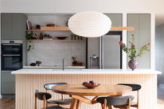
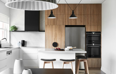
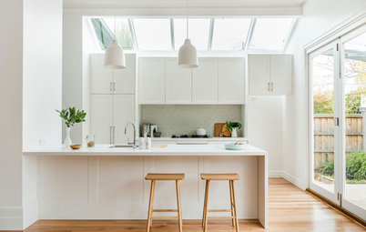
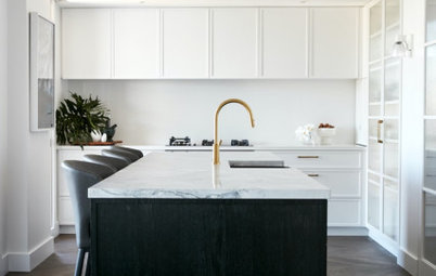
Room of the Week: Pared-Back Perfection in a Contemporary Kitchen
Neutral colours, textured walls and streamlined joinery combine in a kitchen that embraces simplicity

In a Q&A format, we talk to the designers – and examine the creative thinking – behind some of Houzz’s most loveable rooms.
Brief
The clients were looking for simplicity and clarity in the space. It had to be practical but beautiful and timeless too.
Thinking of renovating? Find an interior designer near you to discuss creating your dream home
The clients were looking for simplicity and clarity in the space. It had to be practical but beautiful and timeless too.
Thinking of renovating? Find an interior designer near you to discuss creating your dream home
Starting point
It began with finessing the space planning and making sure that we had everything covered, functionally. Then we focussed on materials and colour palette, knowing that there were some standout elements (the bagged-brick wall and incredible natural light) that would be the heroes of the space.
It began with finessing the space planning and making sure that we had everything covered, functionally. Then we focussed on materials and colour palette, knowing that there were some standout elements (the bagged-brick wall and incredible natural light) that would be the heroes of the space.
Key design aspects
Colour palette: Grey concrete floors, blackened timber veneer, black steel, white-painted cupboards, white-painted walls, and grey-and-white natural marble. The furniture pieces are in natural oak and black lacquer.
Key pieces of furniture/fittings:
Colour palette: Grey concrete floors, blackened timber veneer, black steel, white-painted cupboards, white-painted walls, and grey-and-white natural marble. The furniture pieces are in natural oak and black lacquer.
Key pieces of furniture/fittings:
- An integrated Fisher & Paykel fridge.
- Dining table from Lowe Furniture.
- Chairs from Thonet.
Thinking behind the arrangement of furniture
One of my favourite things about this kitchen is that, even though it’s a completely contemporary, inner-Melbourne, concrete-floored space, it has this lovely country-kitchen feeling where the informal meals table is right there, literally in the middle of the kitchen and it’s the active, functional heart of the house.
It’s so welcoming and has that multipurpose aspect of the table being able to be used as a kitchen bench, dining table, homework space and gathering place for friends because of its scale and placement.
Challenges you worked around
There’s a tiny, almost-secret, step-in pantry to the right of the wall oven with a sliding door that had to close completely flush to achieve the effect we were after. We needed to maximise this space for storage without compromising the appearance of the main space, and it almost didn’t seem possible.
The joiner, Kurv, did an incredible job of making everything on that wall millimetre perfect and totally flush, including a built-in fridge, wall oven and the pantry.
Why do you think this room works?
Everything is there for a reason. Its proportions and materials were all carefully considered. Everything is purposeful, thoughtfully resolved, and designed to work really hard for the family, but it’s also knock-out beautiful with abundant natural light.
Also, the clients were fantastic to work with, very decisive and focussed. They knew themselves well and were really clear about what mattered to them. That’s a real gift to a designer.
The architect, Emma Mitchell, did an incredible job of harnessing natural light and making the most of the orientation, also making sure there are many options for what can be open or closed to control the light. That’s really important. What might be the perfect amount of light and heat in mid-winter could be unbearable in summer, but she modelled all of that and how window coverings would operate.
Emma kept visible connections to the Victorian-era parts of the house – a glimpse of original red bricks through a skylight shaft and rendered brickwork in the kitchen give it texture and visual interest that you just don’t get with plasterboard walls.
Your turn
What do you love about this open-plan kitchen? Tell us in the Comments below. And don’t forget to save your favourite images for inspiration, like this story and join the conversation.
More
Craving more great interior makeovers? Take a look at this Room of the Week: Magic With Marble for a Teen-Friendly Kitchen

Sponsored
Sponsored
Answers by Sonia Simpfendorfer, creative director of Nexus Designs
Who lives here: A family with two children (and a beautiful dog)
Location: Melbourne, Victoria
Room purpose and size: The room is 8 x 5 metres overall and encompasses the kitchen (including a small walk-in pantry), the meals area, and a wall of joinery that includes hidden AV/tech, a coffee zone, crockery storage, a home office and a broom cupboard. There is also a window seat.
Scope of works: This kitchen was part of a complete high-end renovation.