
UK Houzz Tour: A Victorian House That's All About Relaxation
Contemporary glazing and an open-plan layout combine beautifully with period features in this elegant family home

Like many a Victorian property, this Hertfordshire house in England has great proportions. What it lacked, though, was a generous space in which the family could gather. It was also in need of new wiring and plumbing – and a brand new look. “The decor was multi-coloured,” says Cherie Lee of Cherie Lee Interiors, who came to the property’s rescue.
But, as well as needing to have a less hectic appearance than its previous incarnation, it was vital the property’s refurbished interior was relaxed and comfortable. “The couple didn’t want their children wallking on eggshells,” Lee says. Crucial, too, was a finish that respected the house’s age as well as introducing modern touches.
But, as well as needing to have a less hectic appearance than its previous incarnation, it was vital the property’s refurbished interior was relaxed and comfortable. “The couple didn’t want their children wallking on eggshells,” Lee says. Crucial, too, was a finish that respected the house’s age as well as introducing modern touches.
A new roof boosts the amount of daylight in the open-plan space, helping to brighten the previously dark interior. The inherited rainbow decor, meanwhile, has been superseded by a neutral scheme that’s soft enough to also add warmth. The revamped layout allows the family to entertain groups of all ages. “It’s the hub of the house,” Lee says.
A new slot window (pictured here on the right) and a pivot door that leads outside were incorporated into the living area. “We wanted to mix modern elements into the fabric of the building itself, not just in the furnishings,” Lee says.
The designer introduced a wood burner to help zone the living area and add cosiness to the large space. “It really makes you want to gather round the fire,” Lee says.
The wood burner is positioned on a polished concrete plinth that works as both a decorative feature and a handy platform to store logs.
Graphic patterns, like the throw and the fabric on the Loaf armchair, add interest to the neutral backdrop.
The wood burner is positioned on a polished concrete plinth that works as both a decorative feature and a handy platform to store logs.
Graphic patterns, like the throw and the fabric on the Loaf armchair, add interest to the neutral backdrop.
An exposed wall was created using brick slips cut from reclaimed bricks. As well as bringing in texture and warmth, it adds another traditional element to the Victorian home, echoed in this Downton cabinet by Abigail Ahern.
The original bay window was rotten, so Lee replaced it with one in the same style and added a window seat underneath, which makes the most of the view to the garden. “We made sure we weren’t losing the period elements of the house and retained those touches wherever we could,” she says.
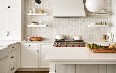
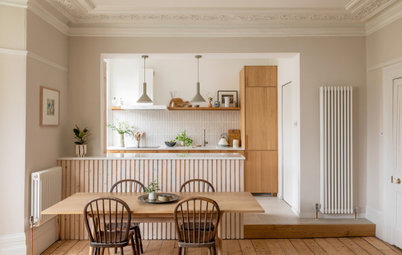
A wall was taken down to create an open layout from the living and dining space to the relocated kitchen. Lee chose kitchen cabinetry sympathetic to the age of the property, but in contemporary colours to continue the fine balance between old and new.
An island was one of the family’s must-have features, ensuring that whoever’s in the kitchen does not feel cut off from the entertaining space. A vintage mirrored splashback behind the stovetop keeps the room light and reflects a beautiful view of the garden.
A generous fridge-and-freezer is among a host of appliances. “The kitchen is full of gadgets, but they’re well blended in,” Lee says.
The hall features fabulous original panelling. “It needed restoration because it had taken a bit of a battering,” Lee says.
A deep grey palette was chosen to add warmth, with the woodwork painted in Mole’s Breath by Farrow & Ball. “This area is a little deprived of daylight and we were never going to make it super light, so we went for something atmospheric and snug instead,” Lee says. A Reader armchair in Bumblebee velvet adds a luxe touch and a vibrant splash of colour to the moody background.
A deep grey palette was chosen to add warmth, with the woodwork painted in Mole’s Breath by Farrow & Ball. “This area is a little deprived of daylight and we were never going to make it super light, so we went for something atmospheric and snug instead,” Lee says. A Reader armchair in Bumblebee velvet adds a luxe touch and a vibrant splash of colour to the moody background.
A large hallway mirror for last-minute checks on the way out was firmly on the owners’ wish list, illuminated by a Farol wall sconce.
The house used to have a mixture of old and new radiators, but Lee replaced these with efficient, modern cast-iron designs throughout.
The house used to have a mixture of old and new radiators, but Lee replaced these with efficient, modern cast-iron designs throughout.
An old storage cupboard has been transformed into a cloakroom, allowing a utility room to be added where the original cloakroom used to be. Lee went for a period look here with a high-level cistern toilet.
“It was important to the couple that their bedroom was a relaxed sanctuary,” Lee says. As the walls are neutral, a pop of teal was added in the furnishings to ensure the scheme didn’t look too bland. A smart wooden floor gives a hotel-style ambience to the space.
The master bedroom’s ensuite features geometric patterns used elsewhere in the house, with the herringbone wall tiles recalling the flooring in the hall and open-plan living space.
The Drummonds brassware and basin, meanwhile, have a traditional feel, giving a nod to the age of the property.
The Drummonds brassware and basin, meanwhile, have a traditional feel, giving a nod to the age of the property.
Small hexagonal tiles from Bert & May around the basin echo those on the shower walls, helping to tie the look together.
The couple’s son’s room features muted colours that reflect the Scandinavian-style aesthetic the family likes. “The bed has a trundle for sleepovers and includes useful storage as well,” Lee says.
“Building in storage was really important in the son’s room, so we used a big wardrobe with extra drawers,” Lee says.
The original fireplace was missing from this room, so Lee installed one taken from another room, creating a classic feature. Star wallpaper from Peony & Sage on the chimney breast adds a playful feel against the more subdued walls painted in Oval Room Blue from Farrow & Ball.
The original fireplace was missing from this room, so Lee installed one taken from another room, creating a classic feature. Star wallpaper from Peony & Sage on the chimney breast adds a playful feel against the more subdued walls painted in Oval Room Blue from Farrow & Ball.
Lee futureproofed the twins’ bedroom scheme. “Pink was the colour of the moment, but we didn’t want a room they’d outgrow in a few years, so we only included pink accents, which can be updated to suit as required,” she says. Instead, Lee painted the walls in Glass III from Paint & Paper Library and Cornforth White from Farrow & Ball.
The previous bathroom had wood panelling – something that didn’t work well with young children – so when it came to this family bathroom, “It was really important that everything was tiled to the max,” Lee says.
The traditional bath shape adds a period feel, while the geometric floor tiles give the space a contemporary update.
Lee designed the colour scheme to suit the whole family. “The wall tiles are a blush tone, but I didn’t want to make it too girly,” she says, “so it’s toughened up with black and dark greys.”
Lee transformed the original kitchen into a home office, installing a fire from the owners’ former home where a stove used to be. In the alcoves alongside, she used bespoke joinery to create hidden storage for files and folders.
Tell us
What’s your favourite part of this UK home? Let us know in the Comments section, like this story, save your favourite images and join the conversation.
More
Love great design from around the world? Don’t miss our Berlin Houzz Tour: Curved, Contemporary Lines Revamp a ’50s Home
Tell us
What’s your favourite part of this UK home? Let us know in the Comments section, like this story, save your favourite images and join the conversation.
More
Love great design from around the world? Don’t miss our Berlin Houzz Tour: Curved, Contemporary Lines Revamp a ’50s Home

Sponsored

Sponsored
Who lives here: A couple, their six-year-old son and three-year-old twin daughters
Location: Hertfordshire, UK
Size: Six bedrooms and four bathrooms, plus a cloakroom
Designer: Cherie Lee of Cherie Lee Interiors
Images by Ray Main
The house used to have two separate reception rooms with the kitchen nowhere near them. Now, those rooms have been knocked through to create an open-plan living and dining area leading through to the kitchen. At the far end, a previously dead space has become a cosy chill-out room for the children. “They’re too young to be in a separate room at the moment,” says Cherie.