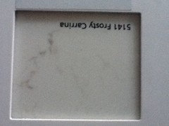
Kitchen Colour Palette dilemma
9 years ago
Featured Answer
Sort by:Oldest
Comments (17)
 9 years ago
Related Discussions
POLL: Which 2016 Colour Palette from Dulux is your favourite?
Comments (13)And therein lies the perpetual issue chookchook2 ! Desktop, tablet and mobile screens all display colour slightly differently and different desktop printers produce different results. You'd think that with a name like 'Tardis Blue' your favourite colour might well sit within 'Infinite Worlds' but in fact a quick look at our Dulux Colour Atlas reveals the closest to it is 'Deep Sapphire' which is part of 'Retro Mix' palette. Until there's a digital fix, for accuracy, all critical colour communication needs to be based on actual paint chips, or those of colour authorities such as Pantone....See MoreKitchen Reno dilemma
Comments (20)I think the decision rests with whether you NEED a butlers pantry! No point in putting one in just because the room is there. But as one post suggested you could loose the current pantry, thus enlarging the family room, and then you maybe have need for a large pantry. I am a little dubious about a 'butlers pantry' idea in general - a storage pantry is most useful but having appliances etc in another room just means more walking from room to room during meal preparation. I think deciding to include a butlers pantry would require a great deal of thought on exactly how you would use the space. A cleanup space - yes that could be handy; where dishes and pots could be stashed during a meal, saving the kitchen proper for serving up. Still means a lot of walking! I think the kitchen work triangle is still a useful concept! And those big island benches with a sink - so your guests can sit and chat while you cook, and watch the dishes piling up under their noses? Ugh! Not for me! They look lovely when clean and EMPTY, but as a usable sociable area, not practical. (Sorry for the rant; has nothing to do with your question or your kitchen, but this is a bugbear of mine!)...See MoreKitchen Palette
Comments (4)Love your focal timber! Take a couple of sample pots, pop some paint on A3 paper, and stick them around until you are happy... but try Dulux Wentworth (dark, rich blue-almost- black) namadji (grey palette) or even wayward grey (charcoal, with some hint of yellow/green in it somewhere... could make the timber sing. ) If you are worried about it getting too dramatic or overwhelming, one possibility is to use two colours on your cabinet. Have the uppers in a light shade and lowers in dark, or one "block" in a strong colour and the remainder more neutral . Both approaches can be really effective. (Look at Tilly's kitchen for a strong/neutral success story!)...See MoreNew kitchen- colour dilemma
Comments (4)Marion, you have a lot going on in your photos. From your photos I would guess that your house is possibly late 1970's or early 1980's. I would keep all of the stained timber ceilings and beams as a feature and definitely go with a large-format, concrete-look, matt finish, porcelain tile. Don't introduce more timber to try and compete with the existing ceiling. Keep your cabinetwork, simple and understated in a warm, neutral colour (not a forest green), or even a black if the new space has enough natural light. Black can work very well as base cabinetwork, but can sometimes look a bit too much when used in the overheads as well. Consider one of the Ceaserstone concrete-look benchtops. I would bring in the forest feel with a mirror splashback (if the splashback is opposite a forest view), or some forest green mosaic tiles. Keep it simple, and understated, and make your timber ceilings the focus. Best of luck Dr Retro of Dr Retro House Calls...See More- 9 years ago
 9 years ago
 9 years agolast modified: 9 years ago
- 9 years ago
- 9 years ago
- 9 years ago
 PRO9 years ago
- 9 years ago
- 9 years ago
 PRO7 years ago
 7 years ago
- 7 years ago
- 7 years ago
- 7 years ago
- 5 years ago


Luke Buckle