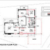
design for narrow lot with 2 street frontages
cclechat
8 years ago
Featured Answer
Sort by:Oldest
Comments (10)

LouieT
8 years ago
cclechat
8 years agoRelated Discussions
Ugliest house in the street
Comments (15)I disagree re the ugliest house comment - I think it's got fantastic potential! Great 'bones', as they say. :) It's a very similar colour scheme and brick to our house (coastal Vic), and we had a similar dilemma when we moved in - young kids (one income!), little money to spend on the house, but a loathing for the terracotta tiled roof and the charming pale yellow of all the trim and weatherboard in fills. First of all, don't consider rendering or bagging the bricks - it's bloody expensive and they're really not that offensive - instead, try to work with them to make the colour scheme more modern - in our case, our bricks have flecks of darker charcoal in them, so we used that and simply tried to make the new colour palate a bit more 'natural' and less 1990s cream/yellow. We ended up painting our window frames and roof (which was terracotta - and it's a very prominent feature of our house, so really had to be dealt with) Colourbond Stone - a much more natural colour that still toned well with our bricks, the guttering, downpipes and front fence Woodland Grey (the darker colour helped to kind of ground the whole look without being too dominant) and our weatherboards Paperbark (a paler neutral complimentary to the Stone). We've been really happy with the change - the bricks now seem like more of a rustic feature and everything sits better in the landscape. In terms of other changes to your place, this is what I think you should consider: It looks at the moment as though the entry path to the house is via the driveway? This kid of makes the house feel a bit lopsided. I think it could be more balanced if you consider building out a small enclosed entry and orient the front door to the side (towards where the garden is now) - I think a side facing entry provides more privacy to the house. (in saying this I'm kind of assuming that you've got internal access from the garage into the house? Otherwise it would kind of make the trip from the garage into the house a bit of a drag... If you don't, perhaps you could make the new entry dual access - one door from the garage side and the main entry from the garden side) Build a small deck from the new entry - you could wrap it around the corner a bit, make a nice feature of it (I'm all for curves and more interesting things than straight square lines - helps to soften a big rectangular house like this one) Keep a small garden where the existing one is (perhaps just update your plants - if you're coastal NSW, perhaps consider a nice feature tree like a frangipani with some lower complimentary planting) - and also plant a new garden along the front of the new enclosed entry - so the entry and the edges of the deck are softened by garden. New entry path to front door through the large lawn expanse - separate the pedestrian access from the drive. Keep the surface to natural textures / materials - anything too hard will take you back to that 1990s feel. Border with some nice plantings. Relocate letterbox to front of new path. I'd perhaps make the path a bit of diagonal - not straight from the front fence - or curve it a bit - something to help balance the big frontage taken up by the garage door and align the house for the new entry. Play with the path shape/route before you cut it using that landscaping spray. The right hand brick expanse on the house is quite dominant at the moment - could you make a feature of this somehow - interesting lighting to break it up or we have put some wall art up on our similar spot (in our case two wrought iron geckos as we have lots of resident blue tongues, but you could pick something that speaks to your locality or other preferences). I'm happy to share some photos of our place and the changes we've made if that helps you - just not on the right computer to access the pics today. I must admit one of our biggest frustrations in looking for inspiration on what we could do is that there seem to be limited examples of houses from this era in Australia and how they have been updated sympathetically. Everything is always - render, render, render and slap on a colourbond roof - it all gets rather boring and the same. I say try and be a little more creative and work with what you're got. :) Good luck and have fun!! :)...See MoreStreet appeal for the front of this house
Comments (28)Judy, do you know if the stepped facade on the art-deco extension is hiding a roof gable or is it purely decorative? If it is only decorative (and heritage regulations allow) I would remove those top 2 courses to make it a simpler box shape. Not essential, but in my opinion that stepped gable is not very attractive, and makes it look more like a public building than a residence. This would simplify and give it more of a modern look, but still be genuine art-deco. The house is already a combination of different eras, so adding a bit of a modern touch will not detract and is more honest when you are renovating anyhow. I would paint the driveway terra-cotta to match the tiles, garage door green to match the roof and change the cladding on the garage front wall to flat fibre-cement panel rendered and built up to a straight line parapet on the front. Paint all walls white, including the rendered panel over the garage door (IMHO this is the only colour that really works with art-deco). Remove the shutters and paint window frames and other trim the dark charcoal you already have on gutters and other trim. The middle section of the column should be that same colour as the top and bottom for its shape and proportions to read well. I would probably leave the stone paths as they are, as they seem to match the dark surround to your front porch tiles. With the front fence I would remove the wrought iron, then extend the pillars up to 2m and fit batten screens between them. To alleviate the sun-load on the western window after those shutters are gone I would instead plant a screen of high growing vegetation inside the front fence, e.g. a row of bamboo. That would give you a better outlook and still provide sun shading and street privacy....See MoreNeed design ideas for a narrow, poky hallway
Comments (55)I some how missed a whole lot of this discussion, it's all coming together beautifully, @kiwimills thank you so much for your lovely comment, if you only knew what an effort it was to get that art work hung, divorce material, he did a great job but after much loud discussion I still ended up with the large hanging not lining up with the bottom of the other frames. I always find that dark spaces work well with darker colours...See MoreNew home design question - 12.5m frontage
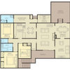
Comments (18)I think I have gotten my head around everything , now I am definitely no designer but this whole design seems like it was done by someone stupider than me ! Downstairs you are going with 3 metre ceilings ( slightly higher than standard ) presumably to get an airier feel . Then you ( or your builder ) want a relatively narrow hallway ? Go slight luxury there IMO . The study has already been discussed , but one thing no-one mentioned was the 'slash' /bedroom 6 there -- a study with a bed ( even a single or bunks ) needs to be bigger . So surely the 'answer' is to make it bigger , push everything back until you get to the dining , and guess what -- yes , the split ceiling would not be a problem ! As Dr Retro says , turn the dining table around , make the alfresco a bit smaller . The alfresco has a ceiling -- it is under the roofline . You have lots of sliding doors . So the temperature and outdoor feel between the alfresco and the dining area is neglible -- I'd go for a bigger dining area any day ! In fact , even if you are BBQ nuts , you could presumably have the BBQ and even some seating 'outside' ( I tried to check the length but gave up , but I assume you have a back garden ) . But heres some other weird things . The garage almost certainly needs a window . Minor I know , but why not ? Then , without seeing an actual impression , the front seems weird . There looks to be columns , and a wall on the other side , a metre and a half or so in front . Its job -- to hold up a balcony . The front entrance is set back , but doesn't seem to have much , if any , weather protection ? And then the other side , in front of Bed 4 , has a large window but no balcony . Now I know the stairs would need a tweak , but why not move the whole upstairs 'back' by the metre and a half , lower the kitchen and dining to 3 metre ceilings ( a 4 metre ceiling in a kitchen may look great , but that top metre will be a pain to clean , and basically unusable -- cupboards , etc will be too high ) . Then you could have the balcony ( or 1 balcony right across , or a roof above the entrance , or even a bigger , more roomy entrance -- and yes I do realise it is double height , but make it a longer , wider , double height more lux entrance ) set back , more space front or rear if thats a priority ? Basically , it looks like someone has taken a template , added some bits , and gone 'there you go' , without considering the overall picture ....See MoreLouieT
8 years ago PRO
PROManias Associates Building Designers
8 years agohaephestus
8 years agolast modified: 8 years agojbantick
8 years ago- PRO
Manias Associates Building Designers
8 years agolast modified: 8 years ago 
LesleyH
7 years agoLesleyH
7 years ago
Sponsored


fianou