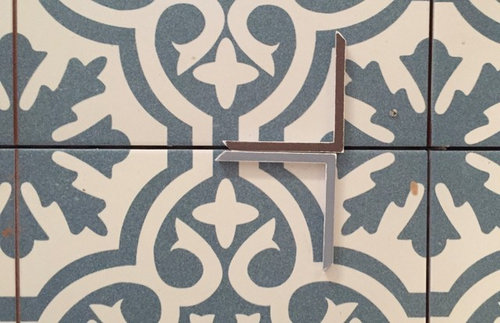
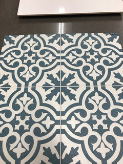
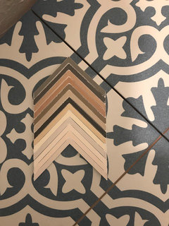
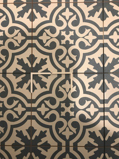
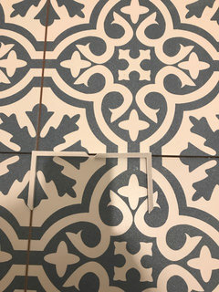
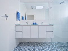
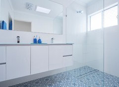
Which grout colour should I choose?
westysdreamhouse
6 years ago
last modified: 6 years ago
Featured Answer
Sort by:Oldest
Comments (42)

bigreader
6 years agowestysdreamhouse
6 years agoRelated Discussions
Which tapware material should I choose?
Comments (6)We have just finished renovating two bathrooms and I was adamant I didn’t want shiny chrome. I insisted on Astra Walker’s brushed platinum tapware and fittings. Whilst it does look a bit gorgeous, I’m afraid it’s not worth the extra 25-30% we paid for it (shhhh, thank god my husband isn’t on Houzz!!). With all special finishes I find you need to be quite particular about wiping down the fittings otherwise they look grubby with water stains. Hindsight you marvelous thing, you’re always 20/20 aren’t you??!! I’ll be sticking to good quality chrome if we ever renovate again. Especially since you can get such a wide variety of styles that suit anything from a Victorian style bathroom to pure minimalism. Good luck....See MoreWhich colour rug should we choose?
Comments (32)Luckily, you have a great monochrome base to start with, so you can almost go wherever your imagination takes you! You could definitely try lightening up the space to contrast the darker lounges with a lighter or brighter statement colour, but be sure to avoid any colours that are too closely matched to the existing carpet. https://www.designerrugs.com.au/rug-collections/designer-collaborations/akira-isogawa-hirameki/batik-ubud/ https://www.designerrugs.com.au/rug-collections/designer-collaborations/hare-and-klein/etched/ https://www.designerrugs.com.au/rug-collections/designer-collaborations/bernabeifreeman/folk/ https://www.designerrugs.com.au/rug-collections/designer-collaborations/greg-natale-carpet/milano/ https://www.designerrugs.com.au/rug-collections/designer-collaborations/dinosaur-designs-series-1/skipping-stones/ https://www.designerrugs.com.au/rug-collections/designer-collaborations/catherine-martin/westchester/ https://www.designerrugs.com.au/rug-collections/handknot-collections/contemporary-hand-knot/blair-ivory/ https://www.designerrugs.com.au/rug-collections/handknot-collections/contemporary-hand-knot/genesis/ https://www.designerrugs.com.au/rug-collections/handknot-collections/contemporary-hand-knot/glory-days/ https://www.designerrugs.com.au/rug-collections/handknot-collections/contemporary-hand-knot/orion-silver-grey/...See MoreWhich colours should I choose to freshen up my exterior?
Comments (6)Surprisingly , I like colour haha -- I'd go Chrome Yellow for the guttering and carport , and go for the contrast with the brown brick and brown roof -- it would add a line of brightness that is lacking IMO . I'd tie it in with doing your entrance door ( especiallyt if it can be seen from the street ) in the same colour . Sunshine yellow , of course , also conjures up images of the sun , it's modern -- oh yeah , like your solar panels ! I honestly think it would lift and modernise the whole look ! BUT if you don't want to be noticed , but still want a bit of class , I'd go for a 'metallic' charcoal in place of the mocca coffee cream , and darken down your look . Doesn't sound inspiring , but I know it would look better and more modern than the current 80's look ....See Morewhich tile should i choose?
Comments (20)The Kitchen -- it is very much a 1970's intrepretation of Colonial IMO , and ties in with the front door , so presumably thge rest of the house is similarly dated -- and thats not a bad thing . In one of the other pictures is a white 'panelled' door -- in a lot of ways its a pity that the rest of the doors weren't wood . Anyway , IMO painting the kitchen white will not achieve anything -- it won't look more modern , and it won't look warmer . The only slight argument is that it may look 'cleaner' but I don't think that's enough reason to do it . Your front door looks a few shades darker , and better for it IMO . So if you are keeping the kitchen , stain it darker , embrace the scrolls and the fake latticework , and the appliances all look reasonably modern . Its a decent size and has a good flow . Even the tiles look okay , but my criticism of them is you actually have to look -- they blend into the walls , because they appear to be exactly the same colour . The kickboards look grey -- you could repaint the upper parts of the walls in a similar grey , but my preference with slightly darker and slightly redder stained cabinets would be stay with a white or off-white , but re-grout in a mid to charcoal grey , and make a bit of a feature with the tiles , and it also ties in with your bench colour . The downlights are good -- the bug catcher UFO light definitely not so . Get something with character , but NOT 1970's , and definitely not 1970's faux colonial . Clean and modern would be the buzzwords . You could start again , or paint the frames white and change the doors to white or grey , lose some character and lose some warmth IMO -- it suits the house , just needs a lift ....See Morewestysdreamhouse
6 years agobigreader
6 years agokimy kimy
6 years agoSara Graham
6 years agogirlguides
6 years agohagan_38
6 years ago
petapea
6 years agolast modified: 6 years ago
Melinda C
6 years agowestysdreamhouse
6 years agowestysdreamhouse
6 years agorobandlyn
6 years agowestysdreamhouse
6 years agoSara Graham
6 years agowestysdreamhouse
6 years ago
butterflyroof
6 years agohagan_38
6 years agowestysdreamhouse
6 years ago PRO
PROThe Styling Edge
6 years agoTilly
6 years ago
LesleyH
6 years agoDonalda Shadbolt
6 years ago
Lillien Curtis
6 years ago PRO
PROWild Bear & Co Hervey Bay
6 years ago
Mwenje
6 years agowestysdreamhouse
6 years ago- PRO
Wild Bear & Co Hervey Bay
6 years ago westysdreamhouse
6 years agoTerri Ferdinando
6 years ago
Dawn Park
6 years ago
Fiona Anastasia Whitefoot
6 years ago
Linda Gross
6 years agokellymunn
6 years ago
wuff
6 years agowestysdreamhouse
6 years agoNiome
6 years ago
cloudpants
6 years agoTerri Ferdinando
6 years ago
beogradbraha
6 years agocloudpants
6 years ago


Casey La Cass