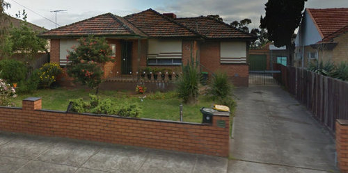
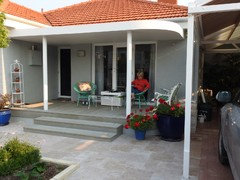
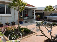
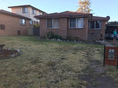
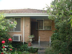
Exterior Modernisation of 1960's Brick Veneer
Matthew James
6 years ago
Featured Answer
Sort by:Oldest
Comments (20)

holdengirl1971
6 years ago
Rebecca
6 years agoRelated Discussions
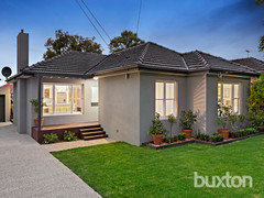
Ideas for modernizing 1960's exterior
Comments (21)We have a 1960 brick veneer, ours is a Colac brick with a fair amount of variation in the colour, more an overall light orange, with the brown terracotta roof tiles. Very funny as we have trades come to the door wanting to clean the tiles, I tell them I love the mossy look. We have the wooden windows painted with 'orange scent' (a creamy colour) and then added a heritage style pergola all along the front and side with grapevines and wisteria. posts and fretwork painted with 'Native grass' paint colour- softened it down and beautified the frontage wonderfully. When we did an extension we thought about rendering but decided to keep the brick look. We took 12 months to source new and old bricks to match the original- looks great....See MoreExterior colours to match Paperbark shed
Comments (16)I too would avoid render. Render is expensive and if you can afford it you can afford to look at other options like quality landscaping. What you spend on render could be transferred to landscape and this would relocate your focus. At the moment it seems theres nothing else amazing to view so we look straight to the brickwork and think thats the problem area. You already have some retro cool chairs and the agave is great but takes too much effort to see... then bam the brick draws you in. New front fence and pathway, a cool new retro letter box, paint the front door a wicked orange or yellow... Way too many people have modernised old houses in the past and have ruined them. Federation houses had stained glass timber windows and doors replaced with aluminium, fretwork removed, fire placed knocked down, etc.. no one does that now, it gets re-instated at significant cost. These later homes are now copping modernising and yet again to the trained eye it rarely works out well. Post a picture of whats out the back or even just a plan, if construction has not yet kicked off. We can perhaps even save you money and improve your home, win win....See MoreExterior reno ideas needed
Comments (21)I like painted brick but more fundamental design questions may simplify your choice process. With respect for expert colour consultants, I question whether colour is your core issue. The desire for a ‘coastal’ style is understood. However the skeleton of your style is already set in brick with a distinctive style. It reminds me of a Bruce Rickard. Research into Bruce’s work may yield some ideas for you. Rather than colour just yet,I would be tracking how sunlight lands on the walls and garden and windows over the course of the seasons. If and when it comes to choosing colours a photoshopped image of colour over your house photos may inform....See MoreExterior makeover help!!!
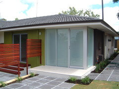
Comments (26)May I suggest that you could quite quickly and affordably: 1 - paint the roller door and the white beam above it in Terrain - https://colorbond.com/colour/terrain - which will stop them drawing your eye. You may still want to put in a wooden roller door but you will get the effect quickly. 2 - replace the eyesore round light fitting at the same time with a modern one 3- left hand side - the next door dirty cream fence is also eye catching either put a fence and gate there to block it from view or just paint it a dark colour so it recedes and separates from the house. 4 - yes the roof either needs a good clean or a repaint 5 - yes the down pipe - can it be replaced by a chain style into the garden bed? Paint it dark anyway to stop it popping. It may be possible to drain it to the side gutters Love the railings - 5- the house isn’t sitting in its own space visually planting darker evergreens to left and right will help to settle it....See More
Matthew James
6 years agolast modified: 6 years agoRebecca
6 years ago
wuff
6 years agoMatthew James
6 years agoRebecca
6 years ago PRO
PRODr Retro House Calls
6 years agoMatthew James
6 years ago
Ruth BT
6 years agojuliemedved89
6 years ago
LesleyH
6 years ago- PRO
User
6 years agolast modified: 6 years ago juliemedved89
6 years agoHU-319610855
3 years ago
Laura Beaupeurt
3 years agoAnne Monsour
3 years ago
Molly 0407
last year
Kate
last year


Dr Retro House Calls