Houzz Logo Print
kkkens

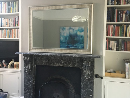
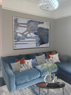
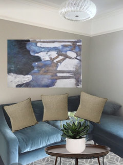
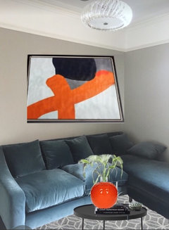
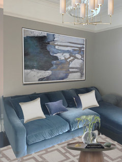
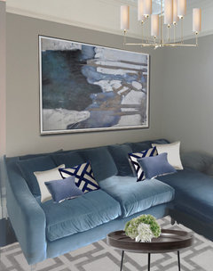
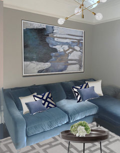
Room looking too grey?

SK K
6 years ago

We've just had our back living room painted F&B Lamp Room Grey and love the way that it brings out the blues of the velvet sofa and the artwork on the wall, however we also feel that it looks quite cold and bare. With regard to carpets/coffee tables/other accessories, do you think it's possible to achieve a look similar to our inspiration for the room (something along the lines of these:

- https://i.pinimg.com/564x/67/b1/30/67b130b092aab3374b099d812ac4afe3.jpg

- https://i.pinimg.com/564x/a0/61/82/a06182eb43e0a6140dc486739d717261.jpg

- https://www.brissi.com/media/wysiwyg/CTL_LWL.jpg


without the room, which is east facing, looking too gloomy and well, grey?!


Any suggestions would be much appreciated!


Comments (90)

  • PRO
    Seasons in Colour
    5 years ago

    Of everything I have seen above, I agree with celerygirl - champagne and blush with artwork will warm it up nicely while still maintaining the lux feel you are after.


    SK K thanked Seasons in Colour
  • User
    5 years ago

    Depends what SK K wants the tone to be. a home should be your comfort zone... go with whatever colours get you there. Doesn't have to have bright colour

    SK K thanked User
  • SK K
    Original Author
    5 years ago
    last modified: 5 years ago

    The thing is, I do quite like the idea of bright colour however the rest of our home is more muted and it would be nice to keep things cohesive.

    (Our front sitting room & kitchen)

  • PRO
    Seasons in Colour
    5 years ago

    You don't need to go for bright colours, rather than accessories with muted warm tones. Realistically, your inspiration includes hard blues and steel both of which are going to make the grey room feel cold. A very light terracotta or blush pink in accessories (throws, artwork, cushions) even if sporadically included can and will warm it up. I agree that you can't have this room include bright colours if the rest of the home is toned down (looks great by the way!)

    SK K thanked Seasons in Colour
  • SK K
    Original Author
    5 years ago
    last modified: 5 years ago

    Added two terracotta cushions & a matching tray


  • Lalitte Stolper
    5 years ago
    last modified: 5 years ago

    Terracotta and smoky blue, complementaries of the same saturation, always look lovely together. If you want to liven it up without adding strong colour, then touches of metal - gold, copper or warm silver would do the trick. Gold and grey is particularly glamorous, but copper would pick up nicely from the terracotta.

    SK K thanked Lalitte Stolper
  • PRO
    amordesigns
    5 years ago
    Maybe having a gallery wall with wood framed pictures instead of one large pic!
    SK K thanked amordesigns
  • PRO
    User
    5 years ago
    Hello,

    My suggestions would be:

    -dark wood coffee table: which would then allow for using the geometric monochrome cushions from your inspiration links and gold accessories such as a table lamp
    - Alternatively mustard or rust colour scheme with regards to accessories would work well to ‘warm’ the room up. A rug and some cushions- do you have a window sill to sit a few vases?
    - I would definitely add a side table with a lamp and use a yellow bulb in this to use as an alternate light in the room to create a more cosy feel. You could leave the ceiling light a brighter white bulb and then use either the lamp or ceiling light depending on the feeling you want to achieve so you are not limited to a ‘warm’ or ‘cool’ room all the time.
    - I would look for a different ceiling light, the industrial pendant lamps look great with yellow bulbs to instantly warm up the room
    - one of the latest trends is geometric side tables in dark gold tones which are great to add a tone to the room and be useful.
    - the inspiration pictures looked very on trend so I would carefully choose some art work to put up behind the sofa. A floating shelf would work well and I would use a think gold frame and an A4, A5 print with a small plant or candle to break up the shelf. The great thing is that you can change up the prints and freshen up the frame to change the look every so often.

    Hope this helps.

    Zahra
    SK K thanked User
  • SK K
    Original Author
    5 years ago
    last modified: 5 years ago

    Hi again! I've ordered this Louis De Poortere rug from Luxdeco in blue - (https://www.luxdeco.com/mad-men-rug/)

    and also the XB17 contemporary art piece from Celine Ziang

    (https://www.czartdesign.com/products/abstract-art-xb17b - 122x163cm) as a base for the sort of look that I'm going for. Now all thatt's left to decide upon is the accent cushions. As always, thanks for all your help so far!

  • PRO
    amordesigns
    5 years ago
    How about beige sand cushions with a dark wood coffee table?
  • PRO
    amordesigns
    5 years ago
    Gold and navy cushions
  • PRO
    amordesigns
    5 years ago
    A different pic ...
  • PRO
    amordesigns
    5 years ago
    Going back to your original inspiration you loved... you already have colour in the room .. colour being your sofas, I don’t think the blue art or blue rug goes with your sofas! I think something more in the lines of what you originally liked, to keep it classy like the rest of your home! Hope that makes sense. Maybe just classy black frames with black white art.
  • PRO
    amordesigns
    5 years ago
    Sorry last one... your sofa is perfect as it is, this other picture you liked with orange, black white and an orange vase... that would look lovely if you want to add colour other than blue.
  • SK K
    Original Author
    5 years ago

    Hi Amor,

    Thanks for all the suggestions but I just can't see why the sofa doesn't work with the art and rug, could you explain further just so I can get my head round it? Would be much appreciated!

  • SK K
    Original Author
    5 years ago

    Is it that the sofa is more blue than the blue-y green of the painting? Because if so, the sofa actually changes from a blue hue to a turquoise sort of hue depending on the time of day/lighting?

  • PRO
    amordesigns
    5 years ago
    Hi SK i just think too much blue, I love your blue sofa colour, love the blue picture, love the blue rug ... but not altogether.
    SK K thanked amordesigns
  • SK K
    Original Author
    5 years ago

  • PRO
    User
    5 years ago
    The rust cushions on the sofa look a bit aloof to me in comparison to the rug and frame. What you could do is tie in the flowers in the vase and have a more colourful arrangement perhaps even just orange gerbras.

    To be honest with the rug and the frame I think it’s already broken up the ‘cold’ blue tone. It’s almost unnecessary to have the rust for the warming affect. Have you thought about a table lamp?

    Just my opinion, hope you don’t mind.
    SK K thanked User
  • SK K
    Original Author
    5 years ago

    Trying something a little different - not too late to cancel that blue rug order but I definitely want to keep the art!


  • PRO
    amordesigns
    5 years ago

    I love that SK, yes love the light, this works now I like it a lot

    SK K thanked amordesigns
  • PRO
    User
    5 years ago
    This is much better without the orange. I like the light too it really adds to the look. Can you see how just adding the subtle beiges and creams the whole feel is already changing - from the inspiration pictures before it seems this is what you were after.
    SK K thanked User
  • PRO
    amordesigns
    5 years ago

    I agree with Zahra the original pictures were exactly what you wanted and so classy. I love the art with the sofa now, rug love too... it looks more classy like the rest of your home... the lighting just finishes it, so lovely. I spent months looking for the right colour cushions for my sofa, and couldn't get the look I wanted, then I realised it wasn't the cushions I needed to change but other accessories like the lighting and adding a mirror. I really love this new look SK

    SK K thanked amordesigns
  • PRO
    Cielshopinteriors
    5 years ago

    Hi Loving your sofa in the blue velvet and the new artwork and lighting is great adding a touch of metallic to the scheme is a really nice way to give it a lift. I would add a touch of brass maybe try one of our gold side tray tables just on the edge of the sofa and then you can play with little vignettes and fun objects that you might collect ie a pile of books, candle bowl for nibbles etc I liked your original idea for some gold/yellow velvet cushions you could try a pair of these too or maybenavy to keep it more classic and coastal. Hope thats helpful we've just joined houzz and its interesting to see whats going on with the forums and helpful comments from the community really great, loving your space!

    SK K thanked Cielshopinteriors
  • Niki Jones
    5 years ago

    The sofa seems classy. Try to add some rugs of natural fiber to the floor.

    SK K thanked Niki Jones
  • SK K
    Original Author
    5 years ago

  • PRO
    amordesigns
    5 years ago

    SK that is a very difficult choice... I love both lightings and cushions and new table I see ... Whichever you choose will look gorgeous. I think I prefer the bottom one.

    SK K thanked amordesigns
  • minnie101
    5 years ago

    I personally think a round/oval table works better with the sofa. Have you tried the 1st table with the 2nd light?

    Also has the rug colour changed, it looked milk chocolate the first time you posted but now looks more of a platinum?

    i might add a little more "brown" for cushions or a throw personally but think it's looking good! Apologies btw for the west elm light, it looked huge when you photoshopped it, lol! Is there anywhere else you have room for a light? I know you've got the same issue as I have with the built in cabinets!


    SK K thanked minnie101
  • SK K
    Original Author
    5 years ago
    last modified: 5 years ago

    Haha I loved the west elm light, unfortunately as you pointed out it was just a little too large for the space. Perhaps I could fit a lamp in on the coffee table though it might look a little out of place?

    The rug is Katherine Carnaby's 'Eaton' and comes in a variety of different colours including biscuit (in the older photo) & silver (in the latest two)

    https://www.katherinecarnaby.com/collections/eaton

  • minnie101
    5 years ago

    Definitely. :( I don't think that would work tbh and then you have the cable issue. I'm not sure it's going to give out much light, lol, (and if you don't mind mixing metals) but the dandelight is beatiful and works well in a cloche for the table or cabinet. Personally I'd try the biscuit ( or mocha) with the pendant light and table as before

    SK K thanked minnie101
  • R J
    5 years ago

    I like the dark round table and the first light. And like the rug, both biscuit and silver.. not sure about the navy&white cushions.

    SK K thanked R J
  • Mara
    5 years ago
    Hi SK. Forgive me, I’m a bit of a novice at this house decor! However, I’ve put together this little mood board.

    From looking at your photos of your existing lounge and looking at photos of rooms you like, I would suggest... add darker blues to the wishy washy sofa as you appear to like bold accents colours. Perhaps a navy/midnight blue throw, a selection of different shades and textures of blue scatter cushions (pulling colours from your art work, if possible).

    I think adding metallics to your room will make it appear so much warmer. And your inspiration photos show hints of Art Deco/ subtle Gatsby inspiration.
    Art Deco coffee table (or a metallic side table if there isn’t room). A few bronze/gold accessories on your fireplace. And a metallic floor lamp! (Perhaps not palm tree shaped haha).

    The lamps will definitely help throw warm light out (during night time hours), especially if you choose your shades and bulbs wisely.

    A large plant and/or a few smaller ones could add more dimension to your colour pallet (I’m thinking variations of palms and ferns).

    Finally, I would be tempted to paint to bookcases in your alcoves the sam shade of grey. I feel like the white breaks that wall up to much.
    SK K thanked Mara
  • PRO
    Atom Interior Styling
    5 years ago

    wow after finally getting to the bottom of all these comments, I would like to offer the following views.

    Lighting on the top of the bookcases would bring a lovely light to the room as well as a wide shade table lamp.

    Above the fireplace I would keep a mirror but would go with one with a Black frame hung slightly higher.

    Behind the sofa I would have a wall gallery incorporating some small mirrors using picture shelves.

    I wouldn't use to many scatter cushions just a couple with a pattern or bright colour. Your sofa is beautiful so would be nice to not hide it. The second link you have chosen is great, with regards to light coloured rug and a black framed coffee table.


    SK K thanked Atom Interior Styling
  • jbtanyderi
    5 years ago
    Instead of art that almost matches the sofa, do a gallery mounting of four interesting pieces of the same size - avoiding predominant blues.
    SK K thanked jbtanyderi
  • Juliet Docherty
    5 years ago

    I am just wondering if two issues have got mixed up here. A room being bare and a room feeling cold are not the same. I would ask; when the room was empty, did you like how it felt? If not then the wall colour is wrong. If you did, then the issue is that it feels bare.

    SK K thanked Juliet Docherty
  • SK K
    Original Author
    5 years ago

    Hi again Colour!

    I think when I first posted this it was more that it felt bare than anything, and we weren't sure how to tone it in with the rest of our home which (as you can see from the pictures above) has more muted colours.

  • SK K
    Original Author
    5 years ago

    Minnie - (first table with second light)

  • Juliet Docherty
    5 years ago

    Hi SK, the other rooms also look really naturally light and sunny. If only we could inject sunlight into a room!

    SK K thanked Juliet Docherty
  • R J
    5 years ago

    This table and light are the more modern of your options which I think works with your wall art. Same for the silver version of the rug.

    SK K thanked R J
  • PRO
    Stephen Ryan Design and Decoration
    5 years ago

    Hi SK

    As I think I said in my first mail, I would add baby pink or blush cushions to warm up the space. Even in metallic finishes.

    Add a large vase of pink peonies and you're there !

    SK K thanked Stephen Ryan Design and Decoration
  • minnie101
    5 years ago


    I personally prefer that light and table option, the light adds a lot of warmth with the table and I prefer the design which sits well with the art although both are lovely. Have you looked at the mad men rug in concrete jungle (which has brown tones on my screen!)? The hydrangea might also be nice in blush? There are lots of brass ornaments around ATM for the table or bookcase too

    SK K thanked minnie101
  • SK K
    Original Author
    5 years ago
    last modified: 5 years ago

    Still yet to hang canvas but have finally got it back from framers! Now just need to buy cushions, perhaps a new coffee table to break up the blue & a new chandelier. Photo was taken when this room gets the least natural light so that's why it looks a little dark. Definitely getting there!!

  • PRO
    Cielshopinteriors
    5 years ago

    that looks nice! maybe try a brass side table to bounce the light in

    Medium Brass and Black Modern Tray Table · More Info

    Brass Modern Folding Side Table

    SK K thanked Cielshopinteriors
  • E D
    5 years ago
    last modified: 5 years ago

    Looking good!

    The frame looks perfect. Well chosen.

    And even the lovely dress matches (well, nearly).

    :-)

    SK K thanked E D
  • PRO
    Bathroom + Kitchen Eleven
    5 years ago

    Hey! I recently helped a friend with an Olive themed living room introduce blue and it looked really great! I've attached an image of an idea for your living room too :)


    Hope this helps!

    - Adam

  • PRO
    Bathroom + Kitchen Eleven
    5 years ago
    last modified: 5 years ago

    P.S. I know you may love the painting, but perhaps consider using a wider painting which would accommodate the sofa a little more :)

  • PRO
    Art Decor Designs
    5 years ago

    I think you need to add some gold colour to the room to give it some warmth especially as its east facing

  • berbice33
    5 years ago
    Hi Minnie101

    Can you tell me where those brass sputnik decor spheres are from? They seem to be plentiful in the USA, but hard to find here in Blighty. Thank you ☺
  • minnie101
    5 years ago

    Hi Berbice. They were from west elm although they don't appear to do the one on the plinth anymore

    http://www.westelm.co.uk/metal-sputnik-objects-d4888

  • minnie101
    5 years ago

    I've got a set of mid century Curtis Jere ones myself although mine are in bronze which are cheaper than the gold leaf ones!


    https://www.etsy.com/listing/241134534/set-of-3-mid-century-modern-c-jere