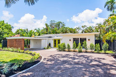
Help with choosing exterior colours for 1960 house please!
Lisa Brown
5 years ago
last modified: 5 years ago

Featured Answer
Sort by:Oldest
Comments (30)

Lisa Brown
5 years agoRelated Discussions
Help choose house exterior colours
Comments (8)Hmmm I know what you mean about not wanting too many colours going on - but if you could count the roof as a neutral (that kind of ties in with the white), and then do a pale grey as the cement balcony, they may still tie together as one visually. I agree it'd be nice to add some colour and interest, but you've got such great bones to work with, I think it's just about adding to bring out it's style, rather than masking to make it feel like a house built today -it never works very well. So I would: - refresh white paint on the white balustrades & windows - even consider spraying. I've just done my front gate that was 1/50th of that size and THAT took a while. Though if you do decide to paint by brush, I found my son's Ikea kids craft brush (it's real bristle) was so much better than any of the proper paintbrushes I had! http://www.ikea.com/au/en/catalog/products/90193320/ - remove the air con unit and even the satellite dish to other locations if you can. - paint the concrete patio and steps a lighter grey such as Studio Backdrop by Berger (remember that colours come out lighter outside) - Plant some bright & lush plants like sweet viburnum (providing it's not too shaded, or if so, some hydrangea) where the dark brown bricks currently are, as well as lots of other plants in the front garden - a pretty maple or crepe myrtle feature or some background plants like small cypress etc will actually add more visually and mean the house doesn't have to shoulder all the prettiness! Or go more Palm Springs style (though it looks cool where you are?) and add succulents, pots of Chalksticks, Crassula Bluebird etc. And all still in keeping with the era. - Then have fun with styling the exterior. Maybe look at some fabulous Slim Aarons photos for inspo! I can see a cool acapulco style chair and (yellow & white!) stripe cushion on the balcony, some succulents in grouped pots - bring back it's heyday when the owners might have had people over for drinks on the balcony! I love this era, the homes can be so light, bright and elegant, but people often try to update (rendering etc!) and lose their original style. Even paint your front door in a matte rich gold yellow or tomato red! - And a small thing, but the curtains inside being blue and green make it look quite busy too (in reference to your concern around too many colours) as well as looking dark. If you wanted to , it would be great to add white sheers - these are in keeping with the era, will make the house look brighter from the outside too, will make the white windows look even better, and are surprisingly good for privacy (coupled with roller blinds for night). - I forgot to mention earlier that I would definitely leave the dark lower brick and introduce some plants along there, then you wouldn't even notice the difference. Brick is a pain to paint, you then will have to clean it, it may well peel, bricks are porous and breathe, I definitely would only paint them if you have to, and I really don't think you do - it's another original element and is inoffensive. - Here's a variety of links/photos for inspiration, but I really think smartening up the house and then adding an interesting garden (there's a few looks you could go for, depending on your climate & taste!) will make it look amazing. http://thedesignfiles.net/2013/02/melbourne-home-ada-leon-kagan/ http://thedesignfiles.net/2016/02/louise-and-graeme-bell/ http://thedesignfiles.net/2015/02/tim-ross-and-michelle-glew-ross/...See MoreExterior House and Roof Colour - Help please!
Comments (8)Hi Pele - I hope you don't mind, but to my mind the thing that immediately jumps out at me as not fitting is the colour of the orange terrace tiles! The wall colour and roof colour seem in the earth/cool ochre range, and sort of complement the cool grey driveway even though they are different. The terrace tiles being bright orange clash! If you do/don't have the budget, I would prioritise painting or staining these tiles the Basalt colour which is a deeper grey like bluestone! Or even better switch your budget to retiling this area with a deeper grey or bluestone exterior tile. Add a few plant pots - and I love your timber garage door and possibly timber balustrade - and it would be dramatically transformed! I think this would be a better impact-for-dollar than painting the roof tiles which look to me to be in good condition. Good Luck!...See MoreHELP choosing exterior paint colour
Comments (20)Another amateur vote for Powdered Rock. I wonder what Double Strength Powdered Rock would look like. I recall the old adage: choose the colour you REALLY like and halve the strength for interior and double it for exterior. The outside colours tend to get lost. Might be interesting. Though of course the choice of exterior depth of colour is dictated by need for either reflection for heat reduction or absorption for warmth. And contradicting myself, really dark colours tend to fade more apparently over many years, making touch up matching more tricky, though modern paint lasts for so many years if well applied. Best of luck....See MoreHelp with exterior house colours please.
Comments (5)I agree with black bamboo and oklouise -- everything looks 60's , but in a clean , updated way , with 2 exceptions and a comment ! The two that are out of character is the roof ( but its livable ) and the portico . Even the gardens look 60's inspired , and I like the overall effect . Thge comment -- it needs more colour , a bit of wow ! So the very first thing I'd do is the front door in the brightest fire engine red gloss I can , it both references the brick but it adds the wow in a small way . It will take some of the focus off the portico , but probably not enough for my taste . So I'd probably do it in Surfmist or similar -- OR a 50's apricot with a bright orange door if you are brave ! But the upstairs still lacks something -- too mehhhh . The grey in the windows I am guessing are roller blinds ? I'd change them for a mid red or orange , but that may not work with the interior colours ? So maybe wooden venetians -- brings in the natural element and touch of class , and still works well with most interiors . Especially if going wooden , I'd do downstairs windows the same -- if going for coloured roller blinds maybe not . It will look more uniform and thought out for $10-15k ( less if you do some or all yourself ) IMO ....See MoreLisa Brown
5 years agoLisa Brown
5 years agoLisa Brown
5 years agoLisa Brown
5 years agoLisa Brown
5 years agoLisa Brown
5 years agoLisa Brown
5 years agoLisa Brown
5 years agoLisa Brown
5 years agoLisa Brown
5 years agoLisa Brown
5 years agoLisa Brown
5 years agoLisa Brown
5 years agooklouise
5 years agoLisa Brown
5 years ago


oklouise