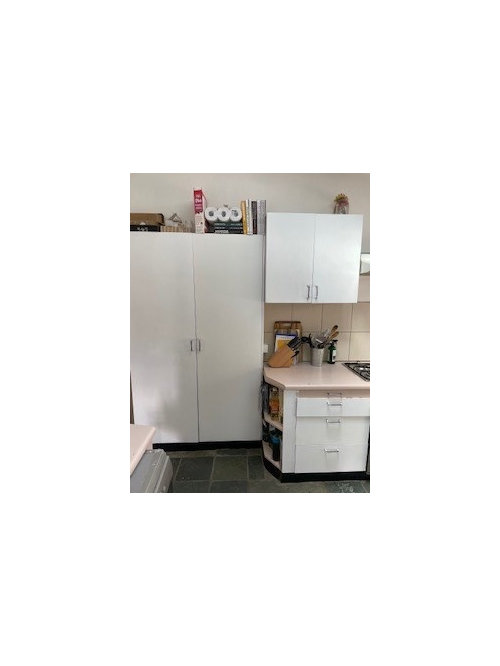
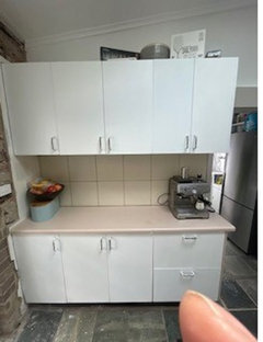
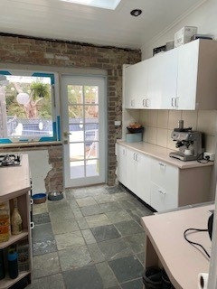
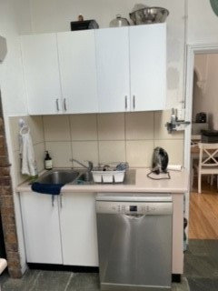
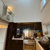
Snowy mountain quarter or vivid white shaker cabinets
G D
2 years ago
last modified: 2 years ago
Featured Answer
Sort by:Oldest
Comments (12)

bigreader
2 years ago
Kimberley Pottinger
2 years agoRelated Discussions
Dulux Snowy Mountain Quarter
Comments (42)Hi Katrina, In the rooms (in my SIL house) that throw that green cast they have a neutral carpet. There is A LOT of light in this particular area of the house, so I do believe that impacts the undertone. In my own house, I also have very bright rooms, large windows, westerly facing. We went NWH. Now what is interesting is in one room (the brightest room) it looks bright and white and in the other room which is adjacent and still a bright room but have sheers over window, it looks darker. I like a bright white room but the SM H/Q threw that weird green cast in my house. I prefer the NW because it has a warmer feel to it whilst still is a nice, white colour. I have light flooring also. Truly, its so difficult and far from an exact science because so much influences the colour in your own home. I'm not sure what the NW would look like next to the SM, but if the rooms are not open plan, I don't know if most people would tell. We painted the bedrooms (I think from memory) Lexicon Q and I don't find it jarring, they are just in a different part of the house and we needed a different white. Good luck, finding the right white is a journey! With kindness, SB....See MoreTimber ceiling - which white wall colour ?
Comments (1)Plain ceiling white is a good choice for ceilings. I'm a huge Natural White fan but will consider Whisper White next time I'm painting....See MoreWhich white to choose for kitchen
Comments (26)Hello Nicole,we love our kitchen. The tiles are one of my favourite features,they were expensive but worth it. The tiles just completed our kitchen.The glass splashback is so easy to clean.. a few squirts of windex & a wipe its clean. Good luck with your kitchen....See Morepaint disaster with Dulux Vivid White
Comments (7)Thank God someone talking about the effects of light and surrounding colour (and furnishings) when choosing a white (or any paint). So sick of reading about how 'bad' vivid white is on walls. I have put a paint sample up on the walls of my (poor natural lighting) unit, and it looks great, as well as being a good foil/contrast to the colours in the furniture I am painting. Tried white on white, which looks great in the pot, only to look 'dirty' on the walls. Vivid white in my unit doesn't look 'clinical', but 'clean', and most importantly, looks 'white' instead of slightly yellow or grey, or worse, like the walls haven't been cleaned in a decade. And the place looks brighter and more welcoming because more light is being reflected off the walls (and as I said, there is not enough of that to begin with). And as an FYI, yes, vivid white is an untinted Dulux colour, and is used as a base. However, I was just talking to a paint shop retailer of a different brand who I have been getting some supplies off, and he said that the Dulux vivid white base is actually slightly yellower than their base (Luxury paints base), which is very white. So even the much disparaged vivid white isn't a 'pure' white. And I did notice that when I put it up on the walls of my unit. The current white is very similar, but more yellow, but I was surprised there wasn't as much of a difference as I expected. Just goes to show the effect of a) the surrounding colour and b) the light a room gets....See MoreG D
2 years agoKimberley Pottinger
2 years agoG D
2 years agolast modified: 2 years agoG D
2 years agoG D
2 years agoKimberley Pottinger
2 years agoG D
2 years ago
Kate
2 years ago


G DOriginal Author