Decorating

Colour Commotion: Throw Out the Rulebook à la Beyoncé
Remember how resplendent Beyoncé looked in her mismatched bra and knickers? Try colour mismatching at home

Who could forget those photos of a pregnant Beyoncé featuring a riot of floral colour as backdrop, and the woman herself resplendent in mismatching underwear – pale blue knickers and a maroon bra – topped off with an eau de nil veil? Anti-minimalist colour fanatics everywhere were swooning, not just Beyonce’s many legions of fans. “The photo is forward-thinking but with traces of historical art traditions from the past – conjuring an appealing remix of rococo excesses, Flemish portraiture and Latin American funerary symbols,” opined New York arts writer Anna Furman in The Guardian. “Behind her glowing, studio-lit body, an enormous floral wreath suggests a sort of halo. The bulbous, super-saturated flowers behind her are hyperbolically lush and incredibly fake, adding a campy edge to the otherwise straightforwardly religious – and, it should be noted, hyper-feminine – composition.”
Phew, that was quite a mouthful but I concur – she looked fabulous! And in homewares, thankfully, mis-matching colours has long been an acceptable, fashionable move forward. What could be described as clashing colours are everywhere from the bedroom to the kitchen, to living areas, and the study. You’re only limited by your imagination. Here are some wonderful examples.
Phew, that was quite a mouthful but I concur – she looked fabulous! And in homewares, thankfully, mis-matching colours has long been an acceptable, fashionable move forward. What could be described as clashing colours are everywhere from the bedroom to the kitchen, to living areas, and the study. You’re only limited by your imagination. Here are some wonderful examples.
Fixtures and furnishings
Cushions in varying prints and colours, rococo panelling wallpaper, a hot-pink light and a bright-yellow table. It sounds like a mishmash but the finished product is, in fact, rather gorgeous. The dark wallpaper offsets all the bright colours to bring it all together and make it work.
Cushions in varying prints and colours, rococo panelling wallpaper, a hot-pink light and a bright-yellow table. It sounds like a mishmash but the finished product is, in fact, rather gorgeous. The dark wallpaper offsets all the bright colours to bring it all together and make it work.
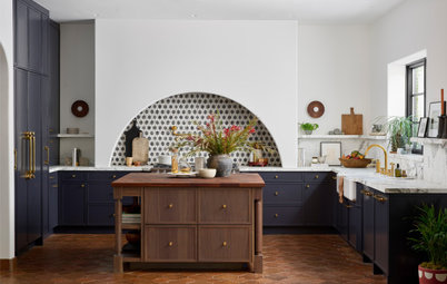
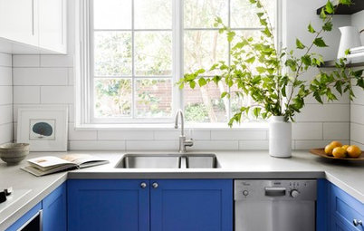
Cupboard chaos
A colour mix-up could start in a hip and happy kitchen. Experiment with different colours by colour-blocking the cupboard doors. This is good idea for a DIY job and a great way to enliven a tired kitchen without breaking the bank. This colourful Mondrian-inspired kitchen in Melbourne features flat-panel cabinets painted in colours not always considered as ‘going’ together but it looks pretty great.
A colour mix-up could start in a hip and happy kitchen. Experiment with different colours by colour-blocking the cupboard doors. This is good idea for a DIY job and a great way to enliven a tired kitchen without breaking the bank. This colourful Mondrian-inspired kitchen in Melbourne features flat-panel cabinets painted in colours not always considered as ‘going’ together but it looks pretty great.
Yellow goes with anything
Really? Yes, done right, yellow can be an amazing backdrop. This London townhouse features gorgeous, vital colour throughout. Here in the dining room, turquoise and a citrusy yellow are working it together.
Really? Yes, done right, yellow can be an amazing backdrop. This London townhouse features gorgeous, vital colour throughout. Here in the dining room, turquoise and a citrusy yellow are working it together.
In this Dublin sitting room teal and pink accents somehow work against a chartreuse backdrop – it’s bold and different but definitely successful.
Who would have thought a sombre blue sofa and a candy- pink chair could look so lovely against a bright yellow wall?
Mix the prints
Some people are understandably frightened of prints, but liberate yourself from that fear and don’t be afraid to create a pattern clash.
Some people are understandably frightened of prints, but liberate yourself from that fear and don’t be afraid to create a pattern clash.
What’s the worst that could happen? You can always make or buy a different cushion cover when you get tired of the first one.
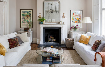
Clashing colours and patterns that just work
Clashing colours and patterns that just work
This goes for wallpaper too. You can go for a strongly featured, quirky wallpaper and try different things against it. And let go of your colour worries or the need to use the same colours together. Most colour experts will tell you the main thing to take notice of is using tones that sit opposite each other on the colour wheel, for example orange and blue, yellow and blue, or red and green.
This delightful home in Cape Cod features unexpected colour throughout and proves once again that the adage about ‘blue and green’ should simply be… ignored.
See more of this colourful house.
See more of this colourful house.
Add white
Try working your different colour patterns onto an all-white background for a mesmerising effect, as in this London home.
Try working your different colour patterns onto an all-white background for a mesmerising effect, as in this London home.
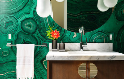
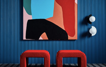
Red and green
Red and green together is one of my personal favourites and has to be one of the most striking colour combinations around, as this photo shows.
Red and green: not just for Christmas
Red and green together is one of my personal favourites and has to be one of the most striking colour combinations around, as this photo shows.
Red and green: not just for Christmas
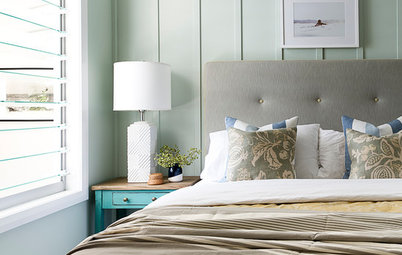
Pink and blue
Another of the loveliest combinations – here in the form of a dreamy dusty pink and teal.
Another of the loveliest combinations – here in the form of a dreamy dusty pink and teal.
Don’t stop at two
Unexpected colour combinations don’t have to stop with just two colours. Take it even further and play with a variety of colours. Look how good pale blue, apple green, lilac and orange can look together.
Tell us
Have you thrown caution to the wind with colour? Tell us about it in the Comments below.
More
Browse kitchen photos on Houzz


Sponsored
Sponsored