Interior Design

Decorating
10 Ways a Designer Added Warmth & Character to a Bland Apartment
A step-by-step guide to how an interior designer imbued a tiny characterless apartment with personality and depth

Filled with natural light, but seriously lacking in character and interest, this small new apartment was ripe for a makeover. See exactly how interior designer Peter Schaad, interior designer and principal at Peter Schaad Design Studio, worked his magic – and find out the products he used – in this room-by-room guide.
The floor plan of the apartment
Redesign budget: $80,000
Where did most of it go: On the furnishings and furniture.
Inspired to add some character to your own apartment? Find a local interior designer on Houzz to help
Redesign budget: $80,000
Where did most of it go: On the furnishings and furniture.
Inspired to add some character to your own apartment? Find a local interior designer on Houzz to help
The kitchen before works
Brief: To give the apartment some character, take away from the all-white walls and provide a warm feel.
Brief: To give the apartment some character, take away from the all-white walls and provide a warm feel.
The reading room before works
What did you keep from the original design?
A selection of art pieces from the client’s collection. The kitchen and bathroom were already installed and were left untouched.
What exactly did you do?
A total fitout, right down to the selection of towels, sheets and kitchen and laundry appliances. Here are 10 features we focused on to enhance warmth and character.
1. A warm, earthy colour palette
I chose an earthy masculine colour palette throughout the apartment to give the space depth and interest and balance out the bright white walls.
The apartment has wonderful natural light so I was able to use darker colours without compromising the look of the space or making it feel heavy. The end result? A cosy, relaxing feel.
The kitchen, with its whites, blonde timber and pale-grey marble, was already installed in the new apartment and the new scheme needed to harmonise with it.
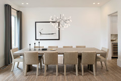
2. Added a focal point to the kitchen
I wanted a striking kitchen table that would create a focal point in the kitchen but wouldn’t overpower the small space. I chose this one with its characterful base from Coco Republic and had it re-stained to match the timber kitchen joinery and the top cut down in size to suit the room’s proportions.
Choosing a round table for this spot allows the eye to travel through the room and doesn’t block traffic flow.
3. Dispensed with a traditional coffee table
The design challenge here was to provide all the necessary furniture items for the client to live comfortably, while not cluttering up the rooms.
Rather than a bulky, traditional coffee table, I had a compact trunk custom-made in faux ostrich vinyl to match the dining chairs. It also doubles as a handy footstool and contains extra storage.
4. Low-profile furniture
Low-profile furniture in light colours, such as the sofa and armchair in the living area, makes the ceiling feel higher and the room look bigger than it actually is.
The armchair is from Jennifer Button Agency and I had it recovered in Elliott Clarke Lee Jofa Omo Embroidery fabric in Oyster Blue.
Low-profile furniture in light colours, such as the sofa and armchair in the living area, makes the ceiling feel higher and the room look bigger than it actually is.
The armchair is from Jennifer Button Agency and I had it recovered in Elliott Clarke Lee Jofa Omo Embroidery fabric in Oyster Blue.
The rug is custom-made and the carpet is from Supertuft.
5. Textured wallpaper
Rather than a flat wallpaper, I specified a textured Japanese grass wallpaper from Jim Thompson to add depth to the walls in the hallway. The colour also provides a great backdrop for a large-scale David Bromley artwork, which was part of the client’s collection.
Using the same grass wallpaper in the reading room (which doubles as a guest room) creates a sense of cohesion between the two.
6. Magic of a mirror
A mirror in the entrance is not only useful, but is a great way to maximise light. I chose this one from Tantra Imports for its interesting shape and the fact that it’s not too large for the wall.
I moved the light switch to another wall to give me the space I needed to hang the mirror.
A mirror in the entrance is not only useful, but is a great way to maximise light. I chose this one from Tantra Imports for its interesting shape and the fact that it’s not too large for the wall.
I moved the light switch to another wall to give me the space I needed to hang the mirror.
7. Large-scale artwork for drama
Choosing the right-size artwork for a wall is key – this large David Bromley piece is the perfect scale for this wall and it also provides enough distance so you can view it properly from the main bedroom and kitchen.
Choosing the right-size artwork for a wall is key – this large David Bromley piece is the perfect scale for this wall and it also provides enough distance so you can view it properly from the main bedroom and kitchen.
I had all the client’s artwork reframed by S&J Framing Workshop, as the original frames were dated and had been colour-matched to the artwork.
8. Dual-purpose furniture
I selected a sofa bed for the reading room (converted from the second bedroom) so it could double as a guest room – giving the client more than one way to use the space. A desk allows the client to work here too.
I selected a sofa bed for the reading room (converted from the second bedroom) so it could double as a guest room – giving the client more than one way to use the space. A desk allows the client to work here too.
The Voyager Interiors armchair is covered in Verve Berko fabric in colour 95. The Furniture Inspirations sofa is covered in Jim Thompson Vara 3570 fabric in Oatmeal.
9. A striking bedhead
The client’s brief for the bedroom was to create a warm, masculine space. I achieved this with rich colours and sumptuous textures.
I specified textured Japanese grass wallpaper for the walls to create a warm cocooning feel, and added a custom-designed velvet bedhead to add drama and another tactile element to the space.
The bedhead is covered in a gorgeous teal velvet – Mokum Bespoke 12395 in colour Atlantic 538 – which contrasts with the earthy, textured walls.
10. Touches of brass
Elements of brushed brass in the bedroom mirror and lamps add ‘bounce’ to the space and reflect the light.
The mirror is from Tantra Imports and the table lamps beside the bed are from Sue Riley Home Collections.
Your turn
What’s your favourite feature in this apartment? Tell us in the Comments below, like this story, save the images for inspiration, and join the conversation.
More
Want more clever apartment ideas? Don’t miss this Singapore Houzz Tour: Singapore Colonial Meets Scandi Style
Interior designer and commentator: Peter Schaad Design Studio (also known as PS Design Studio)
Who lives here: A single man
Location: Malvern East, Victoria
Home set-up: A new apartment with two bedrooms and two bathrooms measuring approximately 73 square metres