Before and After: A Kitchen That was Spun Around and Extended
After a renovation, this kitchen is almost unrecognisable from the dated and cluttered site it was previously

In a Q&A format, we talk to the designers – and examine the creative thinking – behind some of Houzz’s most loveable rooms.
The view into the kitchen before works
What wasn’t working for the owners about the original kitchen?
There was a large masonry chimney that divided up the previous kitchen/dining space and blocked natural light from the rear windows, making the kitchen feel dark. Our client loves to cook and the layout of the previous kitchen didn’t work for her. It also lacked adequate food storage.
Thinking of renovating your kitchen? Find a specialised kitchen designer near you on Houzz, view images of their work and read reviews from previous clients
The kitchen before works
The adjacent dining area before works
What did you do?
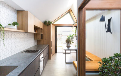
While mostly an internal overhaul, some of the bold moves we did were to realign the opening into the kitchen from the hall to create better flow from the front door to the rear kitchen/dining.
A large chimney was removed and the orientation of this space was turned 90 degrees. This let us create the kitchen and dining space as well as a powder room and laundry.
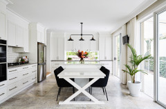
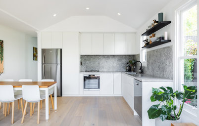
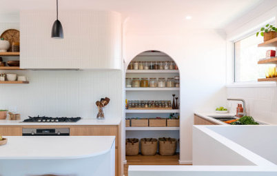
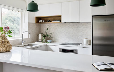
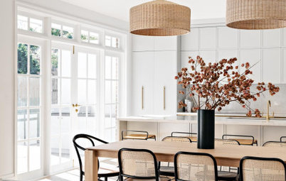
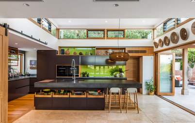
The main feature of the kitchen is the seamless oak-coloured cabinetry block that conceals the laundry door and powder room around the corner. The timber finish brought warmth to the kitchen space. The remainder of the kitchen was done in white, which is light and bright, with marble-look porcelain benchtops and splashback and the black metal-leg detail on the island.
While mostly an internal overhaul, some of the bold moves we did were to realign the opening into the kitchen from the hall to create better flow from the front door to the rear kitchen/dining.
A large chimney was removed and the orientation of this space was turned 90 degrees. This let us create the kitchen and dining space as well as a powder room and laundry.
The main feature of the kitchen is the seamless oak-coloured cabinetry block that conceals the laundry door and powder room around the corner. The timber finish brought warmth to the kitchen space. The remainder of the kitchen was done in white, which is light and bright, with marble-look porcelain benchtops and splashback and the black metal-leg detail on the island.
The floor plan before works
The floor plan after works
Brief
What were the client’s must-haves?
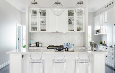
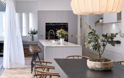
We love how the kitchen island on legs feels like a piece of furniture – why did you specify it?
We wanted an element of delicacy but also sharpness, and to create a consistency of visual language with the steel windows. The memory of a solid masonry chimney was still very present in everyone’s heads, so lifting the island on thin legs was one of the furthest things away from the chimney that we could design. It was a counterpoint.
- Something soft and delicate that respected the ‘prettiness’ of the existing Victorian detail in the house.
- A strong design but not overbearing or slick to the point of being cold.
- Storage baskets for vegetables and fresh fruit.
- Storage for small benchtop appliances.
- A school-drop zone.
- A low-maintenance design.
What were the client’s must-haves?
- Ample storage.
- Natural light.
- Good-quality joinery.
- Organisation.
- Functionality.
We love how the kitchen island on legs feels like a piece of furniture – why did you specify it?
We wanted an element of delicacy but also sharpness, and to create a consistency of visual language with the steel windows. The memory of a solid masonry chimney was still very present in everyone’s heads, so lifting the island on thin legs was one of the furthest things away from the chimney that we could design. It was a counterpoint.
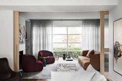
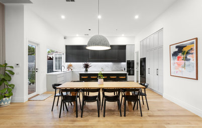
The dining area seen from the hallway
What was the thinking behind the arrangement of furniture/fixtures?
What challenges did you face with this kitchen and how did you solve them?
Removing the chimney, which involved working closely with a structural engineer. Also
maximising storage in a useable way while retaining the feeling of openness that we were working so hard to achieve by removing the chimney.
What was the thinking behind the arrangement of furniture/fixtures?
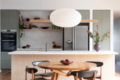
- Reorientate the space in a long direction, away from a U-shaped kitchen.
- Exploit the typical long and thin terrace house footprint to create a feeling of openness and space.
- Increase natural light.
- Play on the long and linear, for example with the table, island bench, pendant and recessed lighting channels in the ceiling.
- Extend the eye into the outdoor space beyond.
What challenges did you face with this kitchen and how did you solve them?
Removing the chimney, which involved working closely with a structural engineer. Also
maximising storage in a useable way while retaining the feeling of openness that we were working so hard to achieve by removing the chimney.
How important was indoor-outdoor connection with this kitchen/dining area?
The client had already completed some work on the outdoor area, to make sure the new spaces integrated without having to redo the outdoor space.
Having spent much time in Queensland, the client was also very realistic about the amount of year-round use the outdoor space would get, so an indoor window seat, which could be enjoyed even in the middle of winter, was determined to be more important than an entire wall of bi-fold doors.
We love window seat with the small open shelf beside it – tell us about it
The idea was the adults could chat with the kids while cooking dinner as they are reading books. It allows the chef to remain engaged with the conversation and provides an element of warmth and an opportunity for colour.
Your turn
Which idea would you steal from this space? Tell us in the Comments below. And don’t forget to save your favourite images for inspiration, like this story and join the conversation.
More
Want more great interior makeovers? Take a look at our last UK Before & After: An Unused, Chilly Garden Room Gets a Cosy Look

Sponsored

Sponsored
Answers by Stephanie Reed-Marshall, project architect, Bryant Alsop Architects
Who lives here: A couple with two teenage children
Location: Brunswick, Victoria
Room size and purpose: A 40-square-metre kitchen and dining area
Scope of work: This was a whole house renovation; the kitchen was renovated and the pop-out seat was added
Furniture design: Do it by Design
Builder: Knot Only Carpentry