Before & After: A Space-Wasting UK Bathroom's Clever Redesign
A smart new layout and a sophisticated palette turned this London bathroom into a spa-like bathing space

If you need an example of how rearranging a floor plan can transform a room into something both more functional and more beautiful, look no further than this smart rejig. The clever design by Adam Wollerton of Bathroom Eleven has turned a space with a tiny shower and single basin into a welcoming bathroom fit for a family of five. The new space is now equipped with a large walk-in shower, indulgent tub and double basins for busy mornings.
The original bathroom design wasted space and didn’t work for the busy family. The bath jutting out into the middle of the room created a pinch point with the basin…
…And only left space for a small shower. “This was the driving factor of the whole brief,” says Wollerton. “They were having to cram into this tiny shower and then it started to leak, so they thought, how do we get a bigger shower?”
Is your bathroom in need of a revamp? Find a specialised bathroom designer near you to rethink your layout, materials and colours
Is your bathroom in need of a revamp? Find a specialised bathroom designer near you to rethink your layout, materials and colours
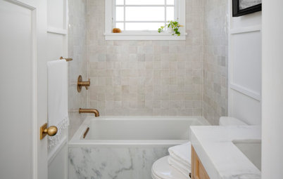
By moving the bath across the room and turning it 90 degrees to slot under the window, Wollerton freed up space for a double basin. He was then able to reposition the toilet where the single basin had been and fit in the family’s key request – a large walk-in shower.
“The final layout I did took the owners by surprise, as they didn’t realise they could move things around so much,” he says.
“The final layout I did took the owners by surprise, as they didn’t realise they could move things around so much,” he says.
The wall against which Wollerton sited the shower is built out by 150 millimetres. This was key to unlocking the layout, as it meant he could move the toilet to make way for the walk-in cubicle.
“The thing that was causing the owners problems with the original floor plan was the loo, because the stack [pipe] went straight out of the wall at the point where it was situated,” says Wollerton. “To move that without doing heavy external work, I knew I’d have to build into the room, so I could change the stack within the boxing.”
Happily, this also meant he could incorporate niches and lighting, and neatly fit in a wall-hung toilet.
To make the shower as maintenance-free as possible, the family didn’t want any moving parts on the screens and asked for large-format tiles for fewer grout lines.
Wollerton chose a matt-black framed shower screen, which chimes with the sash window. “We could have had plain panels, but, because it’s such a big room, it can take the heaviness of the ‘Crittall’ look,” he says of the black-framed glazing panels. “It also gives a little privacy and creates a really nice feature of the shower, which is always what the family wanted to do.”
Browse green-hued bathrooms by Australian designers
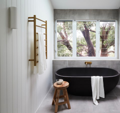
The space under the window was wasted in the old bathroom.
Now, a claw-foot slipper bath, painted in a muted green, is tucked neatly in the space. “Having the bath under the window creates a bit more of a spa vibe,” says Wollerton.
With the shower being more open and the family keen to keep potential problems to a minimum, he replaced the wooden boards with wood-effect porcelain floor tiles. “We had to create a whole new floor and level it, then tile it,” he says.
Choosing a bath with feet as well as a wall-hung toilet and vanity unit means as much of the floor as possible is visible, helping keep a spacious feel in the room and ensuring all areas can be easily cleaned and mopped.
The room originally only had ceiling lights, but Wollerton went for a more layered approach, with fittings at different heights, including these brass pendants, which help create a relaxing mood in the bathing area.
“I wanted to create a few levels of lighting,” he says. “One level is practical, so they have the cabinet and ceiling lighting, then there are all the softer lights, such as the pendants and the spots in the shower nook.”
There’s also low-level lighting under the vanity unit to banish shadows. “Because the vanity is quite big, if you didn’t have that, it would create quite a big dark patch on the floor, and the light cancels that out a bit,” says Wollerton.
The layered bathroom lighting gives the family options. “If you were to go in there in the middle of the night, or just wanted a moodier bathing setting, you could have a lower level of light for a much calmer environment,” he says.
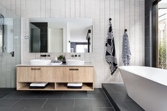
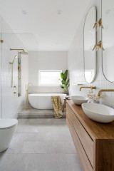
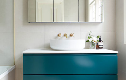
The vanity unit is so much more practical for the family. The double porcelain basins have plenty of set-down space around them and the unit contains two roomy drawers. A large mirrored cabinet above also adds storage, while helping boost light levels and the sense of space.
The panel behind the basins protrudes slightly. “It helps with pipework, but it was more to create a 3D effect to break up the wall and provide a bit of depth, otherwise everything would have been flat,” says Wollerton.
He added a decorative note with heritage-inspired tiles that tone with the green bath. “I sized the panel perfectly to fit seven full tiles across to create a nice little area of pattern,” he says.
The shelf on top of the tiled panel is a piece of quartz, which creates a nice ‘lid’ rather than just having the tile edging. “I matched it with the [strips on the] bottom of the recesses in the shower wall to bring a bit of that dark note across to this side of the room and balance with the black shower frame,” says Wollerton.
“The reason I added quartz strips to the bottom of the niches is it makes it easier to keep them clean, rather than having grout lines with tiles,” he says.
“The reason I added quartz strips to the bottom of the niches is it makes it easier to keep them clean, rather than having grout lines with tiles,” he says.
The owners weren’t sure what colour to go for, but knew they wanted natural elements, so Wollerton suggested soft greens.
He’s restricted the colour palette and patterns, which keeps the scheme from being too busy, but there’s plenty to catch the eye. “It’s quite texture-rich and there’s a lot to look at, so it keeps you interested,” he says.
Tall radiator heaters in both alcoves continue the thin black lines of the shower enclosure and, with three rails on each one, can keep all the family’s towels warm and dry.
The various design details also help zone the space. “Whether it’s the tiling behind the bath and basin, or the lighting, or the shower having a darker tray and Crittall-style screens, each creates an area of the room that’s just for that function,” says Wollerton.
He kept the original big cupboard in the chimney breast (just seen on the right). “It’s actually quite deep, so it gives them a lot of storage,” he says. “We just repainted the doors to freshen them up.”
The family love their new bathroom and are pleased they spent a bit more than planned. “They had options throughout to change their minds, but decided on quality products,” says Wollerton. “They chose to invest in things that made the design.”
Your turn
Which elements of this bathroom redesign do you admire? Share your thoughts in the Comments, like this story, save the images and join the renovation conversation.
More
Liked this transformation? If so, you’ll love this Before & After: A Clever Concealed Office for a Couple Who WFH
Bathroom at a Glance
Who lives here: A couple with three teenagers
Location: London, UK
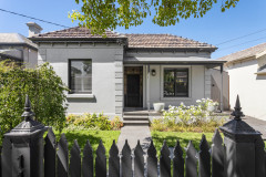
Property: A Georgian house
Room dimensions: 3.5m x 3.2 metres
Designer: Adam Wollerton of Bathroom Eleven
The family who live in this Georgian house share one bathroom, which, now the three children are growing up, had become rather a squeeze. Their key request was for a large shower, plus an extra basin to ease the morning rush. They were also keen on a design that was clean-lined and low-maintenance.
“They wanted a classic nod, to match the age of the property, but with a more contemporary look,” says Wollerton. The resulting design mixes heritage-inspired tiles and colours with strong black lines and modern tapware.