
Decorating

How Colour Can Affect Your Physical Health
We've heard about the emotional effects of colour, but could it be more physical than you first thought?

“Seldom, surely, is the psychological part of an appearance in nature so great as it is in the case of colour,” says Dr Ulrich Beer in his book, What Colour Tells Us. “No one can encounter it and stay neutral. We are immediately, instinctively, and emotionally moved. We have sympathy and apathy, pleasure or disapproval within us as soon as we perceive colour.”
Colour is around us every day and it influences various areas of our lives, but it’s easy to take for granted. Once you understand how colour can impact your physical health, you’ll put colour on the top of your design agenda. Read on to find out more.
Colour is around us every day and it influences various areas of our lives, but it’s easy to take for granted. Once you understand how colour can impact your physical health, you’ll put colour on the top of your design agenda. Read on to find out more.
Colour is a sensory perception
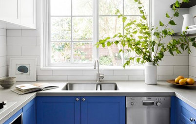
People receive 80 per cent of their information from the environment, and our sense of sight gives us 10 times more information than all of our other senses. Colour is a huge part of that sense and, like all our other senses, carries with it various responses. Fire-engine red, for example, can be arousing and exciting, while light blue can be cooling and relaxing.
Although many argue that colour really doesn’t affect them, colour is one of the strongest stimuli we receive and one of the first things we see in any design, no matter how subtle.
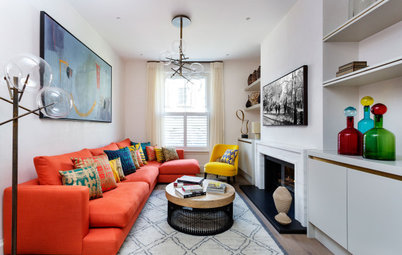
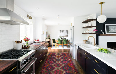
TOP TIP: All colours can have both a positive and negative effect. For example, fire-engine red can be arousing and stimulating, yet it can also be aggressive and intense. Be mindful of both before choosing a colour. For example, this shade of red probably isn’t a great colour to use in a rebellious teenager’s bedroom.
Do babies cry more in yellow rooms?
People receive 80 per cent of their information from the environment, and our sense of sight gives us 10 times more information than all of our other senses. Colour is a huge part of that sense and, like all our other senses, carries with it various responses. Fire-engine red, for example, can be arousing and exciting, while light blue can be cooling and relaxing.
Although many argue that colour really doesn’t affect them, colour is one of the strongest stimuli we receive and one of the first things we see in any design, no matter how subtle.
TOP TIP: All colours can have both a positive and negative effect. For example, fire-engine red can be arousing and stimulating, yet it can also be aggressive and intense. Be mindful of both before choosing a colour. For example, this shade of red probably isn’t a great colour to use in a rebellious teenager’s bedroom.
Do babies cry more in yellow rooms?
Colour has helped us survive and thrive
The science of colour has many applications. Essentially it is the sensation caused by wavelengths of light that our eye recognises and our brain interprets. Colour vision has evolved so that all living creatures only see the specific part of the light spectrum necessary for their survival. We call this visible part the ‘colour spectrum’.
Over millions of years, the colours we see have helped us survive and thrive, from identifying the edible and the inedible, through to the changing colours of the seasons. Although our personal relationships to colour may vary depending on our experiences, deep in our DNA there is still an innate reaction to certain shades.
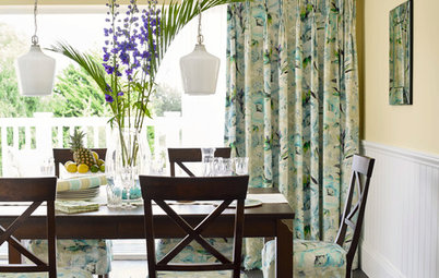
TOP TIP: If you’re looking at using colour in an eating area, turn to your fridge and inspect the colours of your fruit and vegetables. These are the colours related to appetite.
The science of colour has many applications. Essentially it is the sensation caused by wavelengths of light that our eye recognises and our brain interprets. Colour vision has evolved so that all living creatures only see the specific part of the light spectrum necessary for their survival. We call this visible part the ‘colour spectrum’.
Over millions of years, the colours we see have helped us survive and thrive, from identifying the edible and the inedible, through to the changing colours of the seasons. Although our personal relationships to colour may vary depending on our experiences, deep in our DNA there is still an innate reaction to certain shades.
TOP TIP: If you’re looking at using colour in an eating area, turn to your fridge and inspect the colours of your fruit and vegetables. These are the colours related to appetite.
The mind and body connection
Any strong colour will cause an immediate reaction that can be physiologically measured. In his book Color, Environment and Human Response, Frank Mahnke cites various studies in which red was discovered to not only be stimulating, but also increase the temperature of the room. It’s also been discovered that the effect usually lasts only a short time.
This doesn’t mean that we can’t use colour effectively – our minds also have the potential to induce physical reactions such as headaches, bad moods and visual disturbances, and vice versa, in reaction to certain tones. You may have heard someone say that a colour makes them feel physically sick. Depending on personal experience, certain individuals can also have adverse physical reactions to specific colours. For example, if your mother dressed you in pink for the first five years of your life, the sight of pink today may make you feel physically sick.
TOP TIP: When using colour in the home, think about your likes, dislikes and any other associations you have with a colour regardless of trend.
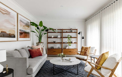
Think about the function of the room and its effect
Always remember you are creating a room experience that must be fit for the room’s purpose in both colour and design.
An all-white room with fluorescent lights can strain your eyes to the point that just being in the room can lead to headaches and anxiety (and the subsequent release of the stress hormone cortisol, which has it own health implications). Not an ideal combination for patients and staff in often stressful environments such as hospitals or other health facilities.
Strong, dark colours can close in a space and make you feel claustrophobic. On the other hand, warm colours with depth can be cosy and inviting – such as this home movie theatre.
Light colours can open up a space, making you feel light and carefree. On cold days, however, light colours can make you feel vulnerable and alone.
TOP TIP: If you want to create a room that can be adapted for mood or temperature (from day to night or season to season, for example), think about using light dimmers, coloured curtains and changing the colour of soft furnishings such as cushions, blankets and throws.
Colour can have real effects
A University of British Columbia study on how colour affects the brain found that after painting London’s Blackfriar Bridge blue-green (from raw black iron), suicides from the bridge dropped by 34 per cent. In other studies, environmental psychologist Sally Augustin found that if you want your employees to be more productive, consider painting your work area green.
TOP TIP: Productive green is also a great colour to use in your home office. Choose tones of mint green, sage green or warm green for the walls. If your eyes are prone to strain, it’s a particularly restful colour.
Seeing green: The latest colour trend
See colour in context
It’s all about the room experience, so know the needs of the people using the space and make that your first consideration in all colour and design applications.
Surface colours rely on various elements including: the pure hue; the lightness or darkness of the hue (for example, burgundy is considered a dark red, while pink is a light red); and brightness or dullness depending on how much grey is added to the colour.
Also consider where to place the colour, how much to use and for what purpose.
And finally, remember that colour and light work hand in hand and should be given equal attention, because they always influence each other – without light there is no colour.
TELL US
Which colours have you chosen for your home and why? Share your thoughts in the Comments.
MORE
Colour Metamerism: When Colours Are Not What They Seem
The Case for a Colour-Coded Home
6 Kitchen Colour Schemes That Will Stand the Test of Time
The use of colour is central to interior design, yet the application of colour is often an afterthought for decorative or trend purposes only.
In my experience, many architects and some interior designers assign colour for cosmetic reasons, while medical professionals such as psychiatrists and psychologists understand the impact colour can have within any environment. They have learned that colour can cause emotional responses, alter moods, arouse the senses and help change behaviour.
TOP TIP: The best use of colour always meets both decorative and functional needs – keep in mind the primary use of your space before choosing a colour palette.