Architecture
Interior Design

Decorating
Arch Deco House: A Designer's Masterclass on Curves & Colour
Stripes, a lilac ceiling and arches galore – see how a designer used accents to great effect in this heritage home reno

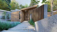
This Spanish Mission-style home in Melbourne was filled with charming original features – arches, decorative fireplace surrounds and leadlight windows. But an awkward floor plan, an unsympathetic 1990s renovation and a lack of natural light made it ripe for a renovation. Enter Anne Hindley, architect, interior designer and director at Hindley & Co.
Hindley focused her attention on rationalising the layout and introduced an exciting colour palette and decorative touches that gave a nod to the past, while adding a decidedly contemporary feel. Her deft touches provide a masterclass on how to use colour and curves – read on to learn how to pick up some insider tips for your own renovation.
Hindley focused her attention on rationalising the layout and introduced an exciting colour palette and decorative touches that gave a nod to the past, while adding a decidedly contemporary feel. Her deft touches provide a masterclass on how to use colour and curves – read on to learn how to pick up some insider tips for your own renovation.
What was your scope of works?
Interior design and alterations to the heritage home.
What did you focus on?
The layout, which made the house feel small – particularly the kitchen/family room. We were asked to create extra space without increasing the footprint of the existing house.
We realised the size of the spaces was sufficient, but as rooms were closed off from one another the flow was awkward, and walking through the utility areas between dining and kitchen was undesirable. There was also a lot of wasted space and unused rooms.
What was your brief?
Our client wanted a complete renovation of their existing house, including a larger kitchen/family room.
What were their must-haves?
A high-quality and contemporary outcome that made a nod to the Art Deco glamour of the existing house, while staying within their budget.
Is your home in need of a refresh? Find an interior designer near you on Houzz
Original ground-floor plan.
How did they want it to look and feel?
The client wanted a glamorous, contemporary reinterpretation of the Art Deco style of the house.
They wanted a redesign that allowed for smarter use of space and storage, while providing more light and a sense of grandeur.
They also wanted to include a mix of vintage and classic-contemporary pieces in the design.
Proposed ground-floor plan.
Where did most of the AU$800,000 budget go?
On the new kitchen, butler’s pantry, glazing and bathrooms.
Where did most of the AU$800,000 budget go?
On the new kitchen, butler’s pantry, glazing and bathrooms.
Original first-floor plan.
Why did you make arches a prominent design feature?
Because they spoke to the architectural language of the existing home. The house had undergone renovations in the 1990s that incorporated rectangular windows, which did not respect or enhance the space.
Why did you make arches a prominent design feature?
Because they spoke to the architectural language of the existing home. The house had undergone renovations in the 1990s that incorporated rectangular windows, which did not respect or enhance the space.
Proposed first-floor plan.
Where did you add them?
There were already three arches in the sunroom-turned-library, which inspired us to use arches elsewhere in the house.
We added arches to areas we wanted to open up and to amplify light and views between rooms and into the garden. Two arches were added to the formal living space, and a further three were added in the kitchen/dining space leading out to the pool area. We also introduced a curved feature wall in the hallway.
Ceiling painted in Madame Mauve: Dulux; Alky chairs: Castelli.
Arches let us frame views and enhance the journey as you move through the house. Used in a contemporary manner, they allowed for space, views and light to be borrowed from the areas around them. We also added curves in the furniture to soften and ease navigation between rooms.
Arches let us frame views and enhance the journey as you move through the house. Used in a contemporary manner, they allowed for space, views and light to be borrowed from the areas around them. We also added curves in the furniture to soften and ease navigation between rooms.
The entry hall. Bisazza Atlantic floor tiles: Perini. Runner: Tsar Carpets.
Tell us about the entry hall
Originally this entrance was uninviting and set the tone for a very dark house. However, we appreciated the little purple alcove. By keeping this colour and referencing it throughout the rest of the interior, such as on the ceiling in the formal living room, we were able to create a narrative throughout the house.
What was your brief?
To make the entrance feel grander and lighter while respecting the heritage of the home.
We wanted to create and reference the moody glamour of the Art Deco age, and create a threshold that sets the tone for the rest of the house.
What did you do?
We added new chequered concrete floor tiles and a striped runner on the stairs that matches the awning in the alfresco area.
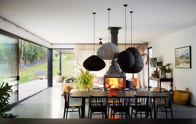
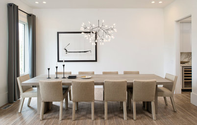
Beetle dining chairs and Moon dining table: Cult.
Tell us about the dining room
The dining room, which is at the back of the house overlooking the pool, had been renovated in the 1990s to include large, heavy aluminium sliding doors that did not speak to the historical nature of the house. In addition, the low ceiling made the room feel small and dark, despite its large north-facing windows.
What was your brief?
To bring in more light and make the space feel bigger.
What did you do?
- Replaced the aluminium sliders with three large steel arched windows.
- Raised the ceiling level.
- Removed and replaced the dark timber floor.
- Added a new fireplace hearth to centre and anchor this feature in the room.
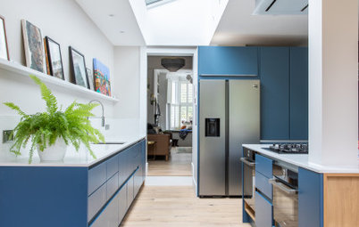
Vibrant Oak Cool White veneer on joinery: George Fethers & Co; Silver Birch benchtop: Corian; Oak Ryde herringbone flooring: Havwoods.
What was the kitchen like originally?
Like the rest of the house, it was dark and dated. The layout and flow did not make for an enjoyable cooking experience and there wasn’t enough storage.
What was your brief?
Create more light, space and storage.
We wanted to create a contemporary kitchen that allowed for entertaining when required and the everyday needs of the family.
The butler’s pantry.
What did you do?
By rearranging the layout of the downstairs areas, we were able to bring more space into the kitchen by adding a new butler’s pantry.
Sculptural forms were carried through from the hallway with half-timber rounds on the columns of the island bench. We used Corian for the benchtops so we could create double curved edges.
Tell us about the playful colour palette
Tone-on-tone colour and space layering were used to reinvigorate this grand, double-storey heritage house.
We amplified the home’s original features and got playful with referencing them in the contemporary rework. The existing arches of the library and the yellow, pink and green terrazzo of the existing bathroom were repeated thematically.
Walls painted in Natural White: Dulux.
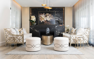
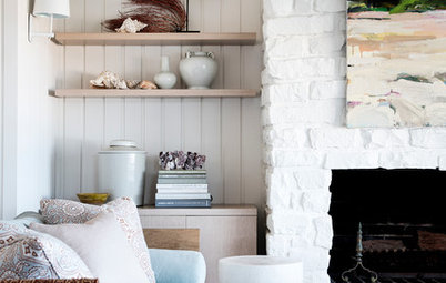
What was the formal living room like?
It is south-facing and had dark timber beams that sunk it into darkness.
What was your brief?
To brighten and open up this room and tie it back into the kitchen and dining room.
We wanted to create a spacious and atmospheric living room that the parents could enjoy.
What did you do?
To create shadowy interest in the existing exposed beams, which were rather ugly.
What was the formal living room like?
It is south-facing and had dark timber beams that sunk it into darkness.
What was your brief?
To brighten and open up this room and tie it back into the kitchen and dining room.
We wanted to create a spacious and atmospheric living room that the parents could enjoy.
What did you do?
- Added aches to borrow light and space from the kitchen.
- Recessed the dark beams into the ceiling by painting them lilac (the same colour as the alcove in the entry hall).
- Retained the Art Deco fireplace.
- Introduced furniture in colours that tied in with the rest of the house.
To create shadowy interest in the existing exposed beams, which were rather ugly.
Walls and joinery in the study and library painted in Coriole: Dulux; Joy armchair: Jardan.
What was the library like originally?
It was originally an outdoor arched verandah that had been converted into a room with dark timber beams and dated carpet. However, the original arched windows framed the garden views beautifully. They were our inspiration for using arches in other areas of the house.
What did you do?
We visually brought the garden into the room through tone-on-tone layering. We then carried these colours through to the study next door.
We added new custom joinery, furniture and lighting that nodded to the glamorous feel of the home.
We visually brought the garden into the room through tone-on-tone layering. We then carried these colours through to the study next door.
We added new custom joinery, furniture and lighting that nodded to the glamorous feel of the home.
Oxford fabric on the window seat: The Textile Company.
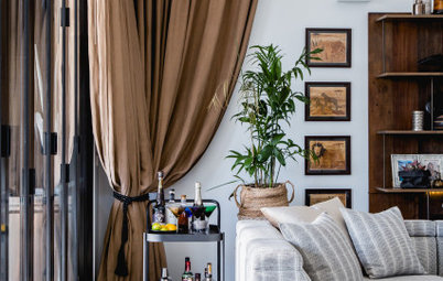
Who uses this study?
Both parents use it as a home office.
What was it like originally?
Dark and dated, with no relationship to the garden.
What was your brief?
To bring in light and make it a more pleasant space to use as a home office. Practicality was key, along with encouraging people to look at the beautiful garden views outside.
What did you do?
- Used tone-on-tone layering to bring in the garden.
- Refreshed the joinery and flooring.
- Added simple yet refined furniture.
- The gorgeous window seat protrudes into the garden. We added a new green cushion to enhance that sense of being into the garden.
Atlantic Butterfly floor tiles: Perini.
What was the ensuite like originally?
It had been renovated in the 1990s and felt dark and dated. The walk-in shower took up a large part of the bathroom and the client wanted to incorporate a bath.
What was your brief?
To brighten the space and add a bath.
We wanted to create a fun and vibrant ensuite that referenced the historical curves of the house.
What did you do?
- Removed the dark tiles and dated tapware.
- Added blush cabinetry and pink Art Deco-inspired floor tiles with an arch motif that references the arches elsewhere in the home.
- Added a bathtub.
- Installed new tapware to complement the bright tiles.
Muuto Halves side table: Living Edge.
What was the main bedroom like originally?
It had large and dysfunctional built-in joinery that made it feel dark and gloomy.
What was your brief?
To make it more open, functional and uplifting with bright colours.
What did you do?
What was the main bedroom like originally?
It had large and dysfunctional built-in joinery that made it feel dark and gloomy.
What was your brief?
To make it more open, functional and uplifting with bright colours.
What did you do?
- Removed the bulky cabinetry and replaced it with freestanding storage.
- Added contemporary furniture pieces in brighter hues.
- Used half-timber rounds on the bedhead to reference those on the kitchen island and the curves downstairs.
What was the main bathroom like originally?
It was dark, with only a small skylight, and the cabinetry felt very dated.
What was your brief?
To keep the existing Art Deco features of the bathroom and replace the leaky shower, the shower curtain and the dated vanity.
What did you do?
It was dark, with only a small skylight, and the cabinetry felt very dated.
What was your brief?
To keep the existing Art Deco features of the bathroom and replace the leaky shower, the shower curtain and the dated vanity.
What did you do?
- Replaced the 1990s vanity with one that was more sympathetic to the original style of the house.
- Opened the skylight and altered the shape of the plaster shaft of the skylight to make it a more attractive feature and to bring in more light.
- Updated the joinery, basin and tapware.
- We repeated the motif in the mirror and vanity. We did not want to overstep the design on the cabinetry to interfere with the existing tiling and floor. These small design references really show how the work is truly in the detail.
Your turn
What are your favourite features in this home? Tell us in the Comments below. And don’t forget to save these images, like this story and join the conversation.
More
Want more great design insights? Check out A Designer’s Masterclass on Material Selection & Custom Joinery
What are your favourite features in this home? Tell us in the Comments below. And don’t forget to save these images, like this story and join the conversation.
More
Want more great design insights? Check out A Designer’s Masterclass on Material Selection & Custom Joinery
Who lives here: A couple with a teenage son
Location: Balwyn, Victoria
Architectural style: A 1930s Spanish Mission, Art Deco-style house
Bedrooms and bathrooms before works: Four bedrooms, two bathrooms, one powder room
Bedrooms and bathrooms after works: Four bedrooms, three bathrooms
Budget: Around AU$800,000
Architect and interior designer: Anne Hindley at Hindley & Co
Builder: Baker Building Group
Joinery: JFJ Joinery