Decorating


How to Use Pantone’s Uplifting 2021 Colour of the Year at Home
Hello, yellow! Good day, grey! See how to use the two colours predicted to be both hot and cool in the coming year

For only the second time since its first Colour of the Year announcement 20 years ago, the colour standards management company, Pantone Color Institute, has unveiled not one but two colours. ‘Illuminating’, a bright sunshine yellow, joins forces with neutral, grounding ‘Ultimate Grey’ as Pantone’s dual selections for Colour of the Year 2021.
Leatrice Eiseman, the institute’s executive director, says Pantone selected these colours to “highlight how different elements come together to express a message of strength and hopefulness that is both enduring and uplifting, conveying the idea that it’s not about one colour or one person, it’s about more than one”.
Leatrice Eiseman, the institute’s executive director, says Pantone selected these colours to “highlight how different elements come together to express a message of strength and hopefulness that is both enduring and uplifting, conveying the idea that it’s not about one colour or one person, it’s about more than one”.
With regards to home decor, Pantone sees these two colours being used primarily in textiles and decorative accessories. They also mention my first thought when I saw ‘Illuminating’ – that it’s the perfect front door colour to pair with neutral ‘Ultimate Grey’ exterior finishes.
Here are more ideas and examples of how to bring this striking pairing into your home.
Here are more ideas and examples of how to bring this striking pairing into your home.
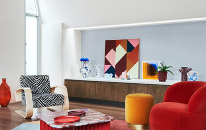
Furniture
It’s important to mention that we are not suggesting you should redecorate your home every year in the latest trendy colours. Rather, this is a good time to source items in these colours if you happen to be a big fan of them. Manufacturers of interiors items such as furniture will no doubt be introducing pieces in these colours. It will therefore be easier to find these hues in the coming year.
Furniture items such as bar stools and dining chairs are smart places to bring in a bold yellow hue. It’s a relatively small spot of colour and is easy to change in the future.
Looking to redecorate? Find an interior designer or decorator near you to help work trends into your home in a timeless way
The dining space shown here, and the previous kitchen, include plenty of medium grey to serve as a neutral backdrop to the striking yellow.
Flooring
If you’re a big fan of bright yellow and want to make a statement with it in a more permanent way, check out your options in flooring. These beautiful, bold tiles are the focal point in this otherwise neutral kitchen palette of grey, black and white.
If you’re a big fan of bright yellow and want to make a statement with it in a more permanent way, check out your options in flooring. These beautiful, bold tiles are the focal point in this otherwise neutral kitchen palette of grey, black and white.
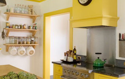
Kitchen cabinets
A yellow-and-grey kitchen can catch the eye and brim with energy and personality. The colour combination can work well in modern spaces as well as in more traditional homes.
A yellow-and-grey kitchen can catch the eye and brim with energy and personality. The colour combination can work well in modern spaces as well as in more traditional homes.
If you go all in with a vibrant yellow for your kitchen, be sure to bring in plenty of soft neutrals. Mid-grey hues offer a nice cool contrast, and crisp whites keep it bright.
This palette also plays nicely with most wood tones. Here, a concrete floor keeps the space light and lively as well as warm and welcoming.
This palette also plays nicely with most wood tones. Here, a concrete floor keeps the space light and lively as well as warm and welcoming.
Bathroom cabinets
Of course, your kitchen shouldn’t get all the fun colour. In fact, I would argue that bathrooms are among the best spaces to inject lively colour, because they’re not spaces you’re spending hours upon hours in, unlike your bedroom, kitchen or living room.
This yellow hue might not be the best choice for your bedroom if you’re seeking a soothing night’s sleep, but in the bathroom, it’s a fantastic punch of colour to help you wake up in the morning.
As with the kitchen examples, adding a healthy dose of a hue similar to Ultimate Grey in the form of wall or floor tiles helps ground the bold yellow hue. Tiles are also more difficult and expensive to change, so using a neutral for those items is a smart move, or scattering small pops of yellow – like the designers have done here – can work a charm too.
Lighting
Light up a room with this sunny hue via a sparkling yellow-hued light fixture. A grey wall can serve as the perfect backdrop to a beautiful bold pendant.
Light up a room with this sunny hue via a sparkling yellow-hued light fixture. A grey wall can serve as the perfect backdrop to a beautiful bold pendant.

Need a pro for your interior design project?
Let Houzz find the best pros for you
Let Houzz find the best pros for you
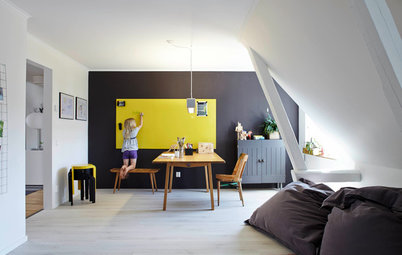
Accent area
One of the easiest, most budget-friendly and impactful ways to bring colour into a room is through a painted accent area.
One of the easiest, most budget-friendly and impactful ways to bring colour into a room is through a painted accent area.
Because a bright yellow hue can be overwhelming in large doses, just a small splash of it, combined with grey, goes a long way and makes a strong visual statement.
This skylight looks like a piece of abstract art with its yellow-and-grey colour-block paint job. I imagine that the splash of yellow also helps the sun shine into this London space even on those overcast UK days.
This skylight looks like a piece of abstract art with its yellow-and-grey colour-block paint job. I imagine that the splash of yellow also helps the sun shine into this London space even on those overcast UK days.
Speaking of bringing in some sunshine, if you have a light-deprived room in your house, think about adding a small bit of summery yellow to the upper wall. With a grounding dark grey on the floor and soft, textured grey on the shower wall, the splash of sunny yellow on the upper wall gives this bathroom a light-filled and spacious vibe.
Browse more bathrooms with yellow accents
Browse more bathrooms with yellow accents
Because of its eye-catching qualities, yellow can help highlight spaces and items that are worth showing off. The back of this built-in bookcase is a fun spot in which to use an accent colour. Grey works as a contrasting base shade that allows the yellow to take centre stage.
Need a pro for your interior design project?
Let Houzz find the best pros for you
Let Houzz find the best pros for you
All of the wall
Here’s an example for lovers of bold colour. Rather than a small accent, go big and paint an entire wall in the hue. This hallway demonstrates how well these two colours work together.
Similar to the bathroom examples, hallways are an excellent place to play with bold colour, since they are thoroughfares of the home and not spaces we hang out in for long stretches of time.
Don’t neglect your ceiling when adding colour. This is a lot of yellow, but it works here because the space is so clean and minimal. It can handle the visual punch of so much strong colour because there’s no clutter competing for attention.
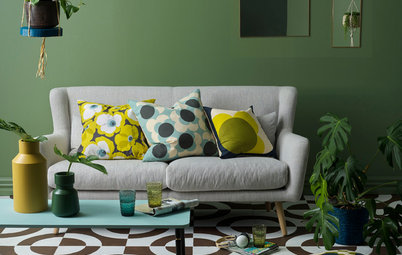
Textiles
Pantone recommends bringing their Colours of the Year into the home via textiles. This is a great option for those who like to play with colour trends, but don’t want a huge commitment or hit to the purse. With a grey or similarly neutral hue for your sofa, you can go a little wild with a zesty yellow throw or a few decorative cushions.
Pantone recommends bringing their Colours of the Year into the home via textiles. This is a great option for those who like to play with colour trends, but don’t want a huge commitment or hit to the purse. With a grey or similarly neutral hue for your sofa, you can go a little wild with a zesty yellow throw or a few decorative cushions.
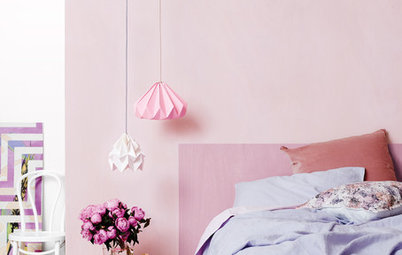
Now this is how I would recommend bringing a bold yellow into your bedroom: through small doses such as cushions. You could also add other bedding elements or a rug in the snappy hue. As long as soothing grey remains a prominent colour in the room, it will stay a serene space for sleep.
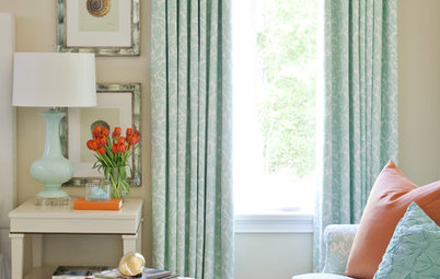
Another option for bringing in one or both Colours of the Year is through window treatments. Curtains allow you to show a little hint of colour (when they’re fully opened) or a large expanse of it (when fully closed). Window treatments can get expensive, but they’re fairly easy to change should you feel an itch to put up a new colour down the road.
Front door
My favourite way to use a bold yellow with a medium grey is on the front door and exterior facade respectively.
Neutral grey-hued exterior materials will age well and allow you to bring in more exciting and interesting colours via your front door, landscaping or outdoor furnishings.
A happy hue such as yellow on the front door is warm and welcoming. Practically speaking, it’s a great spot to showcase a striking colour, because it’s typically applied with paint, making it relatively easy and affordable to change in the future. The grey facade gives you the flexibility of going with any other front door colour your heart desires in the future.
The message is pretty clear that this duo was chosen to convey a desire for balance and peaceful coexistence. Where ‘Ultimate Grey’ is grounding, inoffensive and reliable, ‘Illuminating’ yellow is bold, exciting, hopeful and optimistic. And perhaps what we do need most in 2021 is to feel reassured and resilient, but with abundant hope and optimism.
Your turn
Do you plan on introducing Pantone’s choice for Colour of the Year 2021 in your home? Share your thoughts in the Comments below. And while you’re at it, like this story, save the images and join the conversation.
More
Need more home advice? Here are 6 Ideas For Those Dead & Under-Used Spots in Your Home

Sponsored
Sponsored
Pantone provides these colour-trend forecasts for various design industries, including interior design, fashion, beauty, packaging and multimedia graphics, so you can expect to see more of these hues in the coming year.